Kreple
For the high-protein "Kreple," which brings a fresh breath of air to frozen food aisles by combining convenience with nutrition, we built a hearty, dynamic brand identity that grabs attention on the shelf instantly.
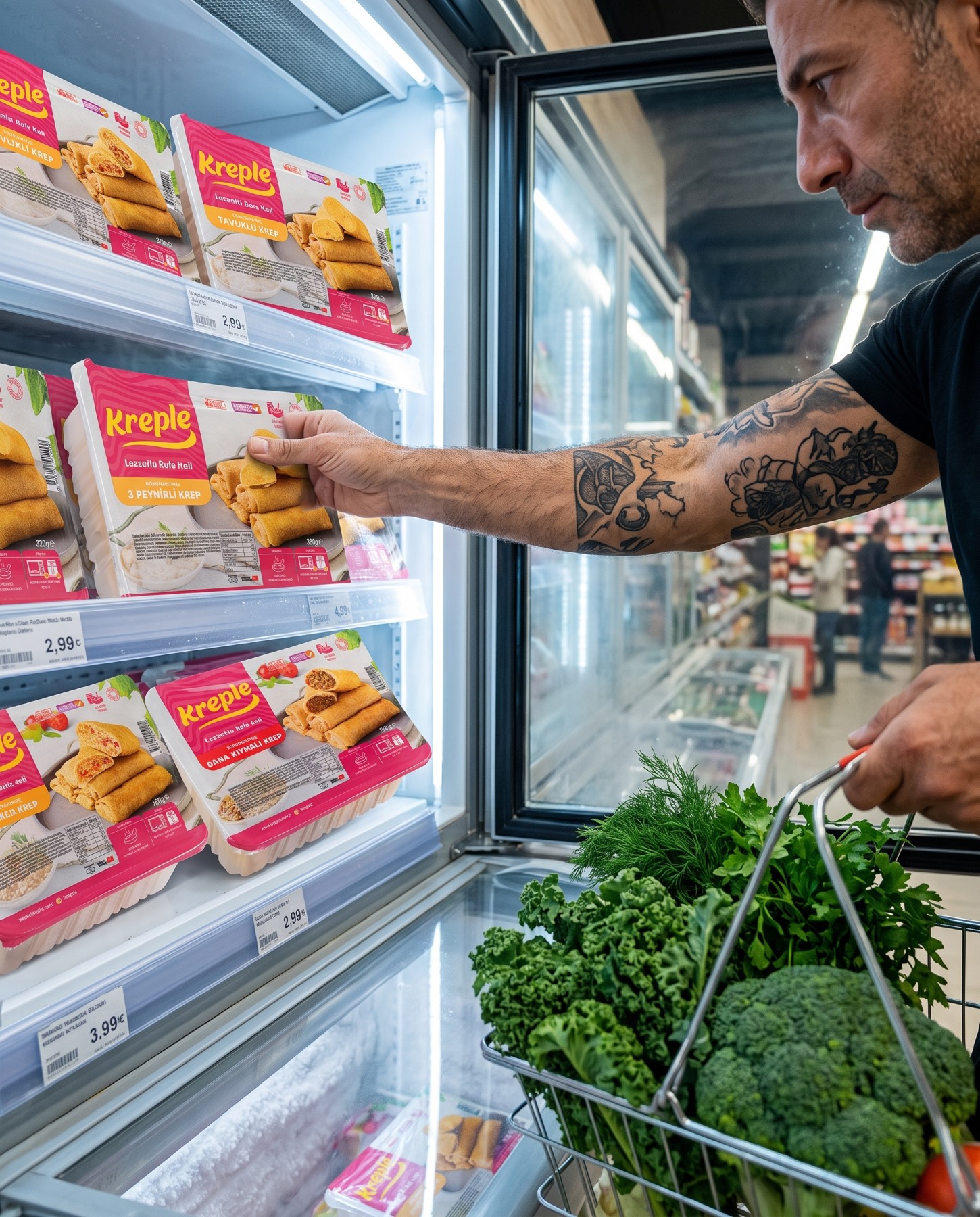
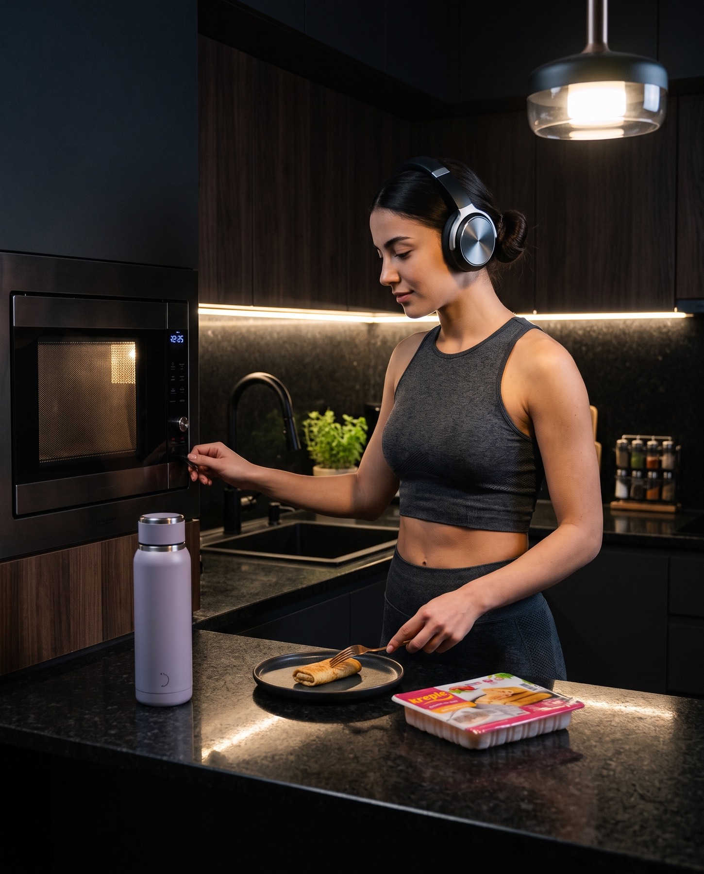
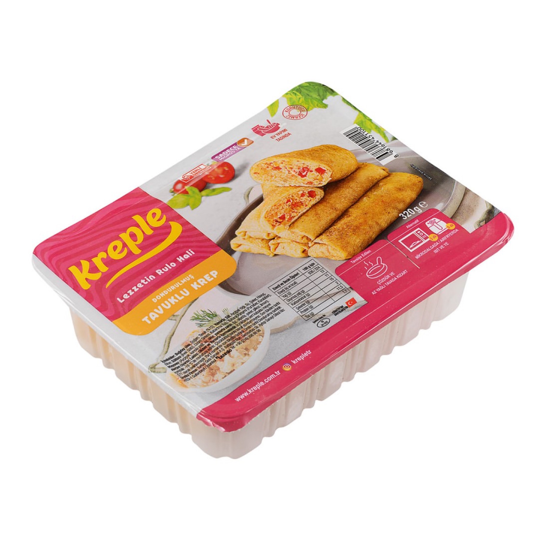
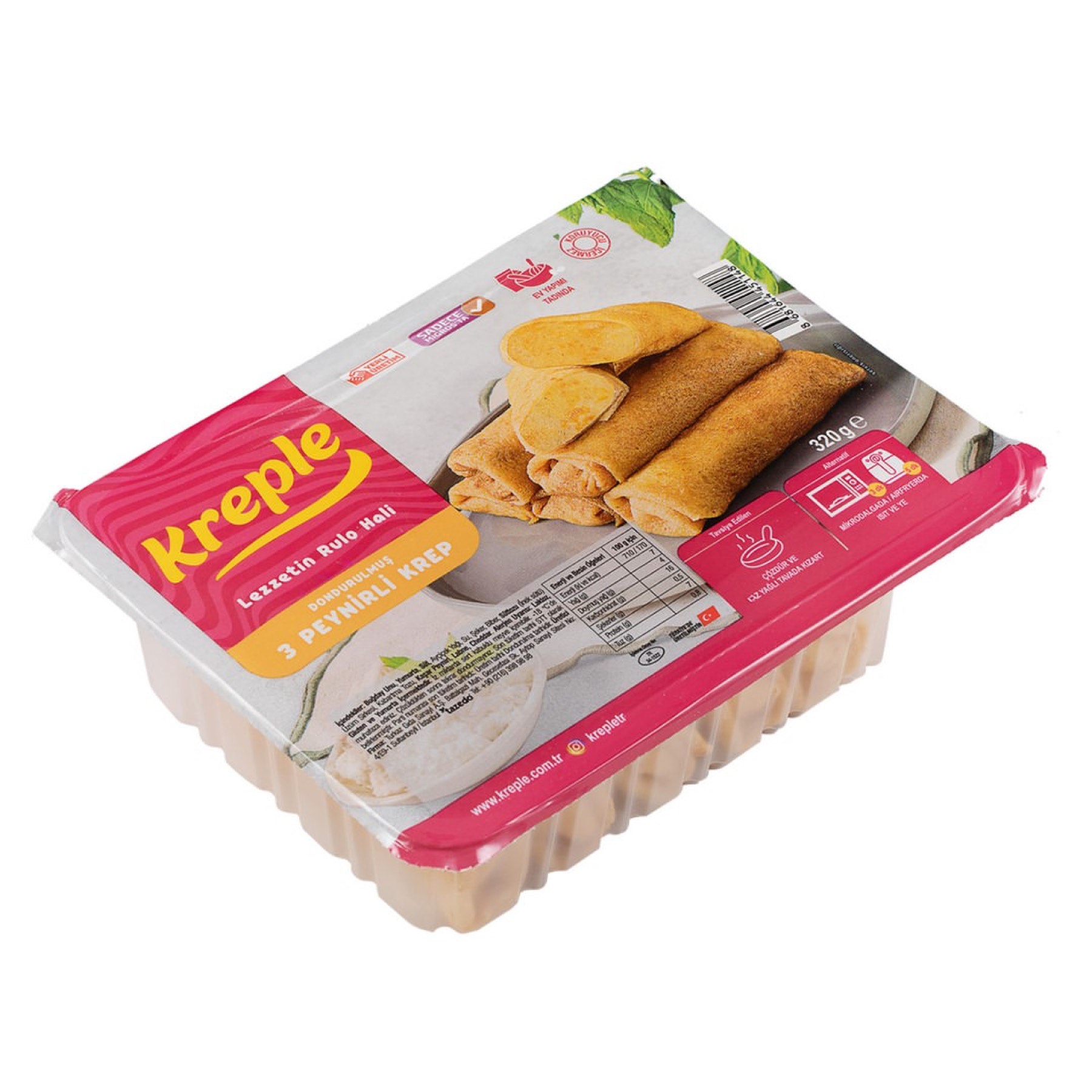
The Kreple logo design was crafted with a wonderful harmony of pink and yellow. The custom lettering reflects the brand's young, dynamic spirit. This logotype stands out through Kreple's chicken, beef, and three-cheese varieties, sold exclusively at MIGROS stores in Turkey.
Challenge
When consumers hear "crepe," they typically think of carb-heavy, sweet, on-the-spot bakery/café products.
The biggest challenge in the project was to completely break this established perception and reposition Kreple as a high-protein, savoury, convenient frozen meal packed with rich ingredients like chicken, minced meat, and cheese. It was also necessary to stay away from the typical "functional/fitness" food category's dull, medical, or overly masculine visual language, keeping the product's appetising flavour promise at the centre of the visual.
Goal
Our core aim was to deliver the brand's innovative "high-protein frozen crepe" concept to consumers through a warm, appetising visual language that shines like a beacon in the cold supermarket freezer aisles.
The logo at the centre of the packaging design was meant to convey the product's convenience, its rich variety of fillings (chicken, minced meat, cheese), and its functional benefit through nothing more than a strong typographic symbol, without needing complex imagery.
Result
The final design that emerged flawlessly reflects both the flavour and the nutritional promise of the brand through bold colour use and full, rounded forms
In the frozen food aisle's typically cold, pale (blues, whites) and monotonous colour world, the contrast of vivid magenta and bright yellow instantly sets the brand apart. Yellow triggers warmth and appetite, while the magenta ground displays a modern, bold, convention-breaking FMCG (fast-moving consumer goods) stance. The bold, plump, soft-edged letterforms plant a subconscious sense of "heartiness" and "satisfaction" reflecting the rich, protein-packed filling inside (minced meat, chicken, cheese). This informal font proves that even a high-protein diet can be fun and delicious. The flowing, upward-curving line underlining the lettering symbolises, in one simple form, both the active lifestyle (energy) supported by high protein and the satisfying "smile" this convenient frozen treat brings to the table.
Kreple has gained an iconic face that guarantees a place in the consumer's basket — not just through its nutritional value, but through its dynamic, appetising visual identity that breaks convention in the frozen food aisle.
Launch Similar Project