Prokarkas
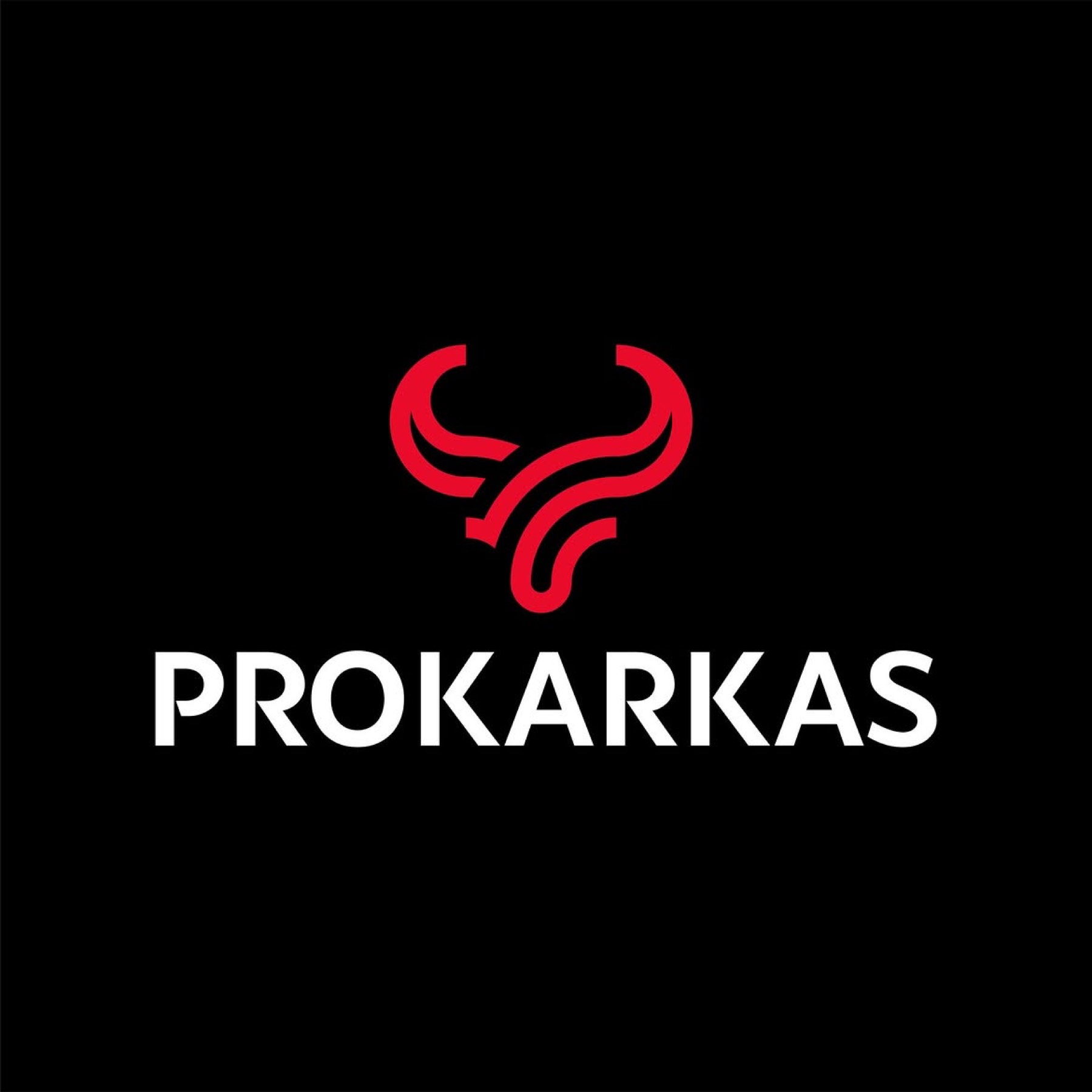
By bringing together the name "PROKARKAS" — combining meat-processing expertise ("Pro") with its core unit ("Karkas," carcass) — with a stylised, cleverly conceived bull symbol built from fluid lines representing the essence of the carcass, alongside a black, modern typeface reinforcing the promise of professionalism, we delivered a brand identity that is both respectful of the sector and visionary.
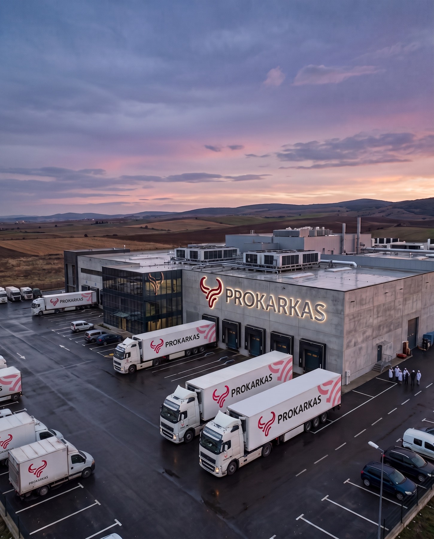
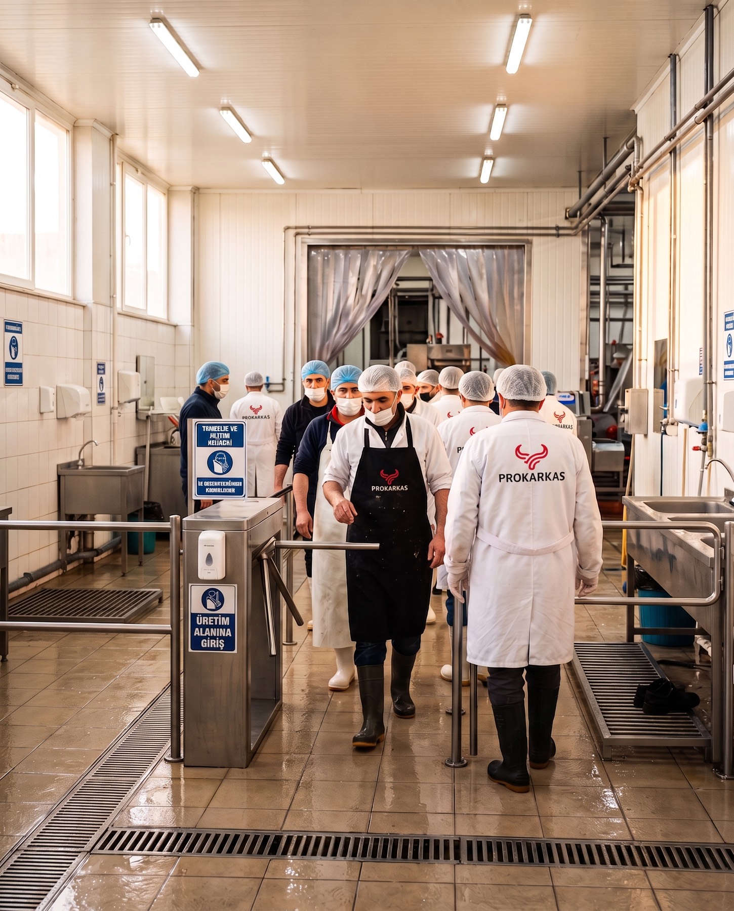
For PROKARKAS, which redefines the traditional structure of the meat and livestock industry with a modern vision, we built a memorable, premium brand identity that brings the sector's expertise and dynamism together in a single line.
Challenge
In the traditional meat, livestock, and protein-focused food sector, brands are often locked into repetitive, complex, old-fashioned visual languages.
The biggest challenge in this project was to construct an identity that clearly expresses the brand's field of activity while also reflecting its innovative, high-quality, industrial strength. It was necessary to create a minimalist yet authoritative, "expert" brand perception at a global standard, both in name and visually.
Goal
Our primary goal in the naming strategy was to emphasise authority in the sector by combining the words "Pro" (professionalism) and "Karkas" (carcass, the sector's fundamental building block) in a seamless phonetic. In the design phase, we aimed to create an iconic symbol, free of clutter, that would fill out and support this powerful name.
We wanted to reinterpret the "bull" figure — the universal symbol of strength, resolve, and the sector — through uninterrupted, fluid line-art minimalism, reflecting the brand's modern production standards. We aimed to build an unshakeable sense of trust by combining the eye-catching quality of red, chosen as the corporate colour, with the solid stance of bold black typography.
Result
A corporate identity was born that crowns the professional weight carried by the name with a bull emblem designed in modern, uninterrupted lines.
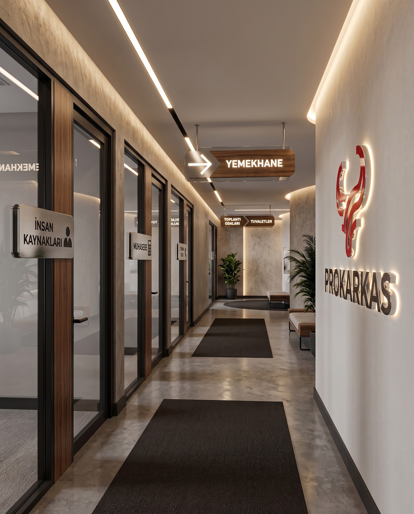
The uninterrupted line form within the emblem symbolises integration, quality, and continuity in production, while the upward-accelerating structure of the horns reveals the brand's resolute growth vision within the sector. The letter spacing and font choice in the typography reinforced the brand's grounded character. PROKARKAS gained a timeless vision that works flawlessly across both digital platforms and industrial packaging, signage, and printed materials — sharply differentiated from its competitors in the sector.
Launch Similar Project