Madame Clarice
For Madame Clarice, a premium skincare brand standing out as a symbol of beauty, elegance and originality, the corporate identity project we brought to life is a journey visualising scientific expertise and tactile elegance through minimalist typography.
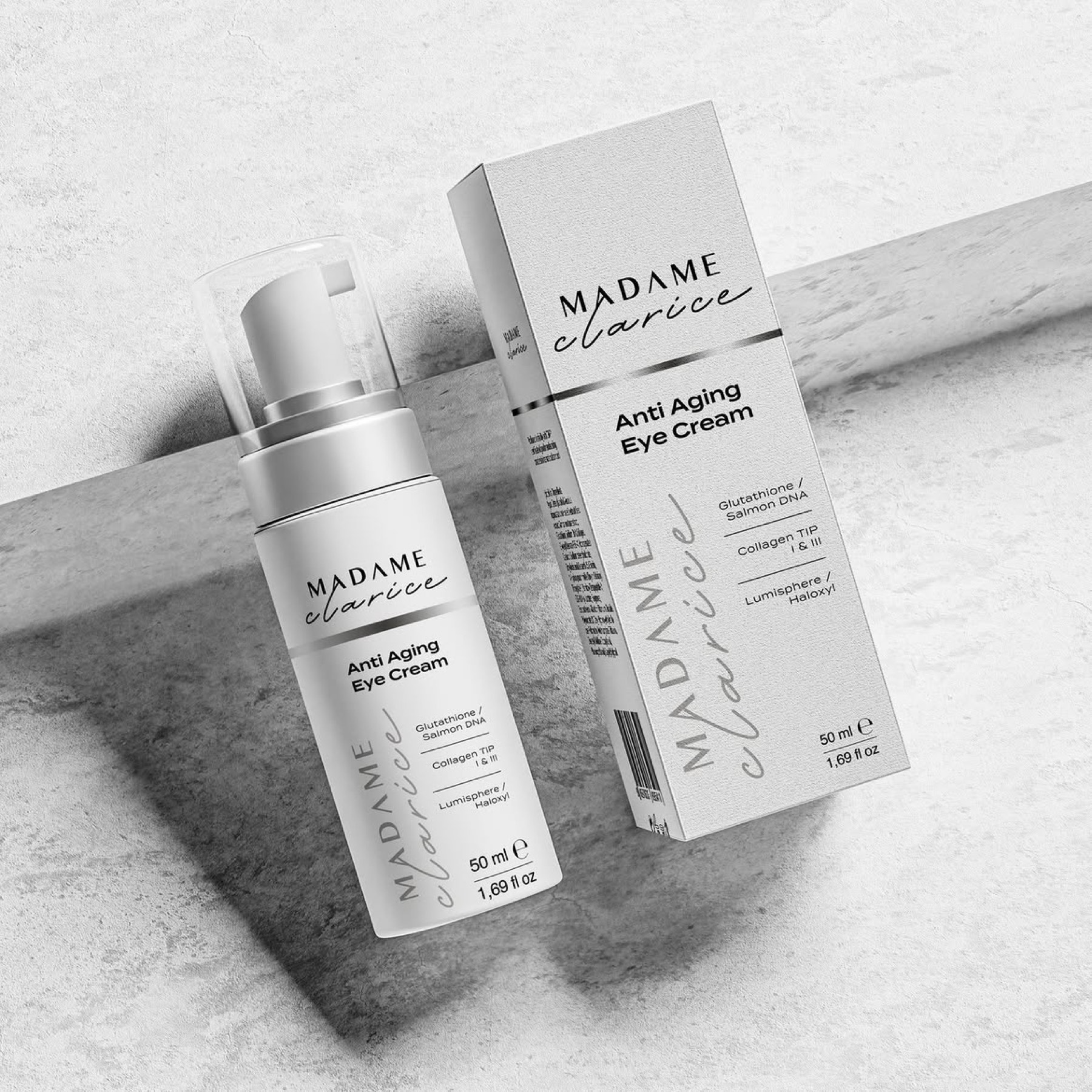
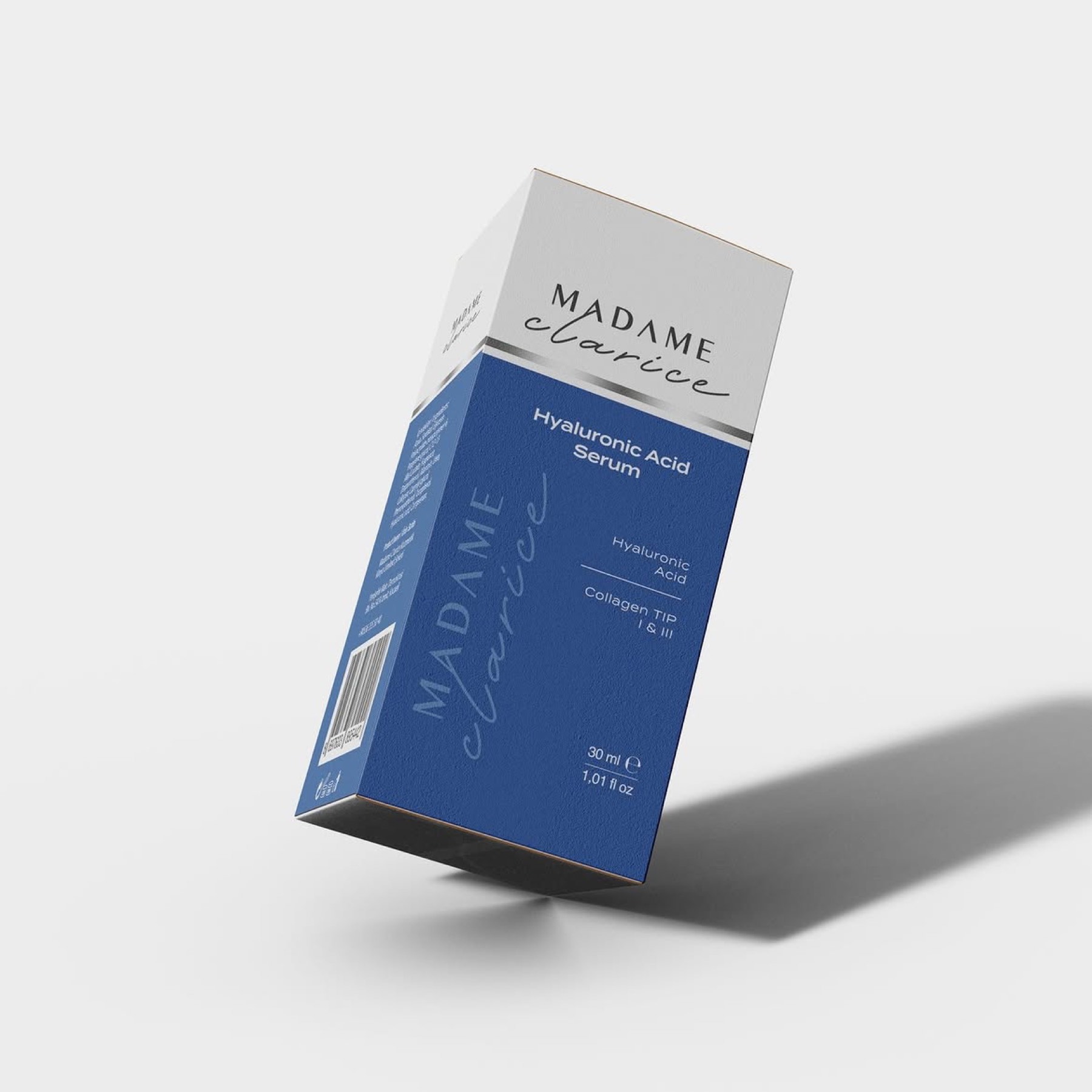
The Madame Clarice brand stands out as a symbol of beauty, elegance, and originality. Our logo design was specially prepared to reflect these qualities. The elegant script font emphasises the brand's sophisticated, luxurious identity.
Challenge
In the intensely competitive cosmetics and anti-ageing skincare market, our core design challenge was positioning the brand on a line that offers both formula-based credibility and an extremely luxurious, personal feel.
In a sector where consumers expect both scientific efficacy (anti-ageing creams, restorative serums) and an elegant care ritual, we needed to create a complex yet balanced brand language reflecting the "original elegance" at the brand's soul — without falling into a cold or ordinary cosmetics perception.
Goal
Our goal was to visualise the brand's promise of renewal and smoothness through a typographic contrast built from the name's two distinct characters (the authoritative 'Madame' and the feminine 'Clarice').
We aimed to melt the scientific, structural foundation of skincare — expressed through modern lines — and the personal, organic nature of beauty — expressed through flowing forms — into a single logotype, giving the brand a signature-quality identity.
On packaging, our goal was to create a minimalist, authoritative packaging architecture that visualised the concept of "clinical luxury", standing out instantly on shelves and in digital storefronts. We aimed to present the "active ingredients" the conscious consumer cares about most through a transparent, legible, modern typographic hierarchy. At the same time, we aimed to add contemporary dynamism to the design by conceiving the brand-specific logo not merely as a standard signature sitting at the top, but as a bold vertical graphic element (a pattern/texture) wrapping around the box and bottle surfaces.
Result
The design process brought to life a cohesive "clinical luxury" language across both the corporate identity and the packaging architecture, flawlessly combining Madame Clarice's scientific expertise with feminine elegance.
The brand's innovative, results-focused nature struck an authoritative stance through the architectural forms in the "MADAME" typography (letters Λ with their crossbars removed), while the word "clarice", set in a personal script style and organically intersecting this clarity, reflected the brand's gentle, aesthetic approach to skin.
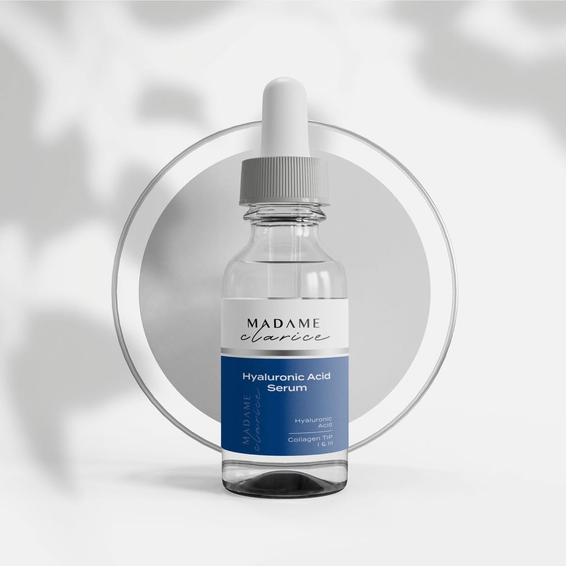
This timeless logo design, thriving on contrast, was not left as a standard signature on packaging surfaces alone; transformed into a large-scale, bold graphic pattern along the vertical axis, it gave bottles and boxes three-dimensional depth and a modern character. Generous white space (negative space) dominating the packaging architecture and minimalist black typography emphasised the products' medical purity and transparency, while metallic silver foil strips integrated into the design gave the range a high-end cosmetic elegance. This pure white-and-silver balance built for core care products gave way to a deep cosmetic blue for the concentrated-formula serums, providing clear colour categorisation without disrupting the aesthetic stance.
Ultimately, this refined design ecosystem, where the logo and packaging speak in one voice, successfully positioned Madame Clarice in the premium skincare market as both an authoritative scientific expert and a unique beauty icon.
Launch Similar Project