Dönüşüm Zeytinyağları
For Dönüşüm Zeytinyağları, born from the lands of Akhisar, Manisa — home to Turkey's largest olive basin with 14 million olive trees — the corporate identity, packaging and web design project we brought to life is the story of a centuries-old, abundant heritage reinterpreted with a modern vision.
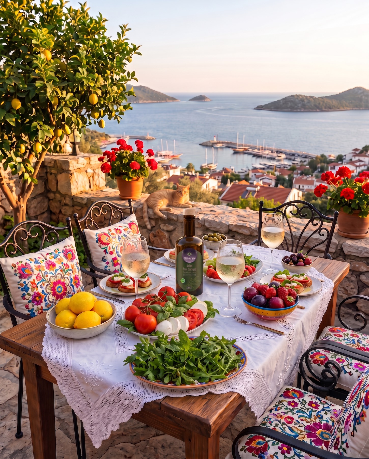
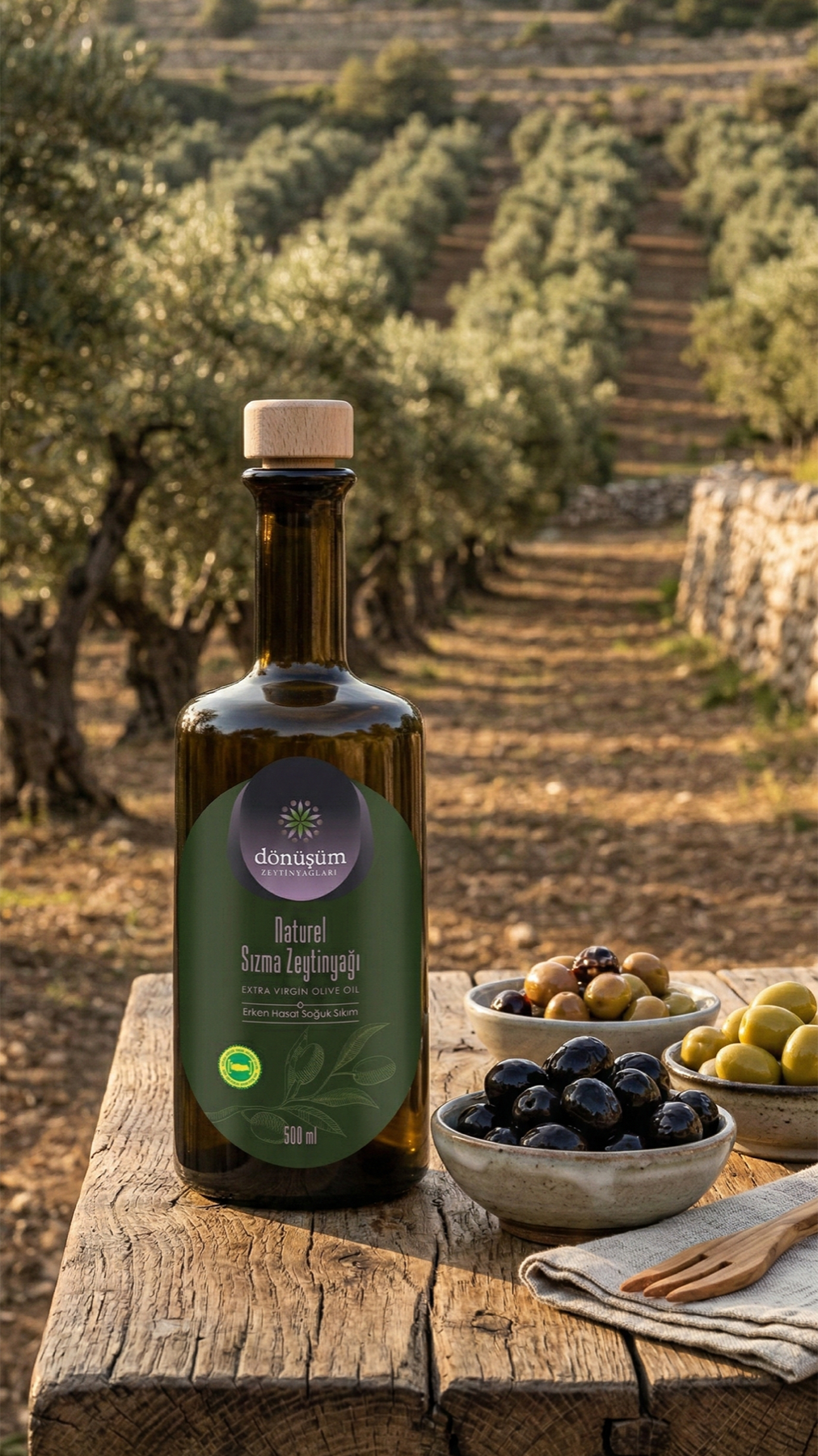
SOCIAL MEDIA MANAGEMENT
Drawing inspiration from the flawless journey of the earth's most precious miracle to the table, the Dönüşüm Zeytinyağları corporate identity project is a visionary design story in which we "transformed" Akhisar's rich agricultural culture into a premium brand experience.
Challenge
The olive-oil sector, especially in a deep-rooted olive capital like Akhisar, is generally filled with repetitive traditional visual patterns — classic olive-branch forms, monotonous green-yellow palettes.
Our core challenge in the design process was to reflect the philosophy of "Transformation" within the brand's name while visualising Akhisar's vast agricultural heritage without falling into the ordinary. We needed to build a cohesive language positioning the brand with both boutique elegance and corporate authority — creating a consistent, first-class (premium) perception from packaging shelves to the digital world.
Goal
Our goal was to tell the flawless cyclical story of olives' "transformation" from nature to the table through a symmetrical, balanced, aesthetic symbol.
We aimed to iconify the journey of harvested olives becoming oil through a mandala-like form built from leaves and olives, evoking infinity and abundance. We sought to turn this aesthetic language into more than just a logo — a brand ecosystem giving the consumer a sense of naturalness and quality at once, across the packaging architecture and web interface alike.
Result
The design process brought to life an iconic emblem symbolising nature's balance and the cycle of abundance, with olive leaves elegantly converging toward the centre, encircled by ripe olives.
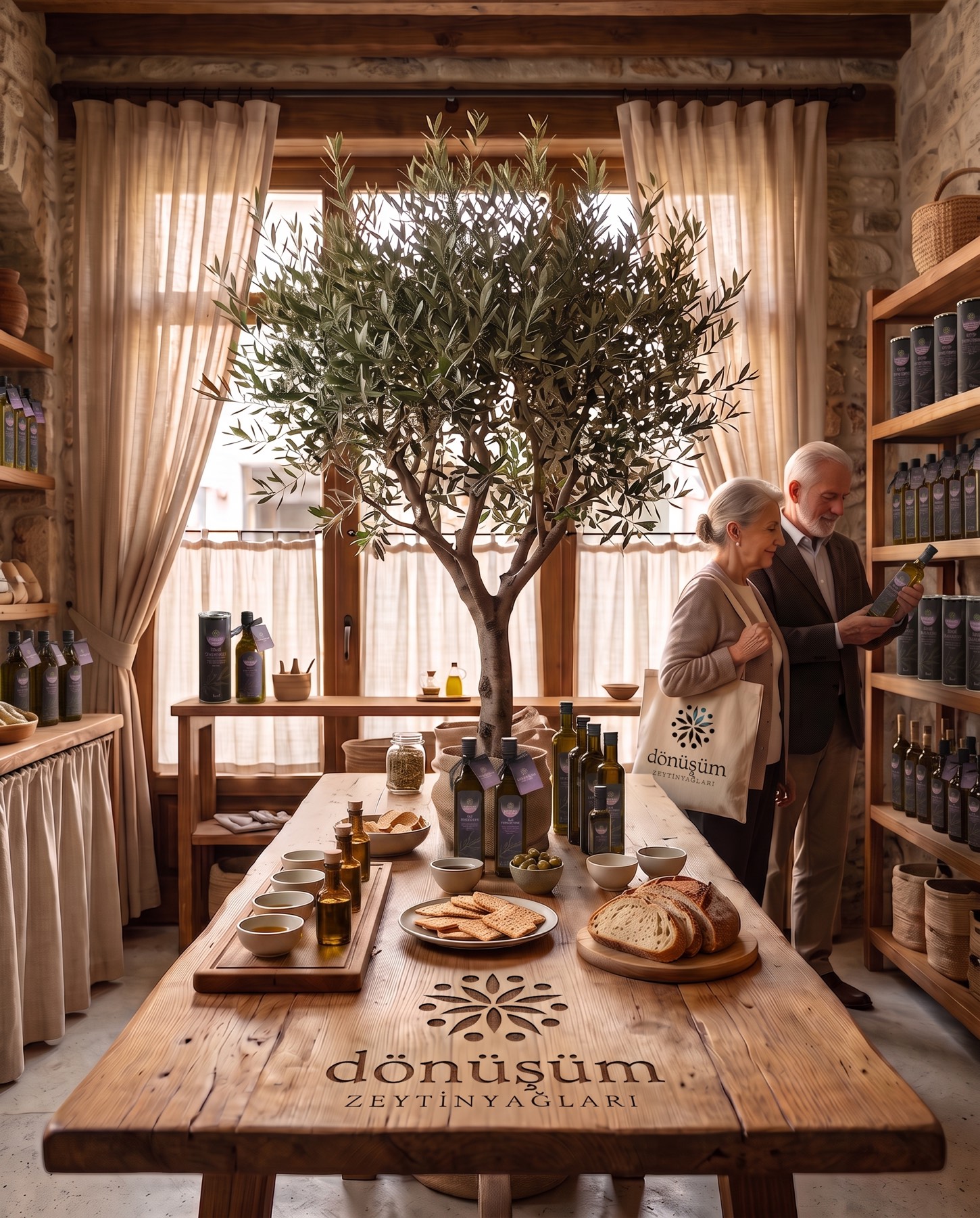
The elegant harmony of earthy olive-green and ripe olive-purple tones used in the logo gave the brand both a natural and a premium character. The circular form successfully completed the "transformation" cycle in the brand's name. The serif typography chosen for the brand name (dönüşüm) reflected a bond with the earth and a deep-rooted sense of trust, while the clean, widely spaced modern font used in the subtitle (ZEYTİNYAĞLARI / olive oils) provided flawless visual balance. This refined identity was seamlessly integrated across every touchpoint, from elegant packaging design to a user-friendly website interface and social-media content strategy.
Launch Similar Project