Mantissimo
We designed not just a name, but an entirely new experience: "Mantissimo." We carried a traditional flavour to its peak with Italian flair. We crowned the brand's patented name's claim to be "the best," and the memorability of its "One bite, endless delight" slogan, with a bold, internationally standard design suited to fast-casual dynamics.
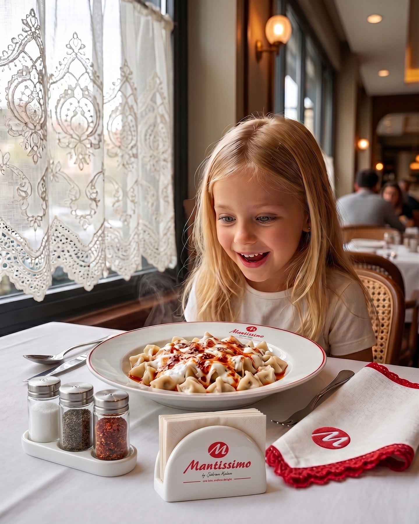
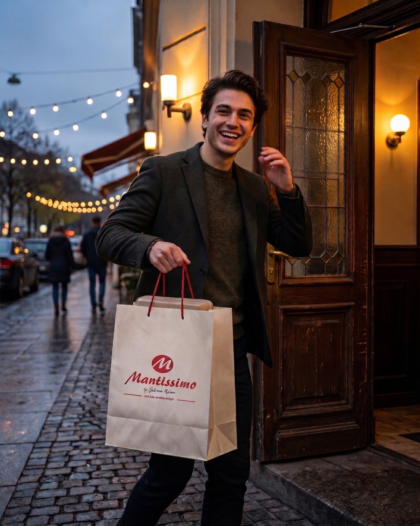
A new brand was born: Mantissimo. The Italian suffix "-issimo" means the best, the most beautiful, the most delicious version of something. We carried that effect over to "mantı" (Turkish dumplings): Mantissimo — magnificent mantı, an appetite-inducing brand! Its name is as bold as its flavour, forward-looking and fun. The naming and slogan work were developed with an international brand vision. The logo design was crafted in appetising shades of red, in a dynamic, contemporary structure.
Challenge
Mantı, by nature, is a highly traditional, local flavour that typically communicates through nostalgic codes (rolling pins, wooden spoons, authentic patterns). The biggest challenge in the project was breaking this traditional perception and repositioning mantı as a modern, dynamic, internationally standard "fast-casual" brand.
The fact that the business would offer both a dine-in experience and run fast take-away operations meant the design needed to radiate an energy that was both warm and inviting, and fast and practical. It was also necessary to meet the high expectation created by the "-issimo" (the best, the most delicious) suffix in the patented name "Mantissimo" through a clean, bold visual language, without falling into clutter.
Goal
The core aim was to gather the brand's claim of being a "magnificent mantı, an appetite-inducing brand" and the uninterrupted flavour journey promised by the "One bite, endless delight" slogan into a single iconic emblem.
The goal was to build a visual identity that would instantly capture the attention of the new-generation consumer — fun, memorable, and forward-looking. The design was intended to become a powerful typographic symbol, a true signature of the brand, offering maximum legibility and scalability everywhere from digital platforms (food-delivery apps, social media) to printed materials (packaging, cups, signage).
Result
The logo design fully achieved its goals, presenting a bold, unshakeable brand stance
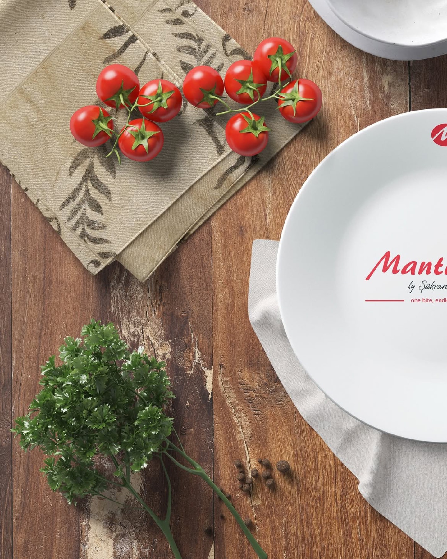
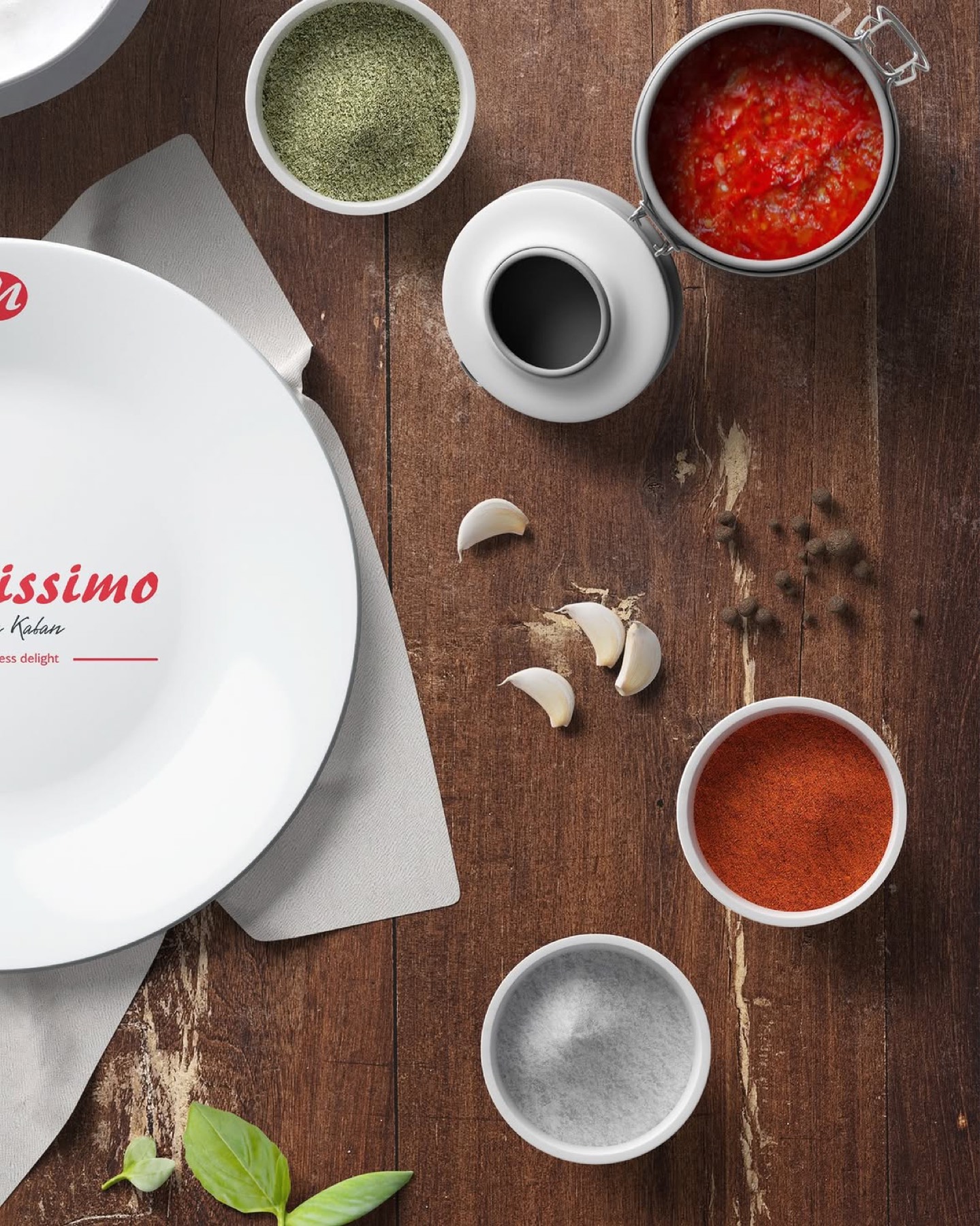
The high-energy, vivid red tone chosen is the most powerful colour for triggering appetite, passion, and movement in the food sector. This colour choice directly conveys the speed of the brand's take-away concept and the excitement behind its "endless delight" promise to the consumer. The clean white elliptical form on the background evokes a flawless porcelain plate, pulling all focus onto the flavour itself. Its minimalist structure instantly sets the brand apart from its traditional competitors' cluttered logos. At the heart of the project is the bold, flowing, script-style letter "M" placed at the centre of the white plate form. This dynamic letterform abstractly symbolises both the fluidity of a delicious sauce being poured and the mastery of a dish carefully prepared by hand. It carries an informal, warm, fun signature character, every bit as exuberant as the spirit of the "-issimo" suffix.
Launch Similar Project