Defneden
Logo and packaging concept design for Defneden, a Hatay brand making natural cosmetics from the laurel tree.
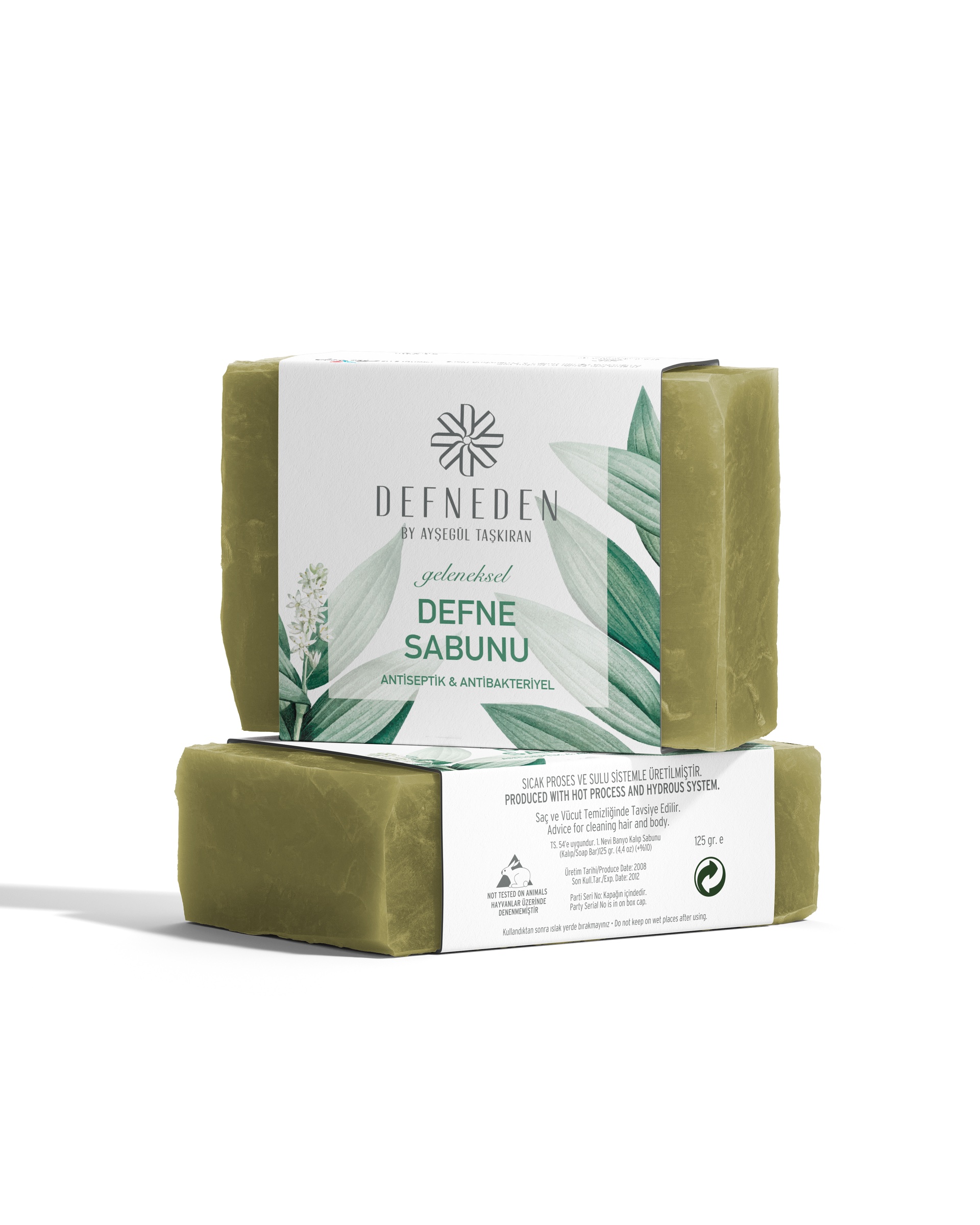
Defneden is a brand in Hatay that processes the laurel tree and its leaves into fully natural cosmetic products. In 2023 we designed its logo and packaging concept: laurel soap boxes, a bay leaf label, and boxes for the hair serum and body creams.
Challenge
Laurel soap is a well-known product of Hatay; Defneden had to present it as a care range that goes beyond soap.
The product family runs from soap to hair serum and body cream. The logo had to stay legible on a small glass bottle label as well as on a box lid, and the packaging had to show the same brand across different products.
Goal
The aim was to turn the brand's name into a single mark.
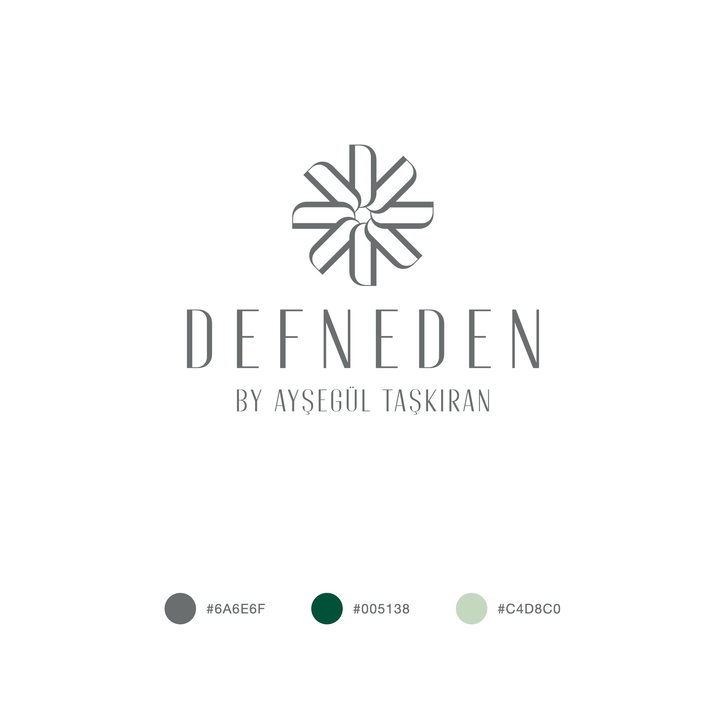
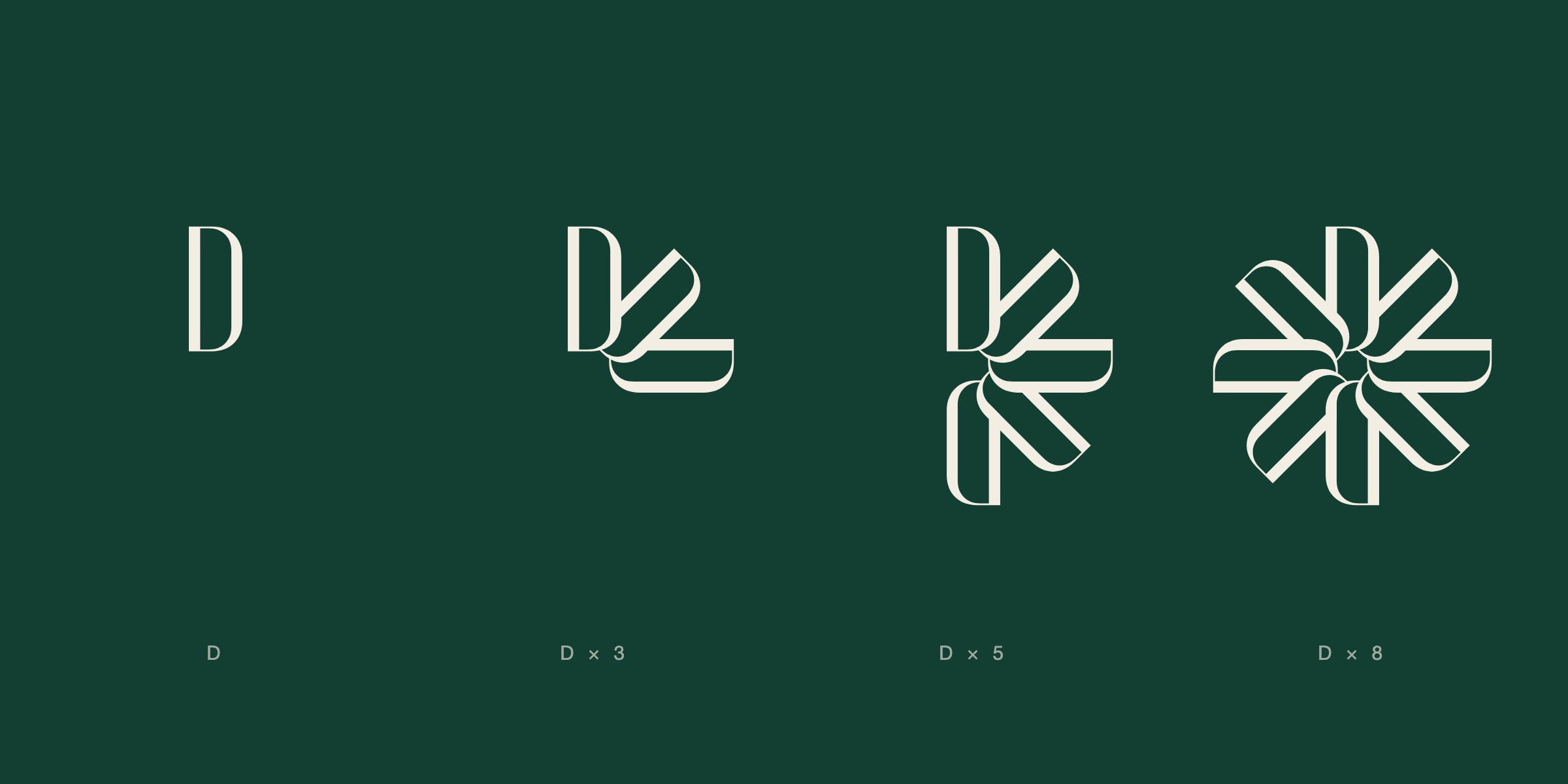
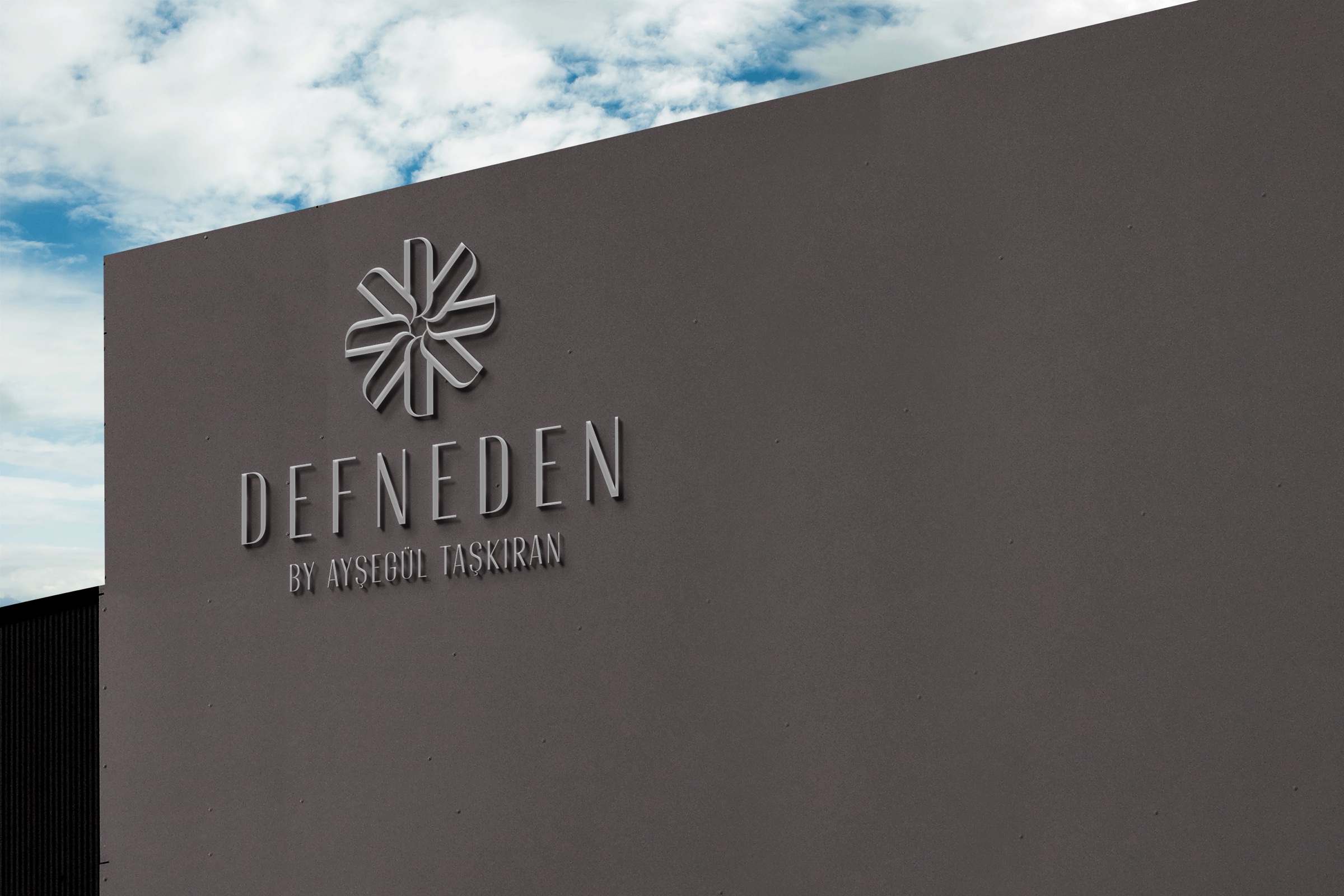
We prepared four directions for the presentation. In the chosen one the emblem is built from D, the brand's initial: eight letter Ds rotate around a centre, overlap one another and form a flower. The name is set in thin, condensed capitals, with the line "by Ayşegül Taşkıran" beneath it.
Result
The flower made of eight Ds became the brand's seal on every product, from the soap box to the serum bottle.
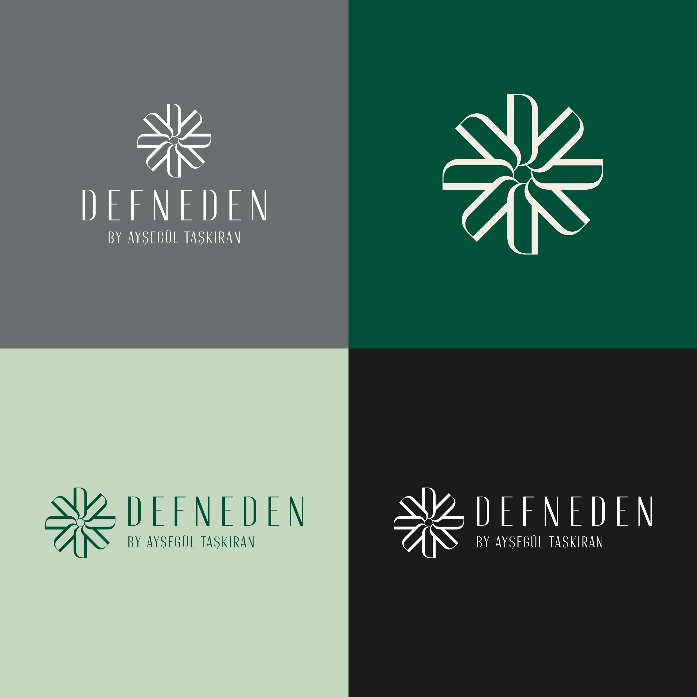
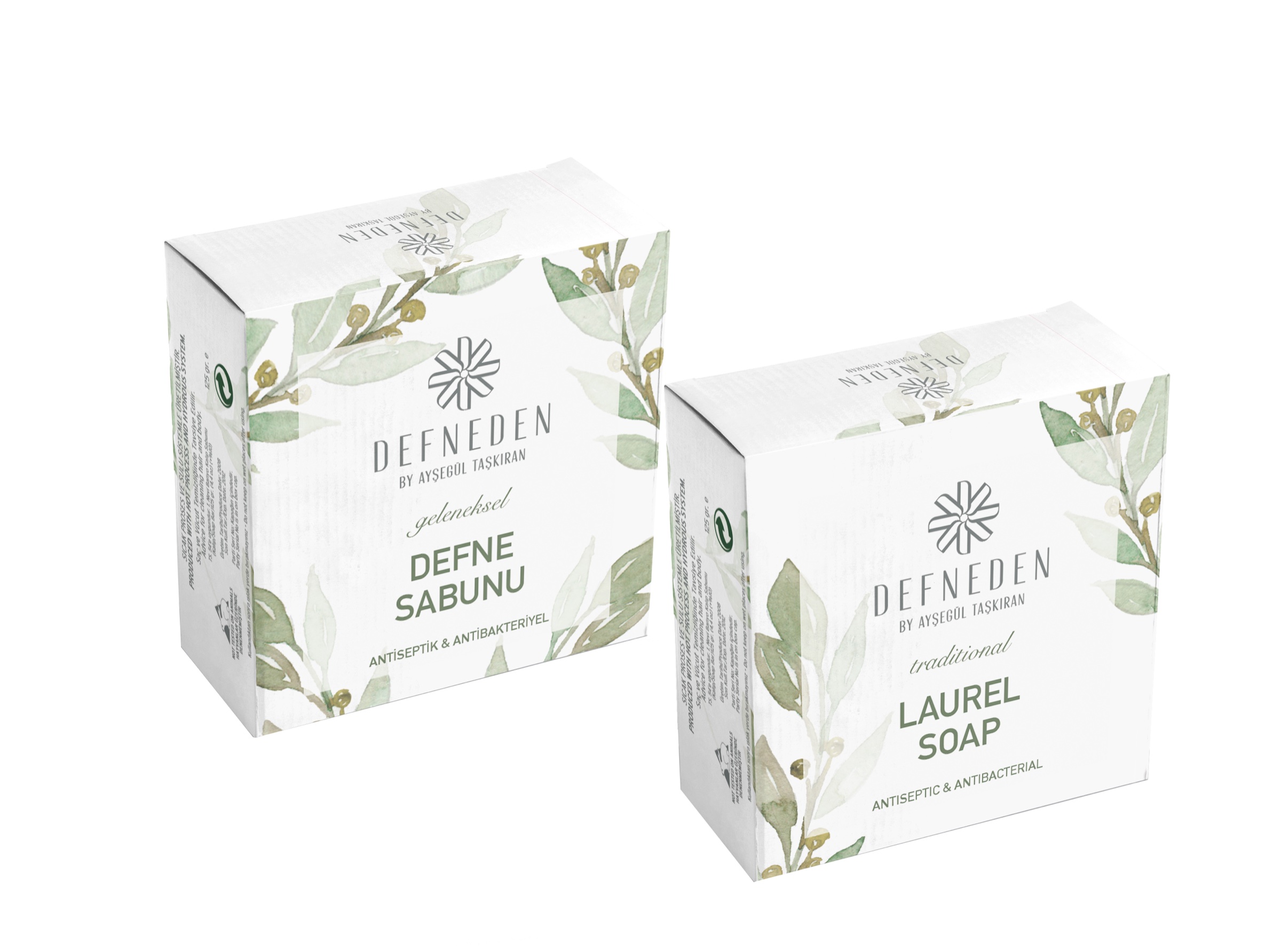
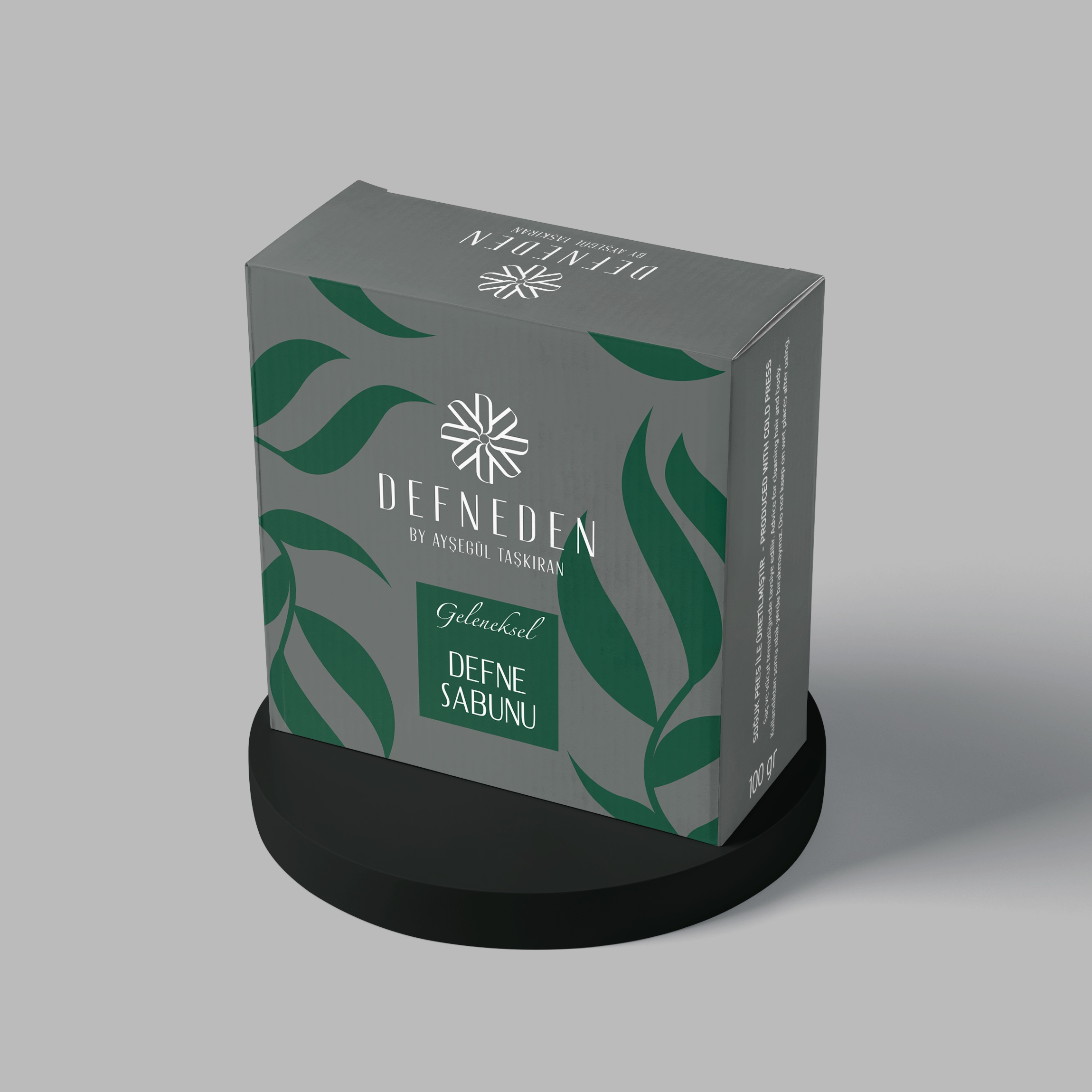
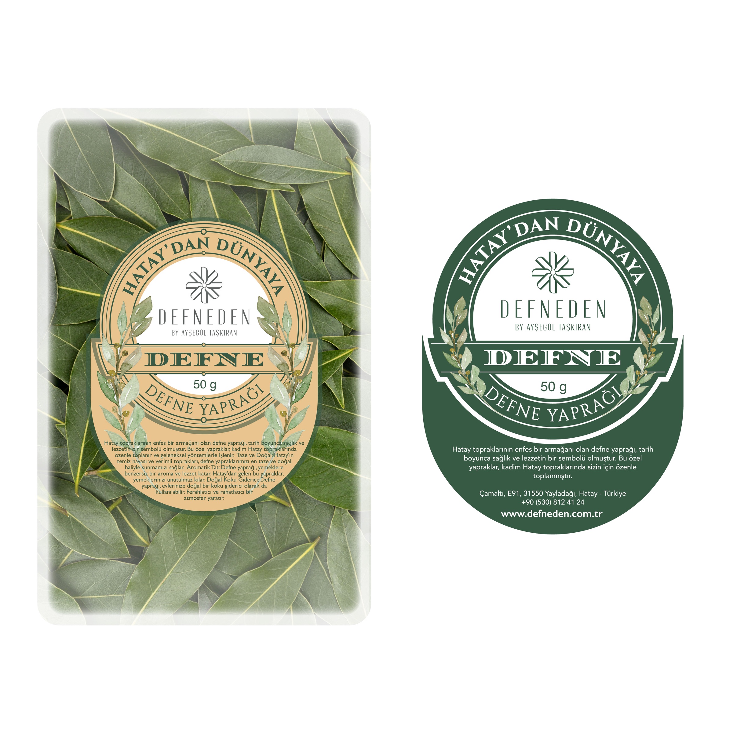
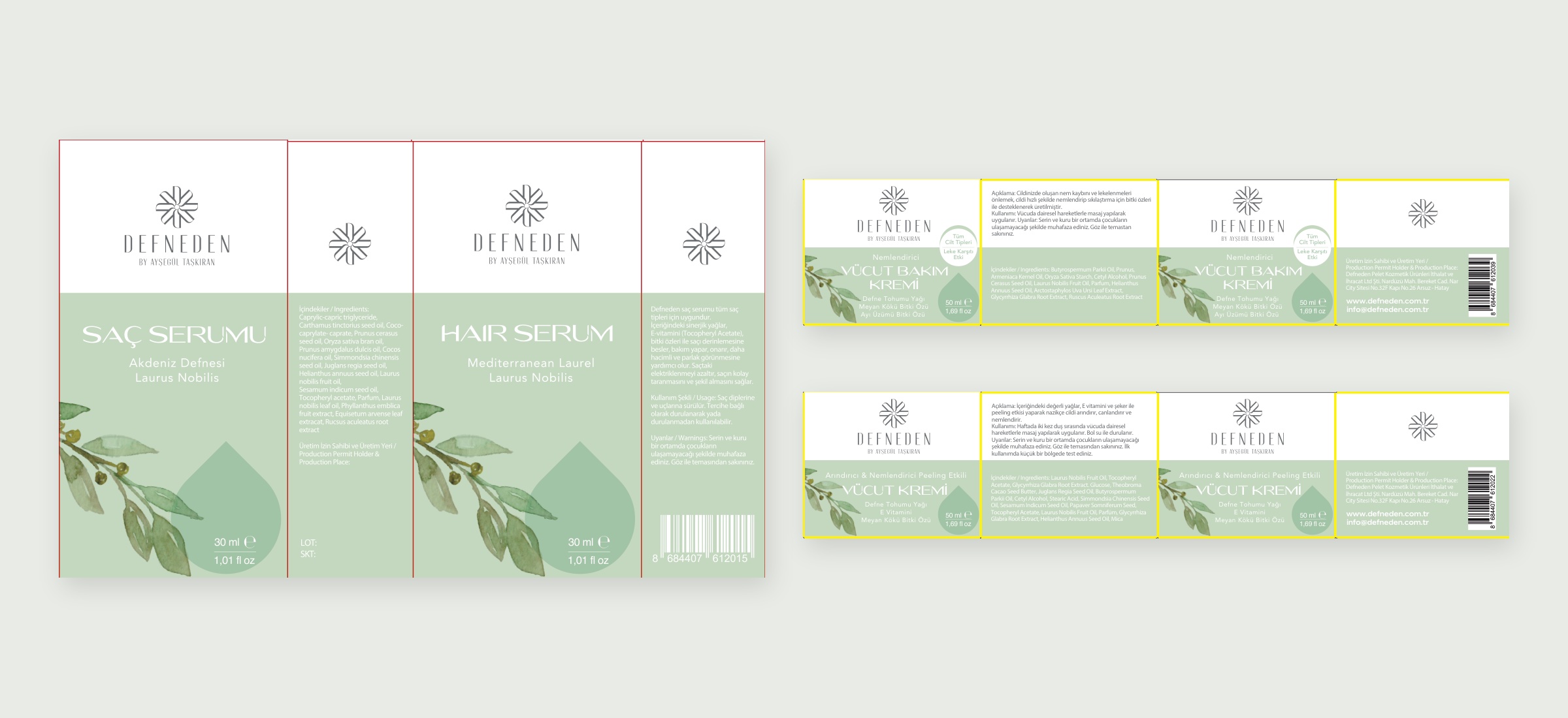
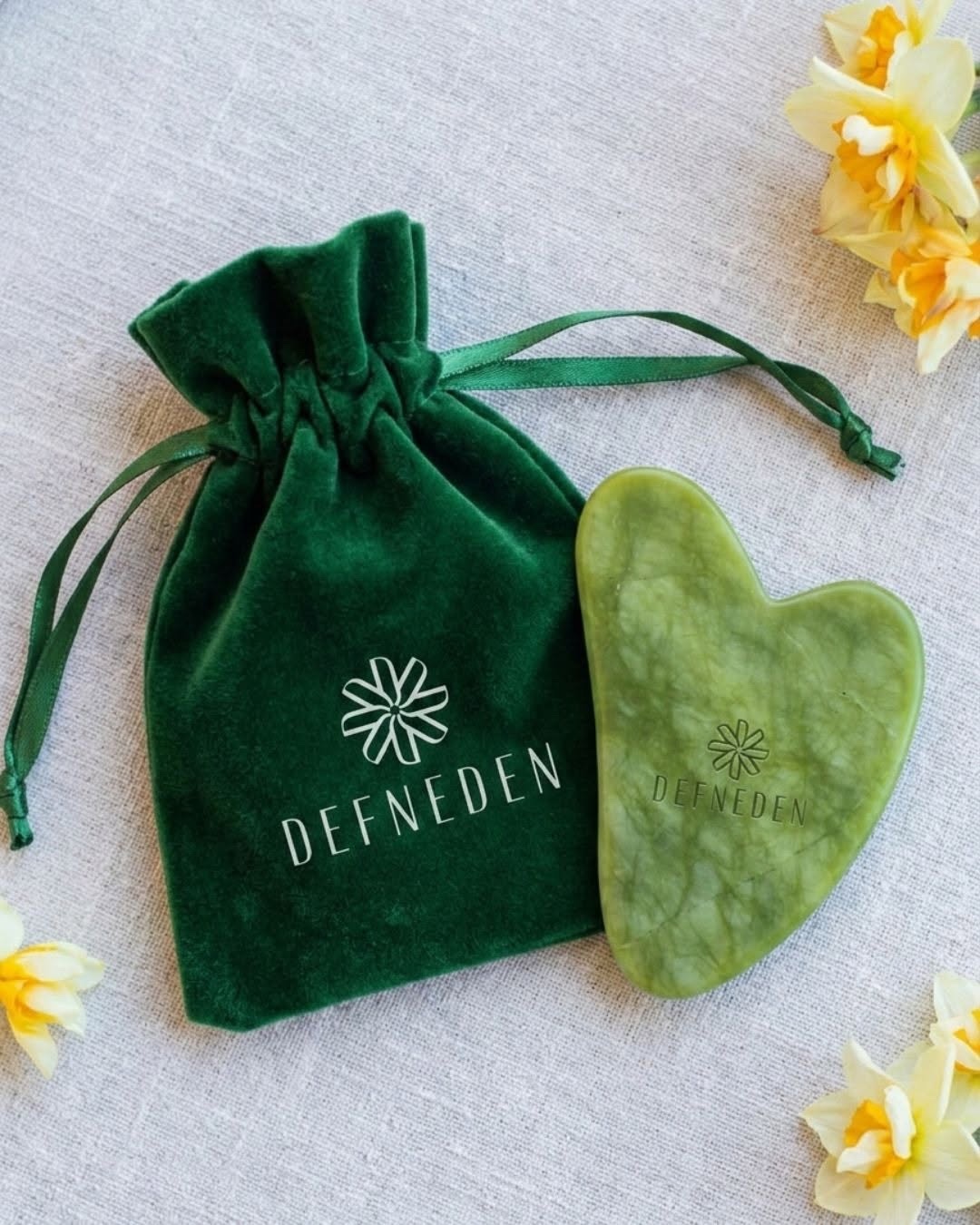
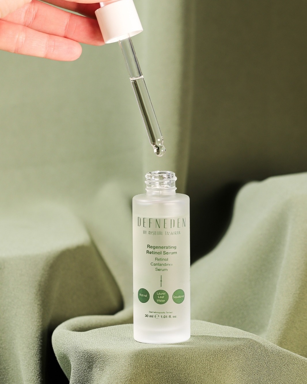
The logo works in a single grey, with versions prepared for dark and light backgrounds. The packaging concept uses a white ground, watercolour laurel branches and a light green band. The traditional laurel soap was designed with Turkish and English box faces, the hair serum and body creams with a box and a clear bottle label. For the soap we also prepared a second box with a grey ground and dark green leaves, and for the 50 gram bay leaf pack a label reading "Hatay'dan Dünyaya" (From Hatay to the World). Today the emblem is in use on the brand's products and accessories.
Launch Similar Project