Devux
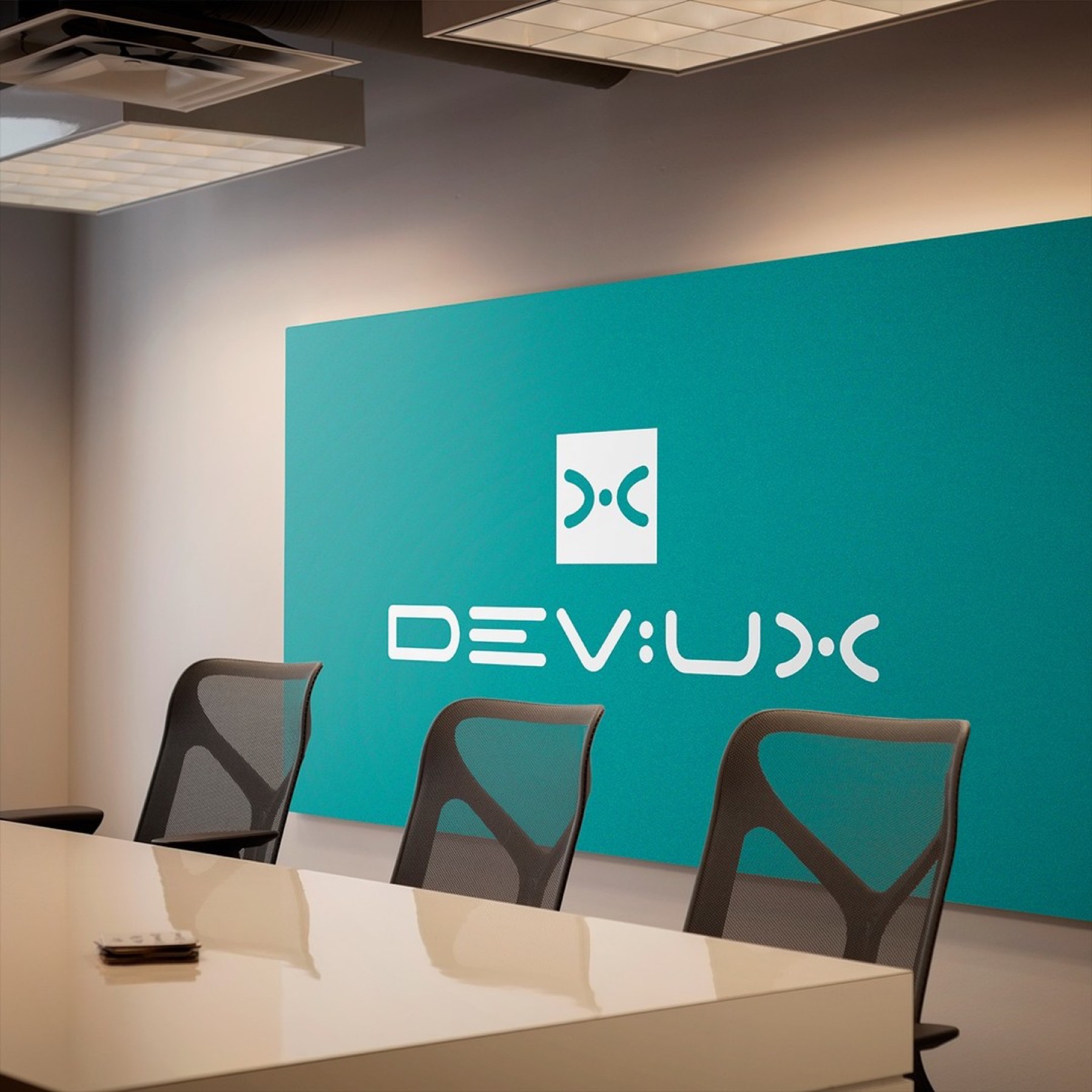
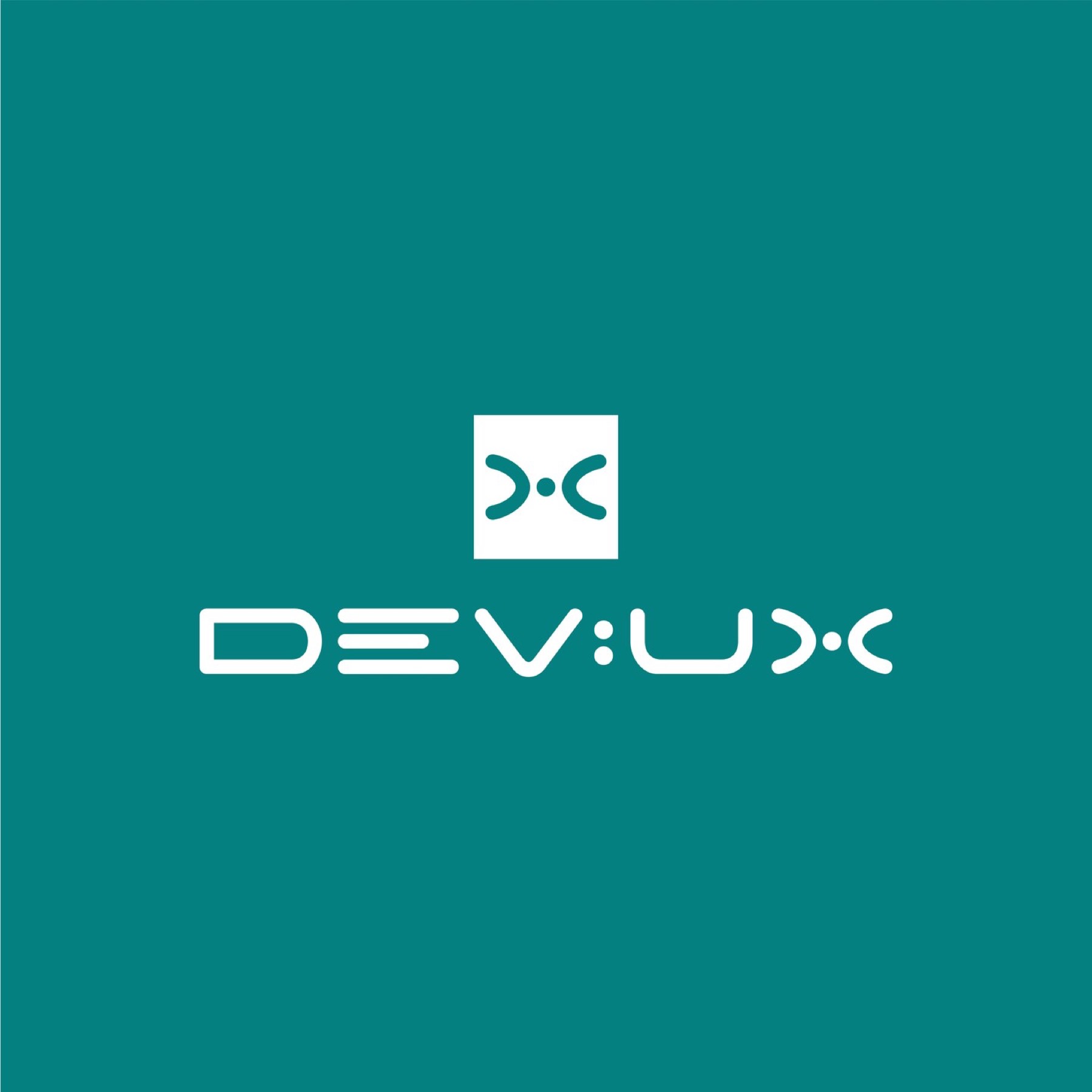
The "Devux" logo design was carefully crafted to reflect the brand's activities in development and user experience, combined with contemporaneity, technology, innovation, and automation.
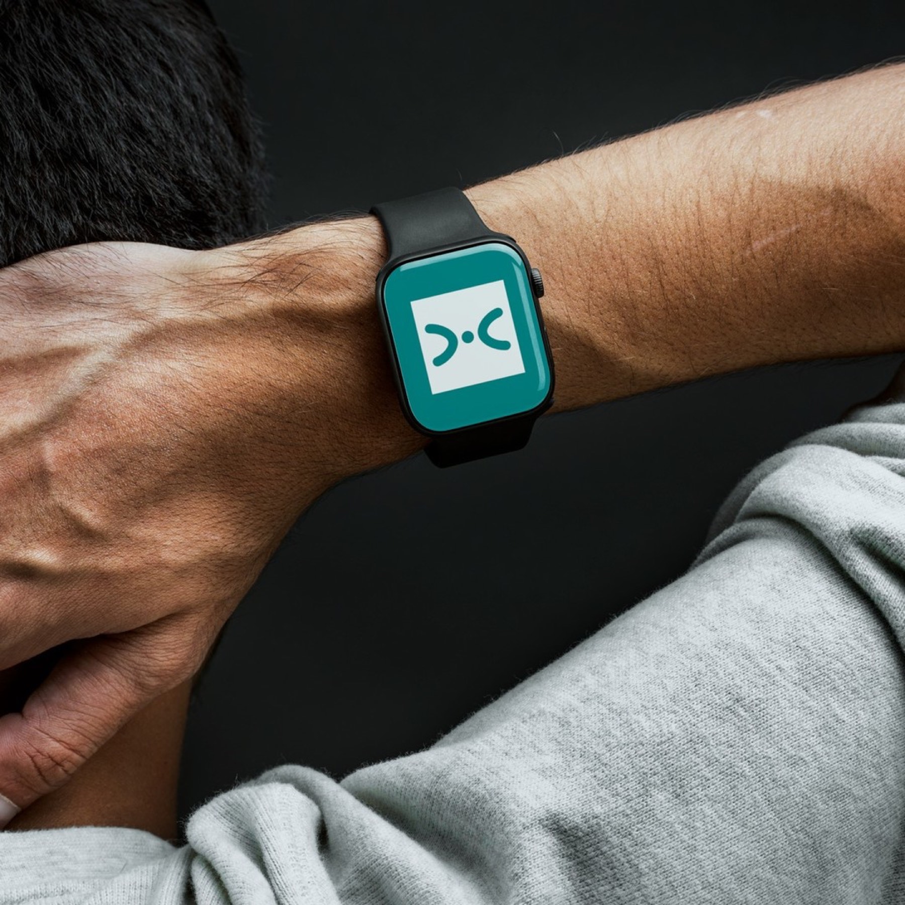
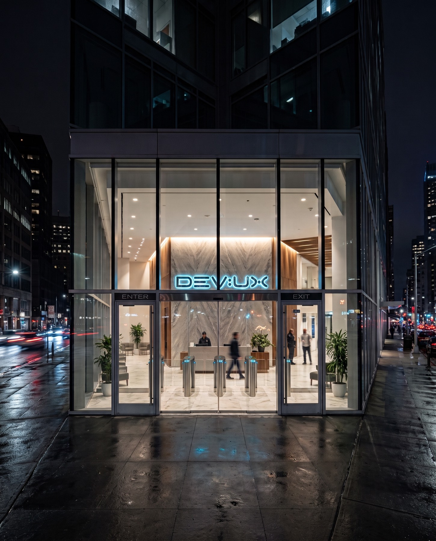
The corporate identity project we brought to life for DEVUX, a technology and innovation firm, is a journey blending the technical depth of software development processes with human-centred user experience (UX) through a minimalist, futuristic, digital visual language.
Challenge
In the fast-changing, intensely competitive technology sector, our core design challenge was building a universal symbolic language that would set the brand apart from ordinary software firms, reflecting both analytical thinking and an innovative approach at once.
It was necessary to move entirely away from clichéd technology icons (circuits, standard network connections, etc.), integrating the digital spirit and dynamism the brand carries directly into its own custom typography.
Goal
Our goal was to visualise the concepts of "DEV" (development) and "UX" (user experience) within the brand's name in flawless balance.
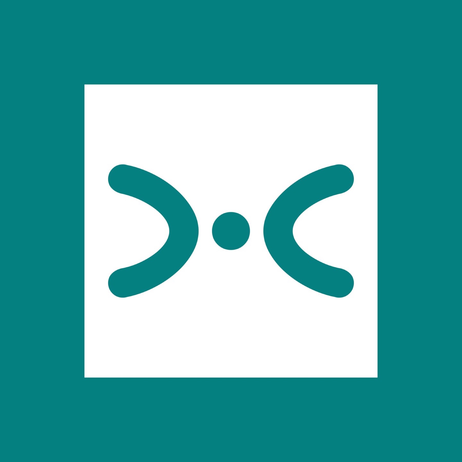
We aimed to take the letters out of their classic structural forms and turn them into a digital code — for example, stylising the letter "E" with parallel lines evoking data flow or lines of code. In particular, we aimed to build the letter "X" at the end of the brand name and the emblem to represent software syntax tags (> <) and the centred user/data point (•), creating a multi-layered technology symbol.
Result
The result was a futuristic, entirely brand-specific typography bringing together the mathematical clarity of software with the boundless nature of innovation.


Launch Similar Project