İhtiyaç Derneği
At first glance, the İhtiyaç Derneği emblem carries the gravity of a trustworthy, charitable institution — while the human figure and meeting-point metaphor hidden within its detail make it a timeless symbol of unity, togetherness, and hope.
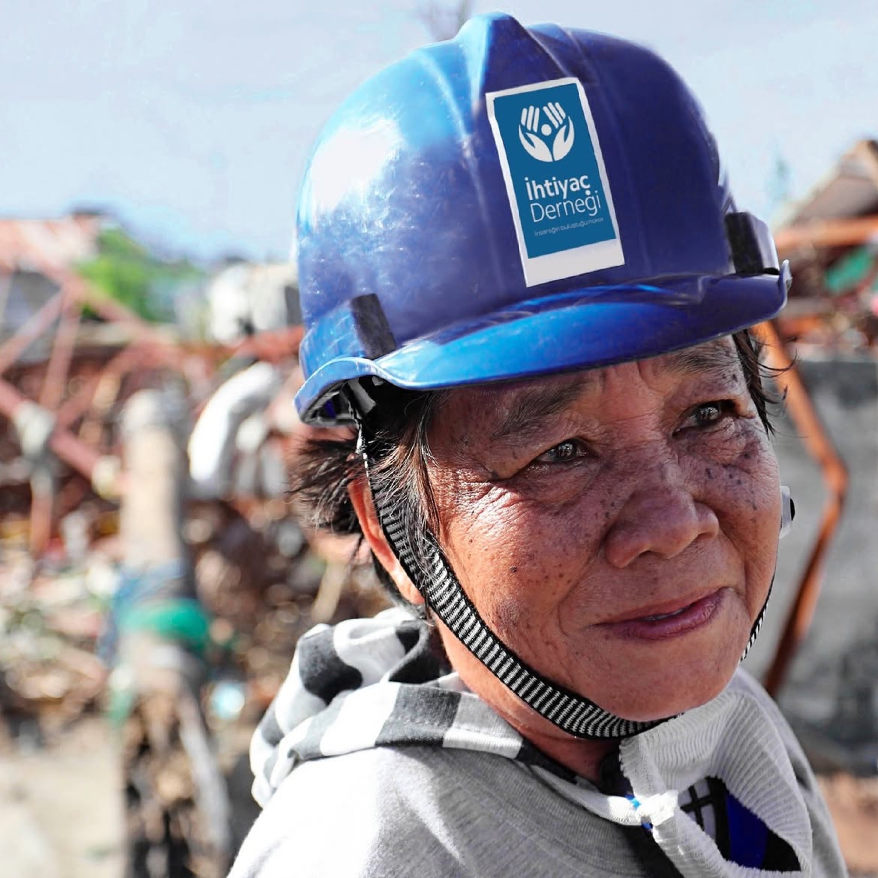
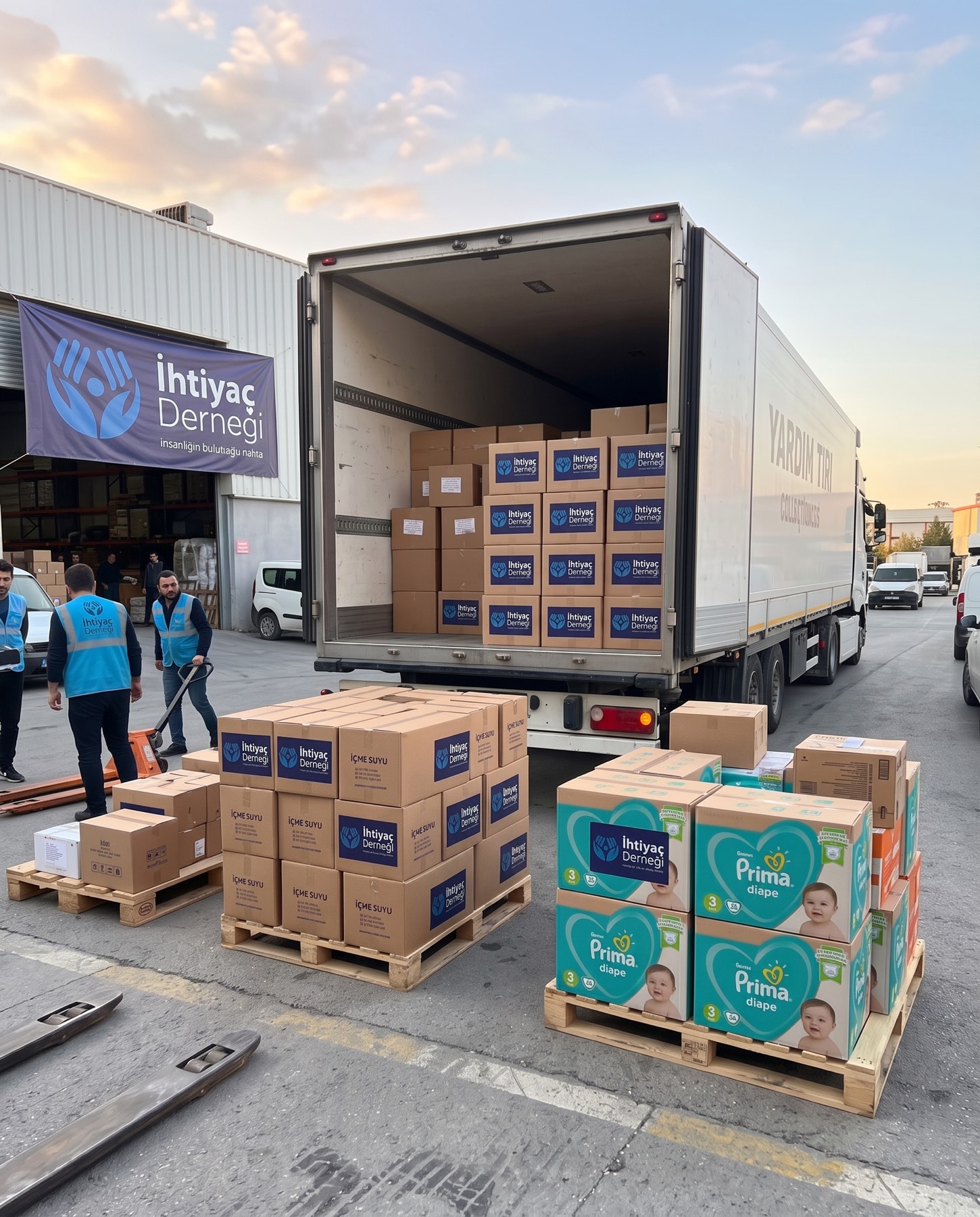
In this logo design, two open palms are placed with a dot inside them. This dot symbolises the place where humanity meets and unites, coming together on common ground. Because the hands are designed open, they emphasise freedom, sharing, and tolerance; at the same time, open hands can also be read as a symbol of collective action and solidarity.
Challenge
The biggest handicap frequently encountered in the visual identities of civil-society organisations and charities is falling into overused, clichéd, and cluttered visual patterns when expressing the concept of "solidarity".
The core challenge on this project was conveying the deep, abstract concepts İhtiyaç Derneği embraces — "freedom, sharing, tolerance, and collective action" — through a single, plain iconography, without compromising the minimalism and corporate gravity modern design requires.
Goal
Placing the association's vision — "the point where humanity meets" — at the centre of the design formed the foundation of our strategy, building an inviting, unifying, embracing visual language.
The goal was to integrate the "open palms" form representing solidarity and unconditional tolerance into the design with modern geometry, visualising the synergy the association creates by coming together and its goal of building "stronger, happier people, together" — creating not merely an institutional logo, but a positive "symbol of solidarity" awakening trust and hope in the viewer.
Result
In line with these challenges and strategic goals, an aesthetic, memorable brand symbol enriched with layers of meaning was brought to life.
The two upward-facing open hands forming the logo's main skeleton simply reflected freedom, openness to sharing, and universal tolerance. The circular form (dot) positioned exactly between the two hands, as the head of the human figure, brought the association's mission of being the "meeting point" uniting all of humanity on common ground into focus. The true intelligence and emotional touch of the design was hidden in the human figure appearing in the negative space at the point where the palms meet. This illusion, symbolising the happy individual that emerges as the ultimate result of solidarity and collective action, gave the logo a dynamic, warm, and profoundly positive spirit.
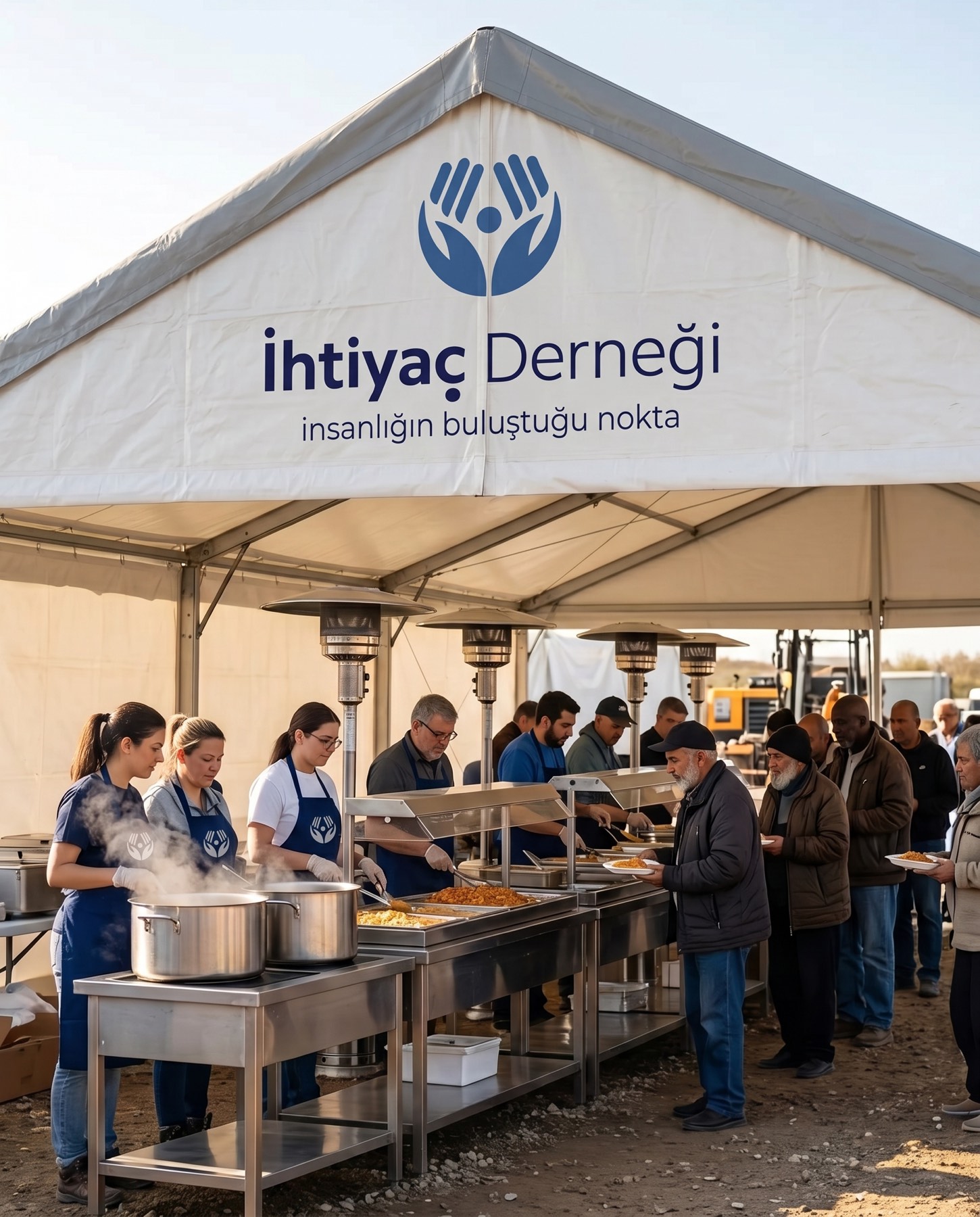
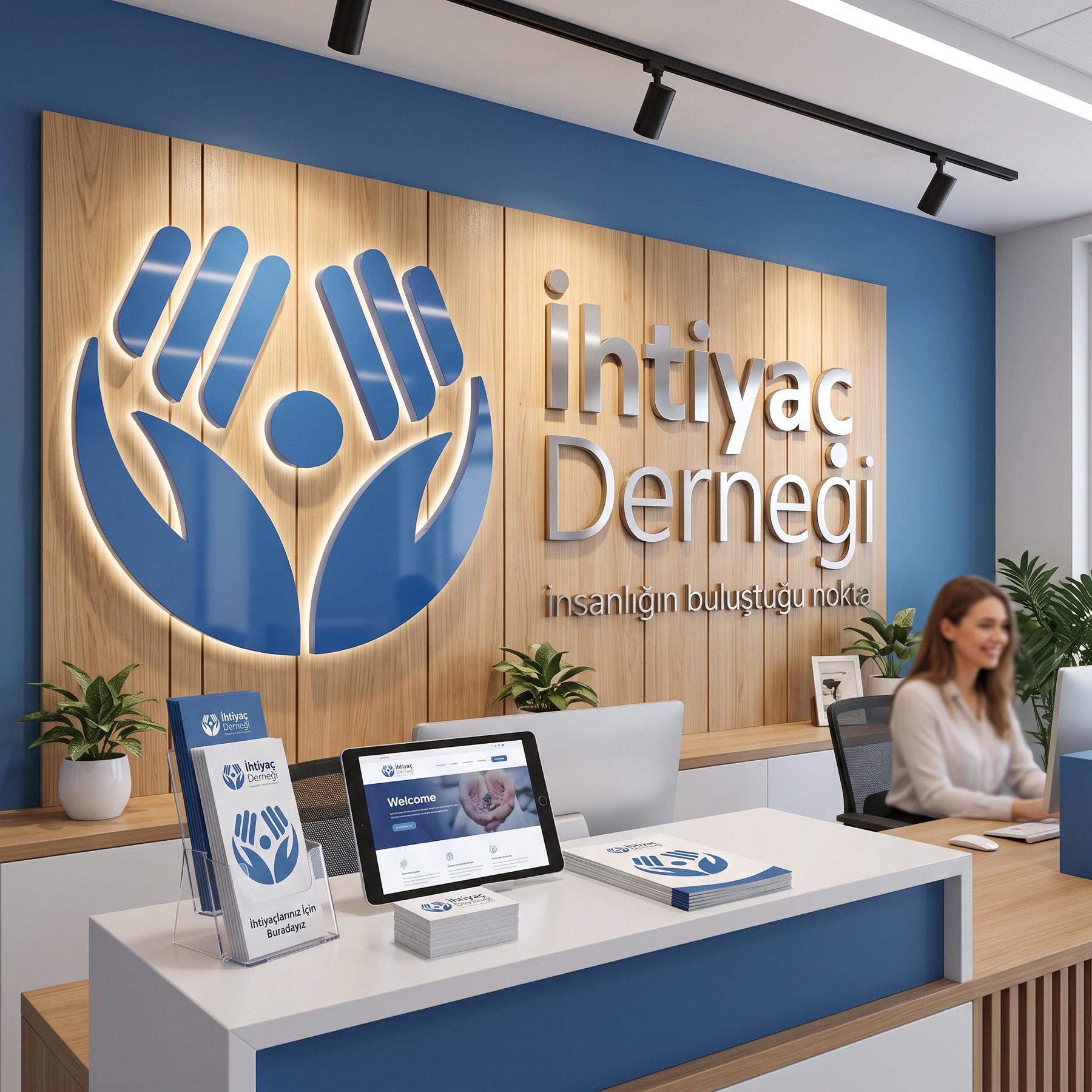
Launch Similar Project