Defne Pelet
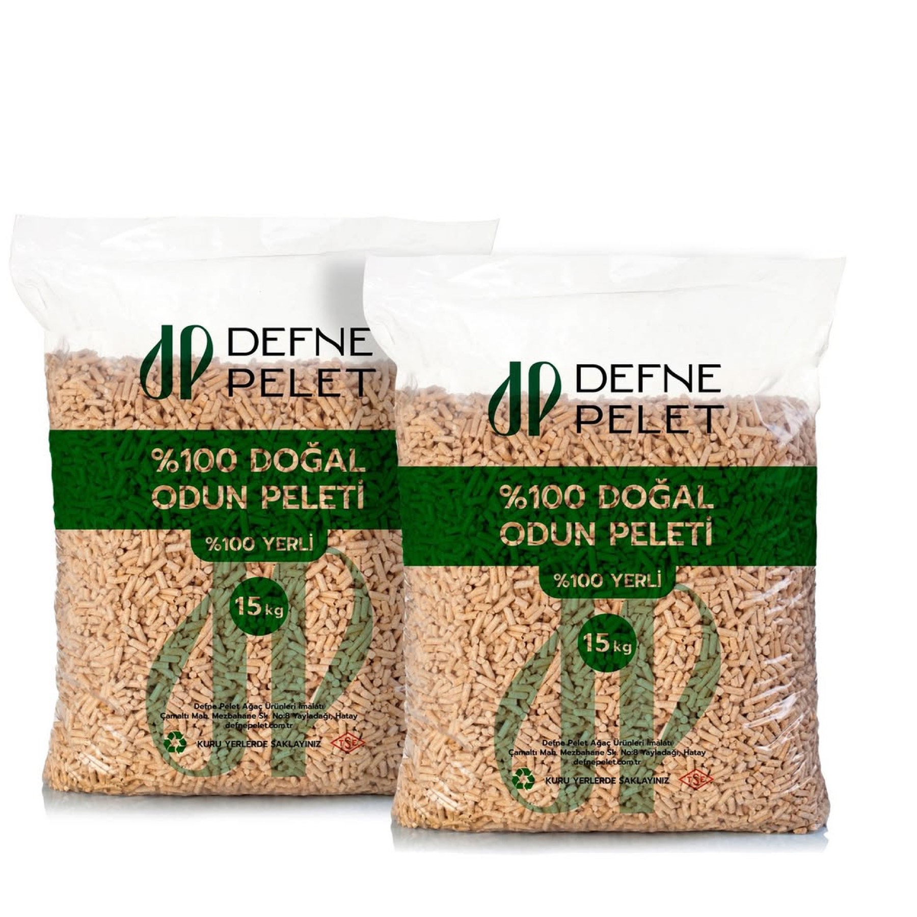
Ayşegül Taşkıran — named by Garanti BBVA as one of "Turkey's Women Entrepreneurs Making a Regional Difference" — chose our agency for the logo design of her brand, Defne Pelet.
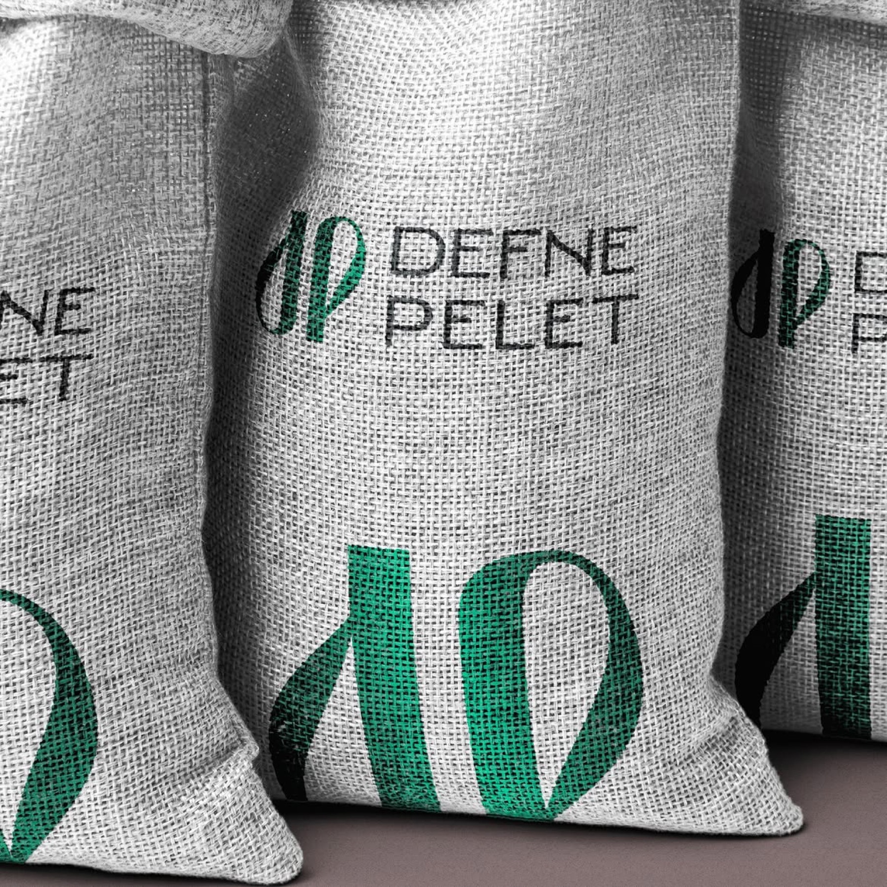
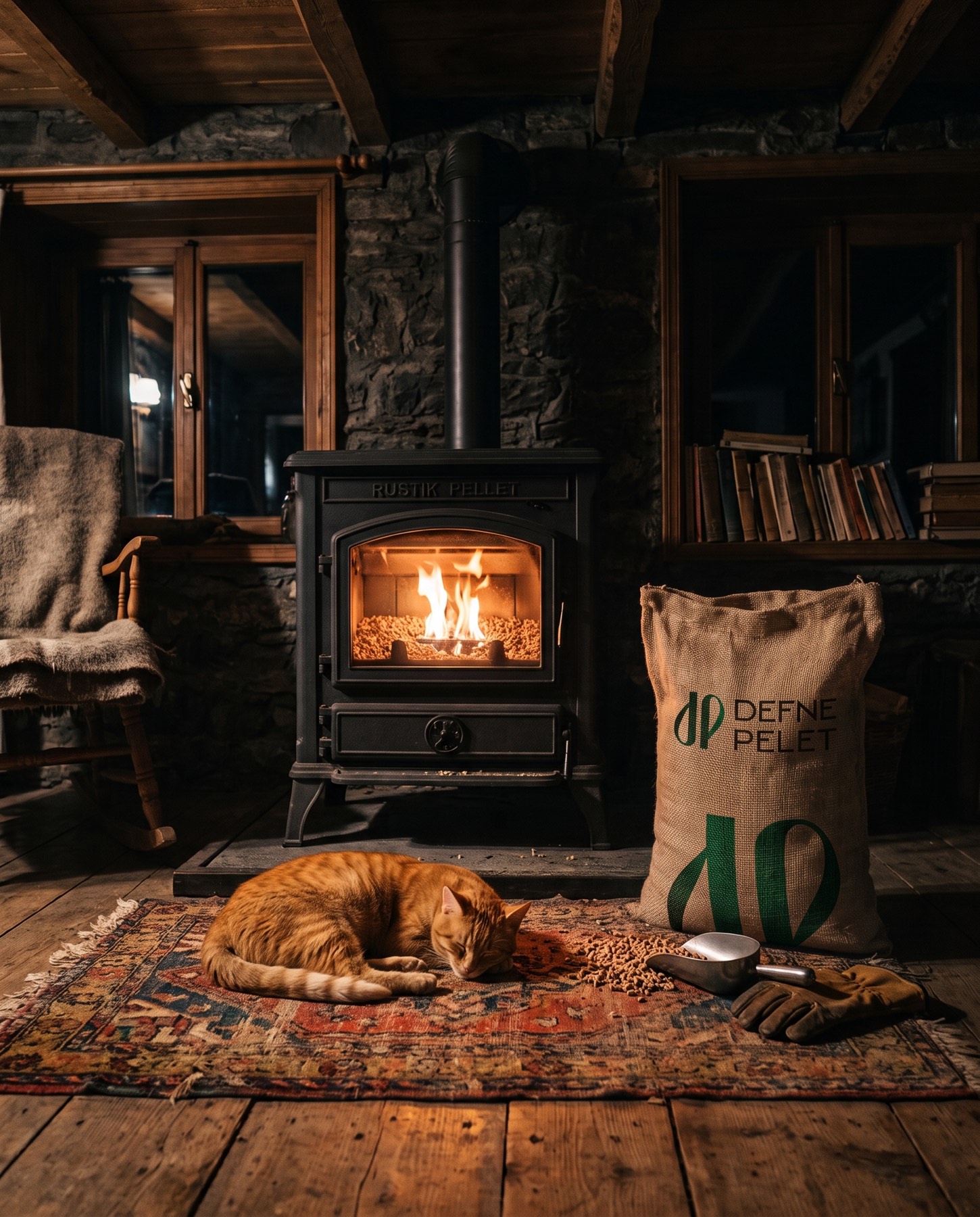
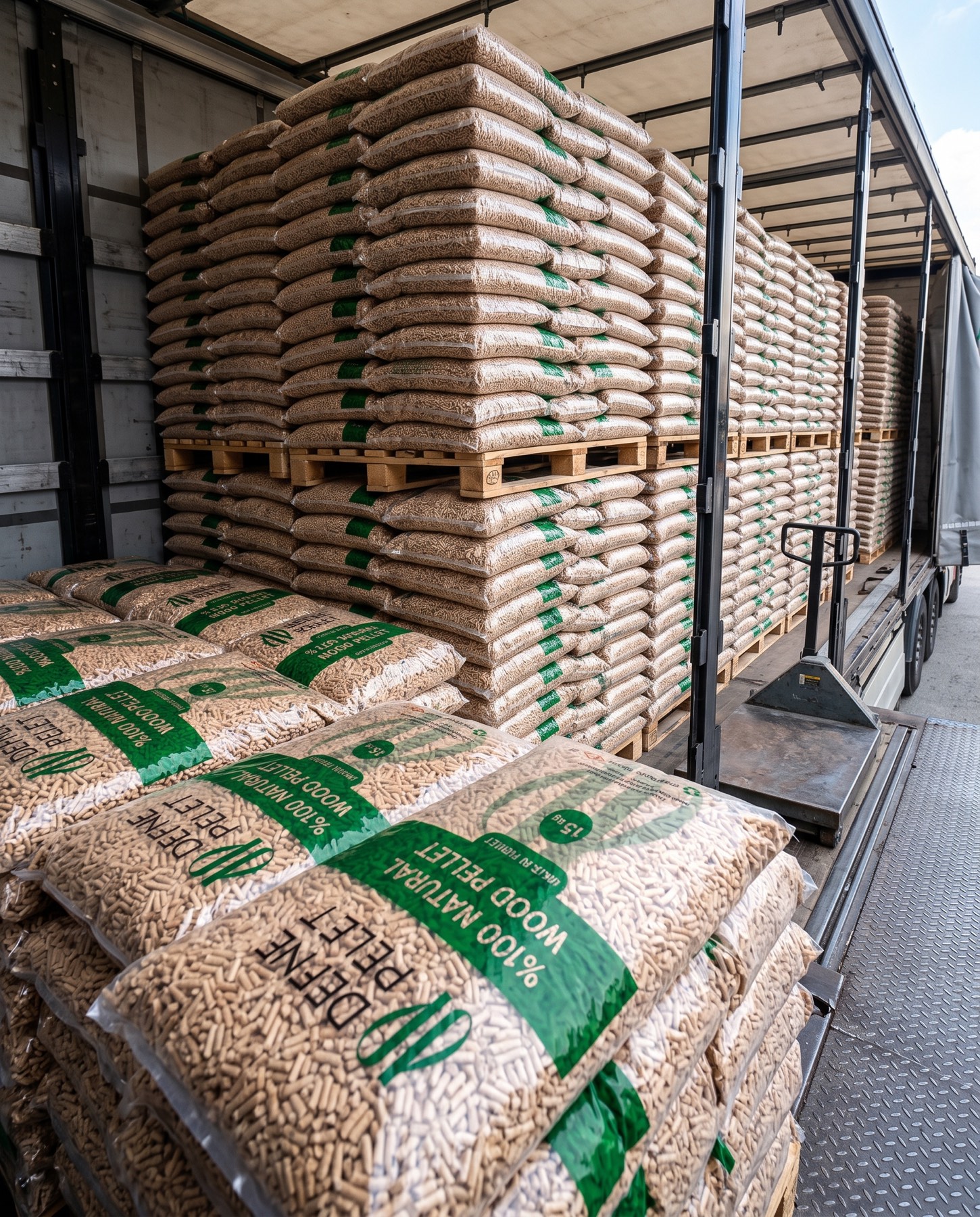
For Defne Pelet, which transforms bay-laurel stalks — an agricultural resource from the fertile lands of Hatay — into sustainable energy, we built an eco-friendly, modern brand identity that blends nature's organic elegance with an industrial vision.
Challenge
The core challenge was reflecting the strong, organic, and regional values the brand draws on — "Hatay" and "defne" (bay laurel) — without creating the impression of an ordinary or amateur agricultural brand.
Turning bay-laurel stalks into pellet fuel is, at its core, a highly ecological, nature-friendly production model — yet it ultimately serves an industrial energy sector. It was necessary to melt the message of naturalness and environmental responsibility together with a trustworthy, corporate, visionary producer image into a single identity.
Goal
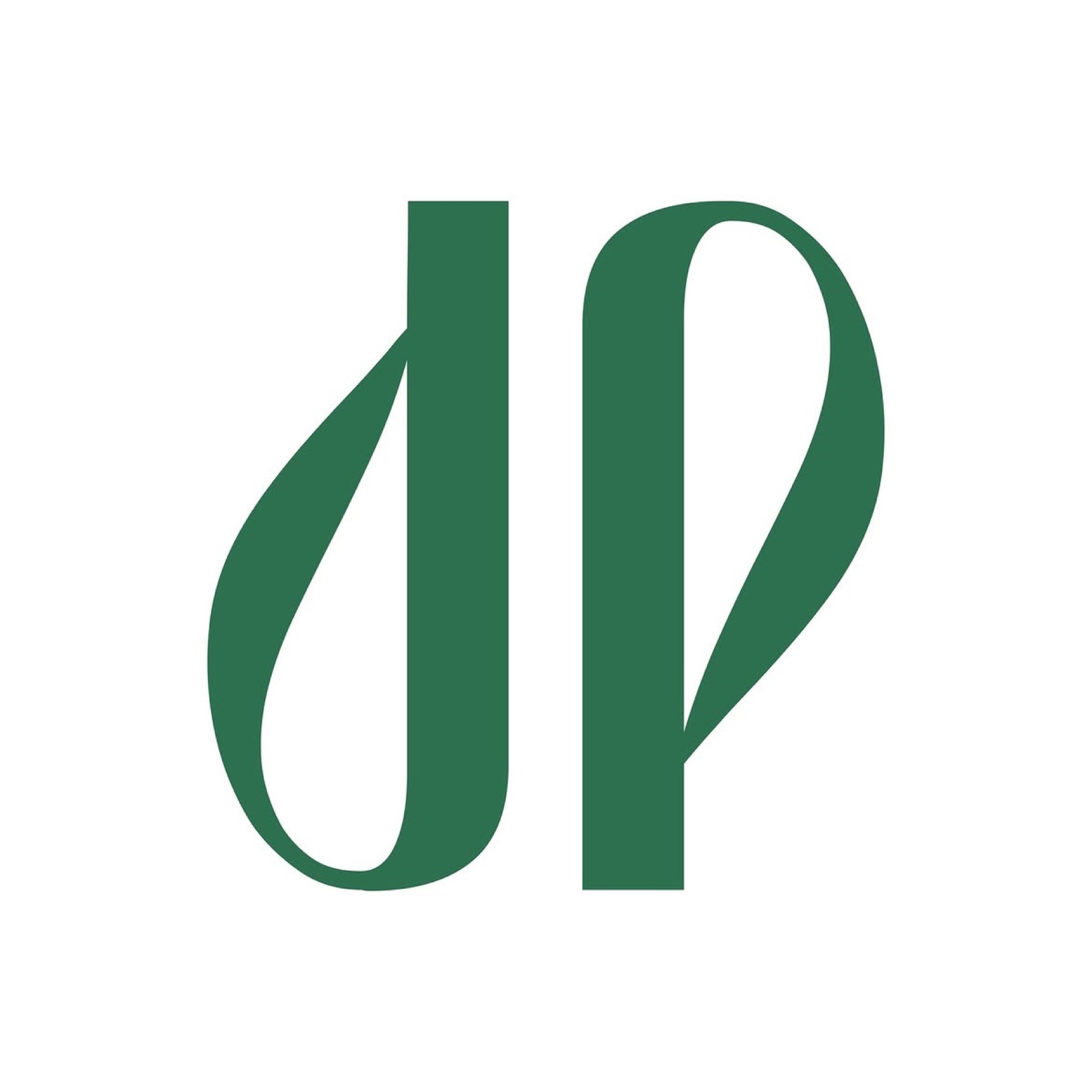
Our aim was to design an intelligent monogram emblem centred on the letters "D" and "P" from the brand's name, alluding to the elegant form of the bay-laurel leaf, the raw material itself.
We aimed to construct a visual communication language stripped of unnecessary detail — modern, memorable, and reflective of a vision of sustainability. Typographically, we wanted to build a clear, firm structure that would balance the organic emblem and emphasise the brand's grounded, producer-driven identity.
Result
Our design process resulted in a logo that flawlessly unites the fluidity of nature with the clarity of a modern corporate identity.
The emblem was designed through a clever combination of the letters "d" and "p." The curves of the letters were stylised to form the natural, elegant silhouette of the bay-laurel leaves at the brand's core. This icon became an aesthetic signature symbolising transformation, naturalness, and sustainable energy. The deep, saturated green tone chosen for the emblem pays direct homage to the bay-laurel plant as the raw material, while also reinforcing the brand's eco-friendly, nature-conscious nature. The organic, curved contours within the icon were balanced by the wide, sharp, modern sans-serif lettering used in the logotype. The minimal, aligned placement of the words "DEFNE" and "PELET" foregrounds the brand's corporate seriousness, technological infrastructure, and sector reliability.
Launch Similar Project