Oba Yazılım
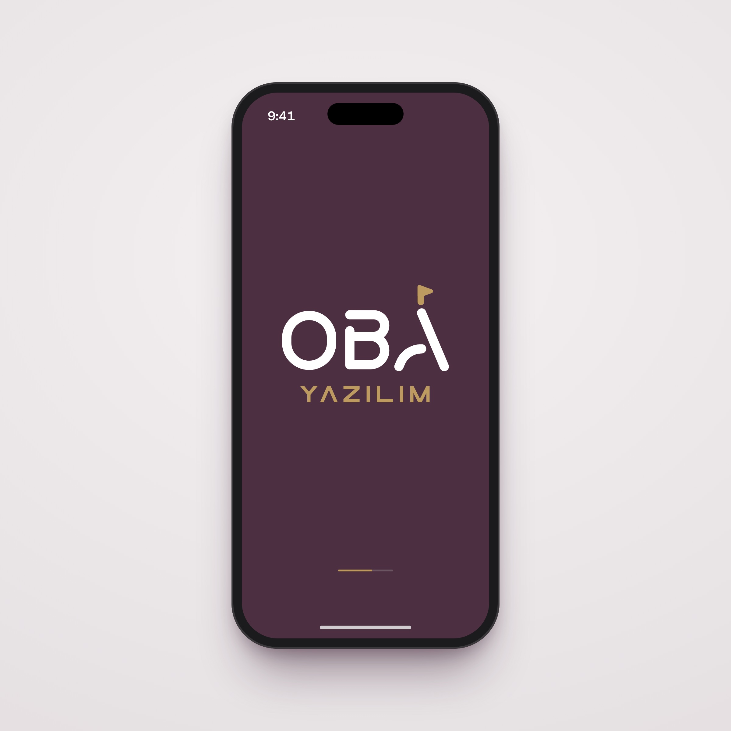
Logo design for Oba Yazılım, an Ankara-based developer of property, school and business management software, ending in an A with a flag planted on top.
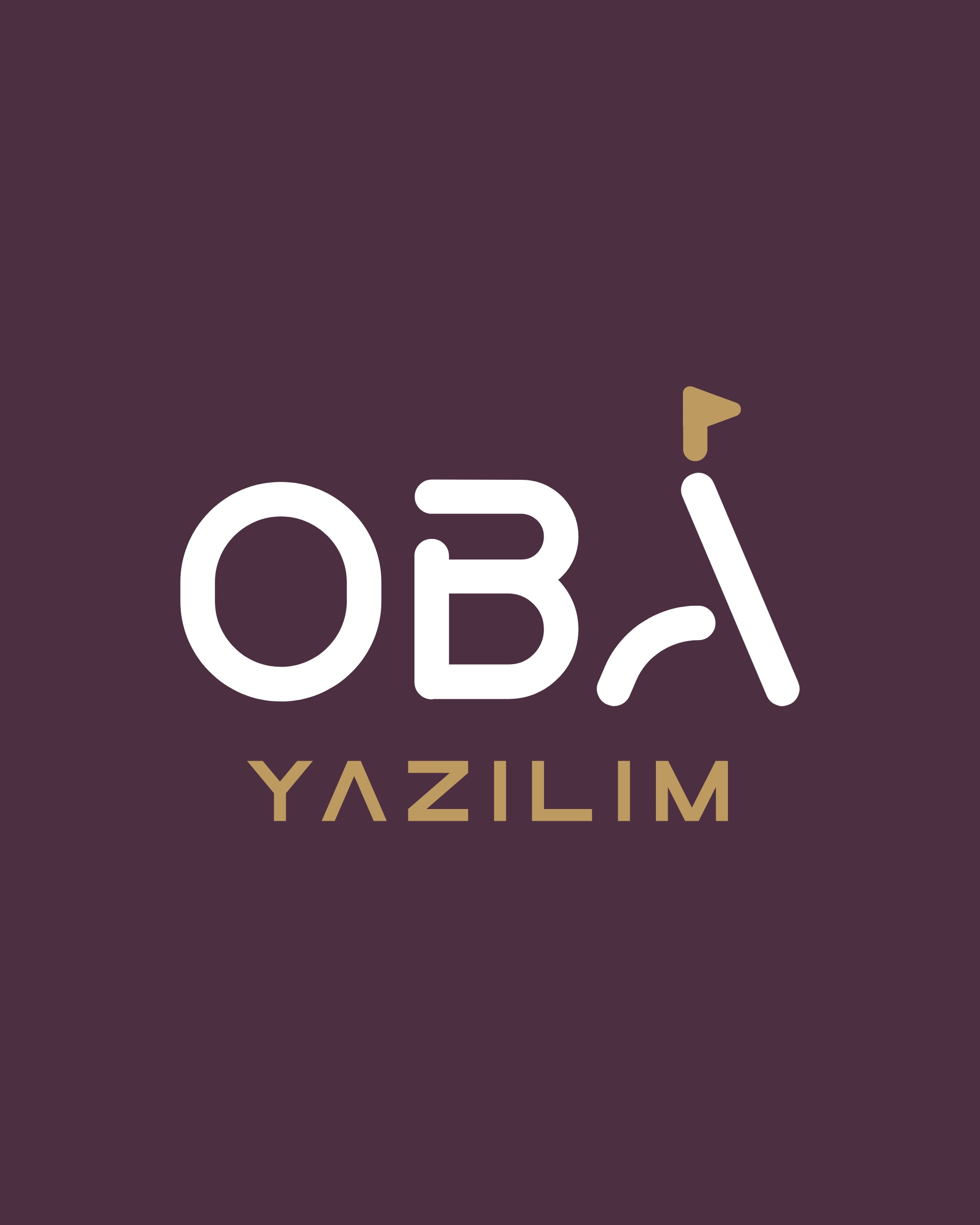
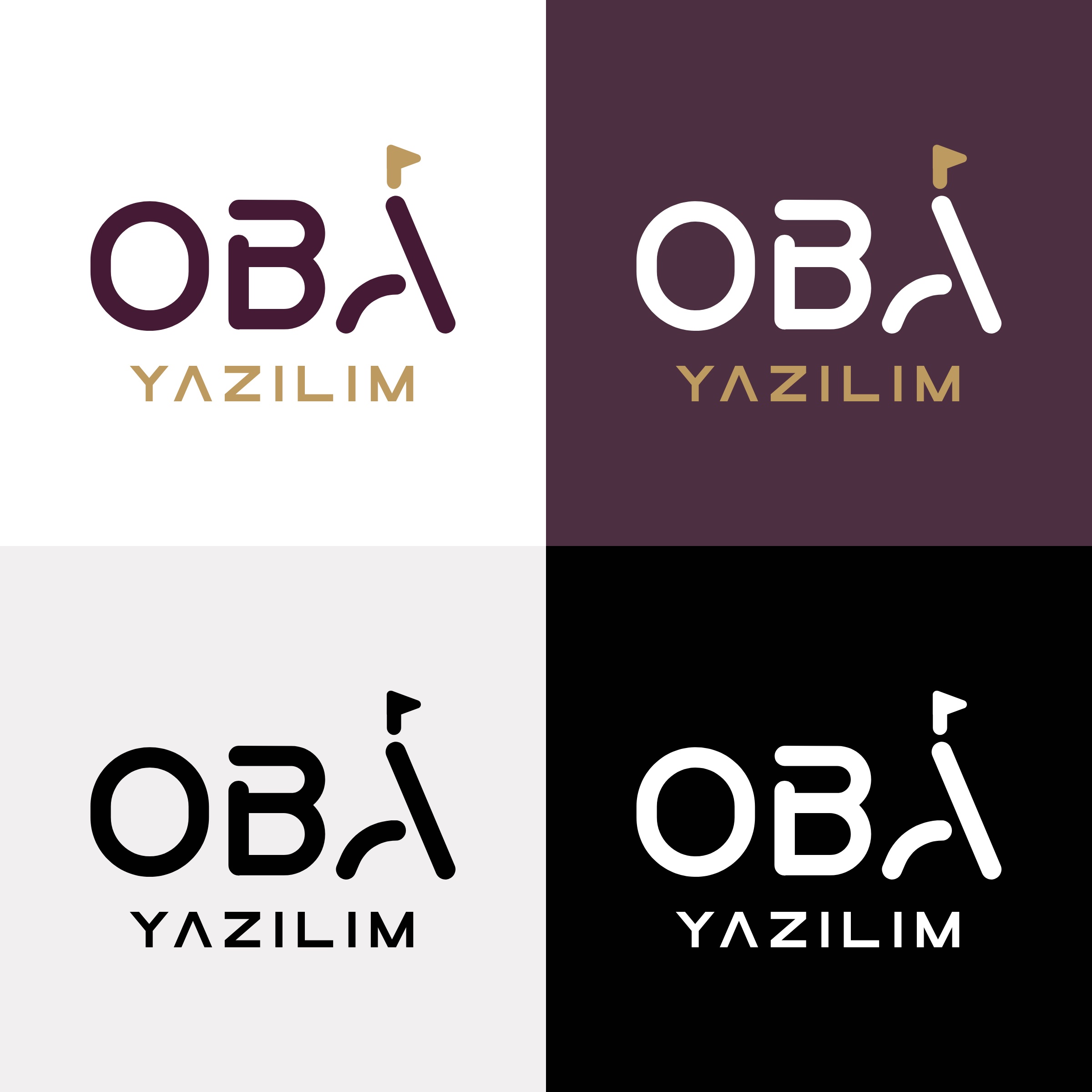
Oba Yazılım is an Ankara-based company that develops management software. Its products for residential site and apartment management (OBA-SAYS), school management (OBA-OEYS), student dormitory management (OBA-YURT) and enterprise resource planning (OBA-ERP) run on web and mobile. In 2025 we designed the company's logo and delivered it in colour, dark-background, black and white versions.
Challenge
One name would sit on top of four very different products.
Oba's products speak to different users: residents of a housing complex, school administrators, students in a dormitory, a company's accountant. The logo had to stand above all of them and stay legible at small sizes, on an app icon and a login screen. It also had to keep the simplicity of a software company without becoming a cold tech logo.
Goal
The idea came from the name itself: a flag planted in the oba.
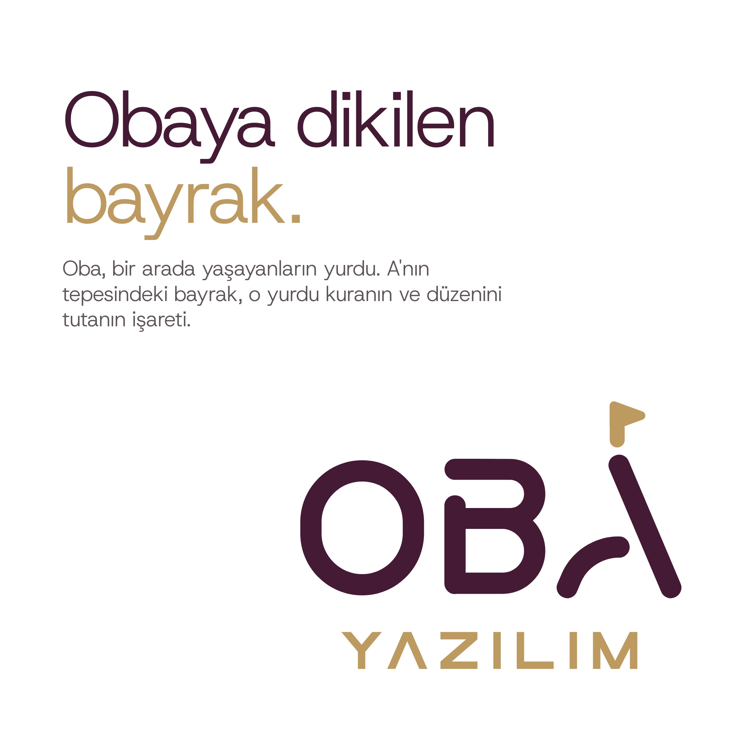
An oba is the encampment a community builds to live together. The product the company puts forward also manages the order of people living together: housing complexes and apartment buildings. So we turned the last letter of the name into a pole and planted a flag on top. The flag marks the one who sets up the home and keeps it in order.
Result
The logo is the word OBA, ending in an A without a crossbar that carries a gold flag on top.
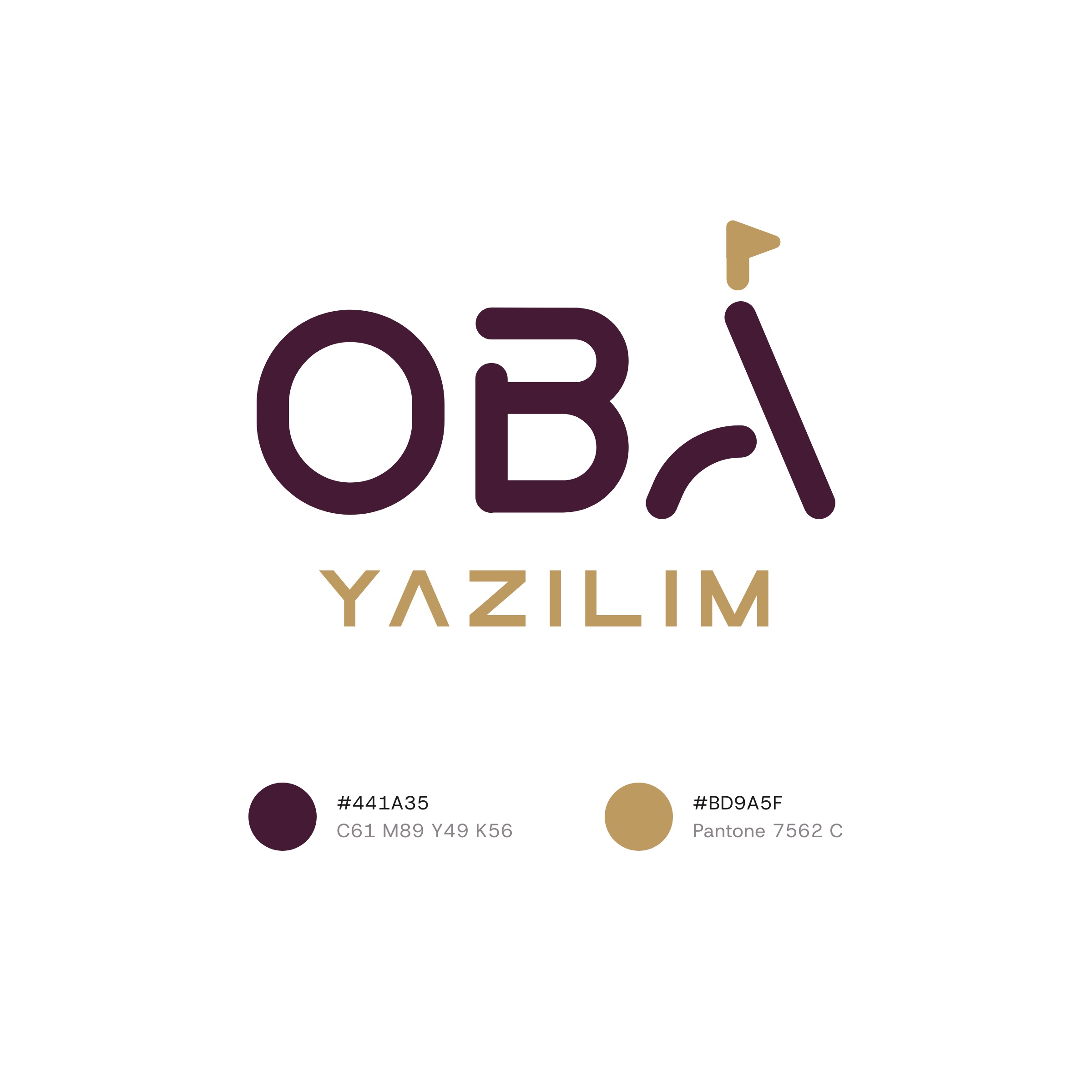
The letters are drawn with round-ended strokes of equal weight. The right leg of the A is the pole; the left leg is an arc curving into it. Below sits the widely spaced line YAZILIM (software). The colours are deep plum (#441A35) and gold (Pantone 7562 C). On a plum background the letters turn white while the flag and the YAZILIM line stay gold; there are also single-colour black and white versions. In the logo animation the letters are written one by one, the flag is planted on top of the A and waves for a moment.
Launch Similar Project