YSF Maden
Logo design for YSF Maden, an İstanbul company working in metal industry products.

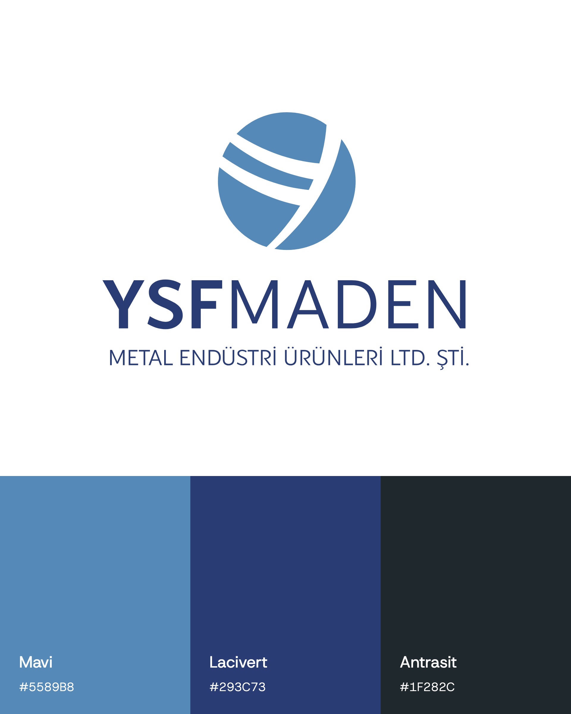
YSF Maden Metal Industry Products is an İstanbul company working in metal industry products. In 2024 we designed the brand's logo: an emblem built from the initial Y and the YSFMADEN wordmark.
Challenge
A single mark had to carry both the name and the company's ambition.
YSF Maden's logo had to carry the brand name while showing the company's vision and mission on a global scale. The same mark had to read just as clearly on the side of a truck as in a small print.
Goal
The idea: a globe built from the letter Y.
The emblem was built from the brand's initial, Y. The Y appears inside a globe as two bands and a diagonal cut. The globe stands for the company's vision and mission on a global scale, and the two stacked lines stand for stability. In the wordmark YSF is set bold and MADEN light, with the company's full title on the line below.
Result
The result: a logo family that stays equally clear on every background.
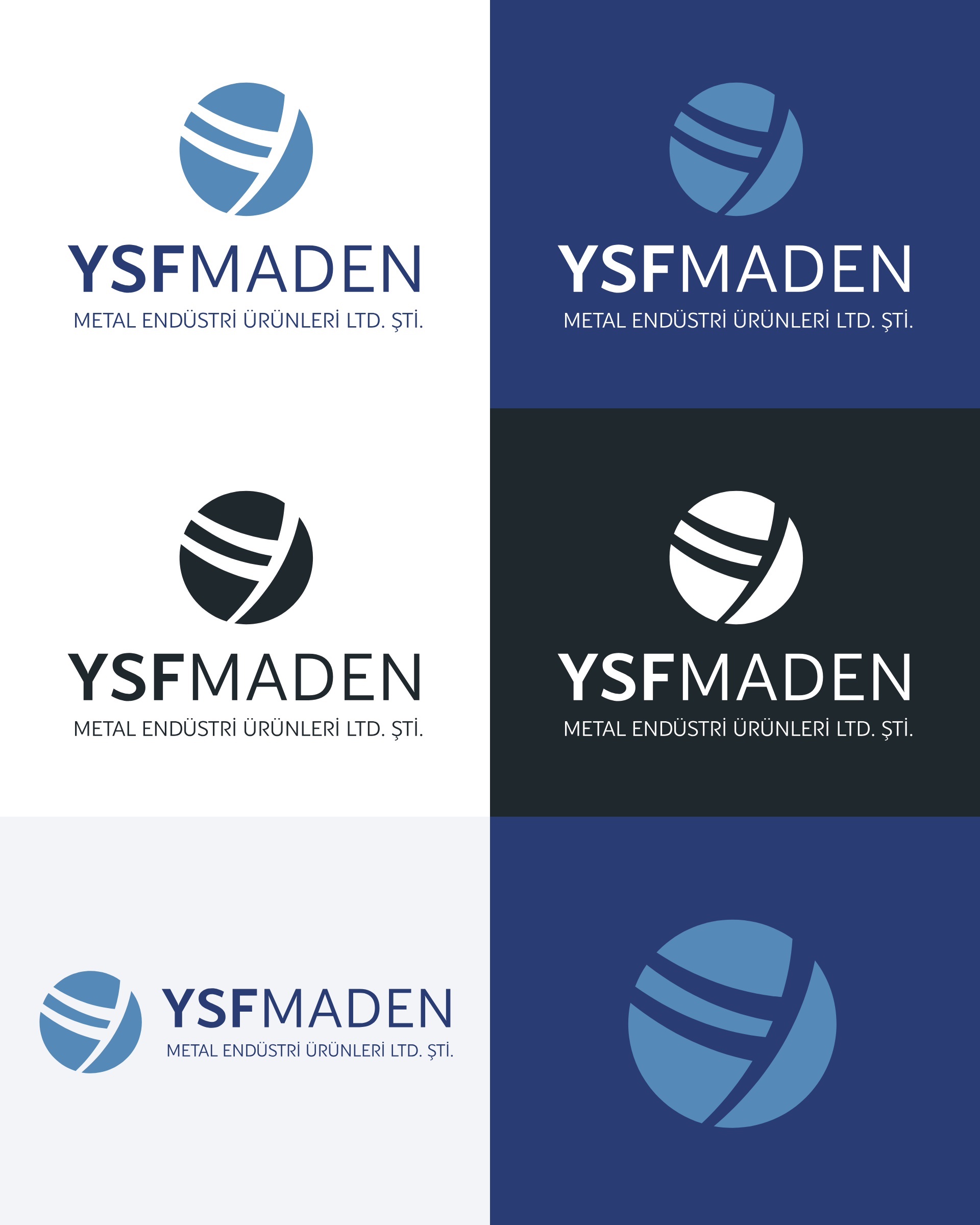
We delivered the logo in vertical and horizontal layouts and as a standalone emblem, in colour, on navy and in single-colour versions. The blue and navy palette holds its balance on large surfaces such as a truck's curtain side.


Launch Similar Project