MDN Zeytinyağları
In the MDN Zeytinyağları logo, we built an iconic design around the brand's initial, "M."
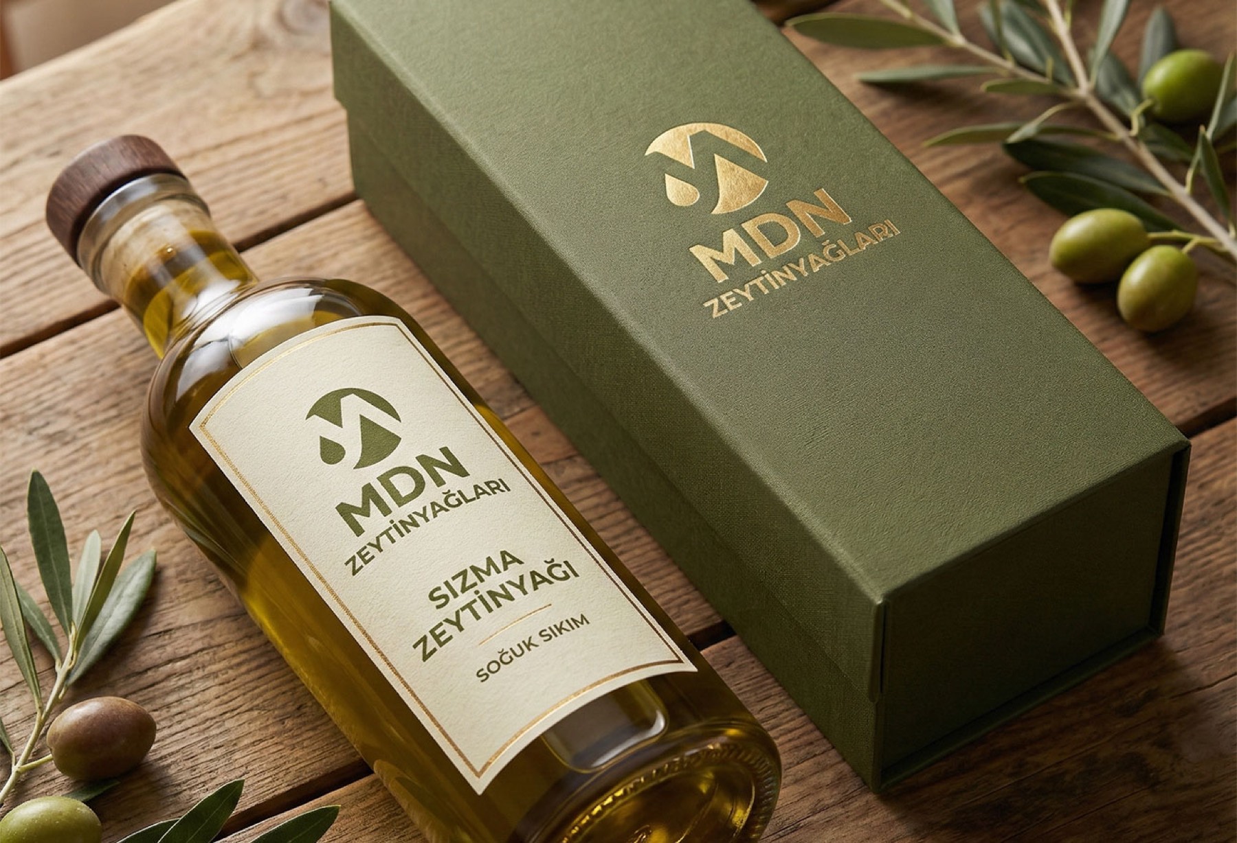
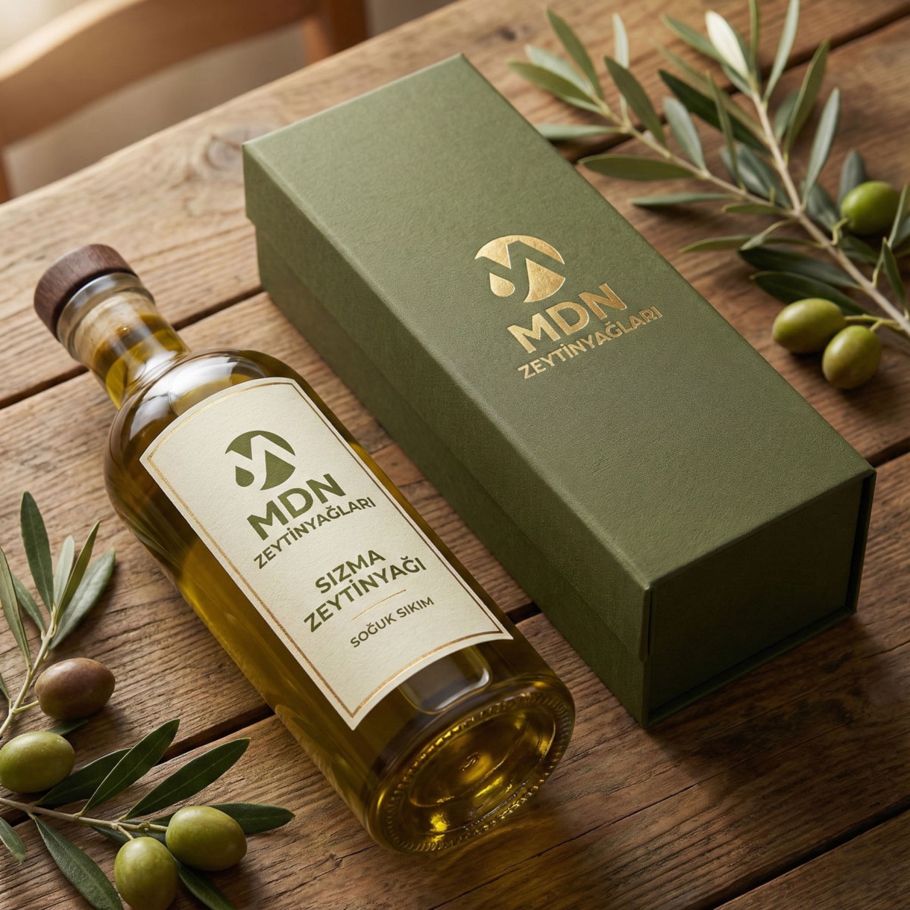
We are proud to have led the logo renewal and corporate identity project for the Madanoğlu Company, which has operated in Manisa province for 29 years.
Challenge
The task was to build a modern, distinctive visual identity meeting today's brand expectations while preserving the company's deep-rooted history and sector-wide reliability.
During the logo renewal process, it was necessary to express olive oil's perception of purity, naturalness, and quality through a strong symbolic language, without damaging the brand's traditional values.
Goal
To create a timeless, iconic logo design bringing together MDN Zeytinyağları's deep-rooted structure, sense of quality, and natural production philosophy in a single symbol. The aim was to build a strong logotype around the brand's initial, "M," creating a simple yet meaning-laden visual language representing the naturalness of olive oil.
Result
In the resulting logo design, the brand's initial "M" was rendered in an iconic form. The elegant drop graphic filling the letter's left gap powerfully emphasised the purity, naturalness, and essence of olive oil.
The resulting logo design;
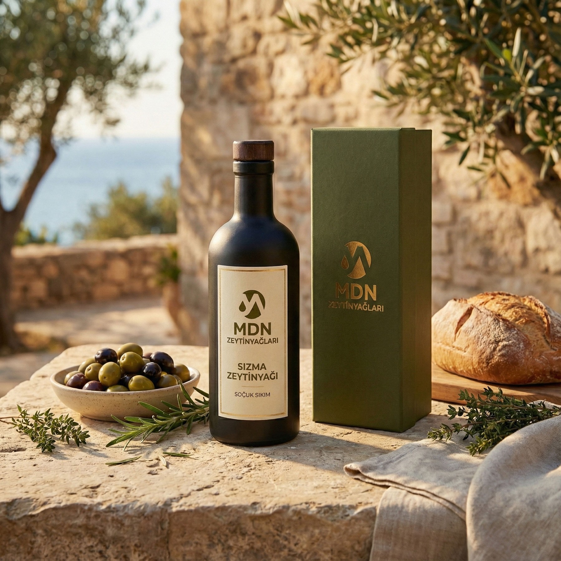
This design became a simple yet memorable brand signature expressing that the brand's two core values — quality and naturalness — are united under one roof. The new logo and corporate identity built a strong, trustworthy brand language carrying the Madanoğlu Company's deep-rooted history into the future.

Launch Similar Project