Psikolog Konsültan
The logo we designed for Psikolog Konsültan was built around an approach centred on trust, balance, and professionalism.
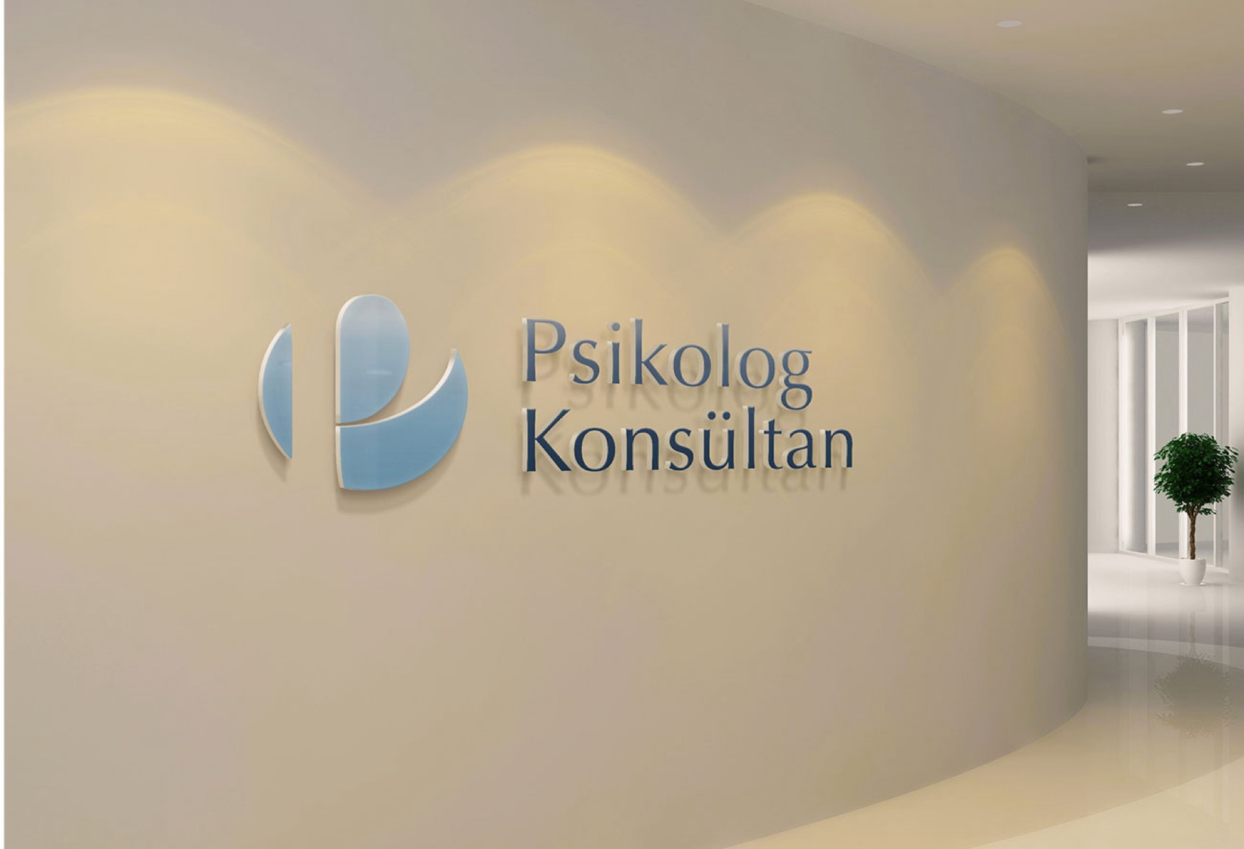

The letter "P," constructed using the golden ratio within the emblem, symbolises both scientific rigour and mental harmony, giving the brand a timeless, iconic stance.
Challenge
To clearly convey a sense of trust, balance, and professionalism at the very first point of contact with the client.
Goal
To express the brand's scientific foundation, ethical stance, and the relationship of trust it builds with clients through a powerful symbol. The aim was to design a logo, centred on a universal, mathematical principle of balance like the golden ratio, that reflects both mental harmony and professional discipline — one that will retain its value for many years.
Result
This design is positioned not merely as a visual identity, but as a powerful brand statement that gives clients the feeling of "I am understood and I am safe" at first contact, clearly reflecting the brand's professional stance.
The resulting logo design;
The resulting logo design represents the concepts of scientific rigour, mental balance, and trust simply yet powerfully through the letter "P," constructed using the golden ratio.
The minimal, clean formal language supports the sense of calm, stability, and clarity needed in the relationship built with the client, while its uncluttered structure foregrounds mental clarity.

Launch Similar Project