Rima Gold
Brought to life as a new symbol of elegance and unshakeable trust in the world of fine jewellery, the Rima Gold brand identity is a sophisticated design journey uniting the timeless glow of gold with geometric perfection.
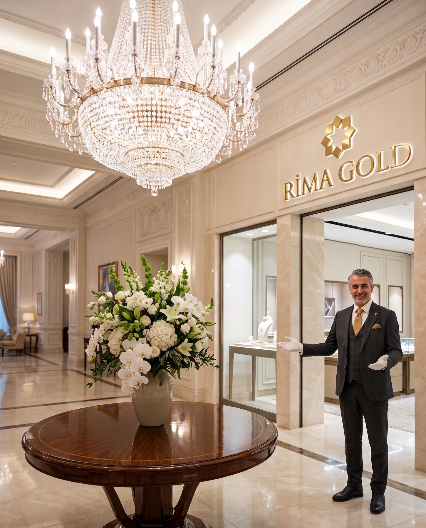
Reinterpreting the concepts of wealth and prestige through a universal design language, the Rima Gold project is a strategic aesthetic vision through which we transformed the brand's deep-rooted sense of trust into a premium visual identity.
Challenge
The jewellery and precious-metals sector is a highly competitive market, generally dominated by repetitive classic motifs and cluttered visual elements.
Our core challenge in the design process for the Rima Gold brand was to stand apart with a modern simplicity, entirely free of clutter, without losing the sense of wealth, splendour, and sparkle at the brand's centre. The brand needed to display a balanced corporate stance that carried both an authoritative sense of trust and a boutique elegance at the same time.
Goal
Our main goal in the design concept was to melt the four core building blocks of the brand's DNA — elegance, wealth, sparkle, and trust — into a single symbol.
Along these lines, we aimed to create a symmetrical, aesthetic form reflecting the flawless sparkle and multi-dimensionality of gold in nature, and to support this form with strong, noble typography, awakening a direct perception of quality and trust in the viewer.
Result
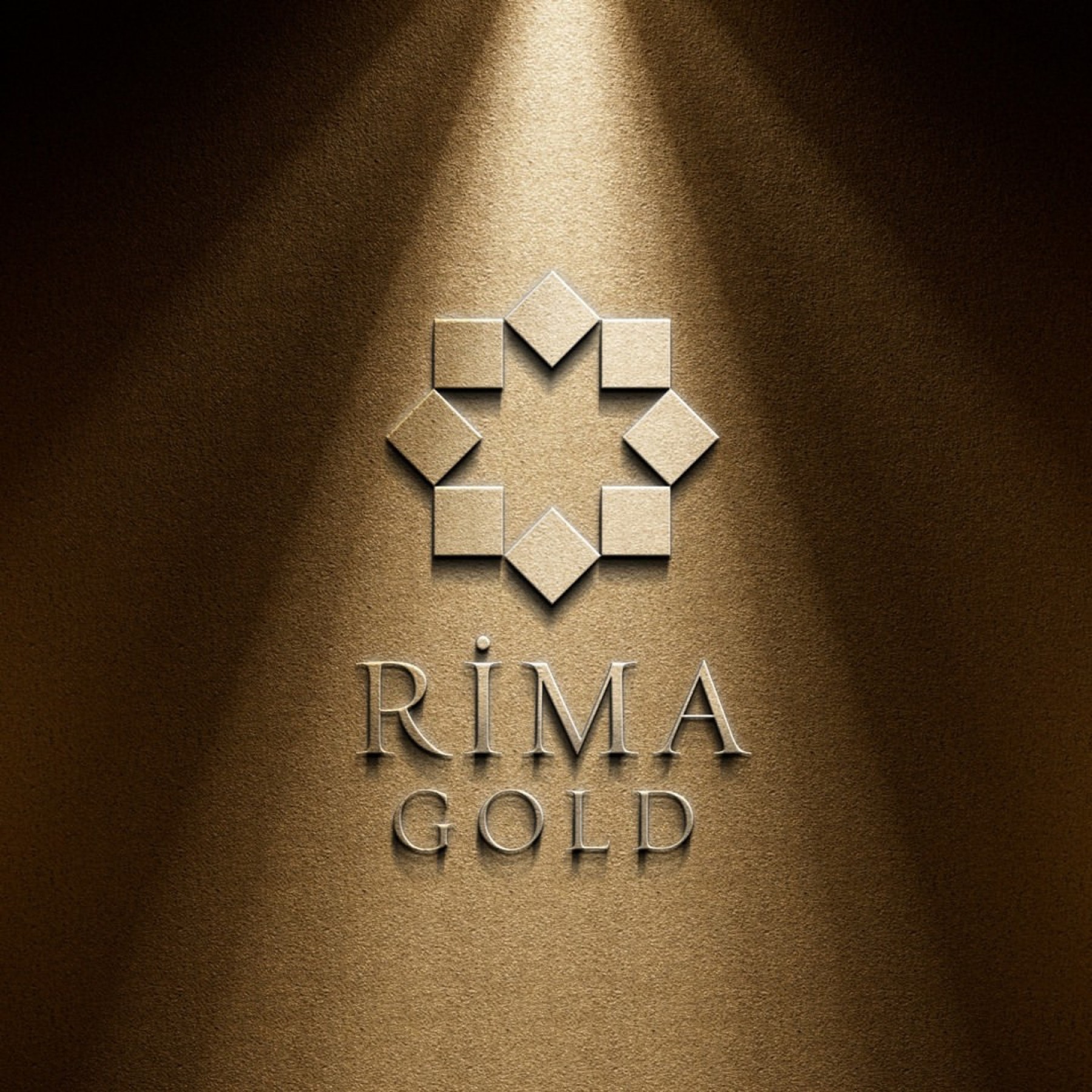
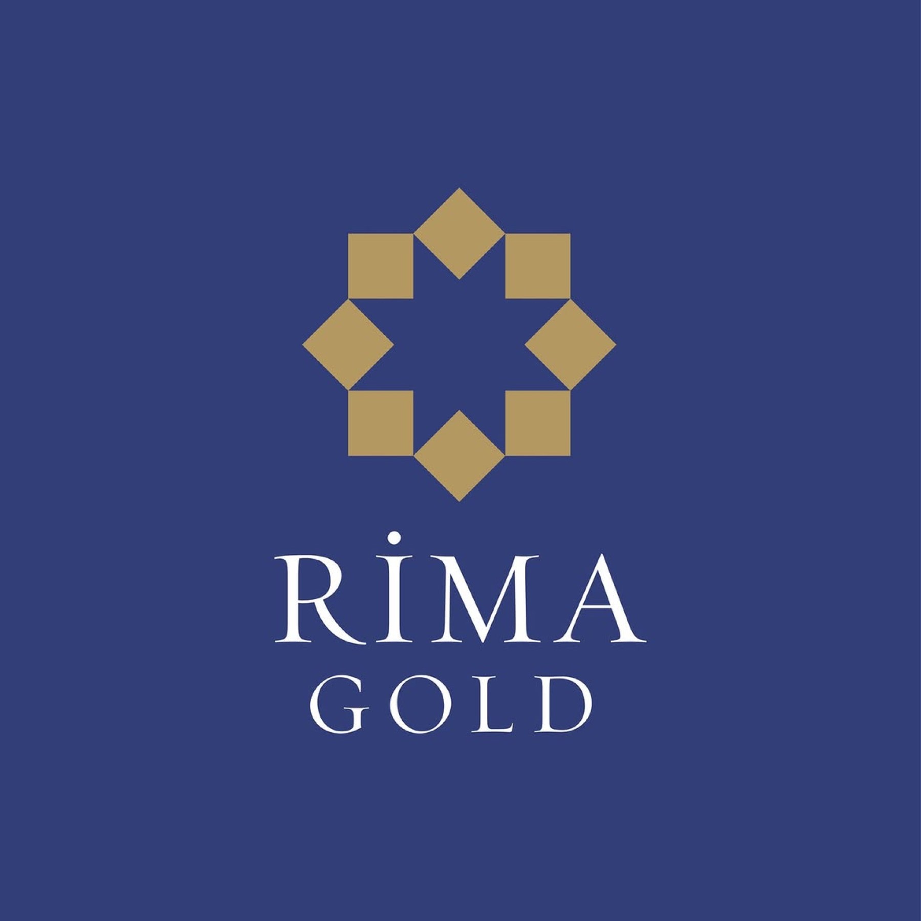
The design process resulted in an iconic, timeless emblem in which square forms come together in flawless symmetry, creating a sparkle (star) at their centre.
The matte gold tone used in the emblem represents the brand's wealth and sparkle, while the deep navy chosen for the typography emphasised unshakeable trust, nobility, and corporate gravity. The finely detailed, serif letterform used in the name "RİMA" evokes a sense of refined luxury, while the sparser, more widely spaced use in the subtitle (GOLD) provided flawless legibility and balance.

Launch Similar Project