Astra
For Astra, Anadolu Group's main distribution company for alcoholic beverages in Turkey, the corporate identity project we brought to life is a journey visualising operational excellence, global vision, and unshakeable trust in the B2B market through an aesthetic, symbolic language.
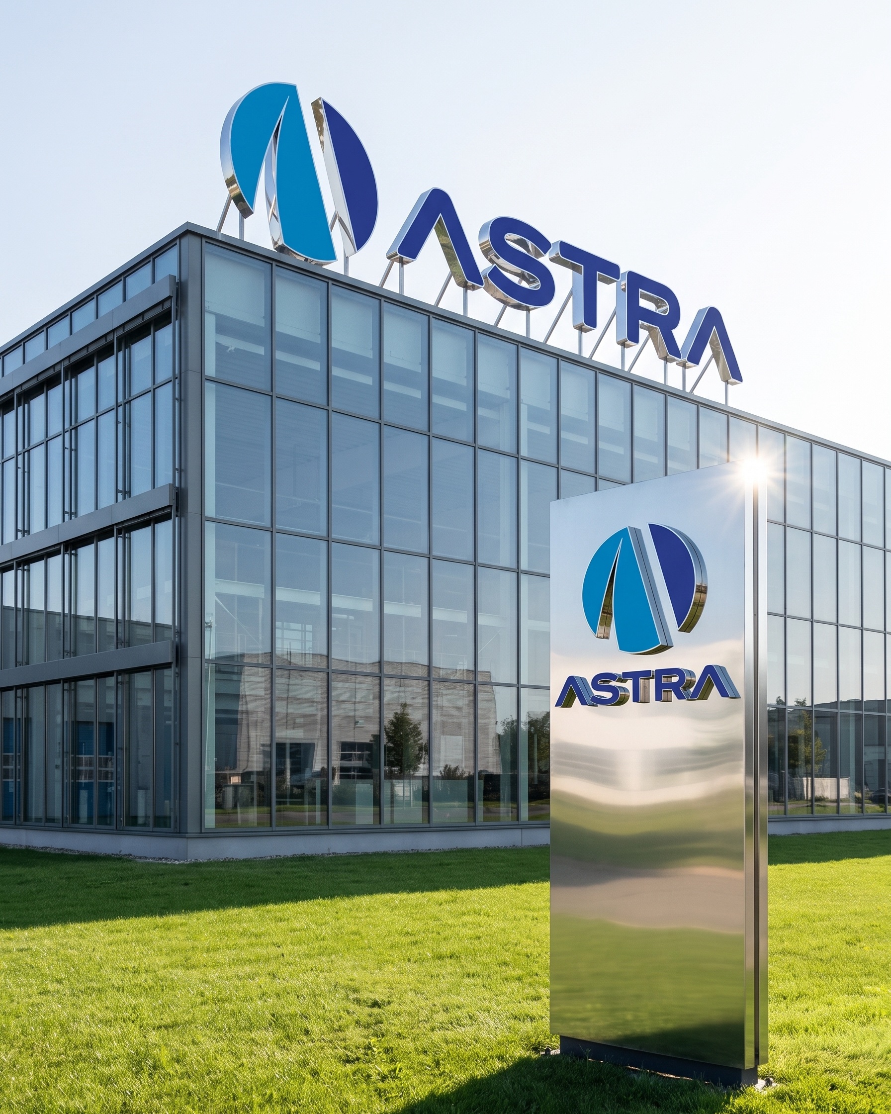
The corporate identity project we prepared for Astra, which runs one of Turkey's strongest distribution networks, is a visionary design story blending the richness of global beverage culture with operational speed and a premium service approach.
Challenge
Alcoholic-beverage logistics is a highly critical B2B (business-to-business) ecosystem, requiring zero tolerance for error, a race against time, and precise storage conditions.
Our core challenge in the design process was to fully abstract the brand from the visual clichés of standard shipping or transport companies (trucks, arrows, simple roads), elevating it to a level reflecting Anadolu Group's corporate gravity and "premium" vision. We needed to convey a sense of vast operational strength while balancing, in a single symbol, the fluidity, freshness, and cultural diversity inherent to the beverage sector.
Goal
Our goal was to bring together, in a single geometric form, the inclusive network of tastes from different cultures across the world, and the flawless logistics route running from point A to point B.
Centring the peak ambition and high quality standards carried by the concept of "Astra" (star) at the root of the brand's name, we aimed to build a stable, modern brand language that instils confidence in business partners.
Result
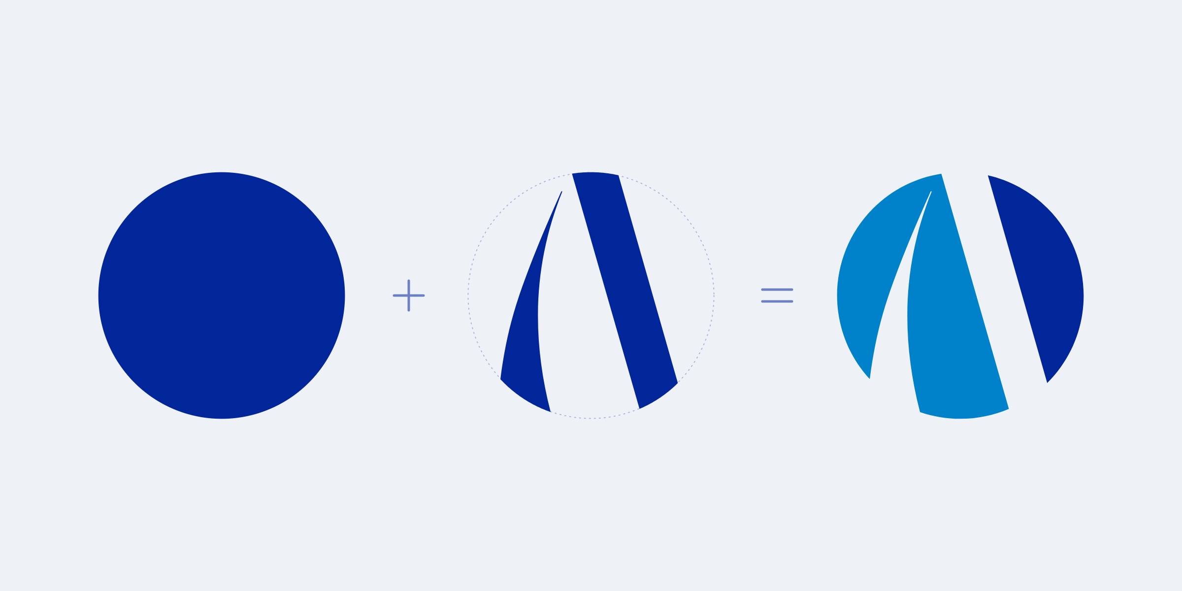
The design process brought to life a dynamic logo telling the story of operational excellence and global vision through three core visual building blocks.
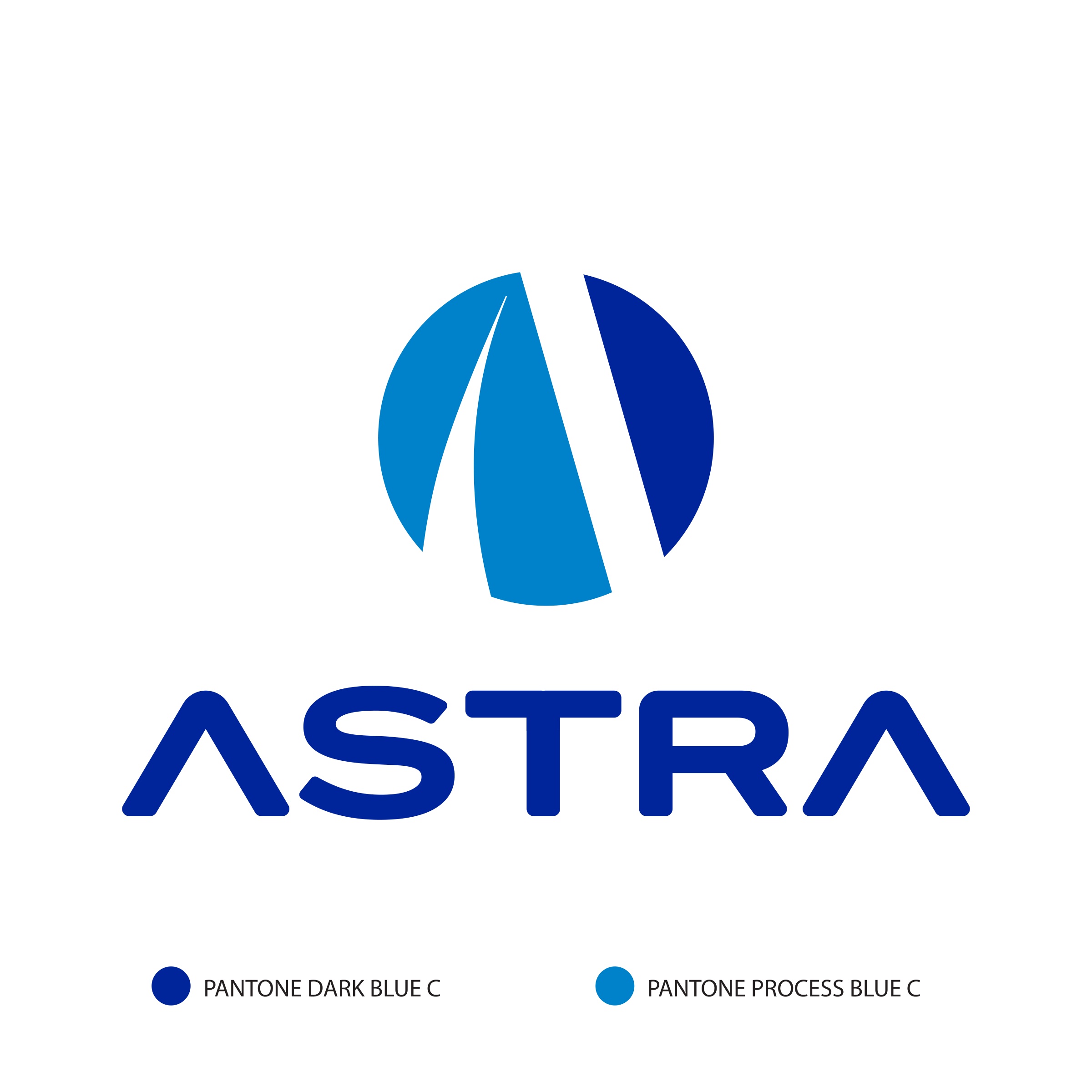
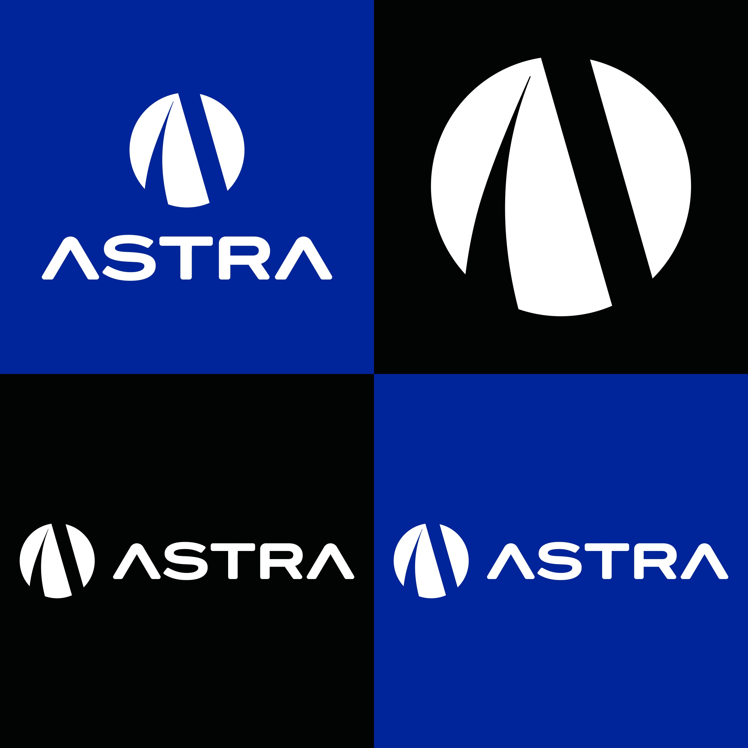
The flawless sphere forming the base of the emblem represented Astra's vast national and global distribution network, its never-ending logistics cycle, and the coming-together of tastes from different cultures. The roads cutting across the sphere in perspective and narrowing inward formed a dynamic letter "A", symbolising the route from point A to point B and the speed of logistics. This structural form also referenced the name "Astra" (star), emphasising the brand's peak ambition in the sector and its forward-looking vision. The strong blue palette giving the design its character delivered reliability and stability — the most critical elements in B2B relationships — while these tones also successfully reflected the "cold chain" perception vital to beverage distribution, liquid fluidity, and a sense of freshness. Completed with modern "A" letterforms in the logotype, stylised by removing their crossbars (Λ), this refined identity successfully positioned Astra as an unshakeable, visionary, premium-standard distribution authority in its sector.
Launch Similar Project