ChargeLab
For Chargelab, where we brought together the dynamism of energy with scientific innovation, we built a timeless typographic identity with futuristic lines that expresses the brand's technological vision and sector-wide determination with quiet strength.

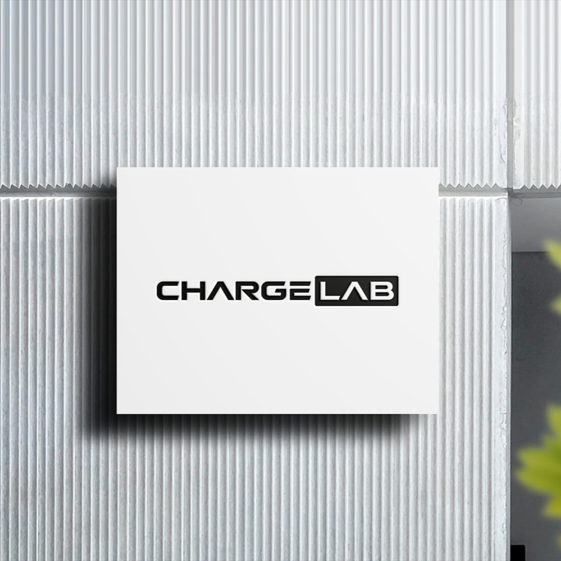
We started from the word "charge" in the brand's name, designing lettering that emphasises energy, power, and modernity. Since the "lab" part evokes innovation and a scientific approach, we gave the logo a modern touch through geometric, technological typography.
Challenge
The core challenge of the project was balancing the high dynamism and sense of motion carried by the word "charge" with the scientific, analytical, innovative approach represented by the word "lab," within a single visual plane.
It was necessary to convey the brand's technology-focused nature without resorting to clichéd energy symbols, while ensuring the logo stayed simple enough to remain equally powerful for years to come, across every digital and print platform, without ageing.
Goal
Our goal was to create a design that would directly convey Chargelab's professional standing in the sector, its disciplined working principles, and its innovative spirit to the target audience.
We aimed to create a modern brand ambassador that instils trust, stays memorable, and evokes a strong sense of belonging in the target audience, achieved through geometric typography reflecting the brand's technological foundation.
Result
The design process resulted in a flawless harmony between two distinct, complementary typographic characters that turn the brand's vision into structural strength.
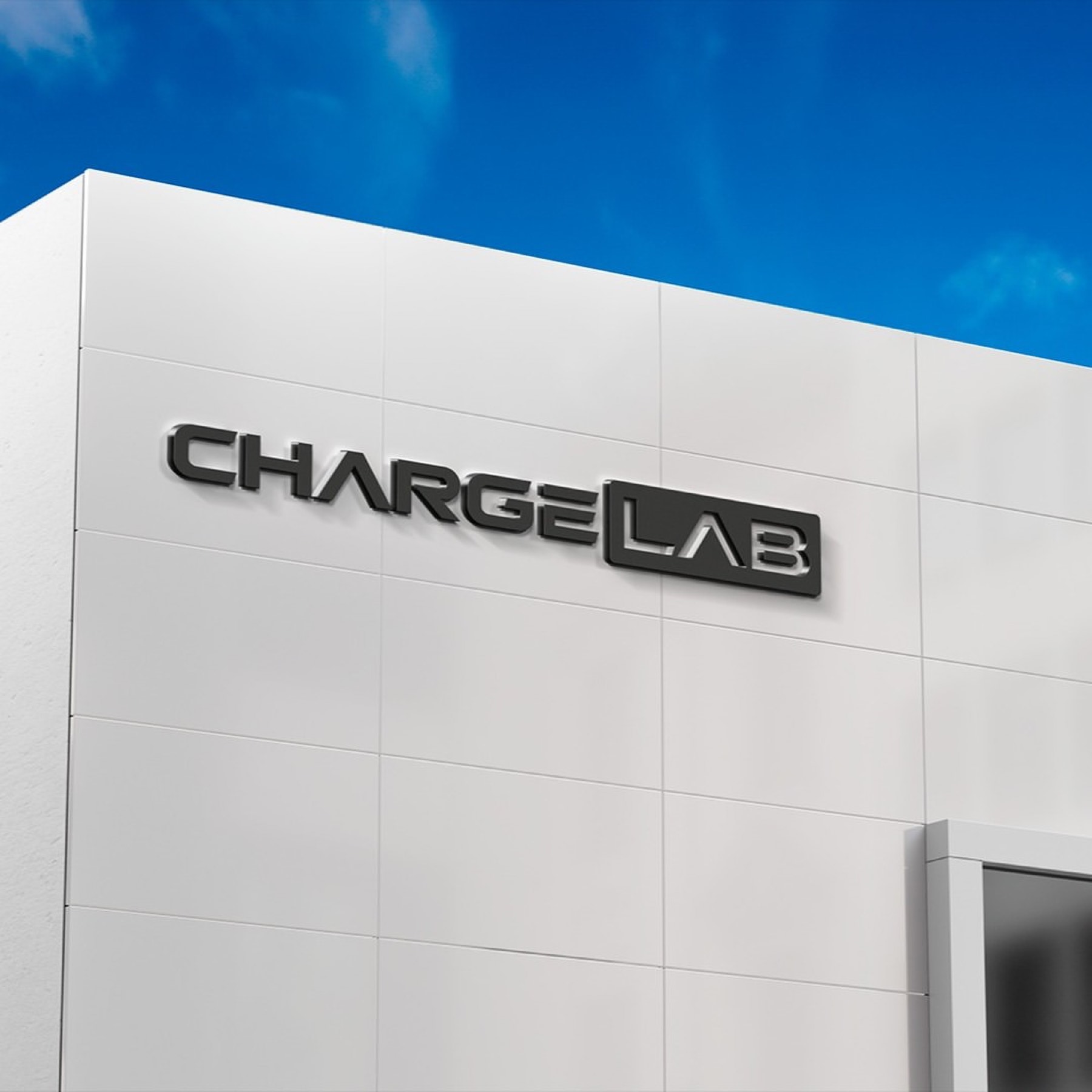
In the custom lettering designed for the "CHARGE" portion of the name, sharp, modern cuts in the letterforms — especially the dynamic shapes of the "A" and "R" — were built to reflect the brand's forward-looking, fast, energetic nature. Placing the "LAB" portion within a solid rectangular block using negative space symbolises the brand's centre of innovation, its solidity, and its scientific foundation. This box form lends the logo visual weight and stability. The monochrome (black/white) approach chosen for the colour palette reinforces the brand's trustworthy, professional, serious identity, while ensuring the design maintains high aesthetic standards at every scale, becoming a timeless signature.



Launch Similar Project