Pars Eczanesi
For Pars Eczanesi, where we reinterpreted trust — the fundamental building block of the healthcare sector — through a modern and memorable minimalism, we built a strong brand identity that respects sector standards while breaking free of generic symbols.

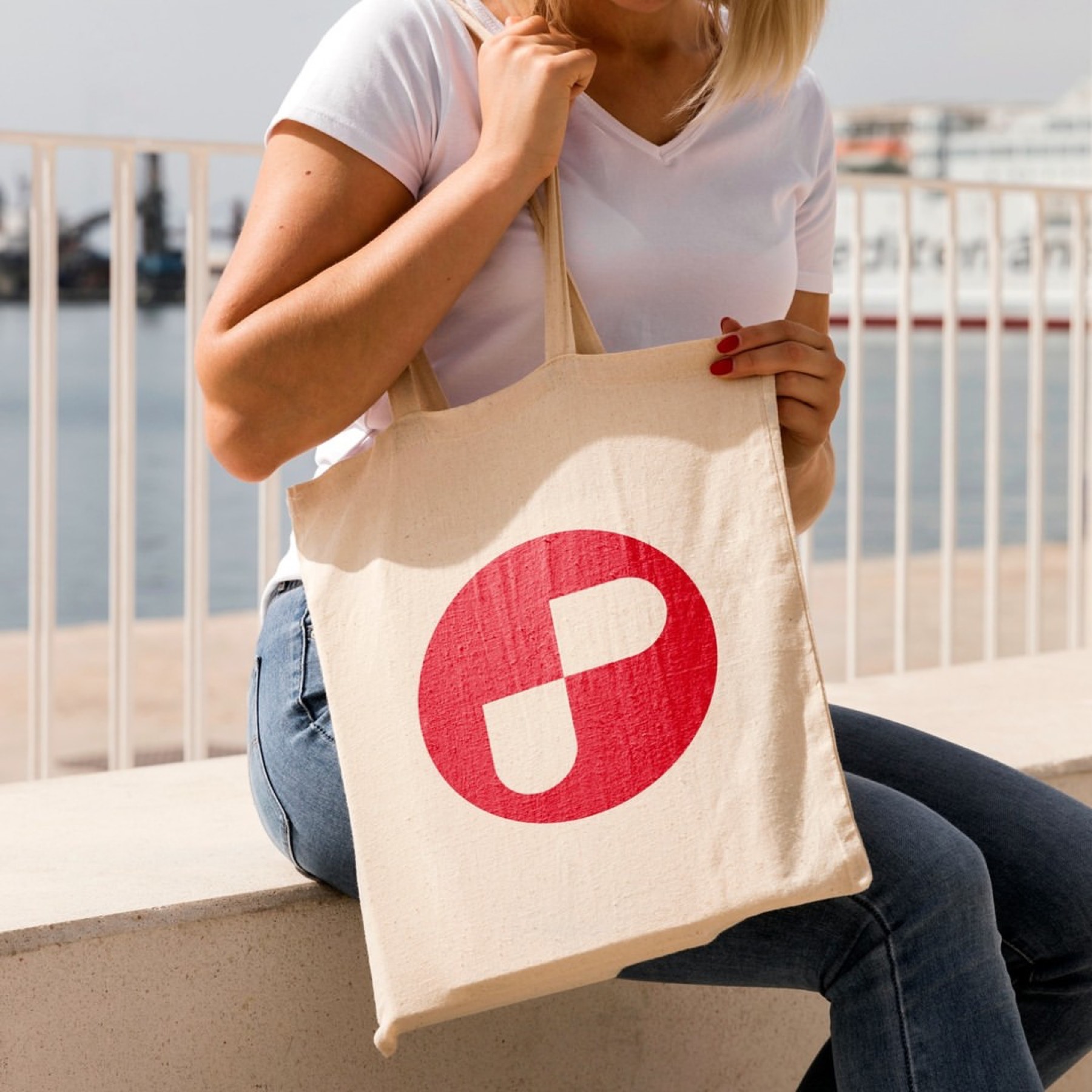
The modular white shapes we composed with flawless optical balance on a red circular ground don't just form the letter "P" — they also present a rational design that reflects a medical capsule and the sector's universal values in an abstract, contemporary language.
Challenge
The core design challenge here was to create an emblem that is distinctive to the brand, innovative, and free of clichés, without breaking away from Turkey's established pharmacy perception and legal/visual standards.
The pharmacy sector is a visually repetitive space, heavily reliant on generic symbols like the mortar and pestle, the snake, or the classic cross. The brand needed to stand as serious and trustworthy as a medical authority while also differentiating itself from competitors with a modern vision.
Goal
Our goal was to design a cleverly constructed monogram centred on the brand's initial, the letter "P."
We aimed for this monogram, stripped of unnecessary detail, to suggest health, a medical capsule, or a plus (+) sign through form alone in its subtext. Our top priority was to build a typographic coherence with maximum legibility — one that would be instantly recognisable on storefront signage, illuminated panels, and carrier products.
Result
Our design process resulted in a dynamic identity that harnesses the power of geometric clarity and optical illusion.
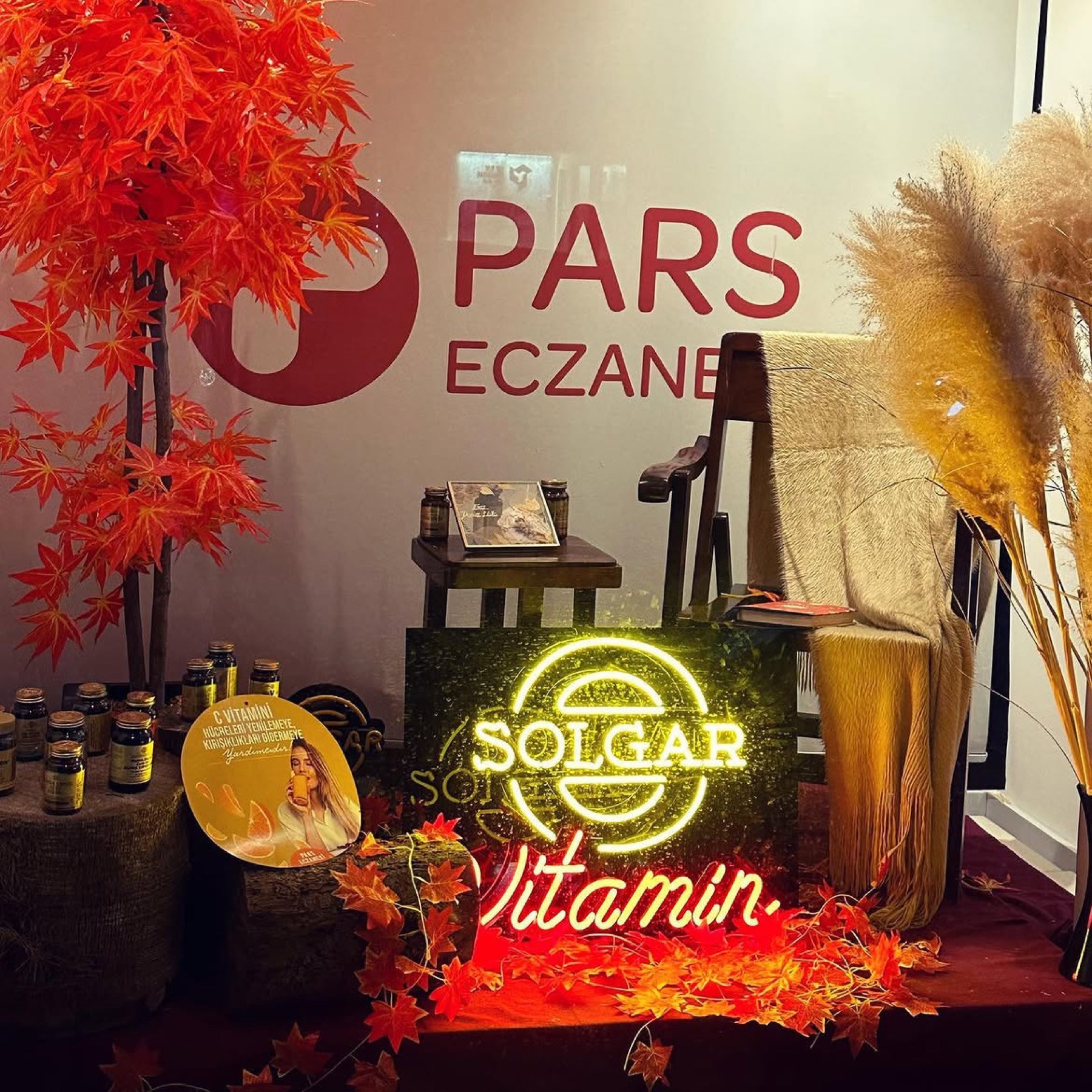
The modular white shapes placed on the red circular ground form the letter "P" with flawless optical balance. This rational geometric fragmentation also reflects a medical capsule and the healthcare sector's universal symbols to the viewer in an abstract, contemporary language. The sector's characteristic medical red, conveying trust and urgency, was adopted as the corporate colour. The high contrast created by red and white delivers maximum visibility and rapid perception on street-level signage. The bold, rounded contours of the emblem were balanced perfectly with the clean, sans-serif lettering used in the logotype. The bold, confident structure of the "PARS" typography represents corporate authority, while the finer-weight "ECZANESİ" placed beneath it establishes a typographic hierarchy for a modern finish.


Launch Similar Project