Burgasm
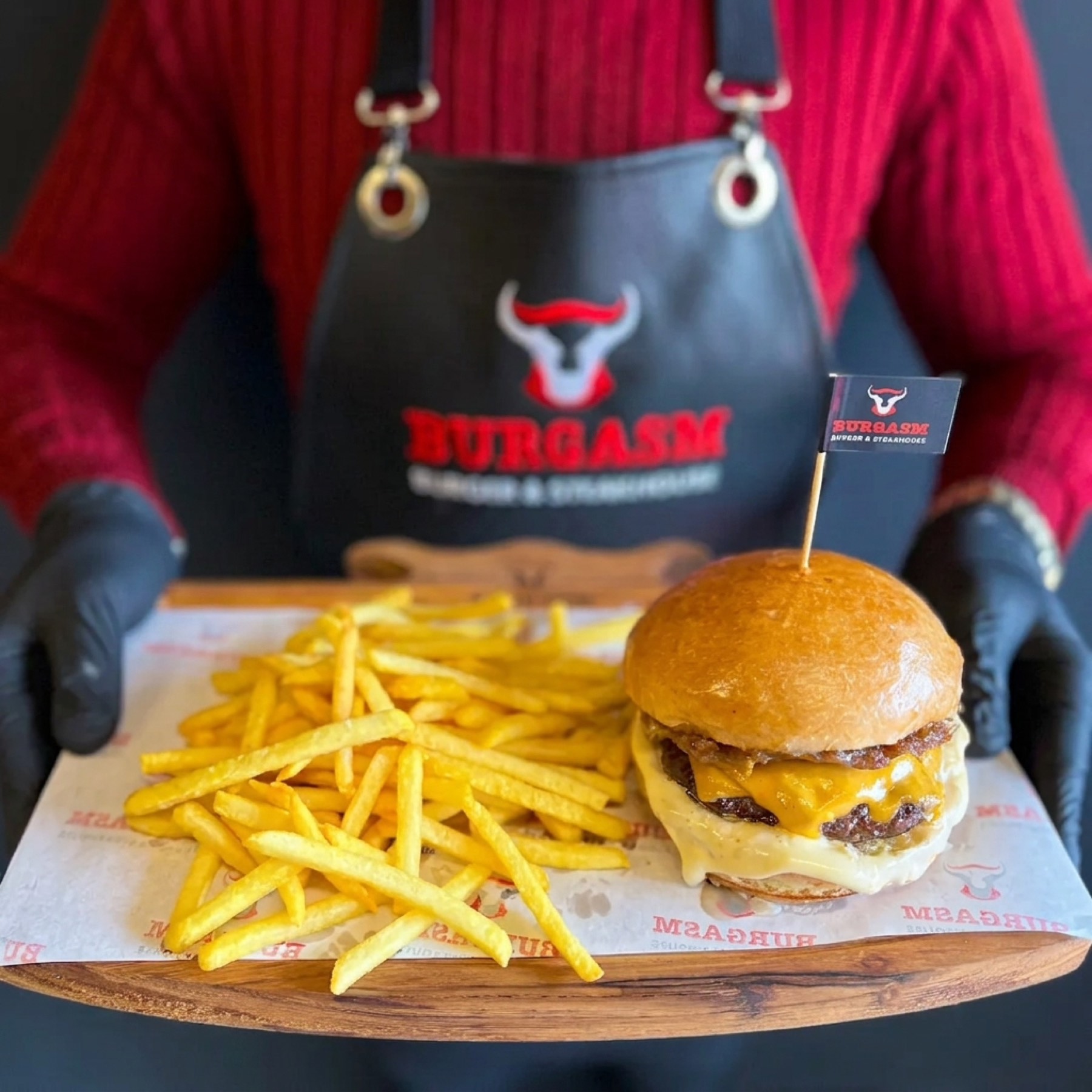
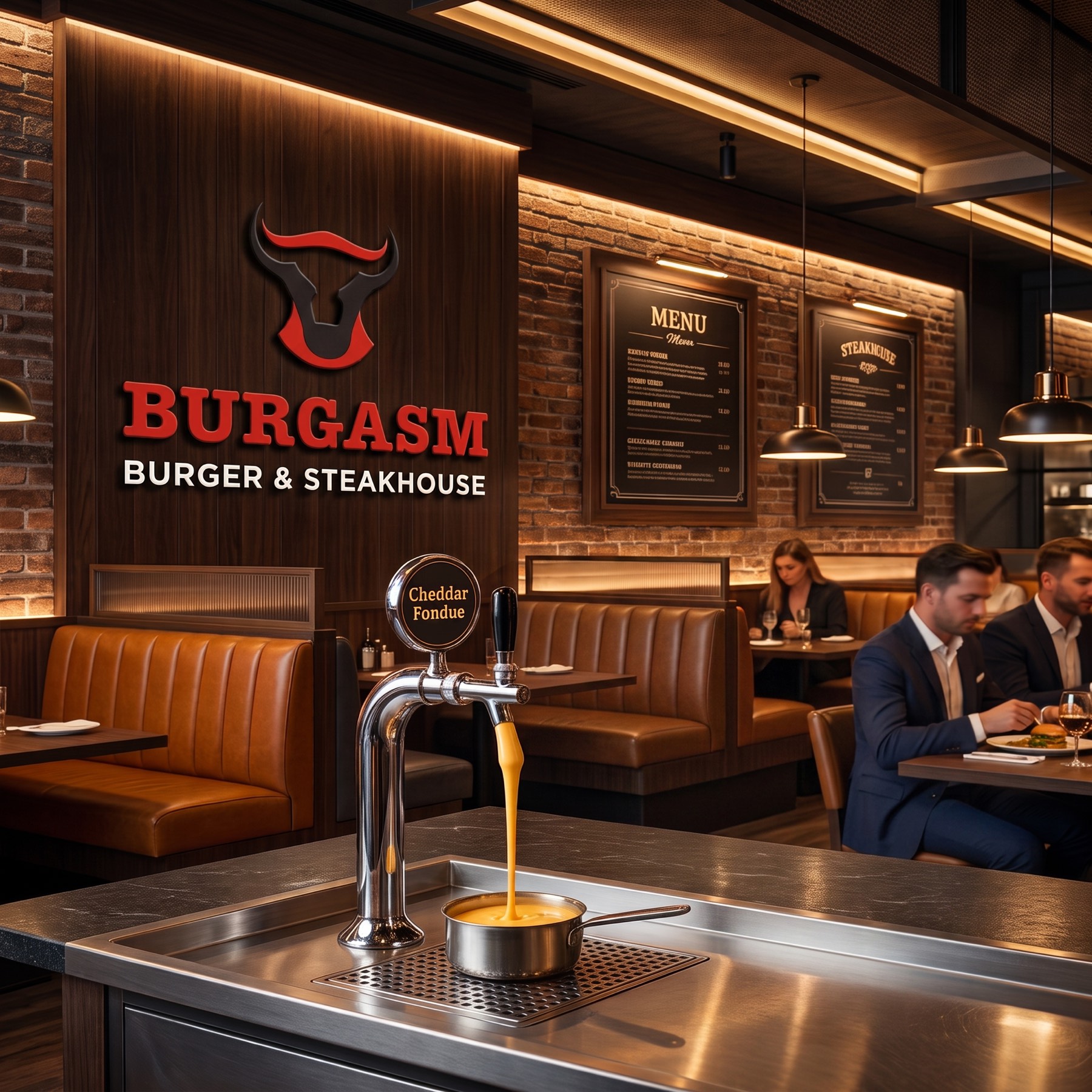
For Burgasm, operating in Ankara, we searched for the truest form to reflect the brand's "bold and delicious" spirit. Our design journey, which began with sketches, was turned into a flawless, confident brand identity in digital form. The bold lines and modern stance you see here are the clearest field reflection of our agency's creative vision.
Challenge
The core challenge of the project was representing, without clutter, both an accessible, dynamic "burger" culture and a premium, quality-focused "steakhouse" concept at once, within Ankara's competitive food-and-beverage sector.
It was also necessary to strike a visual balance capable of carrying the weight of a name as bold, confident, and unconventional as "Burgasm." The emblem could neither read as a classic, heavy butcher/steakhouse logo, nor stay as plain as an ordinary fast-food chain.
Goal
Our core aim was to create an iconic emblem that visualises the bold, passionate attitude carried in the brand's name — one that instantly conveys the power of the meat, its quality, and the burst of flavour it promises.
By integrating our agency's creative vision into the brand through these bold lines and modern stance, we aimed to build an identity instantly recognisable across the venue, packaging, and digital platforms — authoritative, yet appetite-inducing.
Result
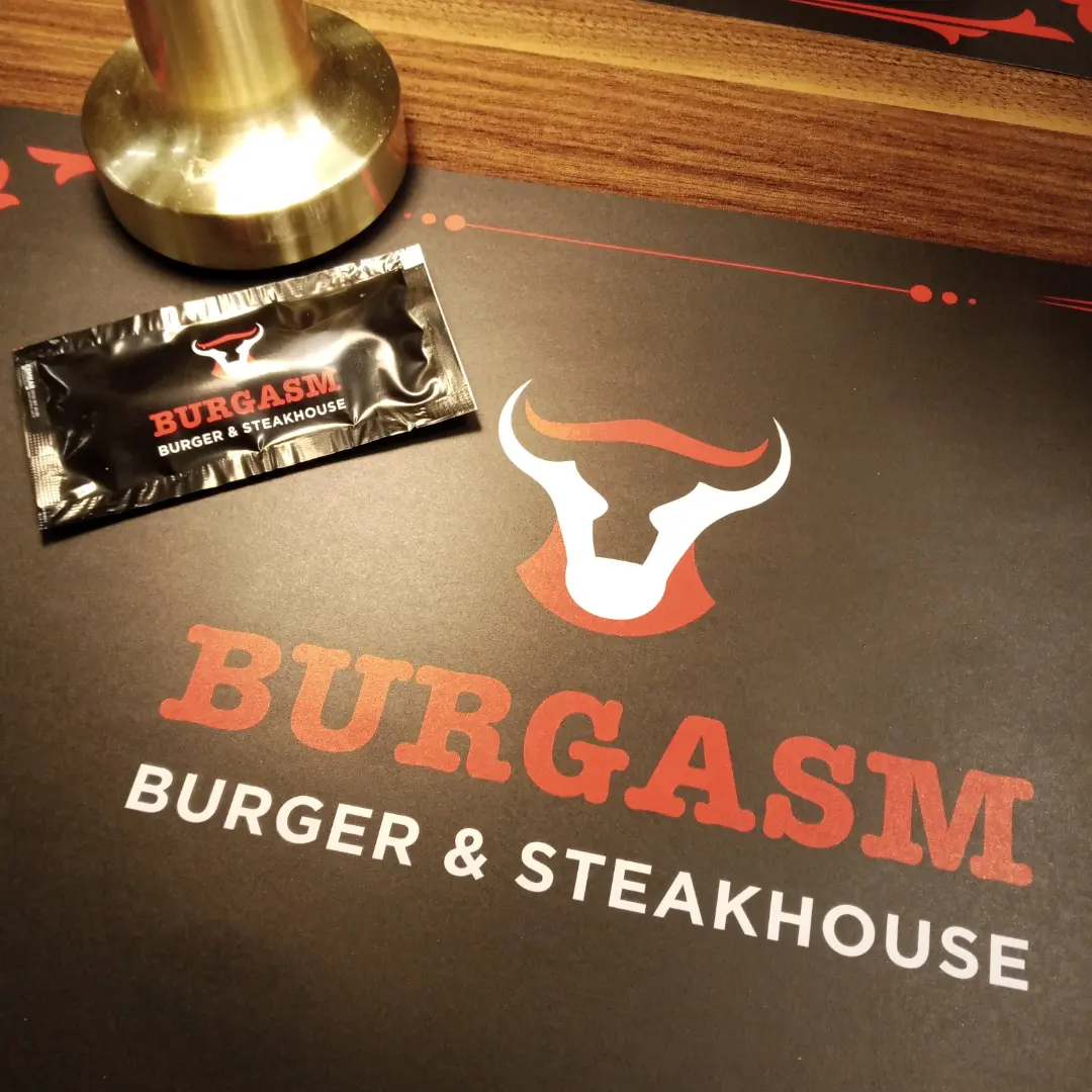
The bull figure at the centre of the emblem was modernised through the skilful use of black and white (negative and positive space).
These sharp, symmetrical lines make a strong reference to the brand's "steakhouse" origins, the quality of the meat, and its authority in the sector. The rich, saturated red chosen for the background is a strategic choice: both the most dynamic element for directly triggering appetite in the food-and-beverage sector, and a reflection of the grill's fire and the passion in the brand's name. The bold, slab-serif font with a retro touch used for "BURGASM" reflects the brand's grounded, hearty, masculine character. The clean, modern font chosen for "BURGER & STEAKHOUSE" just below explains the concept clearly, balancing the hierarchy within the logo.
Launch Similar Project