G-Tech
For G-TECH, active in geotechnical solutions and engineering, the task was to design a typographic and geometric brand symbol reflecting the brand's analytical intelligence, problem-solving ability, and engineering discipline.
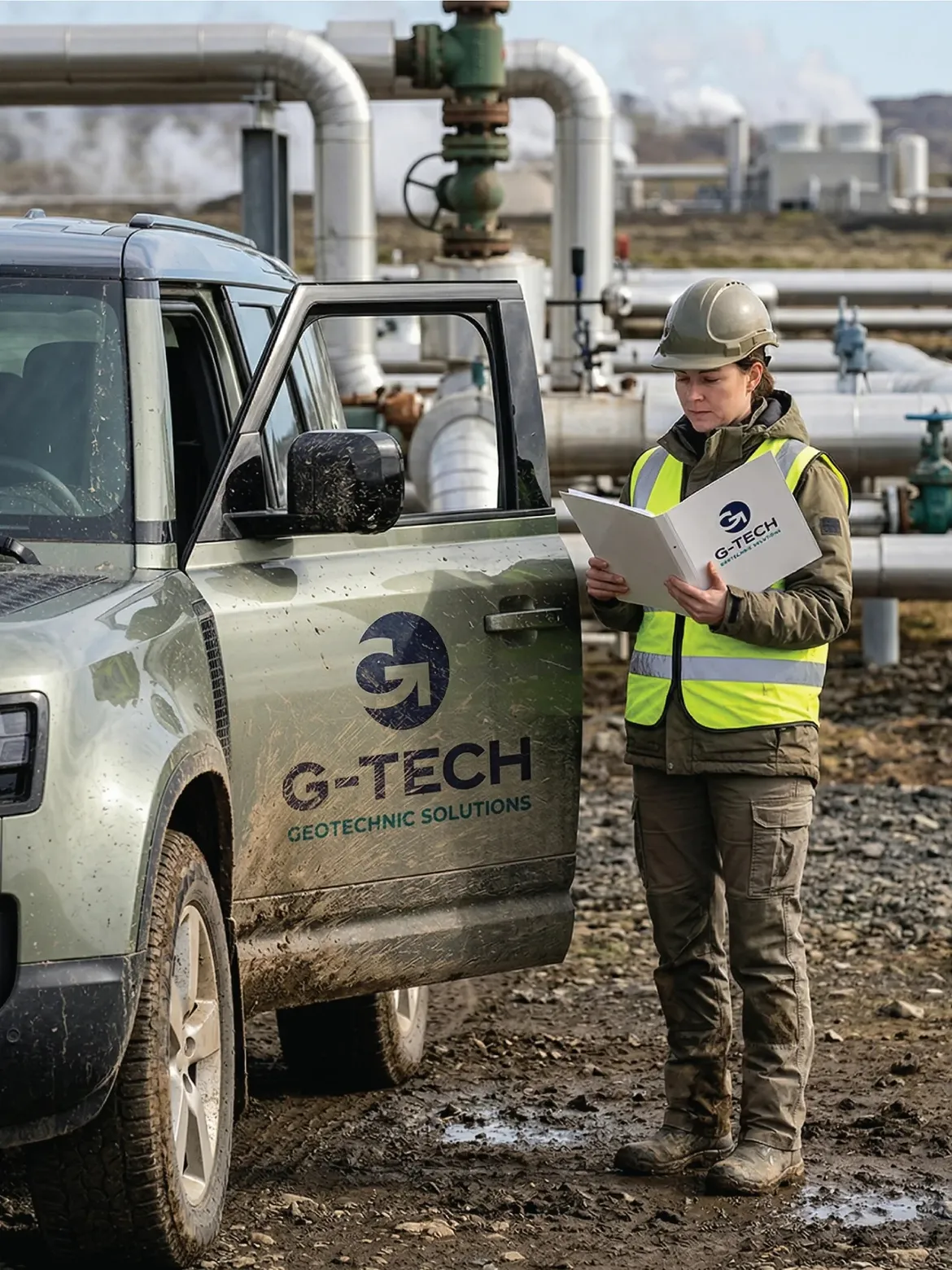
Going beyond an ordinary typographic combination, our G-TECH case study intelligently blends the letters "G" and "T" through the power of negative space — simple at first glance, holding a sense of discovery in its detail.
Challenge
The core problem was moving beyond the complex, overly technical, or clichéd visual patterns frequently found in the corporate identities of engineering and geotechnical brands.
The real challenge was melting the letters "G" and "T" that make up the brand's name into a single, iconic form without creating aesthetic clutter. The logo needed to be serious enough to carry the sector's weight and trust, yet minimal enough to meet modern, scalable design standards.
Goal
To visualise the brand's vision by placing the concepts of "continuity," "system integrity," and "engineering discipline" at the centre of the design.
Rather than simply placing the letters side by side for an ordinary read, the aim was to build a layered structure that evokes mental engagement and discovery in the viewer, to base the design on the sense of unity and universality a circular form provides, and to ensure the design is easily perceived, simple, and clear at first glance.
Result
In line with these challenges and strategic goals, an intelligent design solution was brought to life that directly reflects the brand's engineering character
The flawless circular form that frames the logo emphasises the brand's systematic working principle, its holistic approach to projects, and continuity. The interior of the circular form was strategically carved out to produce a memorable, dominant silhouette of the letter "G" at first glance. The design's real intelligence lies hidden in the details offered to the viewer's attention. The lower stroke of the "G" form and the space within it were constructed using the negative-space technique to form a hidden letter "T." This structure also created a strong, geometric line pointing to upward momentum.


Launch Similar Project