İlbank
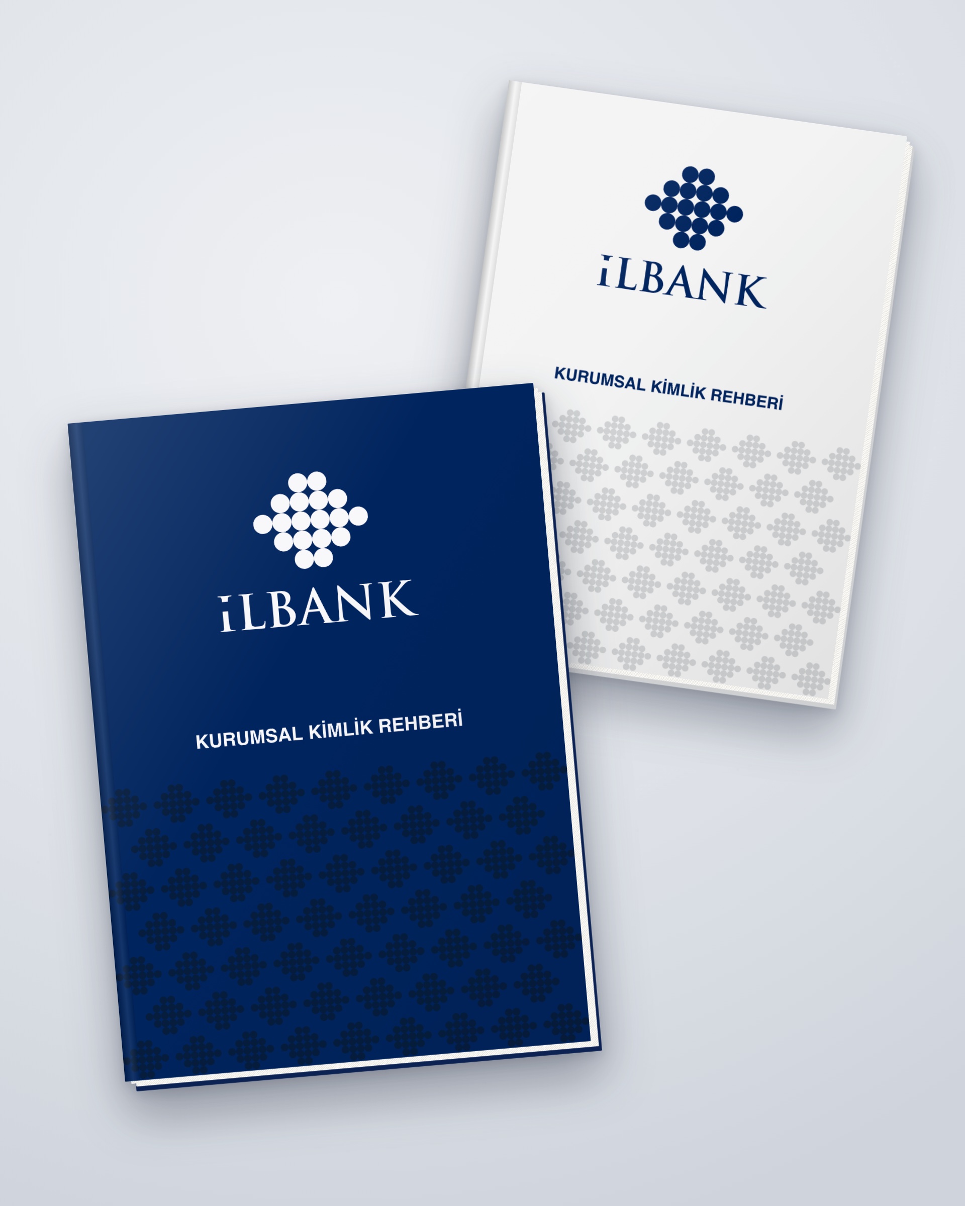
Logo, corporate identity and corporate identity guidelines for İlbank, in partnership with Publicad Agency.

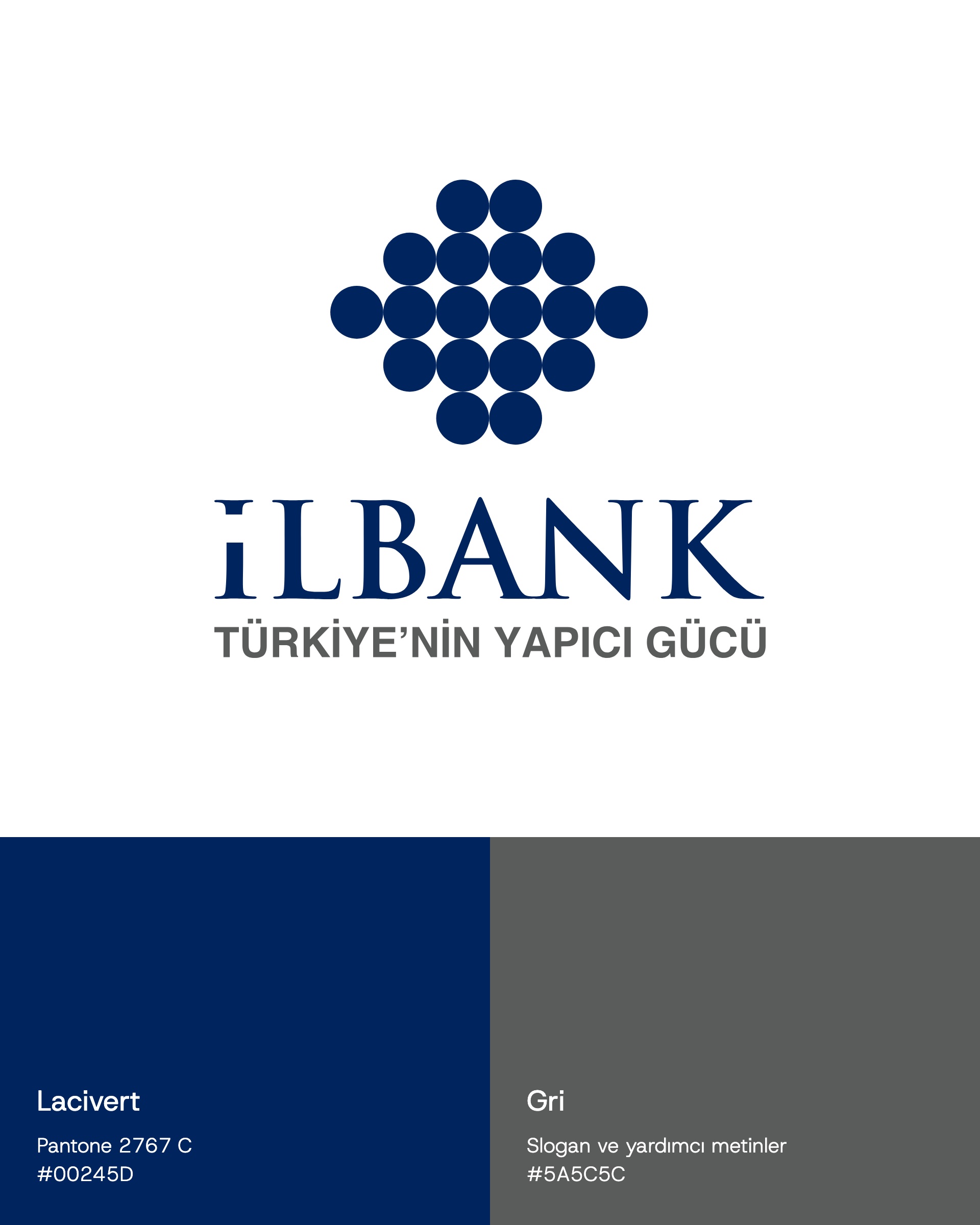
İlbank is a development and investment bank that finances the infrastructure and urban investments of Turkey's municipalities. In 2011, the year İller Bankası became İLBANK A.Ş., we designed the institution's new logo, corporate identity and corporate identity guidelines. The project was run under the management of and in partnership with Publicad Agency; the designs are by Övünç Güven Ersoy.
Challenge
A long-established institution, a new face.
With its new company structure, the bank would appear under one mark across Turkey: with municipalities, on construction sites and inside the institution. The logo had to carry both the trust of a bank and the tangible nature of public works.
Goal
The idea: a face made of circles.
The emblem is made of eighteen circles arranged in a diamond. As a whole it reads as an abstract face; the diamond tiles that form in the negative space between the circles stand for the foundation stones of architecture. Navy (Pantone 2767 C), the colour long associated with banking, was chosen, with the slogan and supporting text set in grey. The slogan "Türkiye'nin Yapıcı Gücü" (Turkey's Constructive Force) belongs to Publicad Agency's communications team.
Result
The result: the same mark everywhere in Turkey.
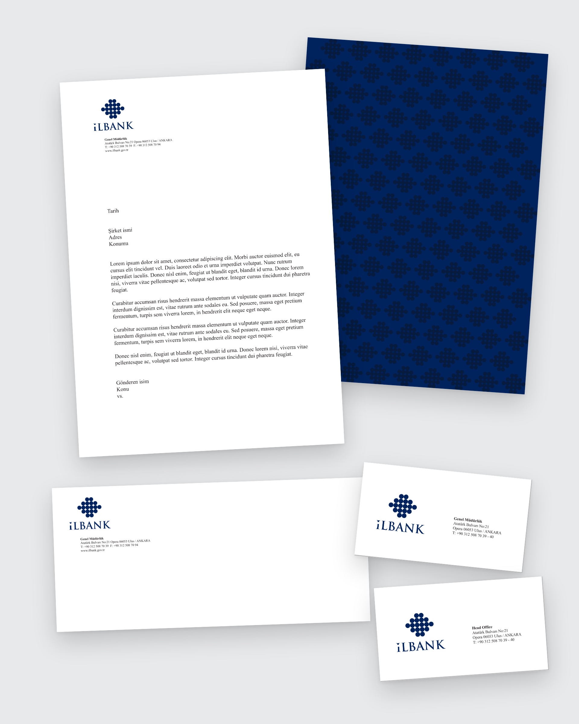
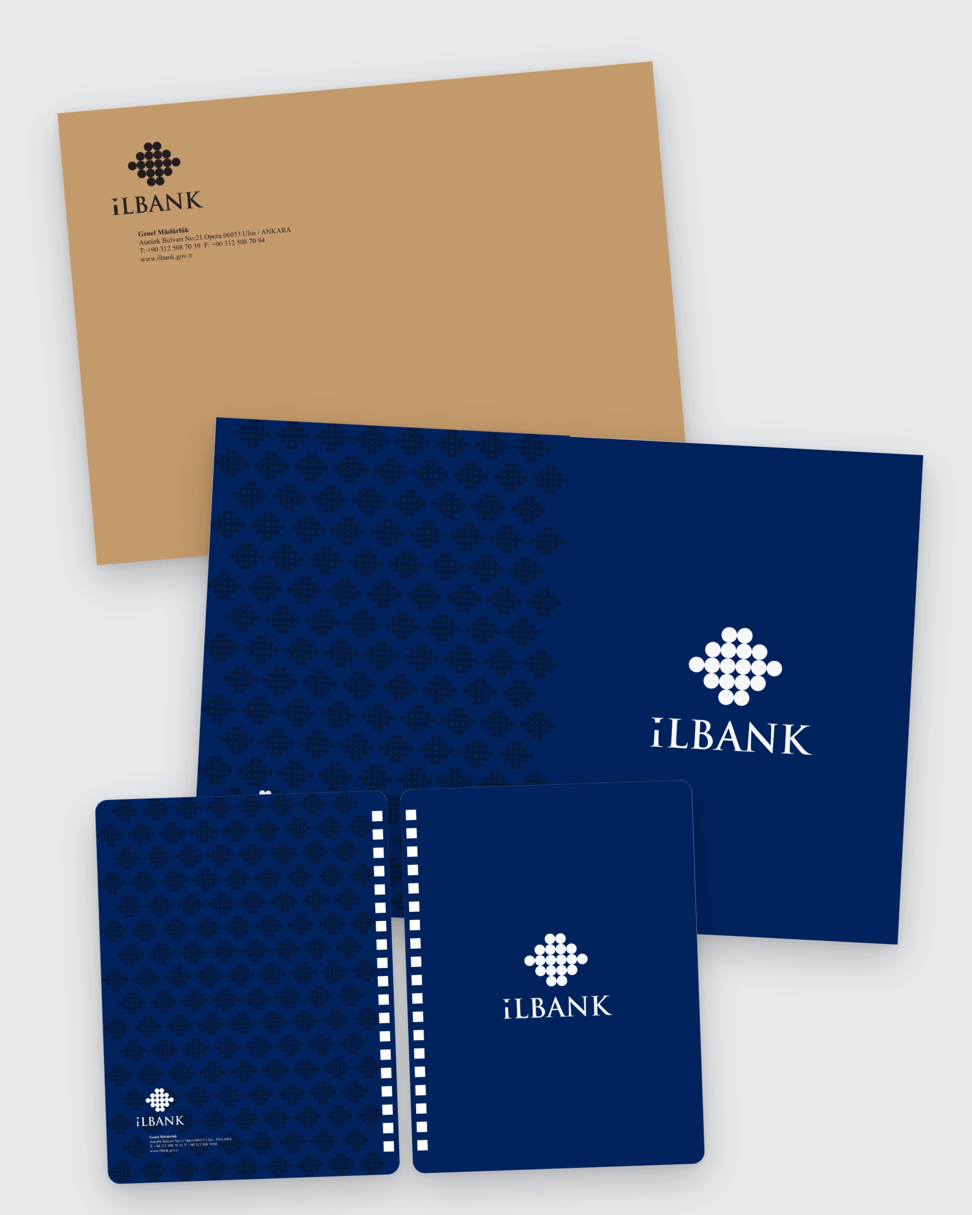
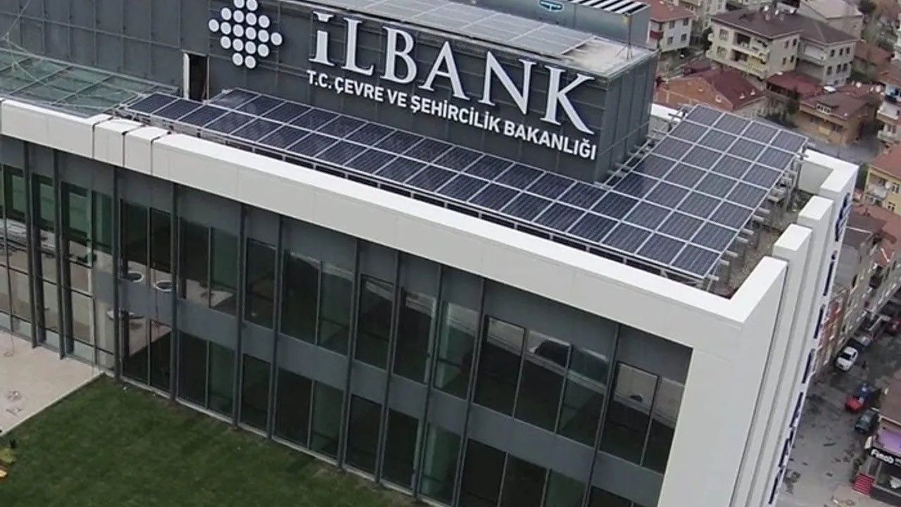
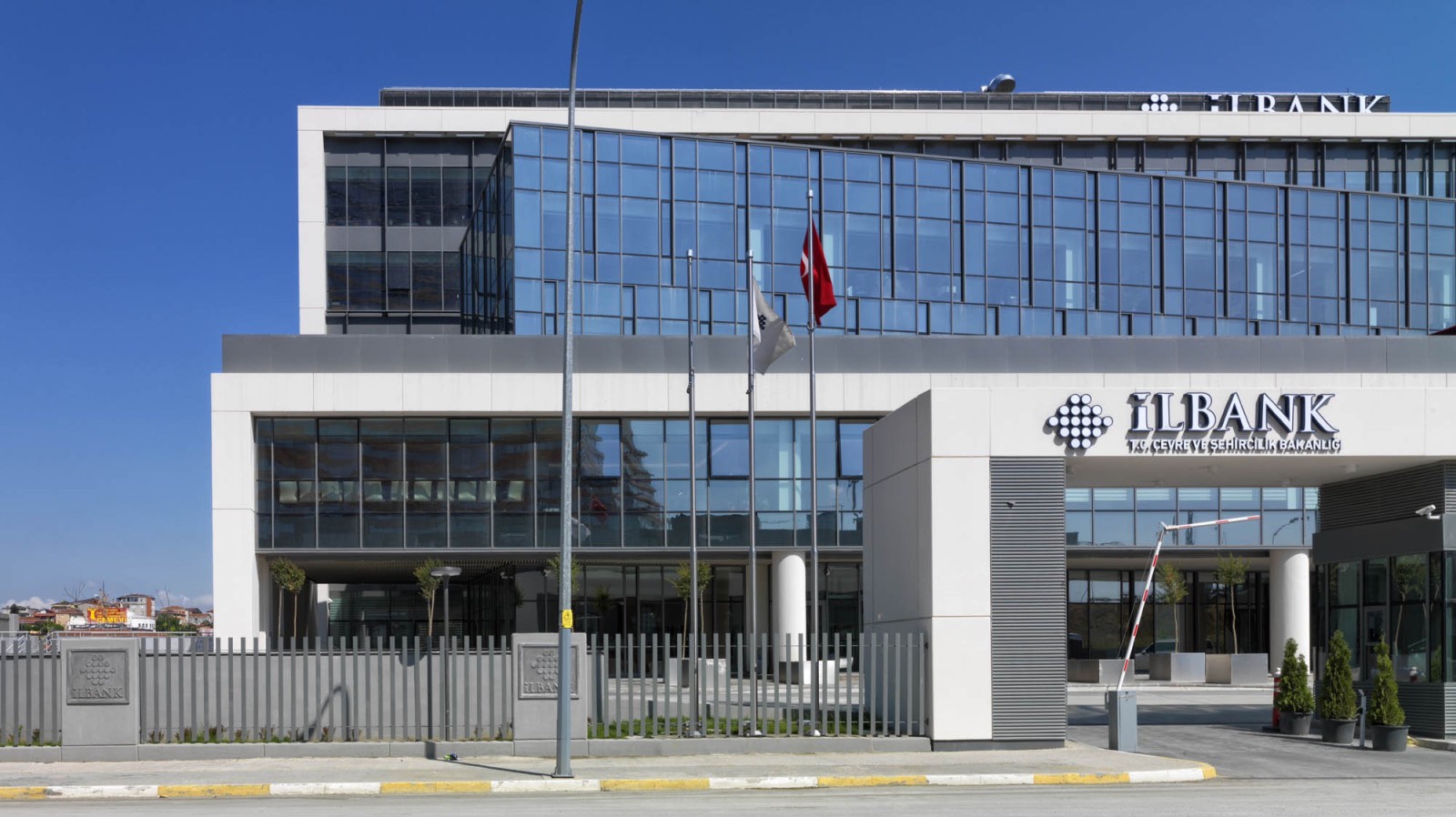
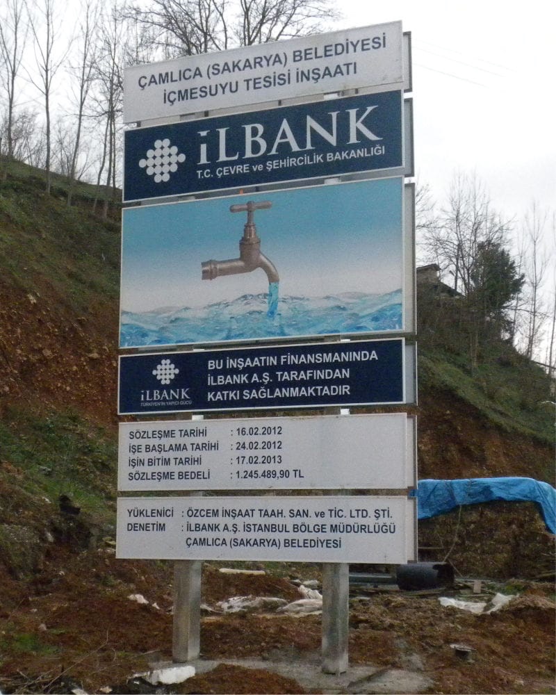
Alongside the logo, we brought its applications, from business cards, letterhead, envelopes, folders and diaries to staff cards, flags and lapel pins, together in a single corporate identity guide. Today the logo is used on İlbank's buildings, at its head office in Ataşehir, Istanbul, and on the site boards of the projects it finances.


Launch Similar Project