Payiz Gold
As for the logo design story behind our brand launching in Iran…
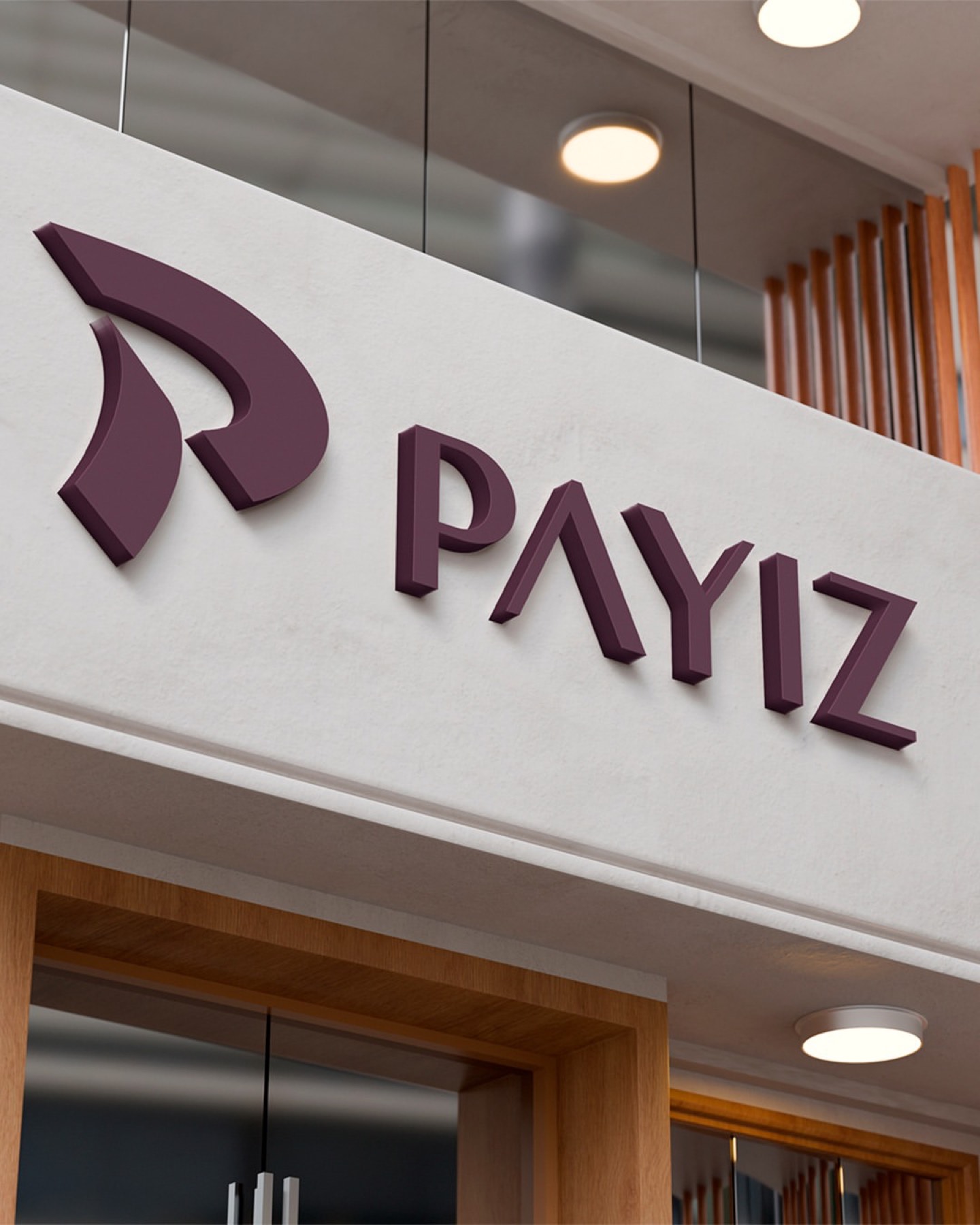
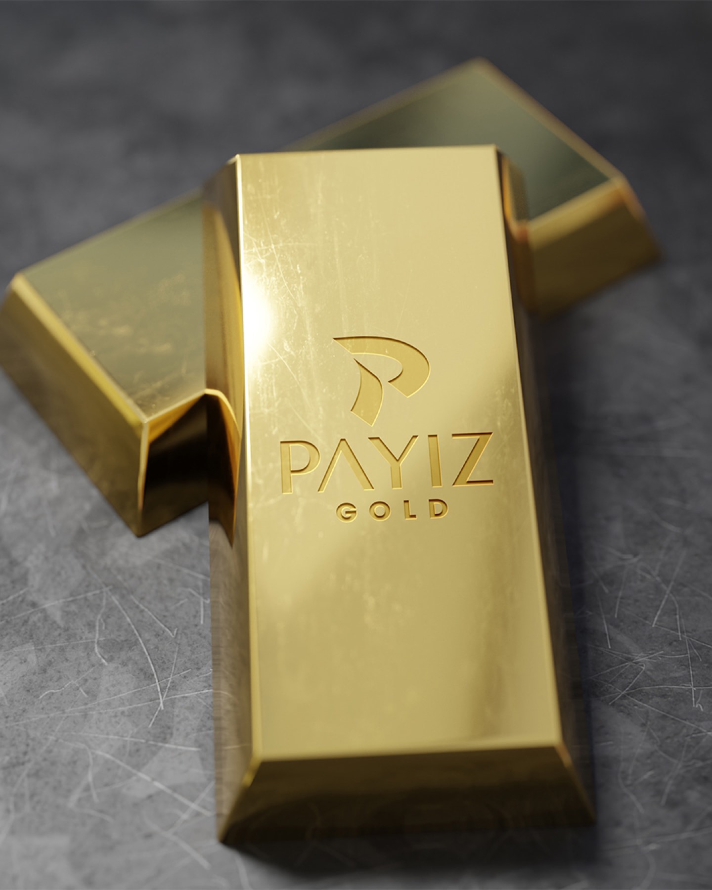
Inspired by the season when nature turns golden and time ripens, we built a luxury brand identity for the Iranian market with "Payız Gold" — bringing together the elegance of the wind, the melancholic nobility of autumn, and the timeless value of jewellery in a single letter "P."
"Payız" means autumn in Persian — the season when nature turns golden and deep burgundy, when time ripens. Designed from this meaning, the Payız Gold logo symbolises autumn's elegant touch and its gold-standard worth.
The letter "P" at the centre of the logo was built on the elegant, free movement of the winds that blow in autumn. Shaped with a soft curve, as if carried like leaves on the wind, the letter carries a sense of motion and the spirit of the season. This motion conveys both a sense of change and of permanence — much like the dignified renewal autumn whispers to nature.
Challenge
In a market like Iran, with such a deep-rooted cultural heritage and traditional sense of luxury, positioning the name "Payız" — meaning "autumn" in Persian — for a jewellery brand required strategic finesse.
The core challenge was bringing together autumn's transience in nature with gold's "permanent and unshakeable" nature without contradiction. It was necessary to move entirely away from clichéd leaf or tree figures and visualise the spirit of the season as a luxurious, modern, sophisticated signature.
Goal
Our aim was to create a globally standard monogram by blending the poetic meaning carried by the name with a sense of dignified renewal and splendour.
We aimed for the logo to be as light and free as a leaf gliding on the wind, while also carrying a "gold-standard" weight rooted deeply enough to reflect the brand's rich cultural heritage on Iranian soil.
Result
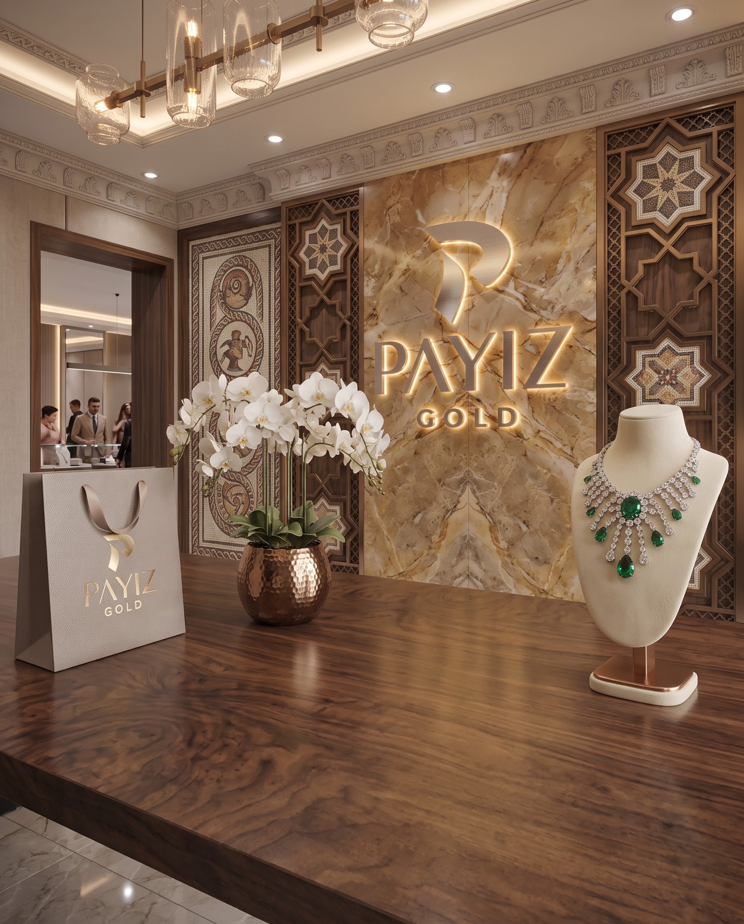
Payız Gold has gone beyond a mere letterform, arriving at a visionary brand identity as precious as a piece of jewellery, kneaded from the spirit of time, nature, wind, and gold.
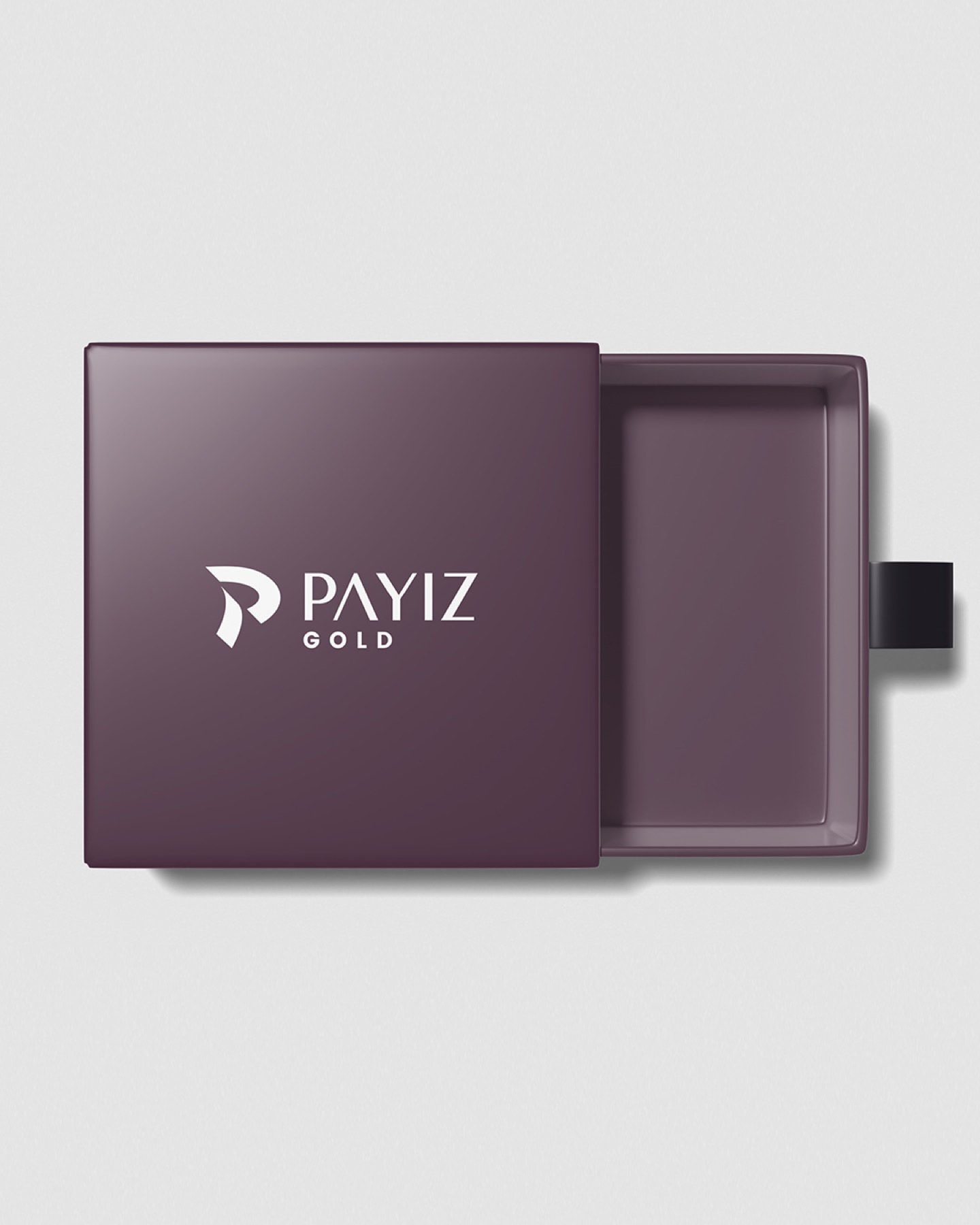
The letter "P" at the centre of the logo was built on the elegant movements of the winds that blow in autumn. This soft curve, reminiscent of leaves gliding on the wind, gives the brand an aesthetic sense of motion while conveying change and nature's dignified renewal (permanence) at once. The chosen matte deep burgundy tone pays tribute to autumn's velvety, warm colour palette, while in the jewellery sector it represents wealth, power, splendour, and deep nobility. This colour underscores, in a modern language, Payız Gold's precious bond with gold. The curved elegance of the emblem strikes a perfect balance with the clean, sharp, modern lines of the "PAYIZ" logotype below it (particularly the minimal cut detail in the letter "A"), carrying the brand's luxury perception to its peak.

Launch Similar Project