Uzm. Dr. Hayriye Alp
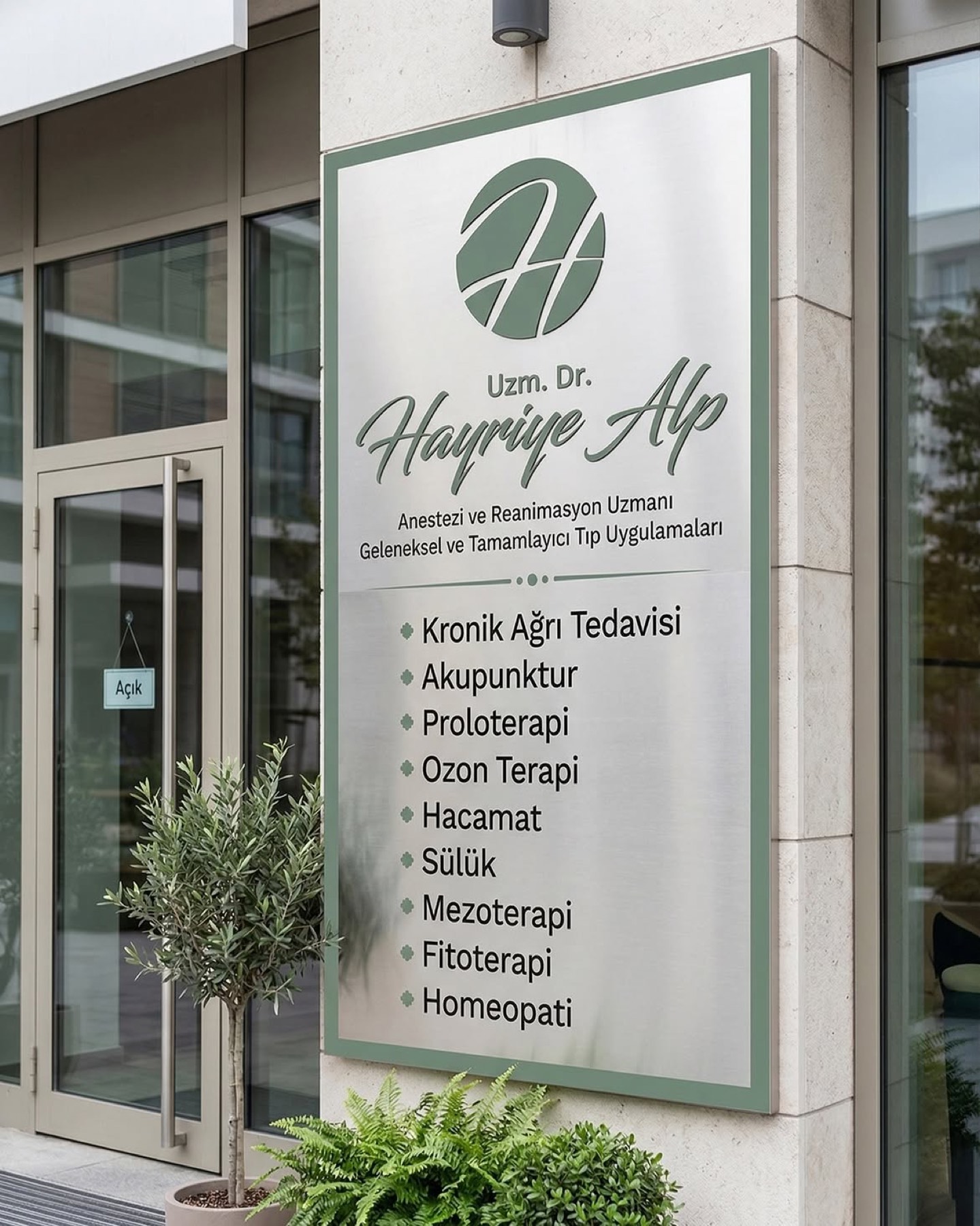
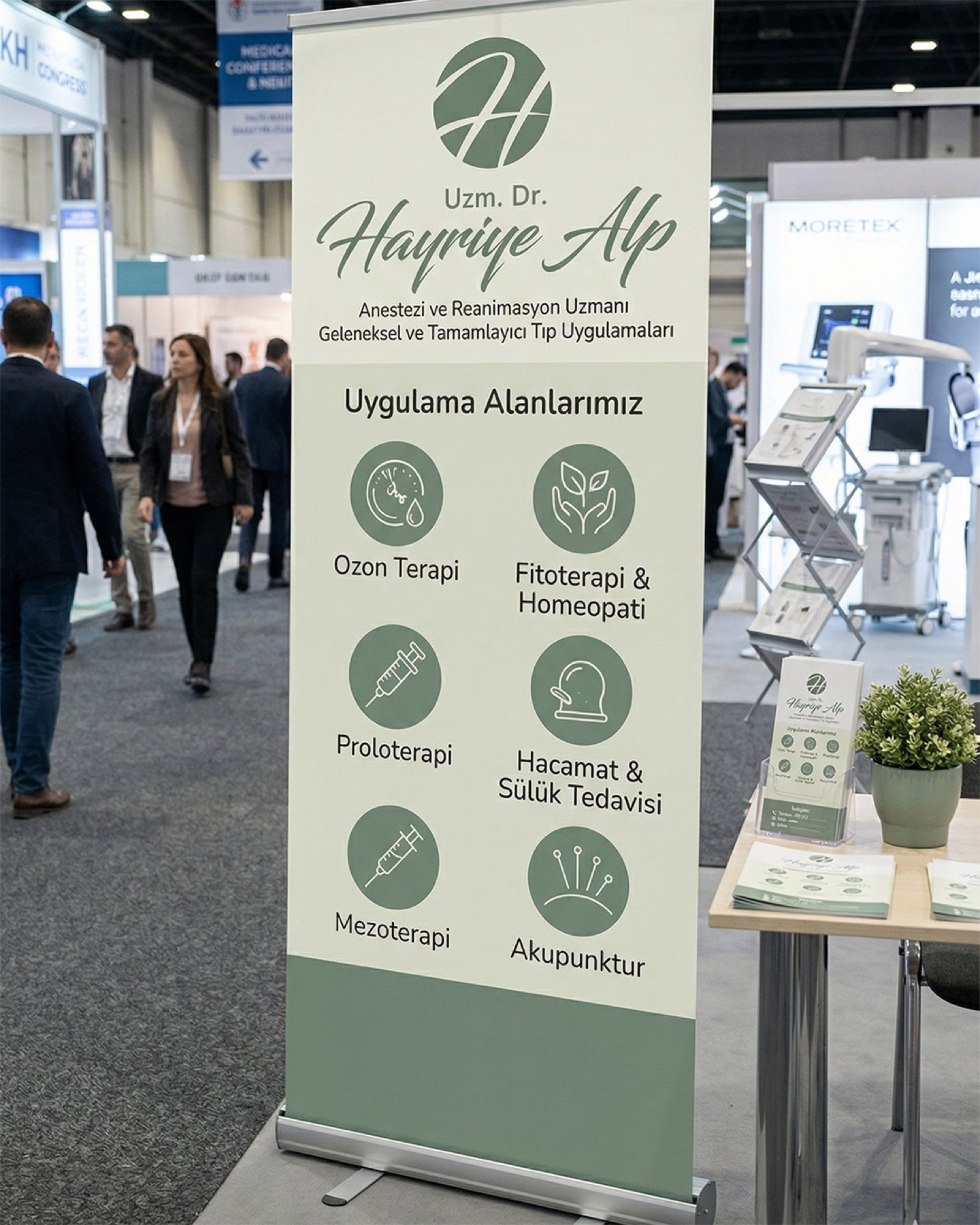
For Uzm. Dr. Hayriye Alp, who brings deep expertise in healthcare through a holistic approach, we built an aesthetic and memorable brand identity centred on simplicity, balance, and trust.
Challenge
In health communication — particularly in Traditional and Complementary Medicine (TCM) practice — the biggest challenge is striking the right balance between the authoritative, clinical stance of conventional medicine and the organic, healing, human-centred nature of complementary medicine.
We needed to bring Uzm. Dr. Hayriye Alp's wide, multidisciplinary range of services — from chronic pain treatment to acupuncture, from prolotherapy to ozone therapy — together under a single corporate umbrella that is free of clutter and instils trust in patients. Our central challenge was ensuring the brand retained the weight of its medical expertise (Anaesthesiology and Reanimation) while carrying a tone of healing and peace.
Goal
Our core aim was to translate the brand's founding concepts of "simplicity, balance, and trust" into visual form.
We set out to construct a clear brand language reflecting the philosophy of "holistic medicine" — treating the human body as a whole — one that would be memorable for its aesthetic elegance while still carrying the weight of a professional physician's identity. By blending strategy and design, we wanted to create a coherence that visually differentiates the brand from its competitors and speaks directly to its target audience's emotional sense of trust.
Result
Our design process resulted in a modern, elegant identity built on a characteristic sage-green tone that gives patients a sense of calm, healing, and naturalness.
The initial "H" was placed within a circular form symbolising universality, balance, and holistic medicine. The organic, flowing lines extending beyond the letter expressed, in an abstract language, the flow of energy within the body, the healing process, and continuity — the relief found in chronic pain treatment. The elegant, script-style typography chosen for "Hayriye Alp" in the logotype symbolises the personal, warm, human bond the physician builds with her patients, giving the brand a warm character. The organic, curved lines in the name were balanced by the clean, legible, modern sans-serif fonts used for the title and areas of expertise. This contrast brought together, in flawless harmony, the compassionate nature of complementary medicine with the medical seriousness and clarity demanded by expertise in anaesthesiology and reanimation.
Launch Similar Project