Pan Gold
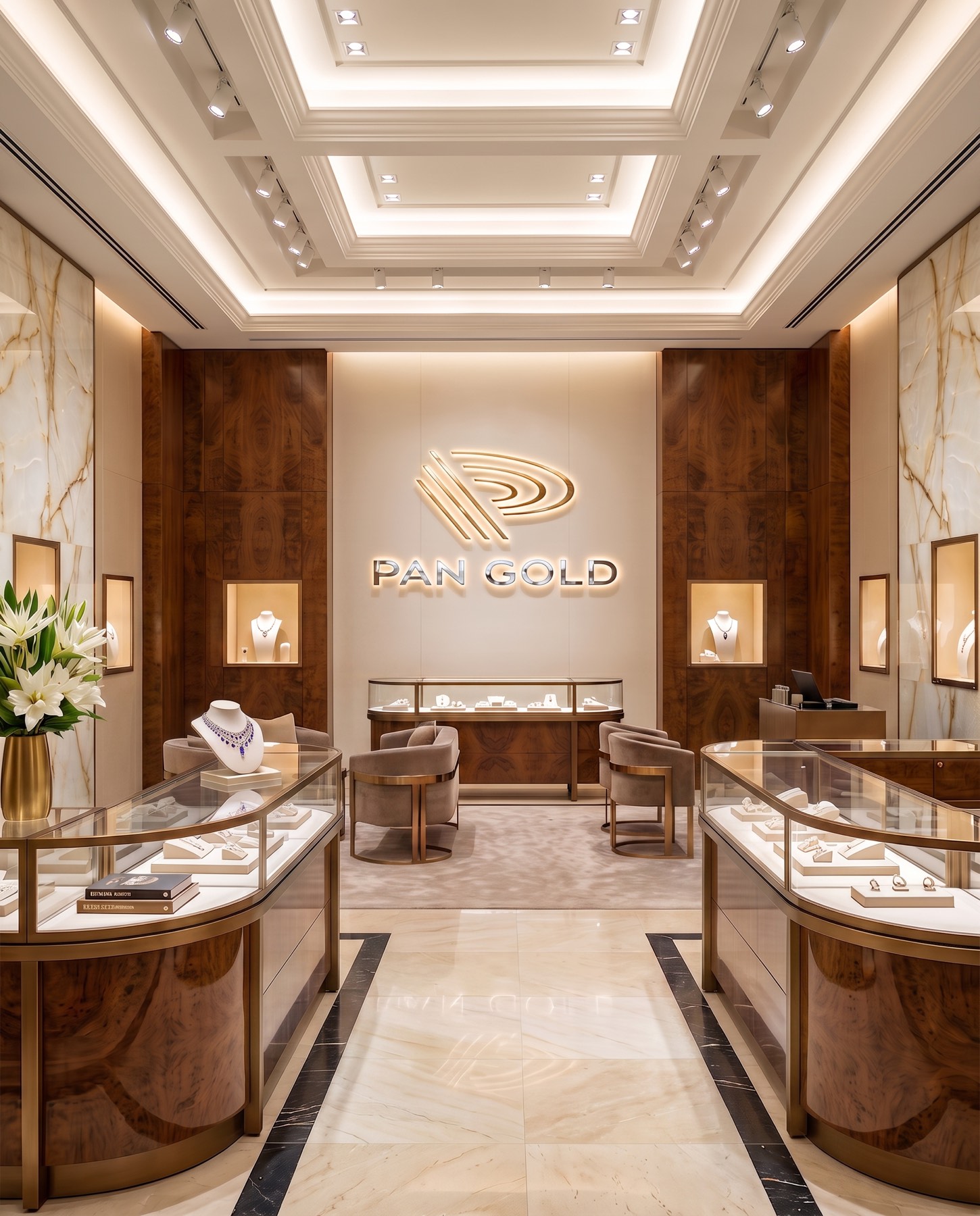
In the PAN GOLD corporate identity, where we united the brand name with its field of activity in a single minimalist form, we carried the traditional gold-panning journey into the future through contemporary lines and a premium perception.

What is a pan? A pan is the name given to the round, bowl-shaped sieving dish that traditional gold prospectors use by streambeds to separate gold from sediment. The layered basin form on the inside of the pan is the most important structural detail that separates gold from water and gravel — a powerfully iconic symbol of discovering gold.
Challenge
Brand identities in the precious metals and gold sector often risk falling into the repetition of overly traditional motifs — bullion, sparkle, classic mining figures.
Goal
Our core aim in the design process was to blend the metaphor of "discovering gold" with the brand's initial in a flawless optical balance.
We aimed to translate the characteristic layered basin form on the inside of the gold pan — the very detail that separates gold from gravel — into a visual language, building an iconic structure that conveys the brand's name and its business in a single glance. Our core strategy was to create a modern vision that would evoke expertise, value, and deep-rooted trust in the target audience.
Result
This process, where strategy and design converged, resulted in an original and powerful brand signature that reflects the essence of the brand.
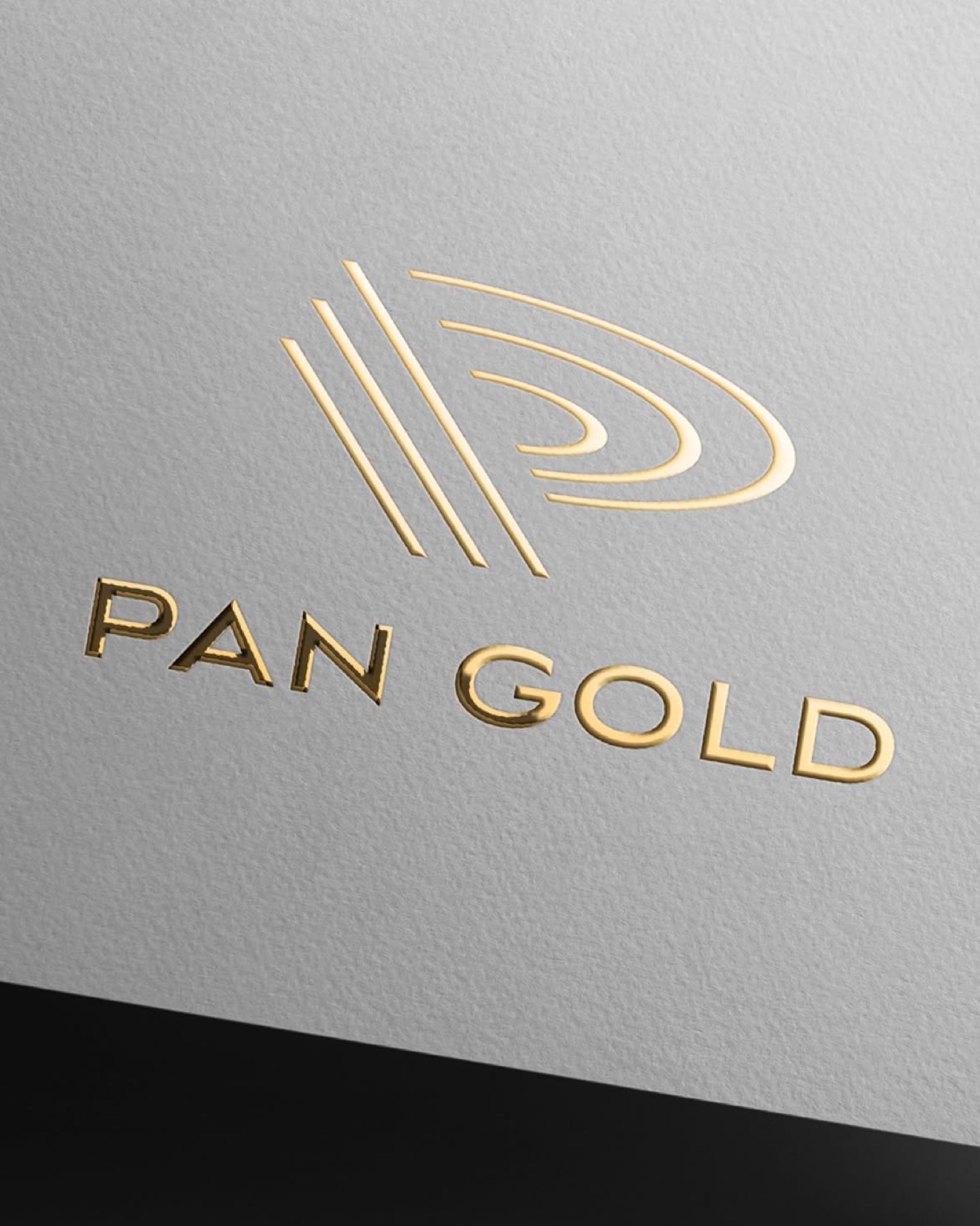
For colour, a refined gold tone was chosen that directly supports the brand's field of activity and foregrounds elegance, visually registering the value and quality the brand offers. The emblem was modernised with concentric, oval lines representing the inner layers of the prospector's pan. These dynamic lines combine through flawless use of negative space to form the brand's initial, the letter "P." The name and the act converge in a single minimalist form. The emblem, composed of modern, characteristic lines, was balanced to create a sharp contrast with the dark tone used in the typography. This dark-toned, clean-lined lettering cemented the brand's authoritative, trustworthy, and powerful stance.
In the end, by reinterpreting the story of discovering gold through simplicity and contemporary lines, we brought to life a premium brand identity for PAN GOLD that is modern, trustworthy, and strongly differentiated within its sector.
Launch Similar Project