Teknoges
A logo built on the idea of cycle and balance, and a corporate identity system covering two sub-brands, for Teknoges, a climate and energy group in Samsun.
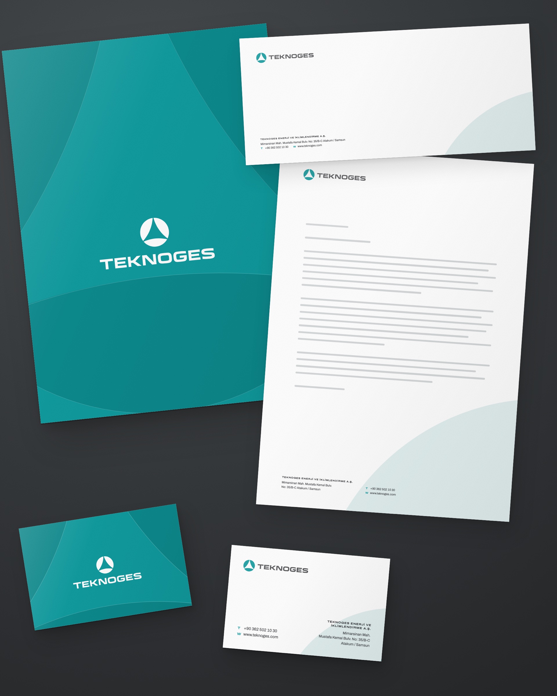
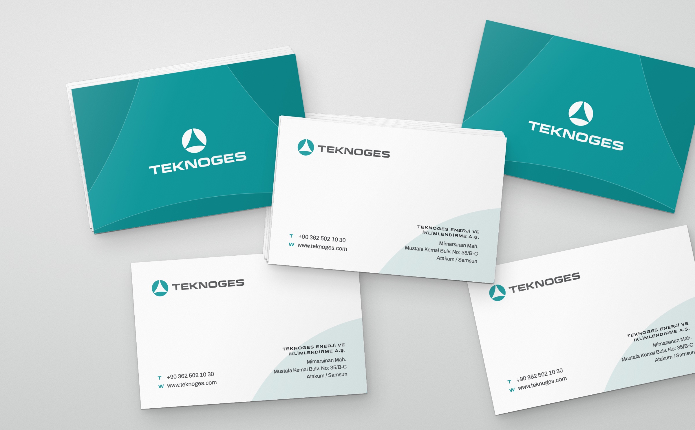
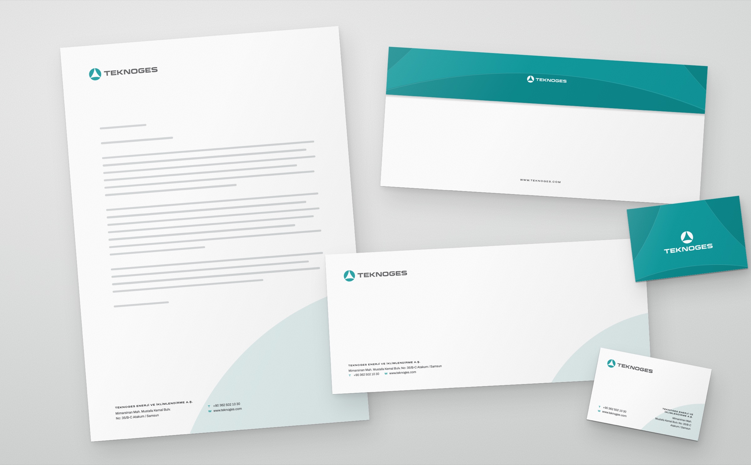
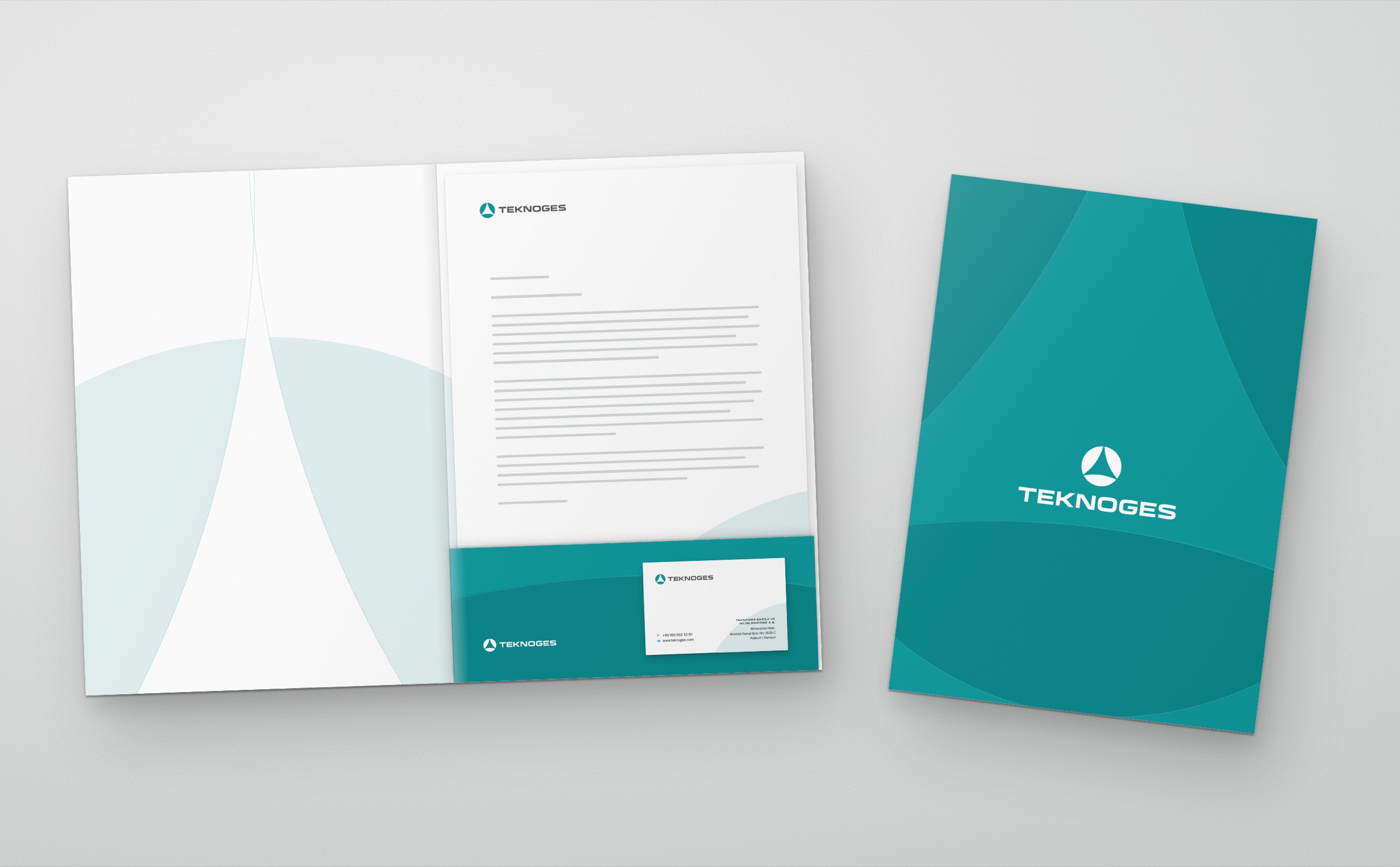
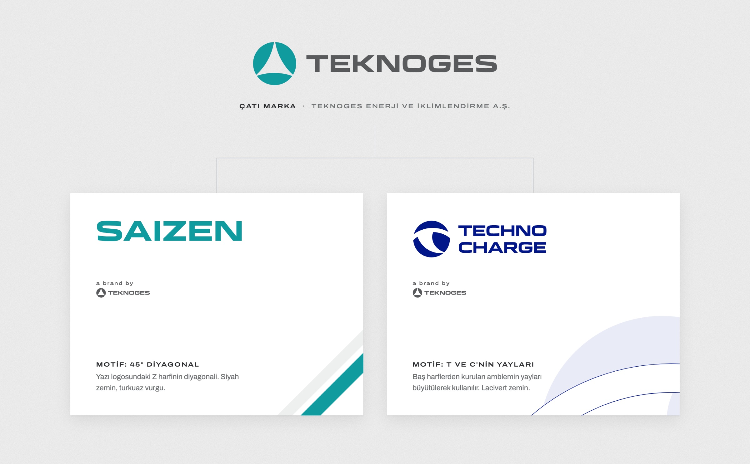
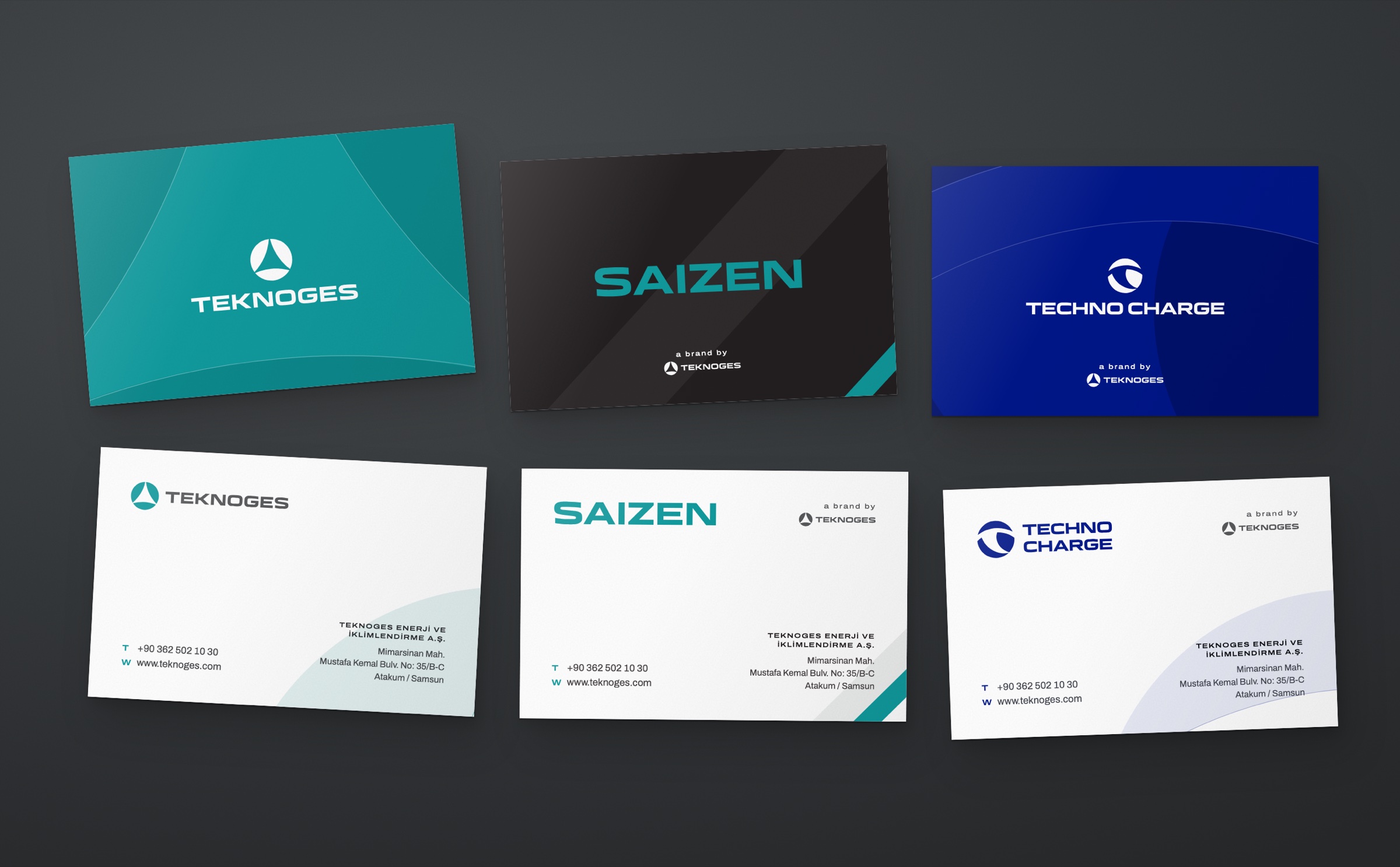
Teknoges Enerji ve İklimlendirme A.Ş. is a group in Samsun offering air conditioning, heat pumps, solar power plants and electric vehicle charging solutions. In 2026 we designed the group's logo and corporate identity, and applied the same system to its two sub-brands: Saizen, its air conditioning brand, and TechnoCharge, its charging brand. Business cards, letterhead, envelopes, presentation folders and email signatures were prepared for all three brands.
Challenge
A parent brand and two sub-brands had to look like one family without blending into each other.
Teknoges offers air conditioning, heat pumps, solar and charging products together; Saizen is the group's air conditioning brand, and TechnoCharge is the engineering brand that builds and installs charging units. The stationery of all three would sit side by side on the same desk and in the same proposal folder.
Goal
The idea is cycle and balance: one circle, three arcs.
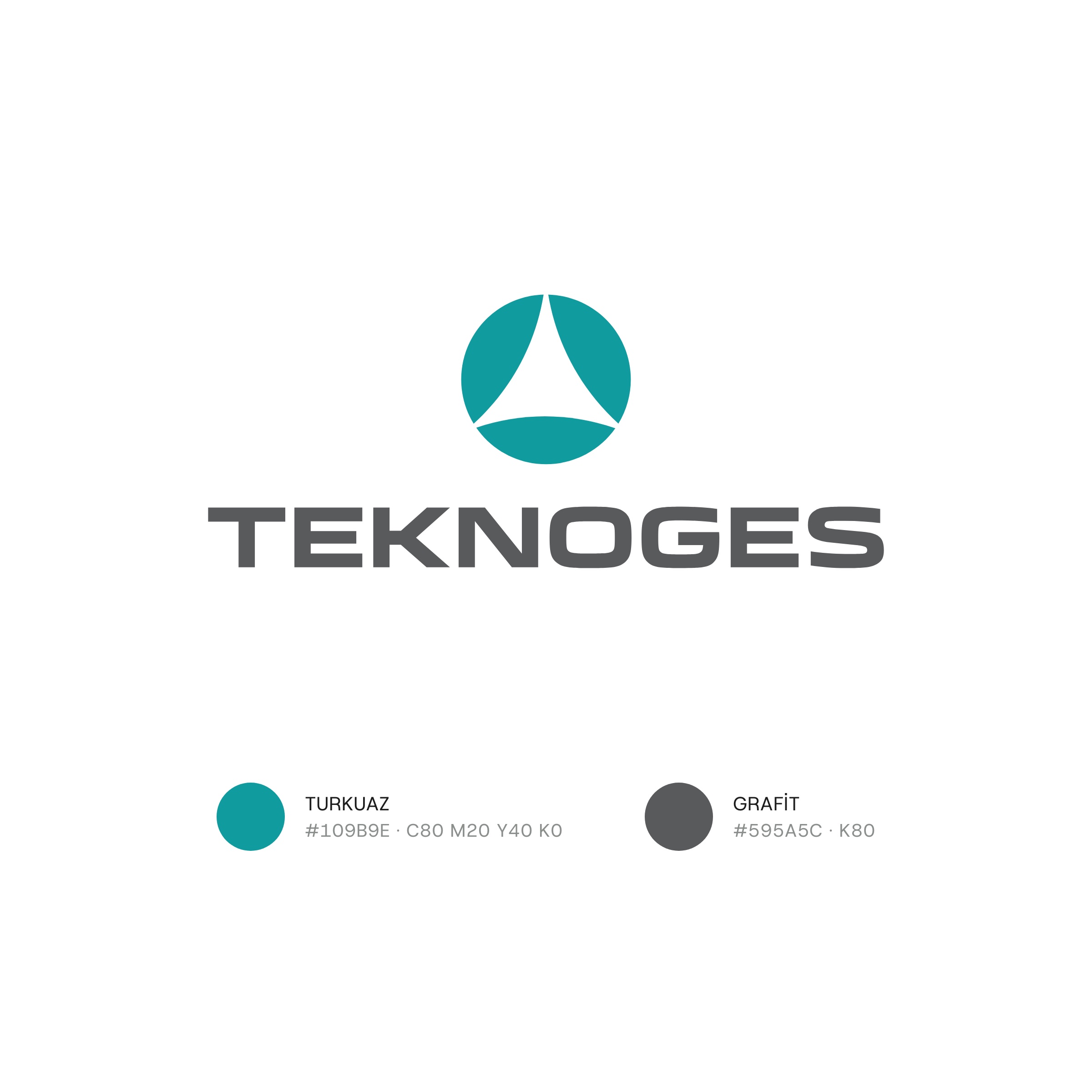
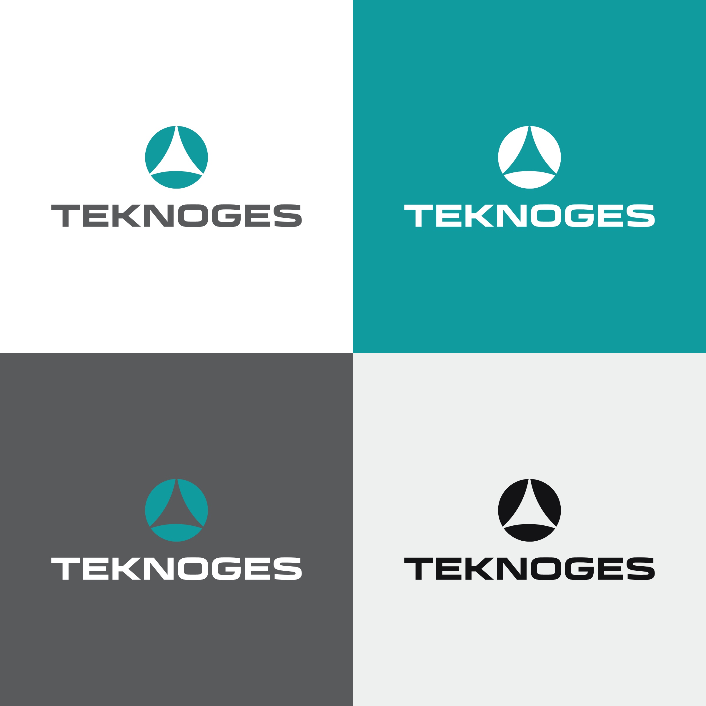
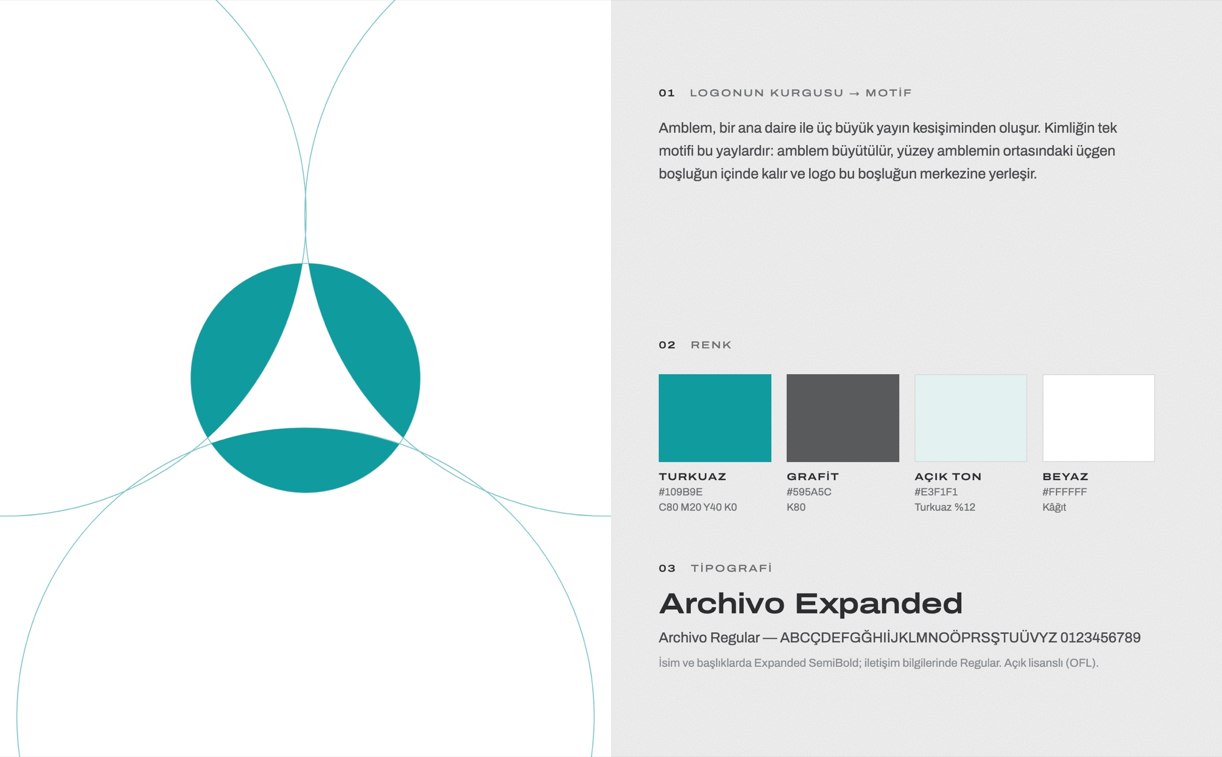
The circle in the emblem stands for the energy cycle and sustainability. The three arcs cutting through it represent the group's three fields, climate, energy and charging; the triangular space left between them is their common centre. The colours are turquoise and graphite.
Result
The identity's only motif is the logo's own arcs.
No outside shape was added to the identity; the emblem's arcs were enlarged and spread across the surfaces. On coloured surfaces the logo sits exactly in the centre of the triangular space of the enlarged emblem. Layout, typeface and information structure are shared by all three brands; colour and motif belong to each brand. On the sub-brands the Teknoges logo appears with the words “a brand by” in the same position on every surface. In the logo animation the three arcs rotate around the emblem's centre and settle into place.
Launch Similar Project