Saizen
A logo set in wide, angular letters and a corporate identity built on the 45-degree diagonal of the letter Z, for Saizen, the air conditioning brand of the Teknoges group.
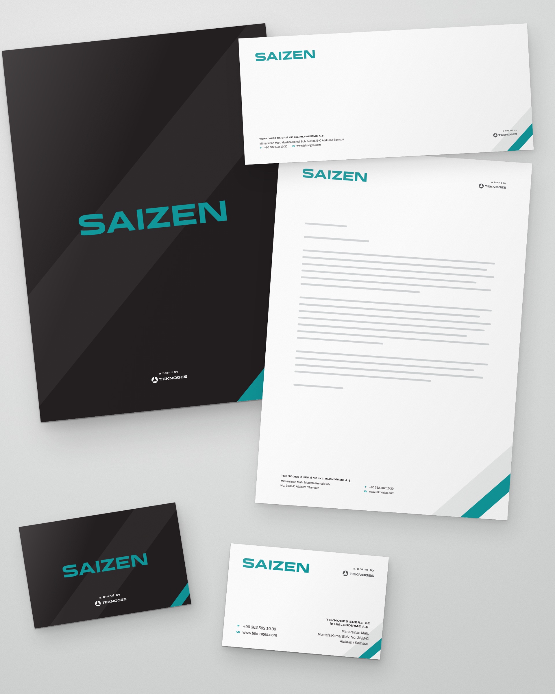
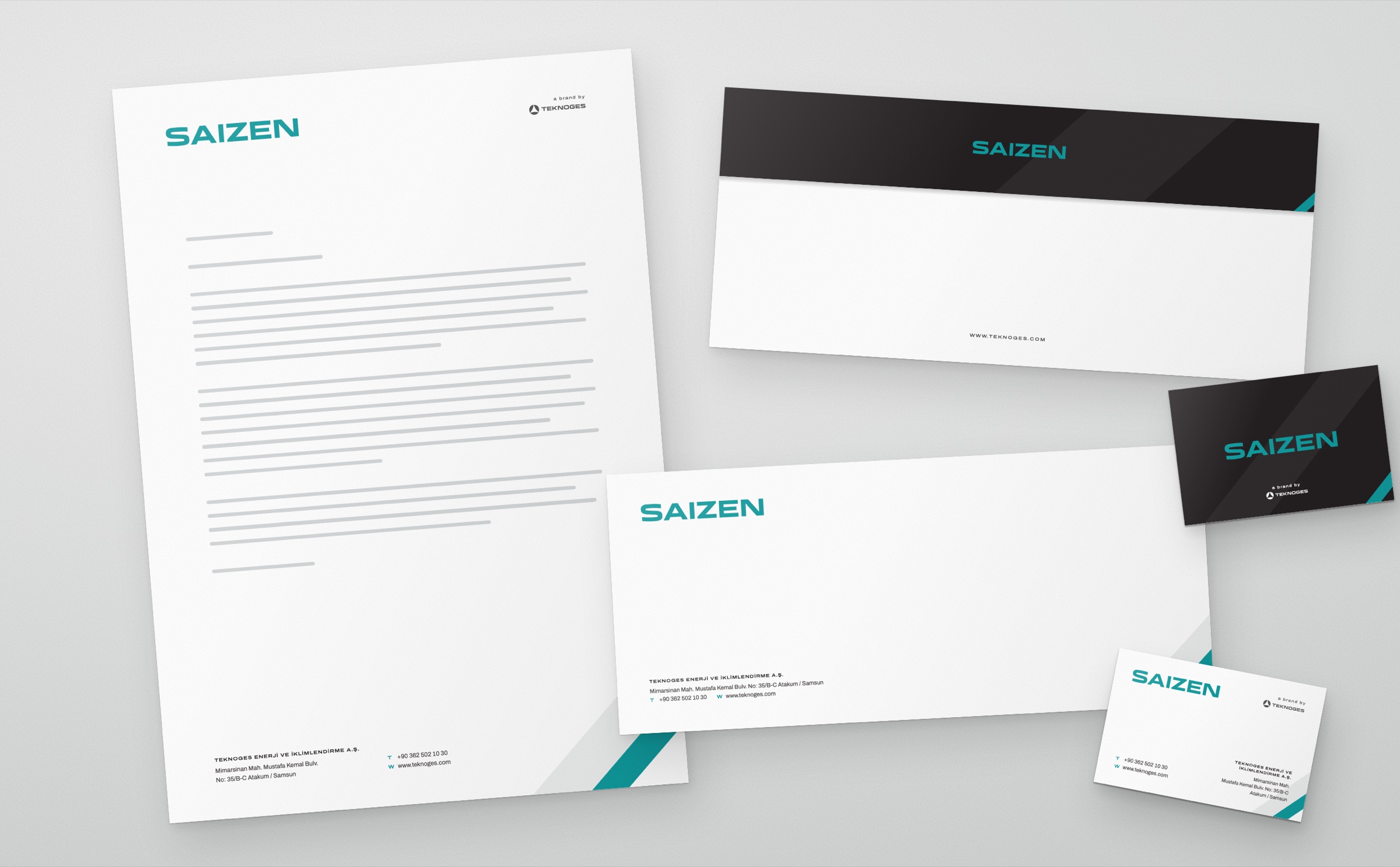
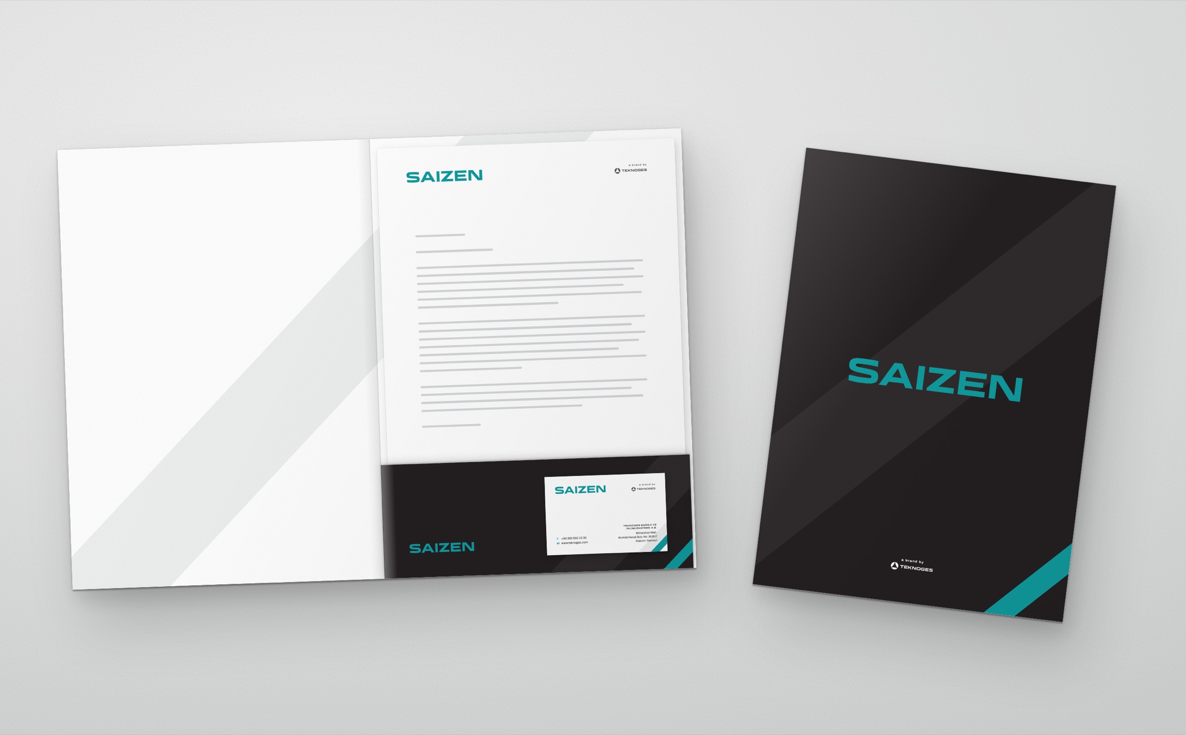
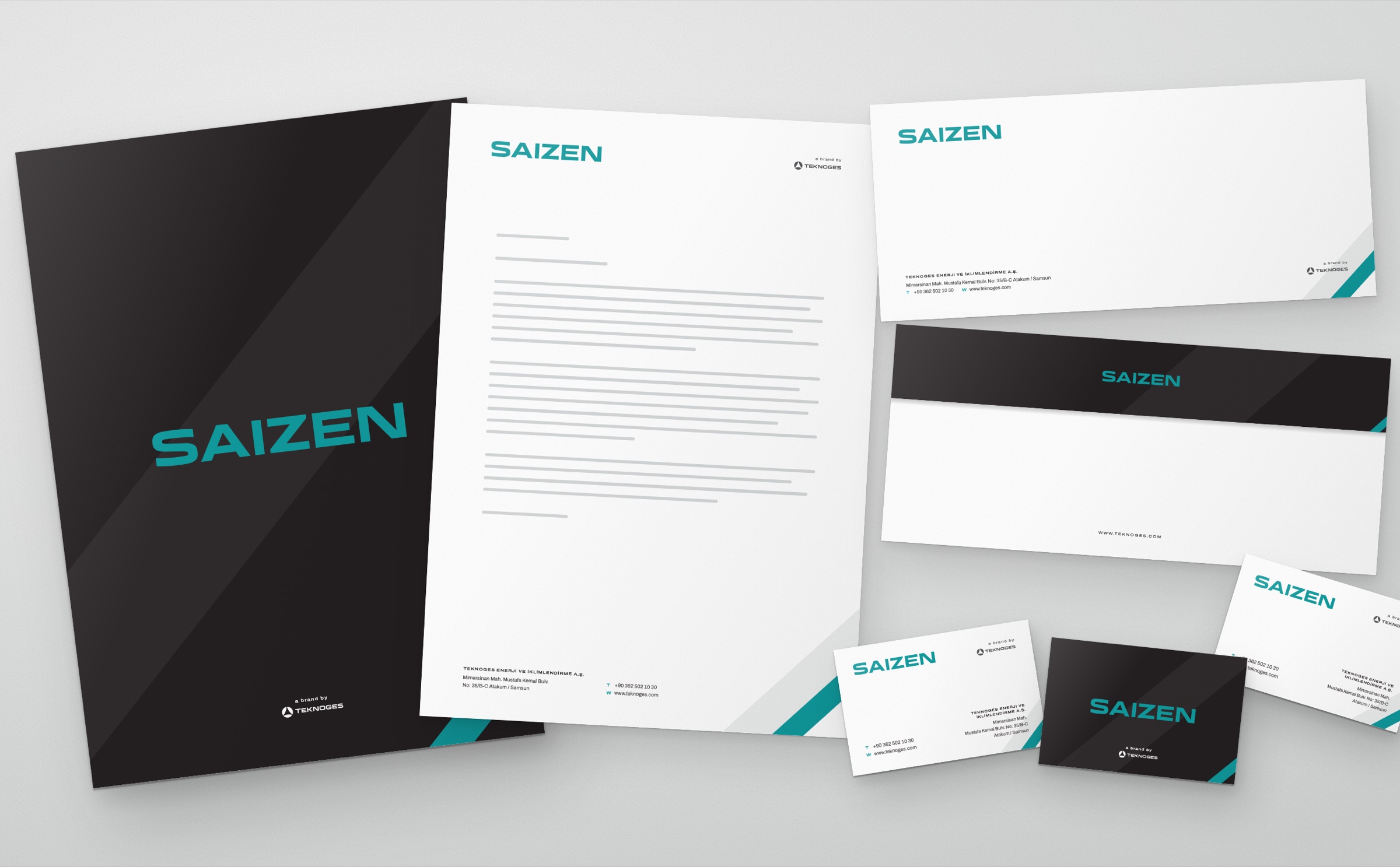
Saizen is the air conditioning brand of the Samsun-based Teknoges group. In 2026 we designed the brand's logo and corporate identity: business card, letterhead, envelope, presentation folder and email signature. The identity is part of the same system as the parent brand Teknoges.
Challenge
An air conditioning brand had to carry an identity of its own while showing that it belongs to the same family as its parent brand.
Saizen products reach end users, dealers and service teams. The brand's own name had to lead; that it belongs to the Teknoges group had to be stated quietly but legibly on every surface.
Goal
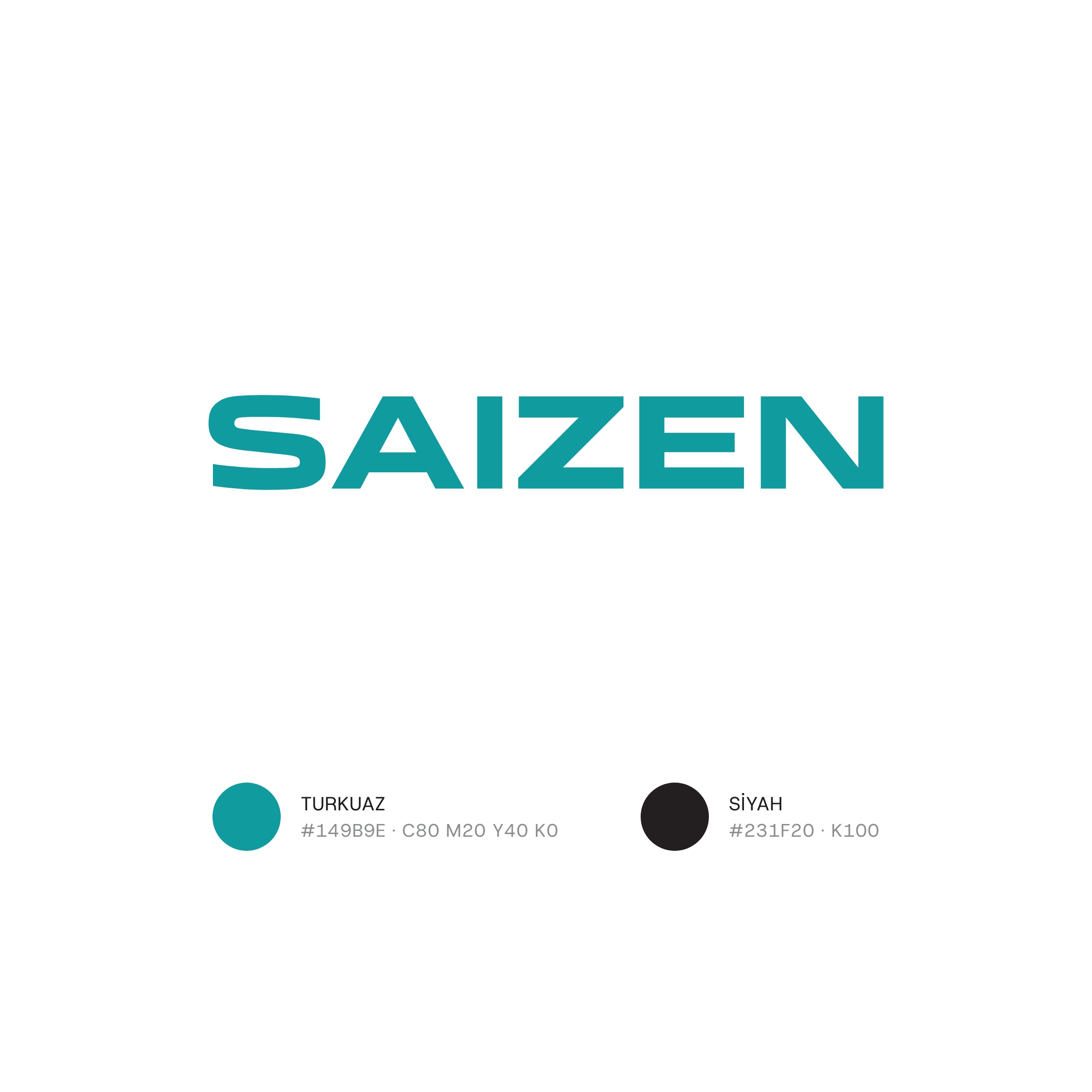
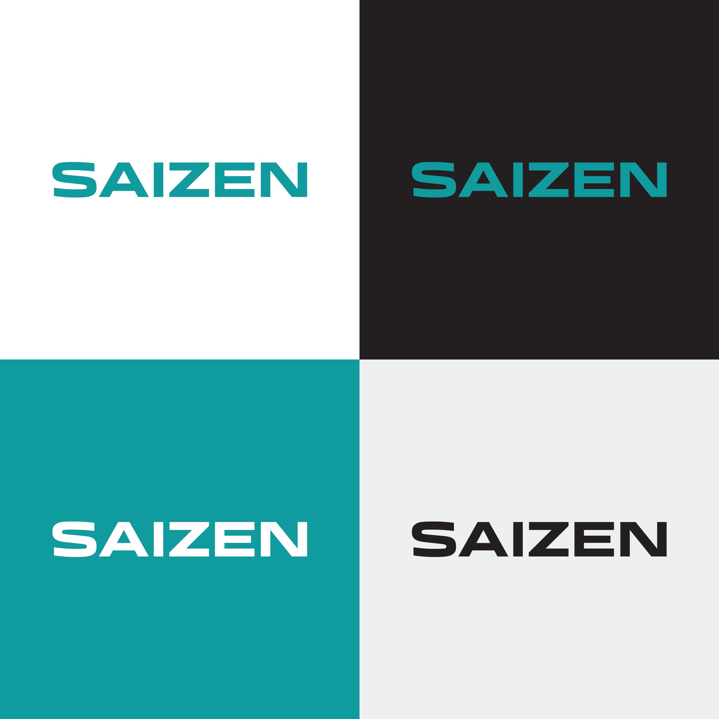
The logo is type only: SAIZEN in wide, angular letters.
The letters are kept wide; the 45-degree diagonal of the Z is the logo's most distinctive line. The logo is turquoise, and the identity's dark ground is anthracite.
Result
The diagonal of the Z became the identity's motif.
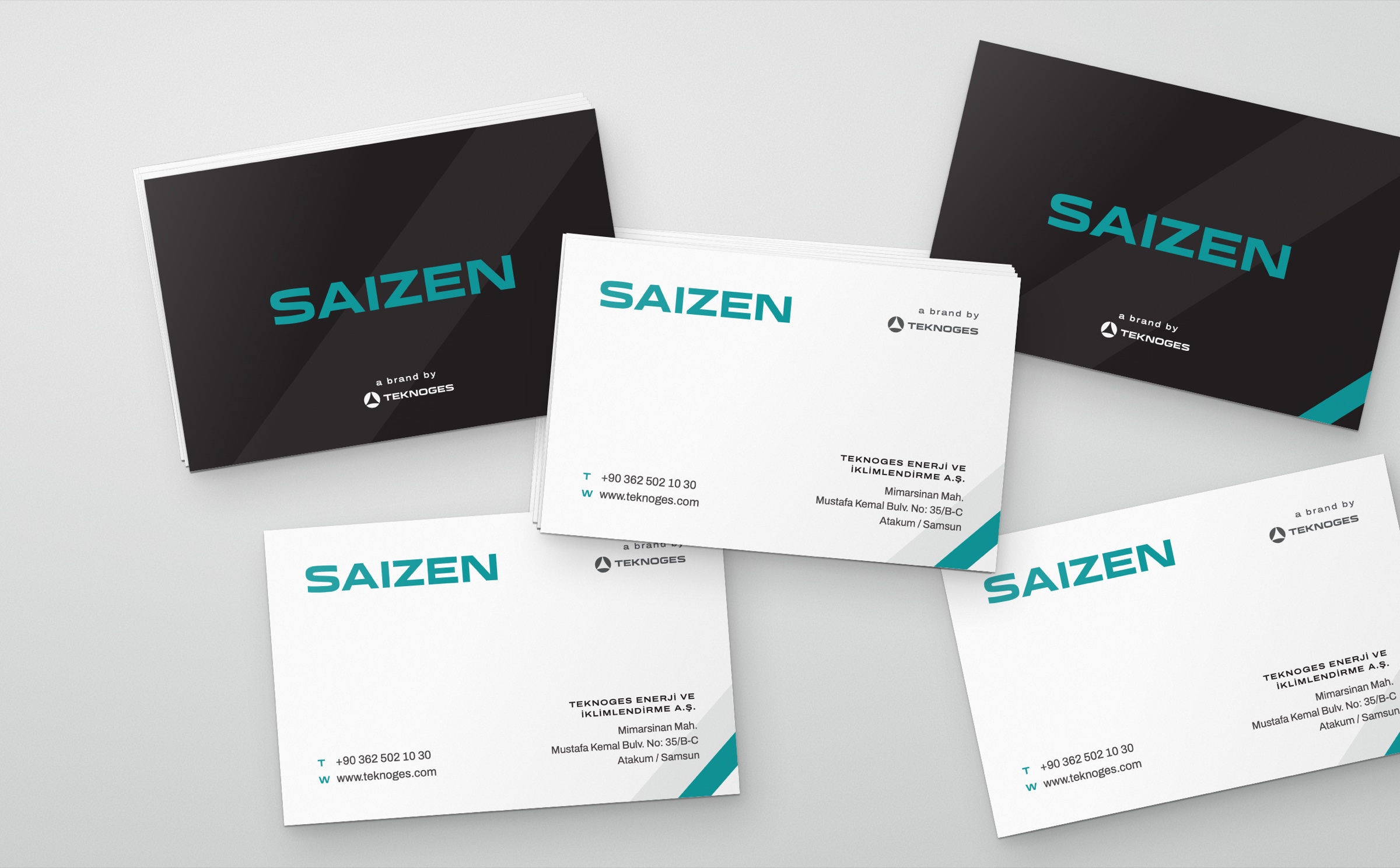
In the corners of the business card, letterhead, envelope and folder, 45-degree turquoise and grey bands continue the slant of the Z. The back of the business card and the folder are dark anthracite, where the logo stays turquoise. The Teknoges logo appears with “a brand by” in the same position on every surface. In the logo animation a 45-degree band crosses the frame and leaves the word SAIZEN behind it.
Launch Similar Project