TechnoCharge
An emblem built from the letters T and C, and a corporate identity, for TechnoCharge, the electric vehicle charging brand of the Teknoges group.
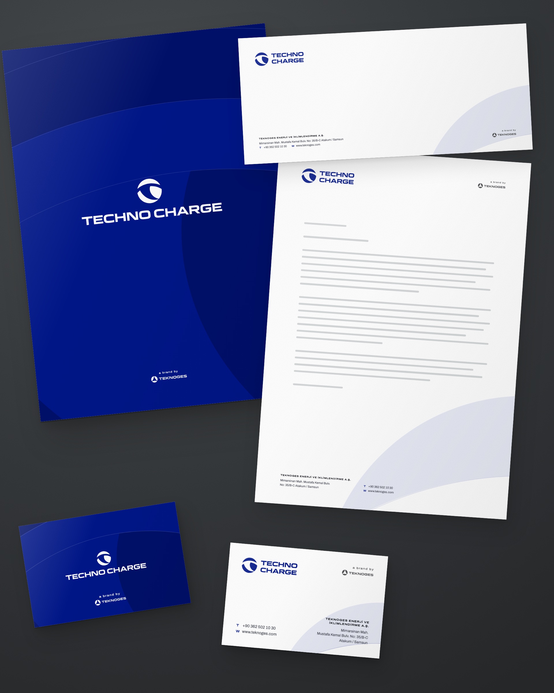
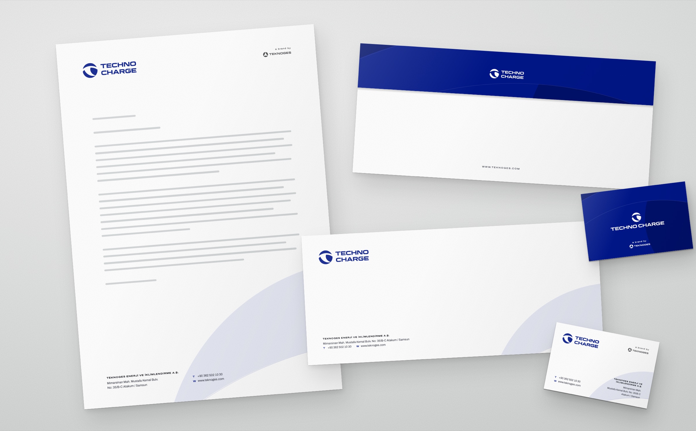
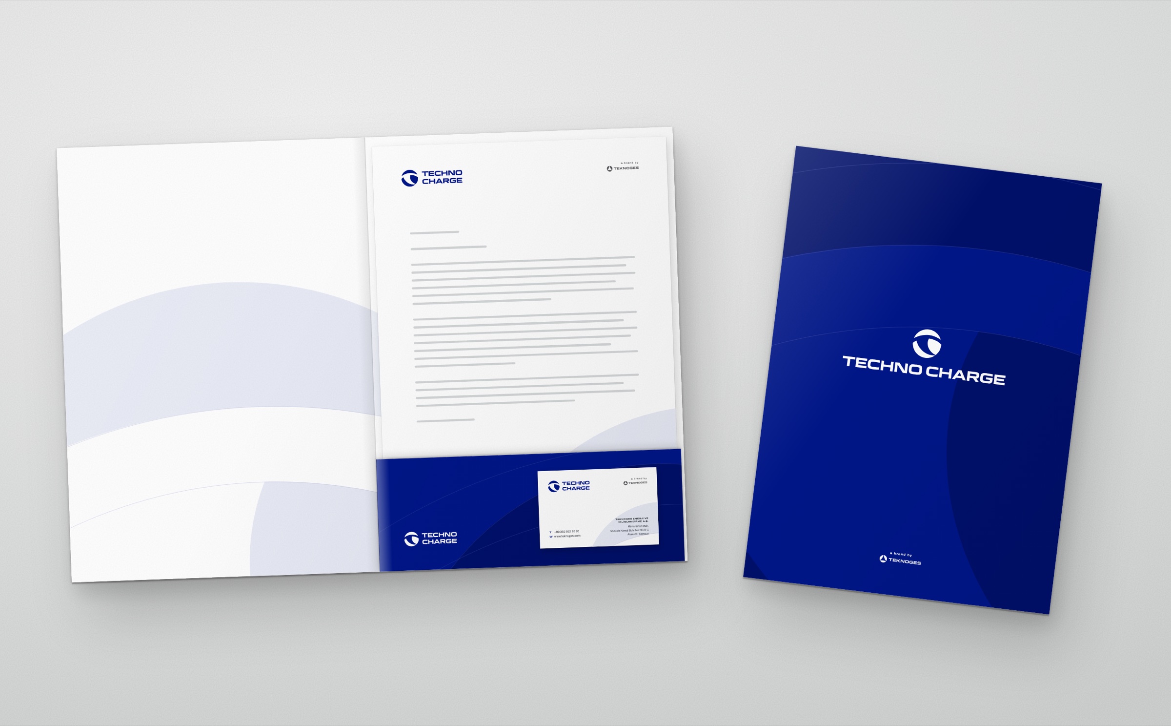
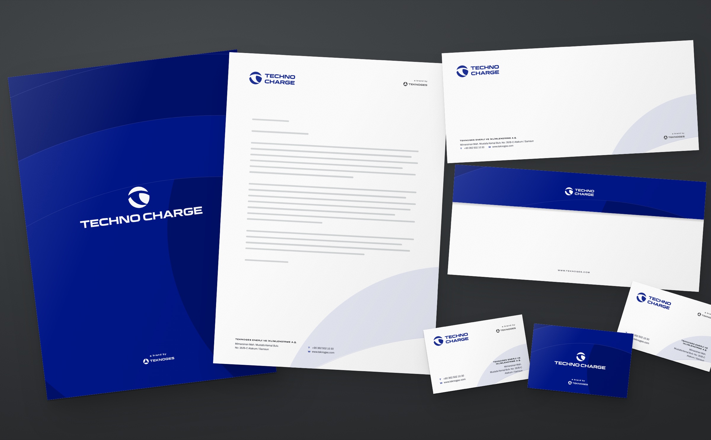
TechnoCharge is the charging brand of the Samsun-based Teknoges group: it makes and installs electric vehicle charging products, from home units to motorway stations. In 2026 we designed the brand's logo and corporate identity: business card, letterhead, envelope, presentation folder and email signature.
Challenge
An engineering brand that makes charging technology needed a mark that is both technical and memorable.
TechnoCharge products stand at very different scales, from a home garage to the side of a motorway. The mark had to be recognisable on the product body, on the station and at small sizes on paper.
Goal
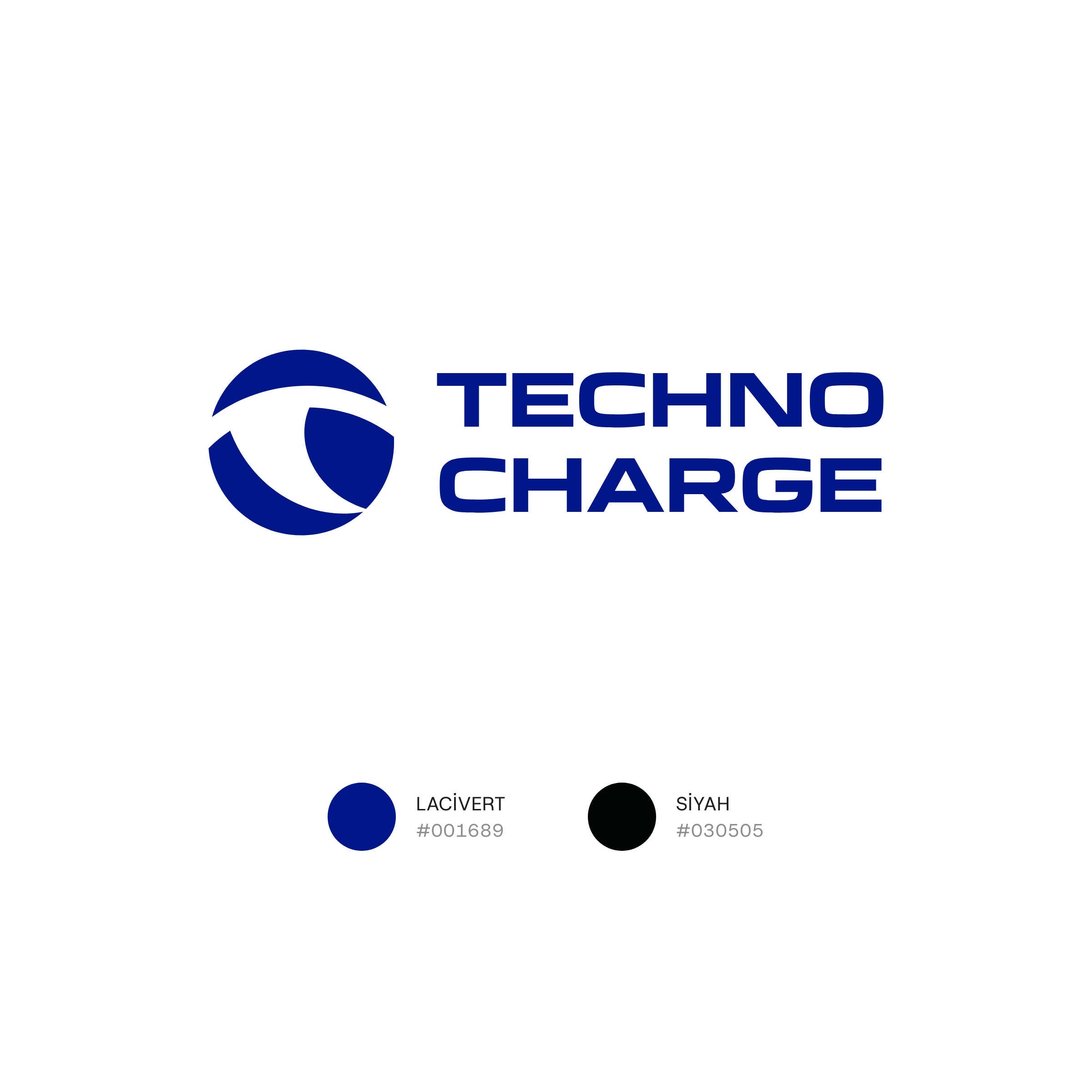
The emblem is made of the brand's initials: T and C.
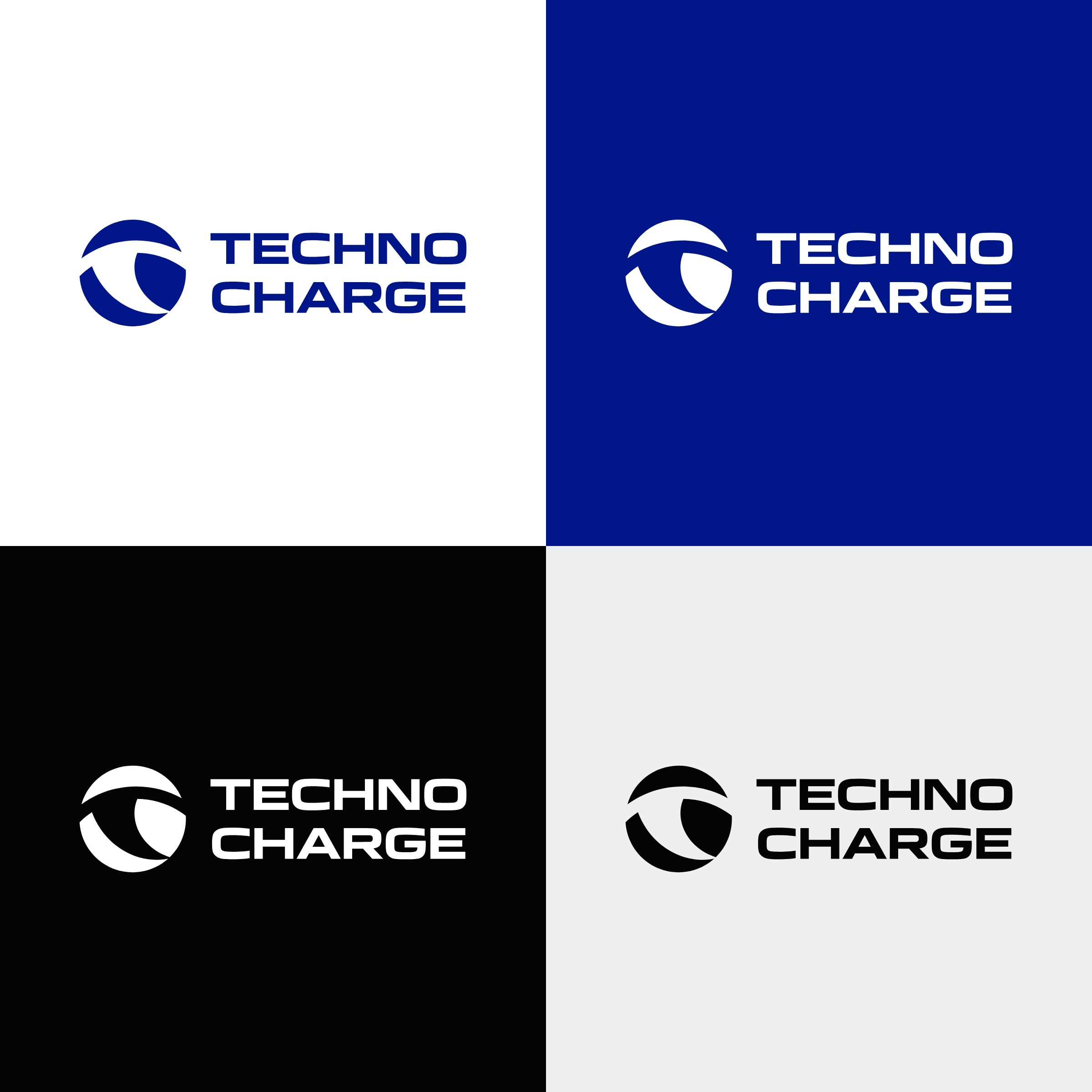
The two letters merge into a single circular form. The emblem's successive arcs speak of energy, motion and sustainability. The colour is a deep navy.
Result
The emblem's arcs grew into the identity's motif.
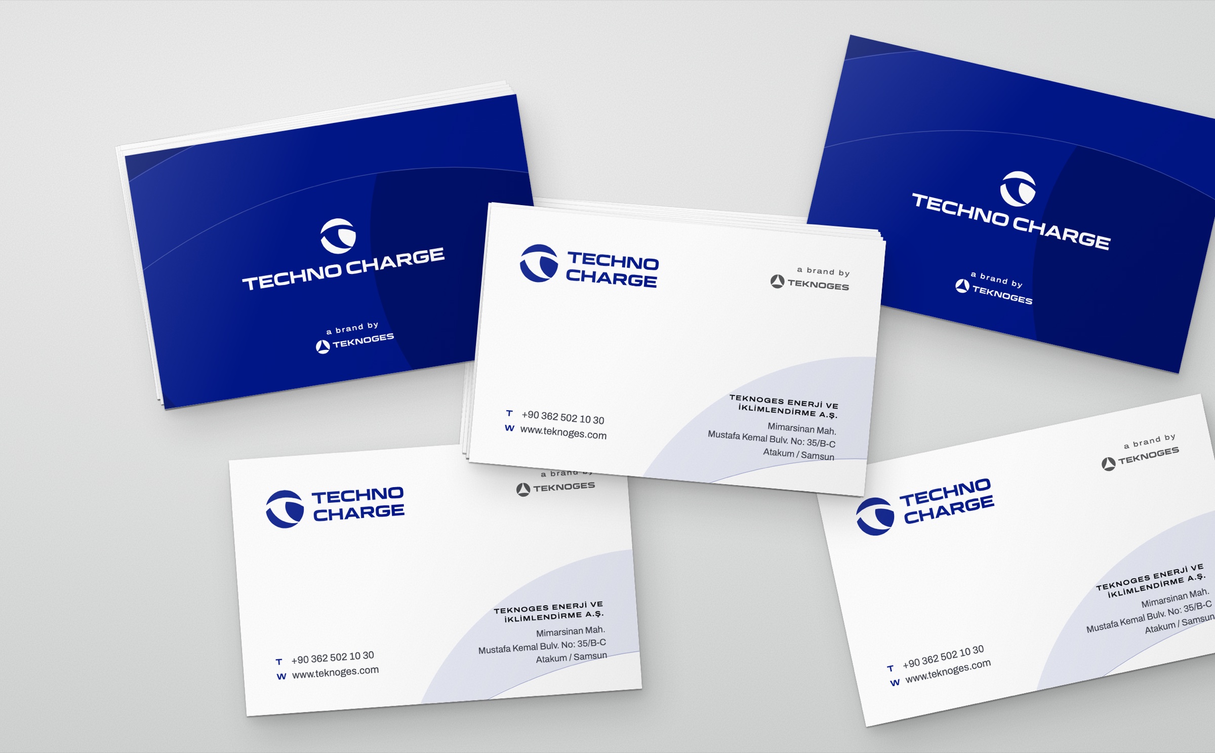
On the business card, letterhead, envelope and folder, the emblem's arcs are enlarged and spread across the page as a pale navy pattern; the back of the business card and the folder are navy. The Teknoges logo appears with “a brand by” in the same position on every surface. In the logo animation the emblem appears by filling around its centre like a charge indicator.
Launch Similar Project