Skylar Group
For Skylar Group, managing a wide-ranging ecosystem spanning health tourism to dermocosmetics, visa consultancy to publishing, we brought to life a prestigious visual identity reflecting the brand's global vision, innovative spirit, and corporate credibility.

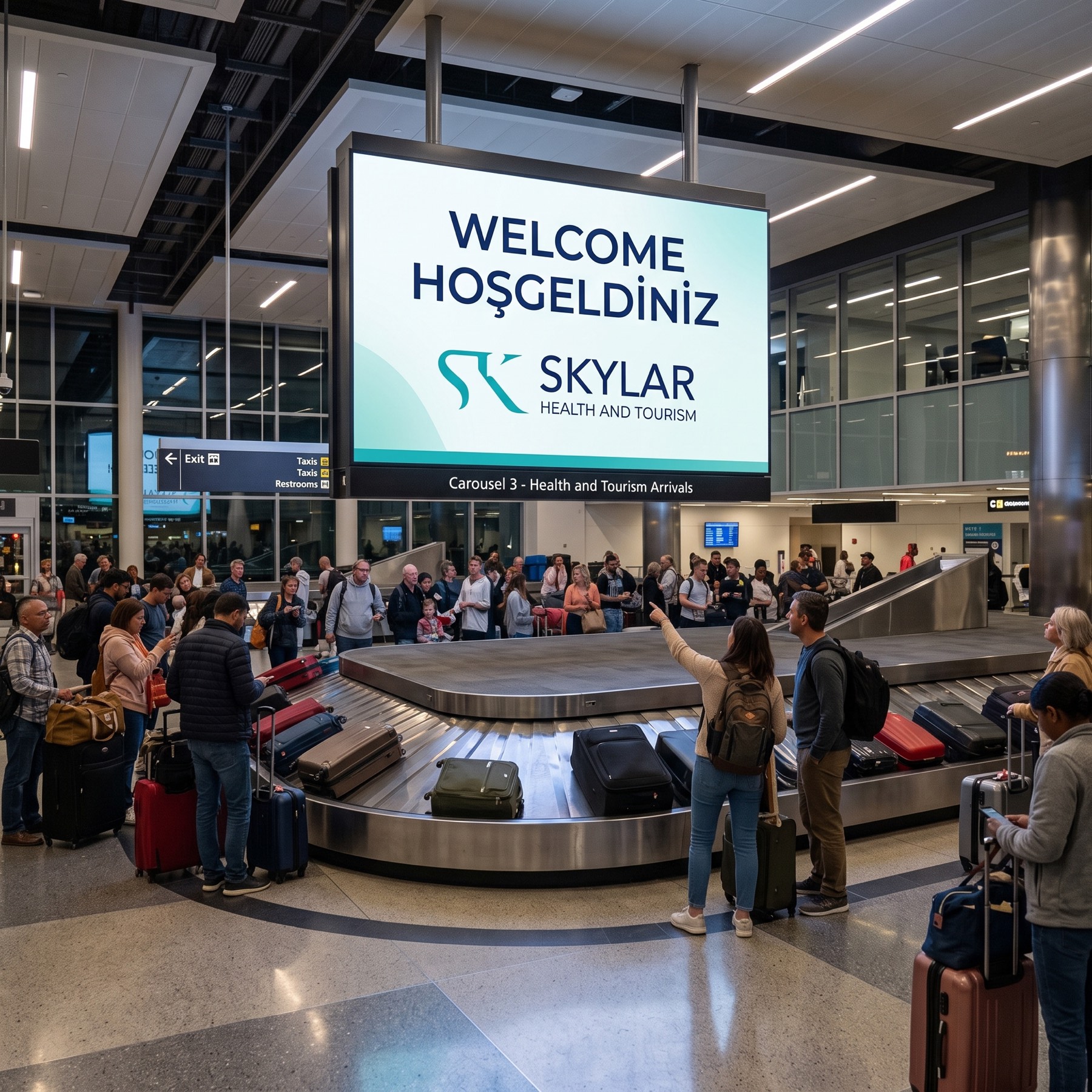
With this design gathering the group's expertise across different sectors under one aesthetic umbrella, we emphasised the brand's driving force — particularly focused on "Health and Tourism" — with modern elegance.
Challenge
The core challenge on this project was bringing together, in one visual language and without clutter, a sterile, trust-focused field like healthcare with dynamic, aesthetic, experience-focused sectors like tourism, cosmetics, and consultancy.
The brand needed to convey both a sense of medical authority and the fluidity and elegance of travel and lifestyle brands. Moving beyond conventional monogram patterns in integrating the letters "S" and "K" carrying the brand's name, to create a form that was memorable, universal, and original in the global market, was the most critical threshold in the design process.
Goal
Our main goal was to build a universal, fluid, trust-inspiring umbrella identity embracing Skylar Group's multi-layered structure.
We aimed for the emblem born from the brand name's initials to have an organic flow symbolising healing, an uninterrupted journey of service, and aesthetics — while the typography would balance this organic emblem, adding corporate weight, solidity, and clarity to the logo.
Result
The letters "S" and "K" were integrated into each other with elegant, organic, stylised lines.
The resulting curved, uninterrupted structure flawlessly symbolises the never-ending journey in tourism and the aesthetic transformation in health and cosmetics. A strong contrast and sectoral harmony was struck by bringing together an energetic teal — representing health, vitality, healing, and freshness — with a navy representing corporate authority, professionalism, and deep trust. The clean, balanced, sans-serif typeface chosen for the "SKYLAR" logotype brought the brand's modern, accessible, visionary stance to the forefront.

Launch Similar Project