N Uysal Yapı
We redefined the corporate brand vision of N Uysal Yapı — one of the well-established and widely recognised construction firms in Aydın's Çine district — with a modern, prestigious visual language.
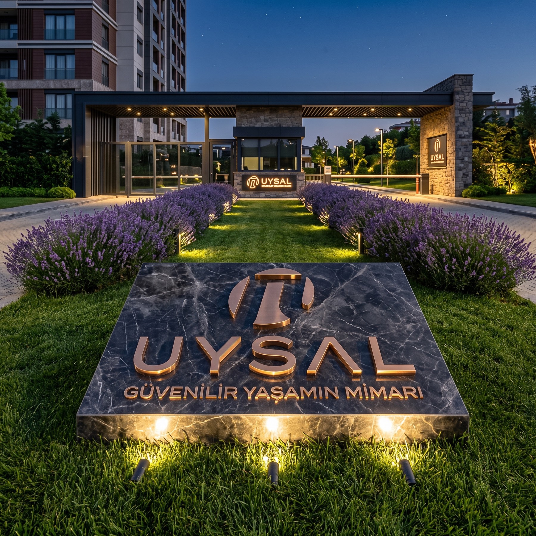
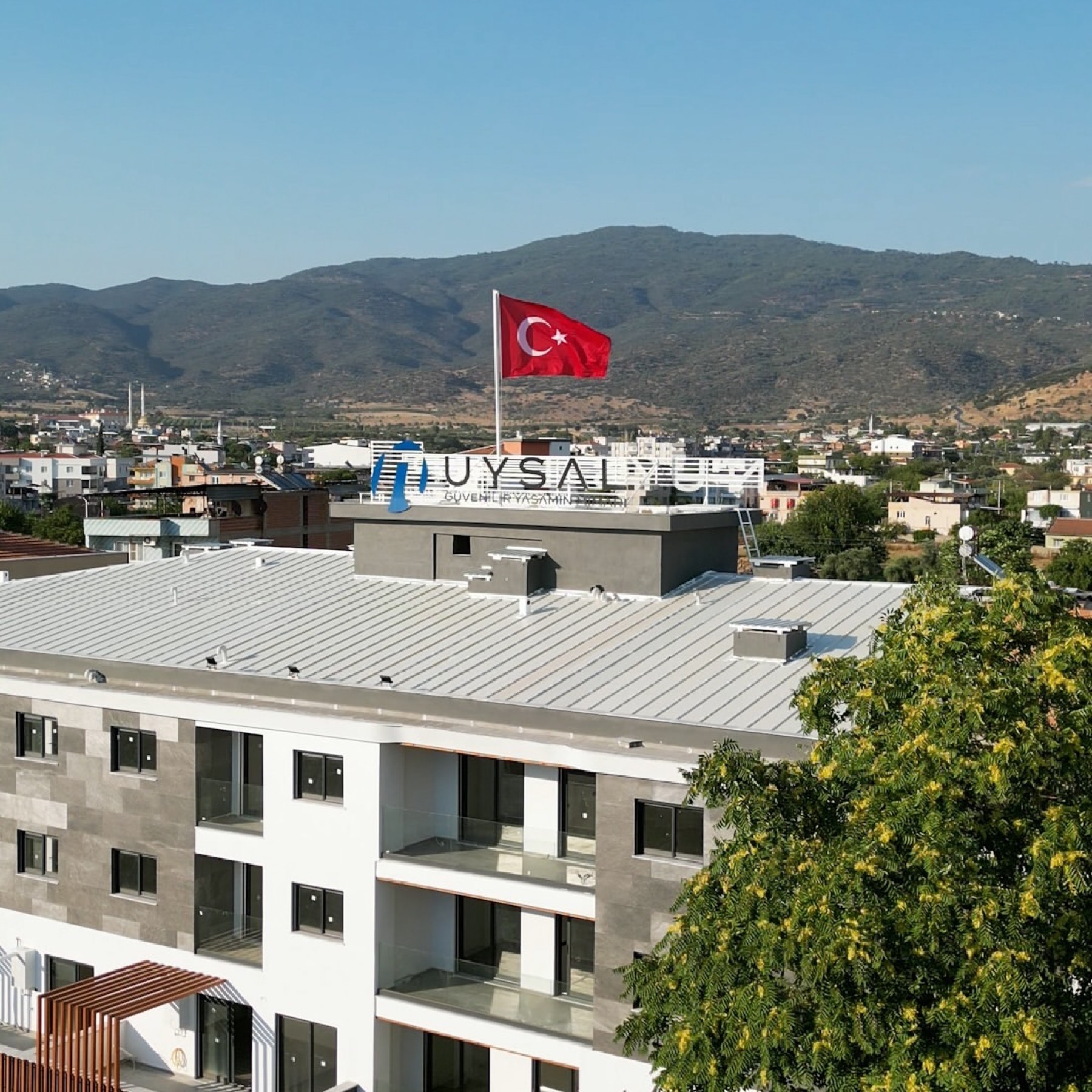
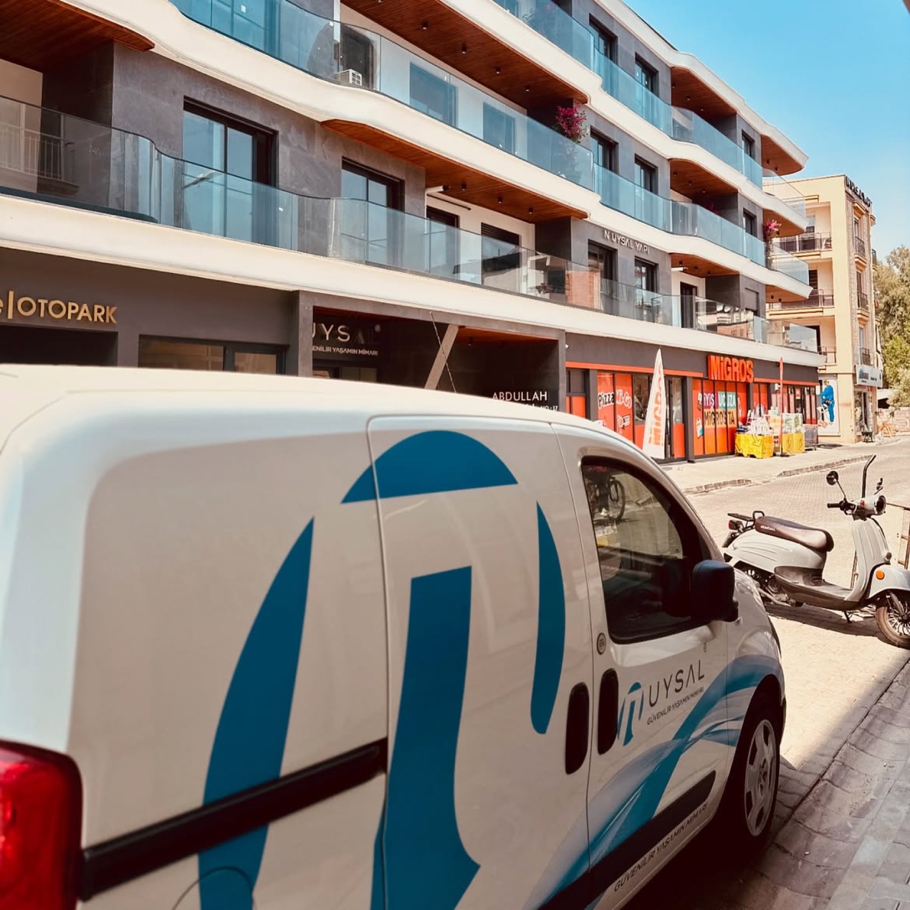
We successfully brought to life a new logo identity carrying the company's trust-based, strong past into the future, iconifying the slogan "The Architect of Trustworthy Living".
Challenge
The core challenge was elevating the company's corporate perception to a competitive, prestigious, trustworthy level within the modern construction and living-spaces market, without shaking N Uysal Yapı's existing strong recognition in the region.
It was necessary to present the company's stability, its modern architectural understanding, and "trust" — the core value proposition in the slogan — through a unifying visual language, without entirely erasing the familiar feel of the old identity. A further critical factor was the requirement to create an emblem that would hold strong in single-colour use (presented as white negative space on a blue-grey ground), remaining legible and iconic on every surface — signage, digital, hard hats, and more.
Goal
The project's core goal was to iconify N Uysal Yapı's brand identity with a visual emblem built on the slogan "The Architect of Trustworthy Living".
We aimed to design a cohesive brand face that combined the brand's stability and the quality of the living spaces it offers with modernity and innovation, conveying both a corporate and a warm (living-spaces) feel. Our core priorities were building a clean, strong, prestigious brand perception that stood apart from the cluttered, dated designs in the sector, and providing a timeless visual platform for the company's next-generation projects.
Result
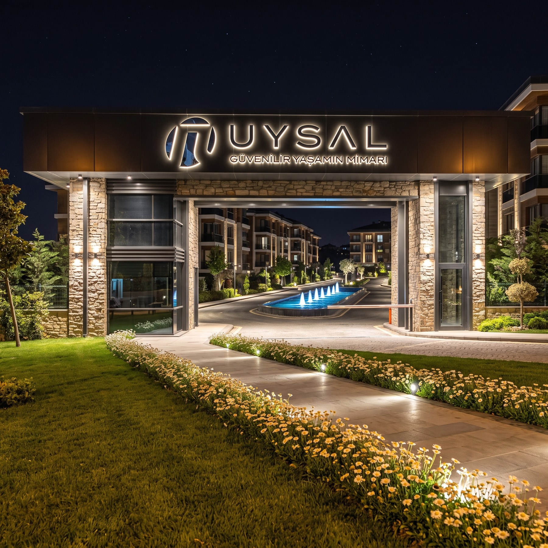
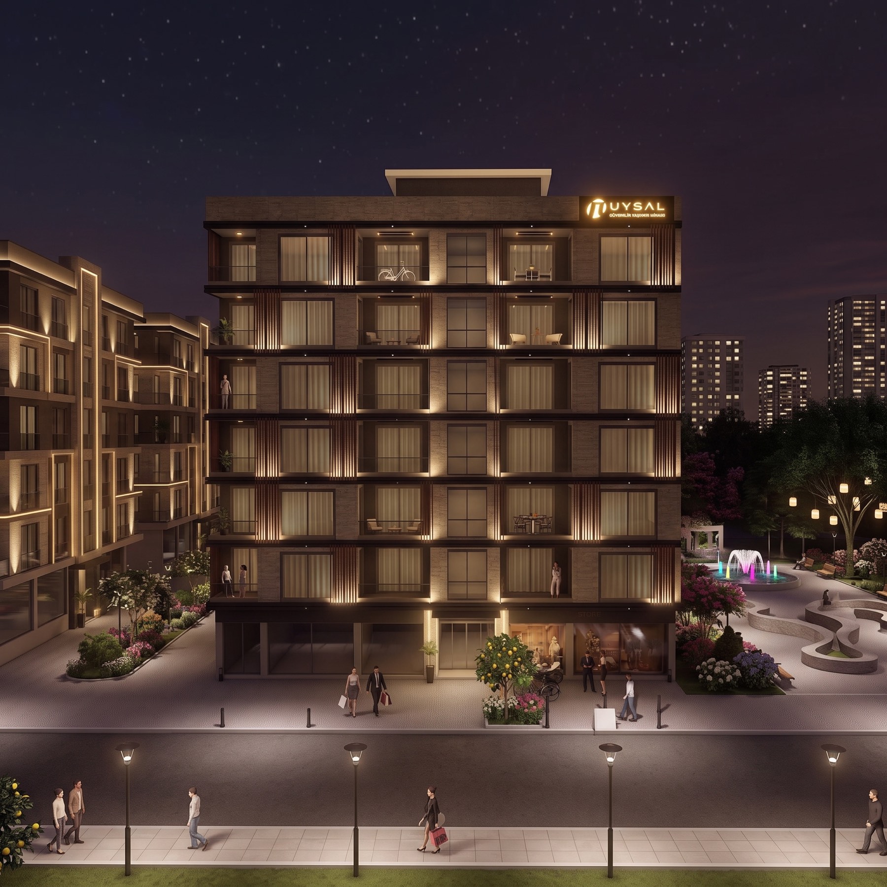
A geometric, symmetrical emblem reminiscent of a portal and strong vertical columns was designed to represent the company's stability, the "gateway" to the living spaces it offers, and its trustworthy structure. This form, evoking an abstract letter "U" and a sense of structural wholeness, visualises the brand's core value. The use of negative space and its symmetrical structure achieved flawless visual balance and a strong brand perception in single-colour white (on a blue-grey ground).
For the "UYSAL" logotype, an open, geometric typeface was chosen to emphasise modernity and clarity. The slogan "THE ARCHITECT OF TRUSTWORTHY LIVING" was placed beneath this logotype in a thinner, complementary typeface, unifying the brand message. The result was a prestigious, trustworthy, iconic logo identity that honours the company's deep-rooted past while positioning it as a modern construction and living-spaces brand. A strong visual platform was provided for next-generation projects, while preserving brand recognition.
Launch Similar Project