Parmin
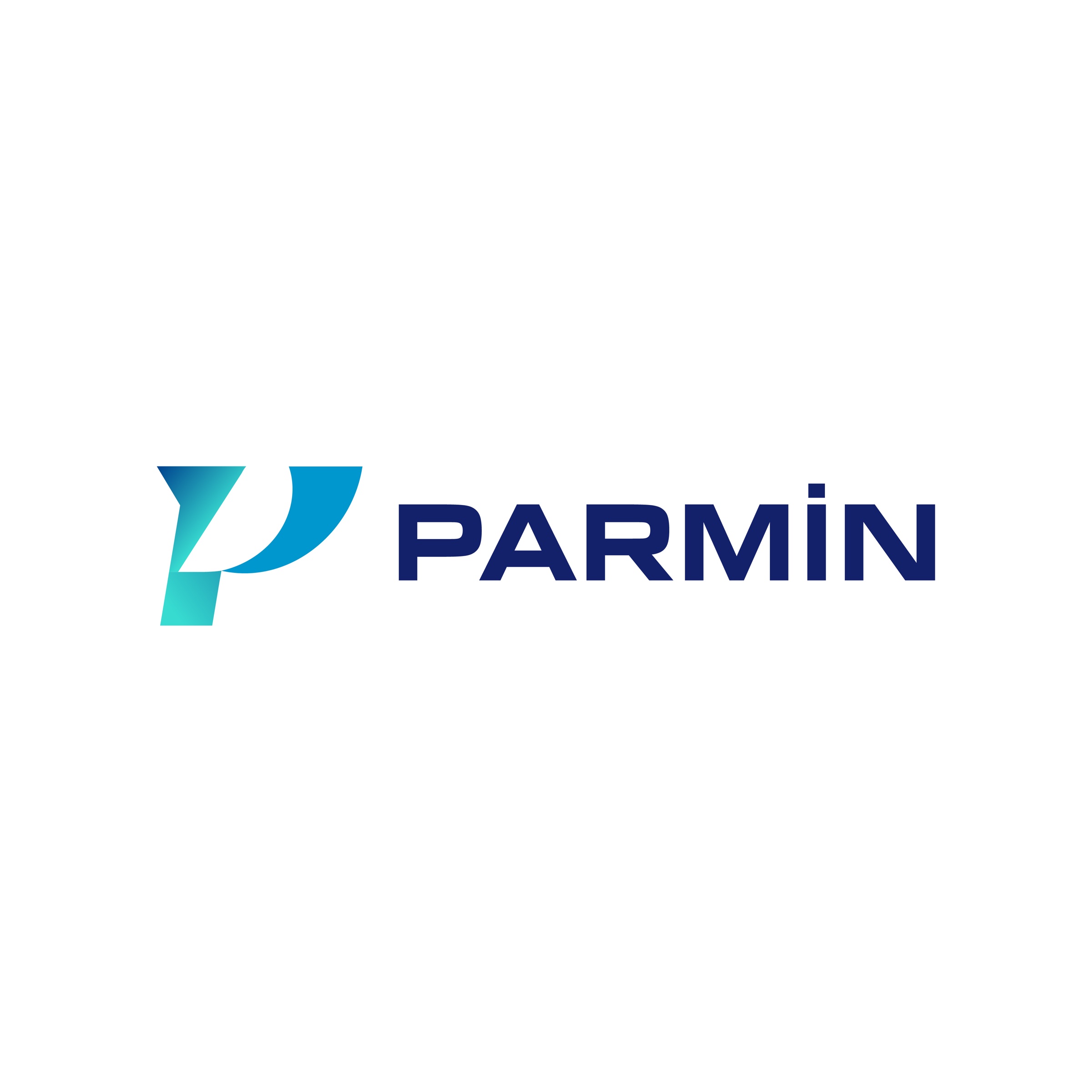
Logo design for Parmin, a platform that brings services and sales, from car washing and carpet cleaning to spare-parts supply, together in a single app.

Parmin is a platform that brings very different services and sales, such as car washing, furniture and carpet cleaning, and spare-parts supply, together in one mobile app. The brand would be seen most often as a small app icon on a phone screen, so we built the logo for that size.
Challenge
Parmin does not belong to a single industry: the person getting their car washed and the person looking for a spare part see the same brand in the same app.
Any symbol pointing to one service, such as foam, a drop or a gear, would have trapped the brand in that field. The logo had to be recognisable without describing any service, and legible in a space as small as an app icon.
Goal
The goal was a mark that starts from the platform's name, stays independent of its services and reads at icon size.
We reduced the symbol to the letter P alone and gave it a sense of speed and movement through the shape of the letter. The typeface follows the same simplicity: uppercase and geometric.
Result
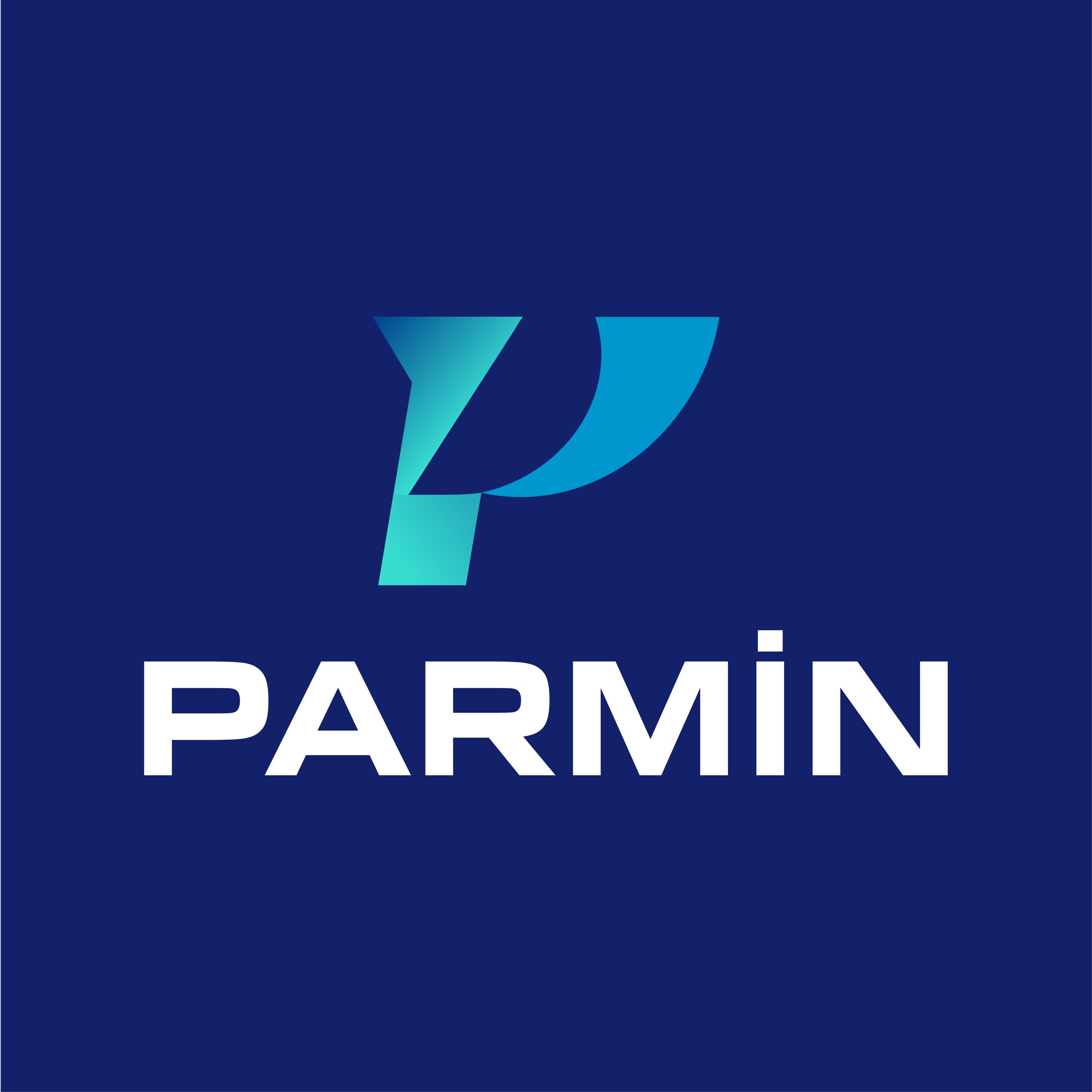
The P is built from two parts: a forward-leaning stem and a curved wing attached to it. The counter of the letter forms naturally in the space between them.
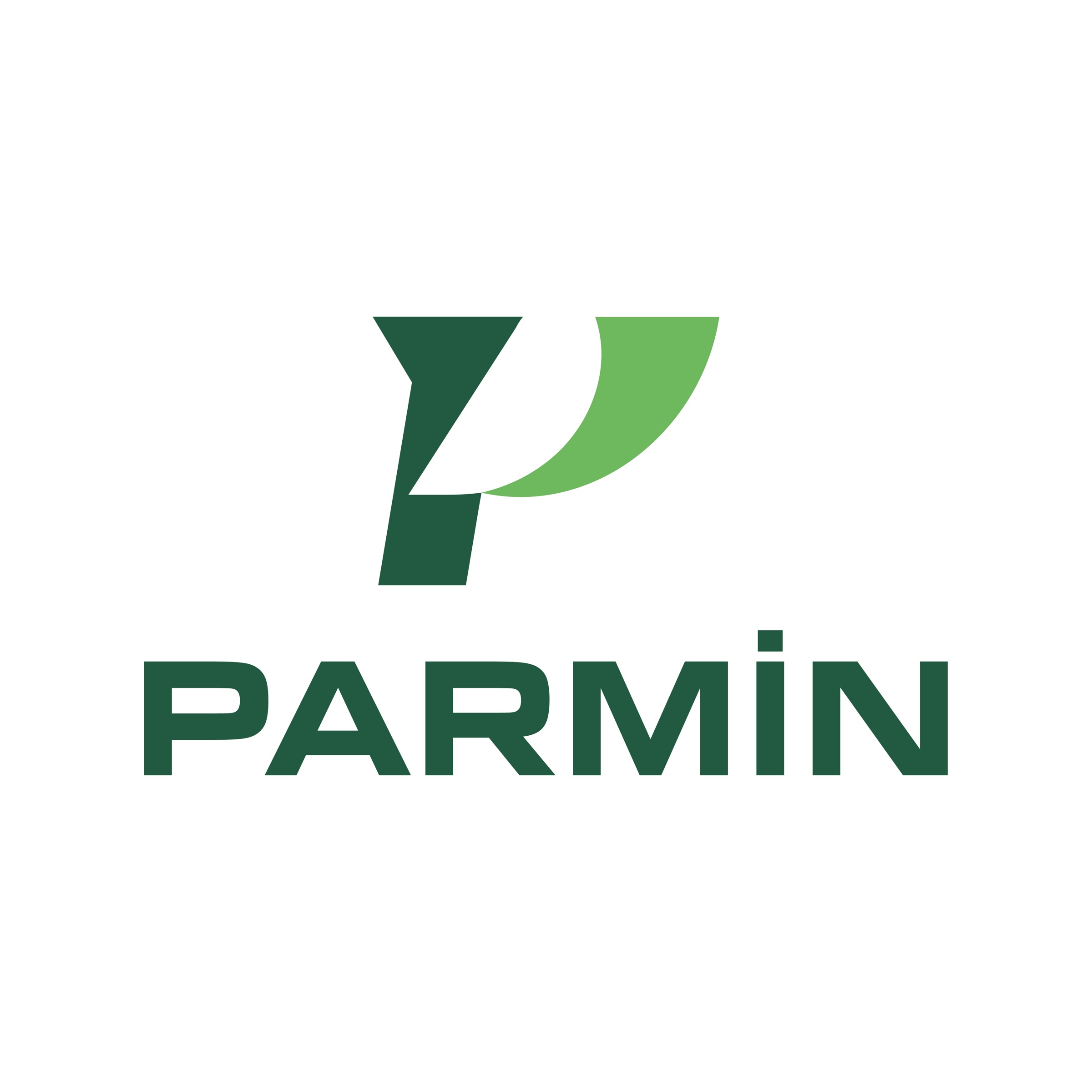
A gradient from turquoise to blue gives the symbol movement; with navy type and backgrounds it forms the brand's blue colour system. The same mark was also delivered in a second system of dark and light green. The logo was prepared in three uses, horizontal, stacked and symbol only, each in light and dark background versions.



Launch Similar Project