Tezel İnşaat
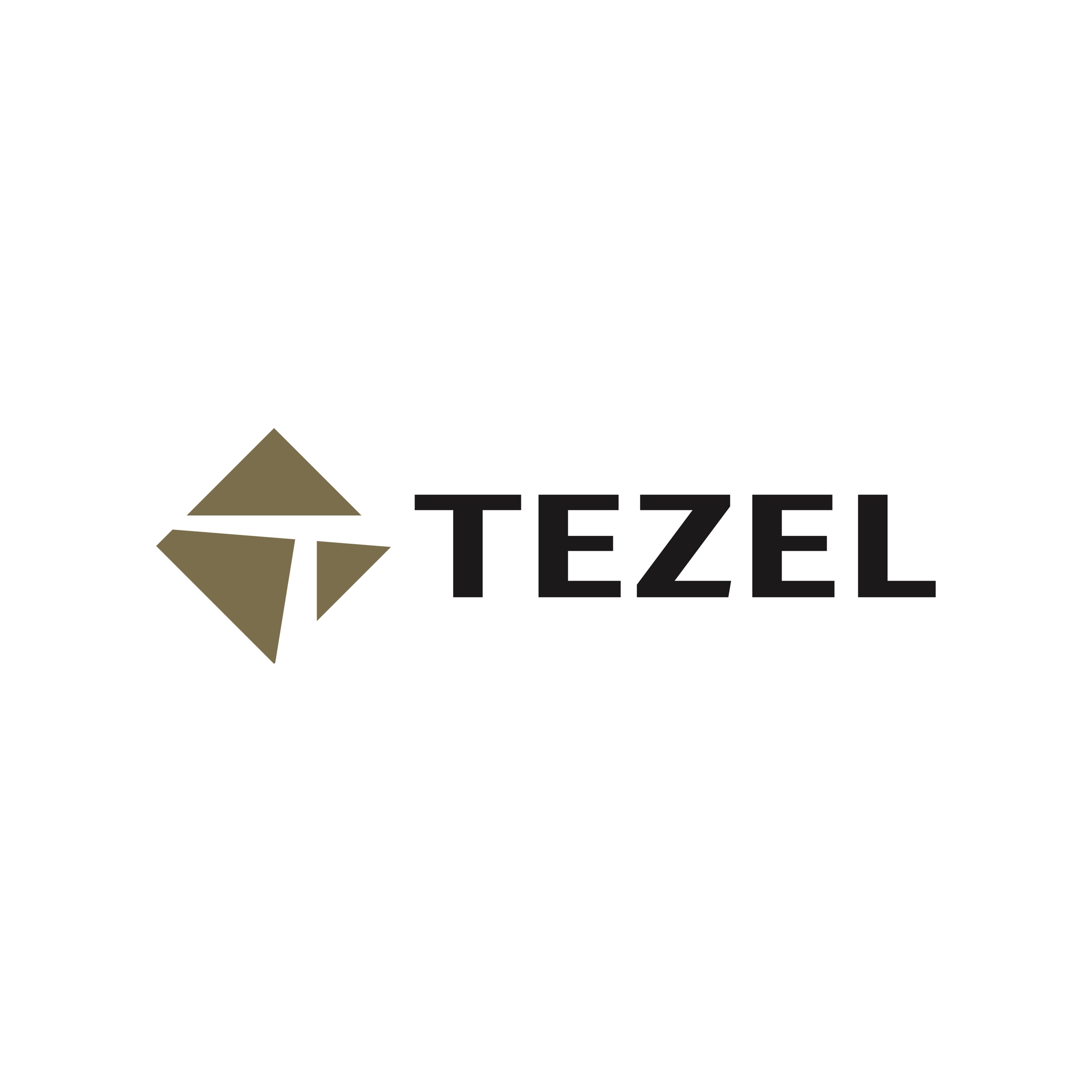
Logo design for Tezel İnşaat, built from three triangles that carry the letter T in the space between them.

We prepared the logo and core usage set for Tezel İnşaat, a construction company. The mark had to read just as clearly, from a distance and in a single colour, on a site-entrance sign as on a letterhead.
Challenge
Construction logos mostly come from the same moulds: a roof, a building silhouette, a crane.
Tezel needed to stand apart from that crowd. Fine lines and multi-colour solutions, meanwhile, disappear on a site sign seen from a few metres away.
Goal
The goal was a mark that speaks of structure without drawing a building, and that works in a single colour.
We started from the triangle, the most stable geometric unit in building. Rather than drawing the letter, we set out to have it read from the space left between the triangles.
Result
The symbol is made of three triangles set inside a square turned 45 degrees; the space between them draws the letter T.
Metallic gold Pantone 871 C and 100% black were chosen as the colours. The logo was delivered as horizontal, stacked and symbol-only versions, in colour, black and white. A sign application showed how the mark looks on site.

Launch Similar Project