Panova
For Panova Window and Door Systems, a manufacturer of the fundamental building blocks of modern living spaces, we designed an original corporate identity that pairs the brand's industry expertise with minimalist elegance.
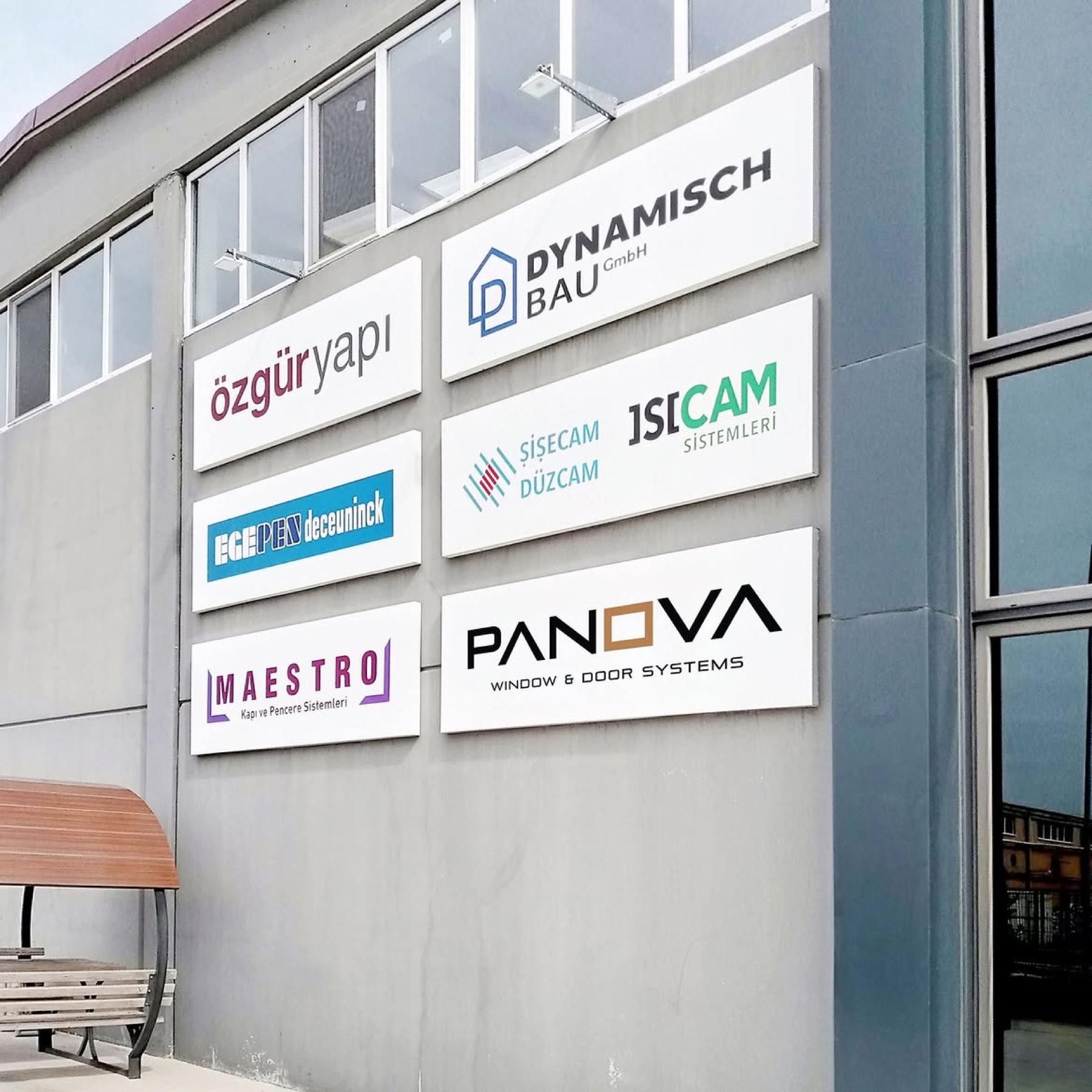
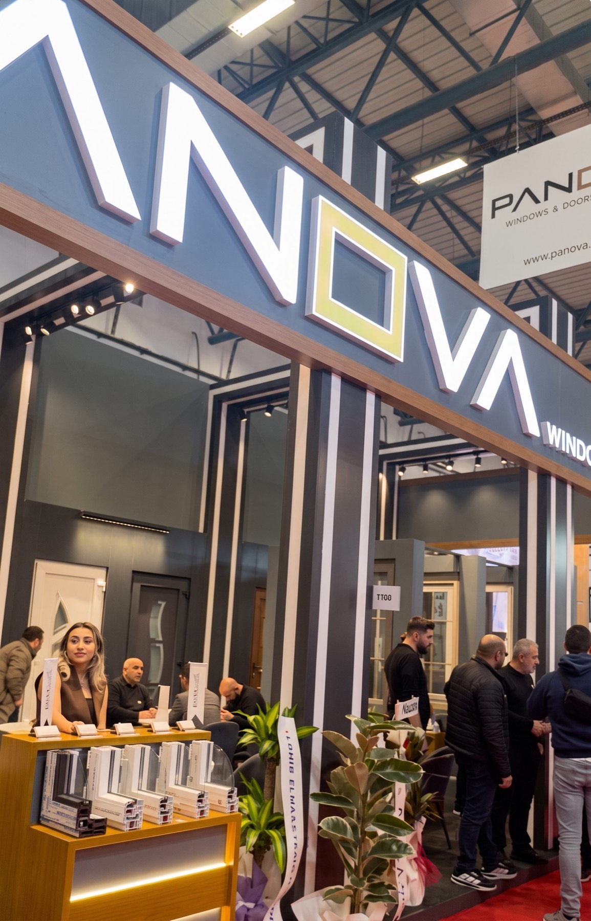
With this visionary logo design uniting functionality and aesthetics in a single typographic form, we translated the brand's innovative stance into a direct, memorable visual language.
Challenge
The greatest design challenge in brand identities for the construction and joinery sector is that, when symbolising concrete objects like windows or doors, the design tends to fall into clumsy, cluttered, or overused clichés (roofs, houses, classic window illustrations).
Our core test on this project was to find a corporate formula that could directly reflect the company's physical systems (windows and doors) without burying that reference in an extra emblem — presenting it instead within an extremely modern, understated, premium architectural elegance.
Goal
Our main goal was to create a minimalist, "self-explanatory" logotype by turning the typographic structure within the brand name itself into a strategic communication tool.
Along these lines, we focused on the letter "O" at the exact centre of the word "Panova" as a point of balance — aiming to convey the brand's area of expertise to its audience in a chic, modern construction, with no need for any extra detail.
Result
The design process resulted in a contemporary identity, stripped of every unnecessary line, with an architectural character.
The letter "O" in the brand name was taken out of its traditional round nature and transformed into a sharp, gold/bronze-coloured square form representing a window and a door. Placed at the exact centre, this distinctive form became a powerful and clever nod to the company's core product range (window and door systems). The letters "A" and "V" within the name were reduced to linear, triangular forms (missing their crossbars), reinforcing the visual weight of the square "O" at the centre. This typographic intervention gave the design an aerodynamic, modern, technological flow. Positioned at the centre of the sharp black typography, the premium square form — understated yet assertive — created the impression of a modern, chic, architectural brand that adds value to projects, rather than an ordinary industrial or manufacturing company.
Launch Similar Project