Şahin Soğutma
The logo we designed for the Şahin Soğutma brand brings together trust, flow, and technical precision in cooling technology within a minimal form.
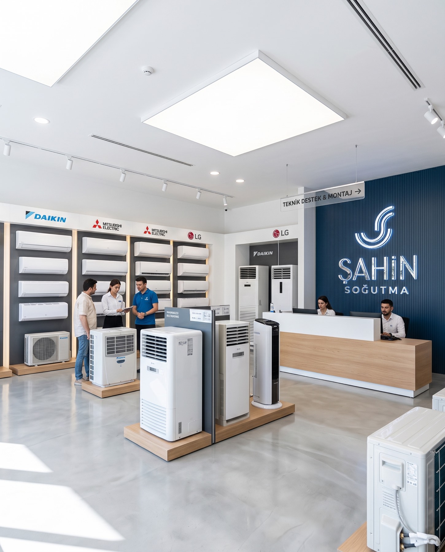
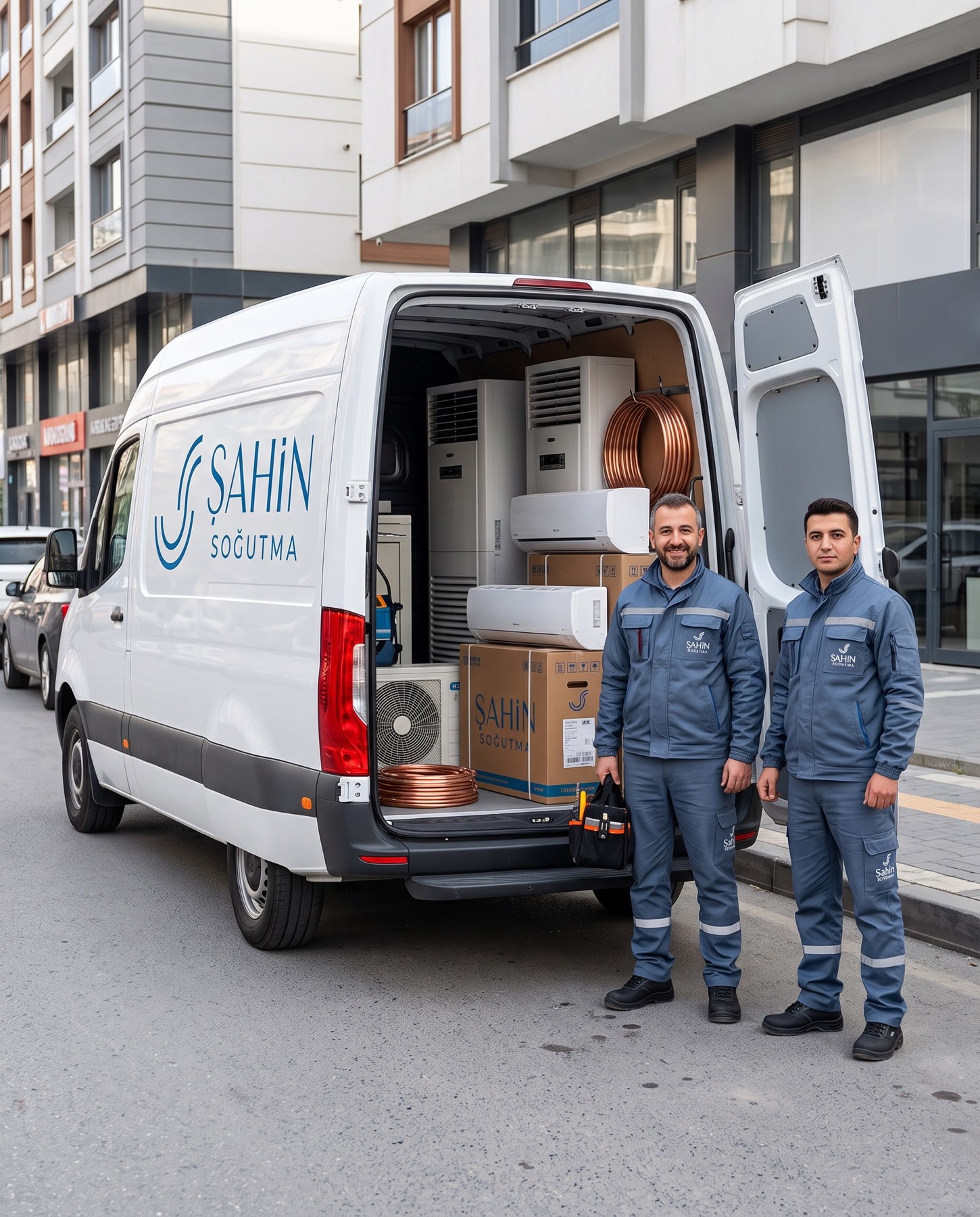
The abstract "S" form represents both the brand's initial and the controlled circulation of the fluid — air, water, or refrigerant gas — within cooling systems.
Challenge
The core design challenge was to break away from the sector's traditional, formulaic iconography (snowflakes, wind lines, and the like) and find an original form that reflects the brand's technical expertise and dynamic structure.
It was necessary to translate the complexity of thermodynamic flow in air conditioning and cooling systems into a clean, modern, aesthetic plane without losing engineering rigour.
Goal
Our goal was to design a modern monogram that renders the controlled circulation of air, water, and refrigerant gases in an abstract form while integrating seamlessly with the brand's initial, the letter "S."
The logo's double curved lines express air circulation and thermodynamic flow. On one hand these lines convey the cooling system's internal circulation; on the other, continuity and engineering precision. We aimed to create a universal emblem in which the upper curve's outward motion symbolises efficiency and the lower curve's inward structure symbolises energy balance, while the chosen cool blue tones standardise a sense of hygiene, technology, and trust at a corporate level. Bringing these two elements together produced a modern monogram narrating the "cooling cycle."
Result
The result is a contemporary, technical brand identity in which engineering precision meets aesthetic vision.
Supported by geometric typography that balances strong, confident capitals with a fine-weight lettering conveying attention to detail, this minimal design builds a timeless visual perception that powerfully represents Şahin Soğutma's professional standing and innovative vision in the sector.
The capital letters used in the word "ŞAHİN" represent strength and confidence, while the finer, smaller-point lettering in "SOĞUTMA" represents technical expertise and attention to detail.
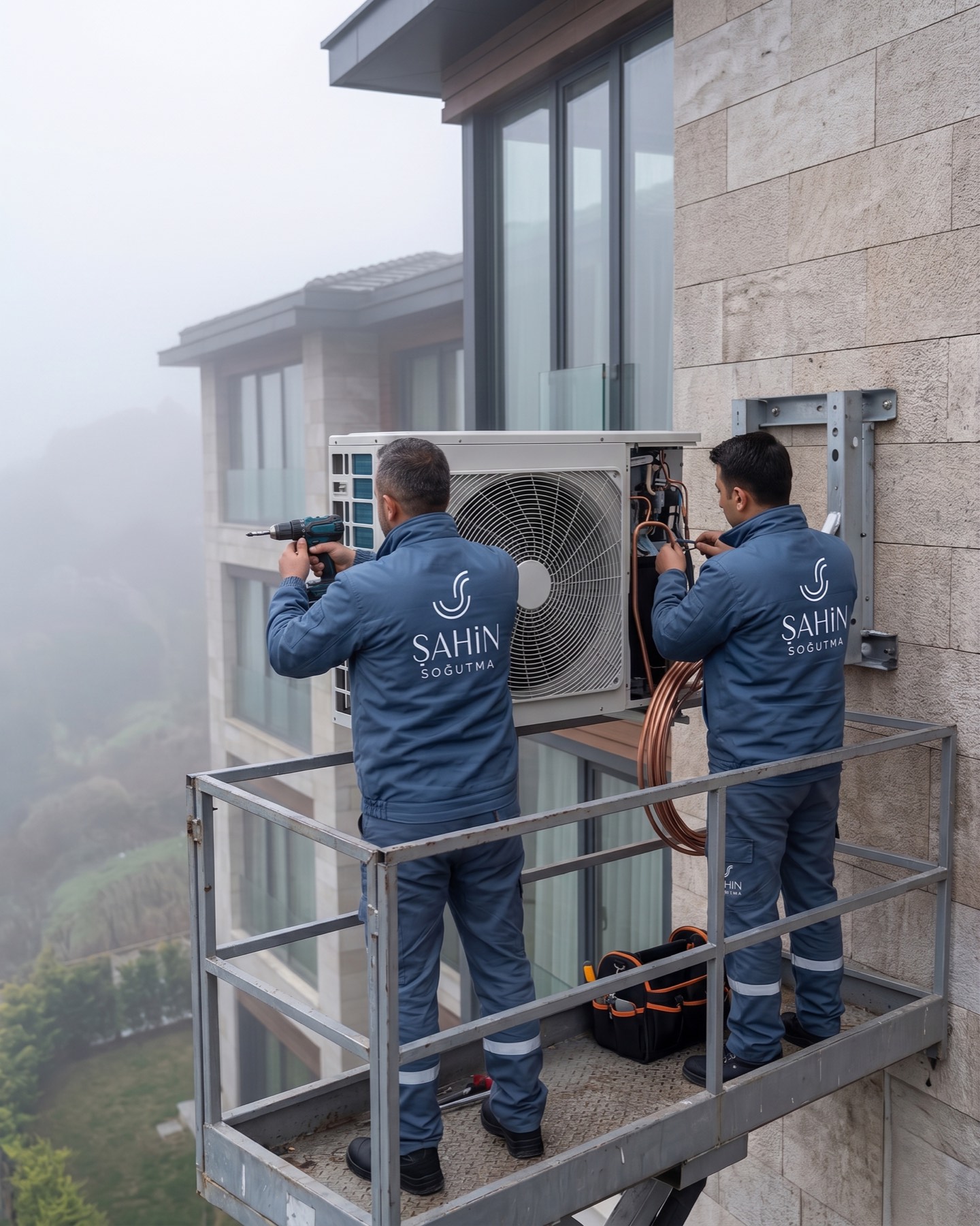
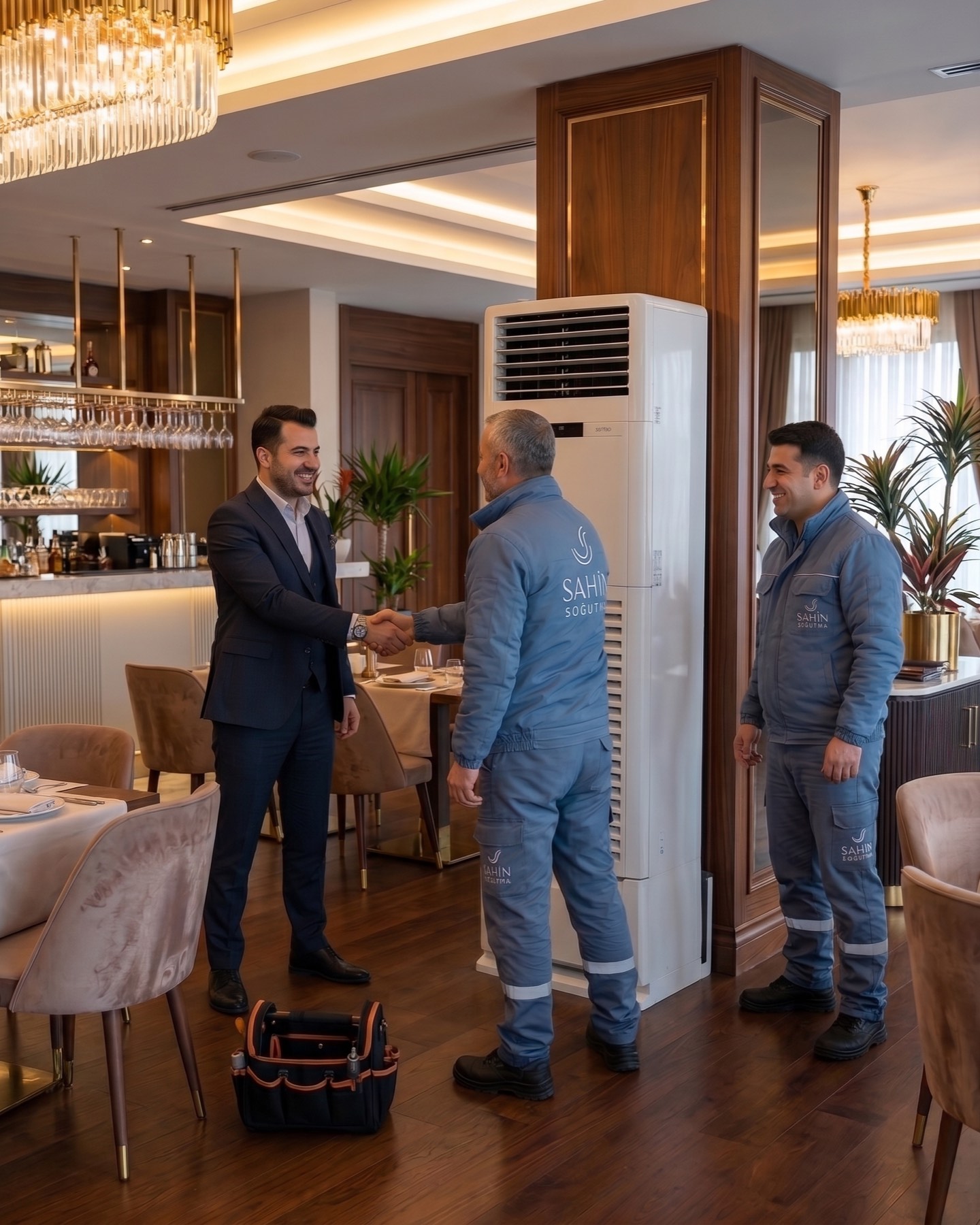
Overall, the logo carries a minimal, technical, and contemporary language. Every form and line is designed to represent the fluidity of the cooling process, cyclical balance, and engineering precision.

Launch Similar Project