Jahome Jakuzi Sistemleri
For Jahome, which brings together the calm of water with the flawless geometry of luxury architecture in a single form, we designed an elite, timeless brand identity that visualises "poolside villa comfort."
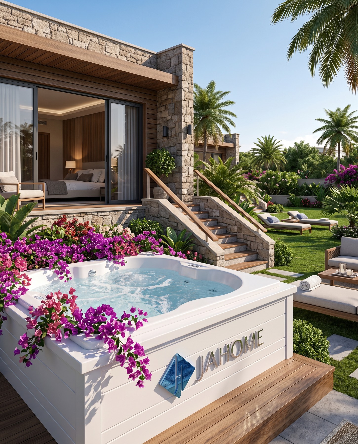
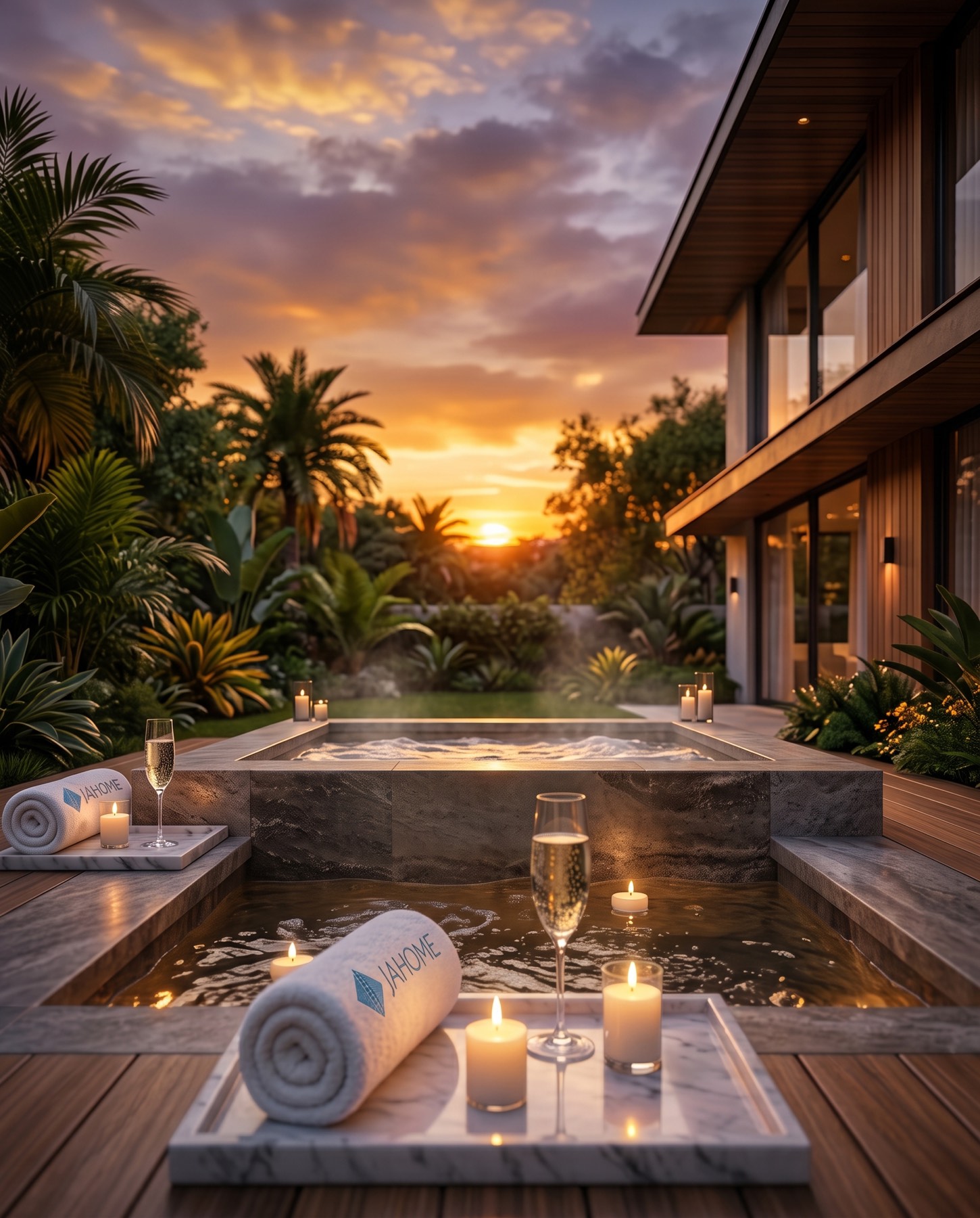
The logo we designed for the Jahome brand — which offers product and concept designs under the "Poolside-Villa comfort" concept for detached homes and hotel/spa centres — is built on an iconic symbol formed by combining the brand's initials, "J" and "H," in a simple, elegant way.
Challenge
Jahome is a brand that speaks to two different yet equally demanding customer segments: owners of luxury real estate and premium hotel/spa operators.
Building an abstract, elite, timeless visual language that synthesises "poolside" (water, relaxation, architecture) and "villa comfort" (home, peace, elegance) without directly using literal elements from either. The design needed to strike a balanced stance capable of speaking simultaneously to villa owners seeking individual luxury and to hotel/spa businesses seeking corporate prestige.
Goal
The core aim was to position Jahome not merely as "a design and product brand," but as an "architect of experience and lifestyle."
As a design philosophy, we aimed for a minimalist, sophisticated symbolism that unites the brand's initials ("J" and "H") with the essence of the concept (luxury, water, architecture, home) under a single symbol. The emblem needed to evoke the fluidity of a water wave, the geometric balance of a luxury architectural structure, and the abstract cross-section of a pool ladder or a lounger. The typography needed to be built with a fine, modern, elegant, elite sans-serif typeface to support this powerful emblem. The overall stance of the logo needed to clearly reflect the brand's reliability, quality, and attention to detail.
Result
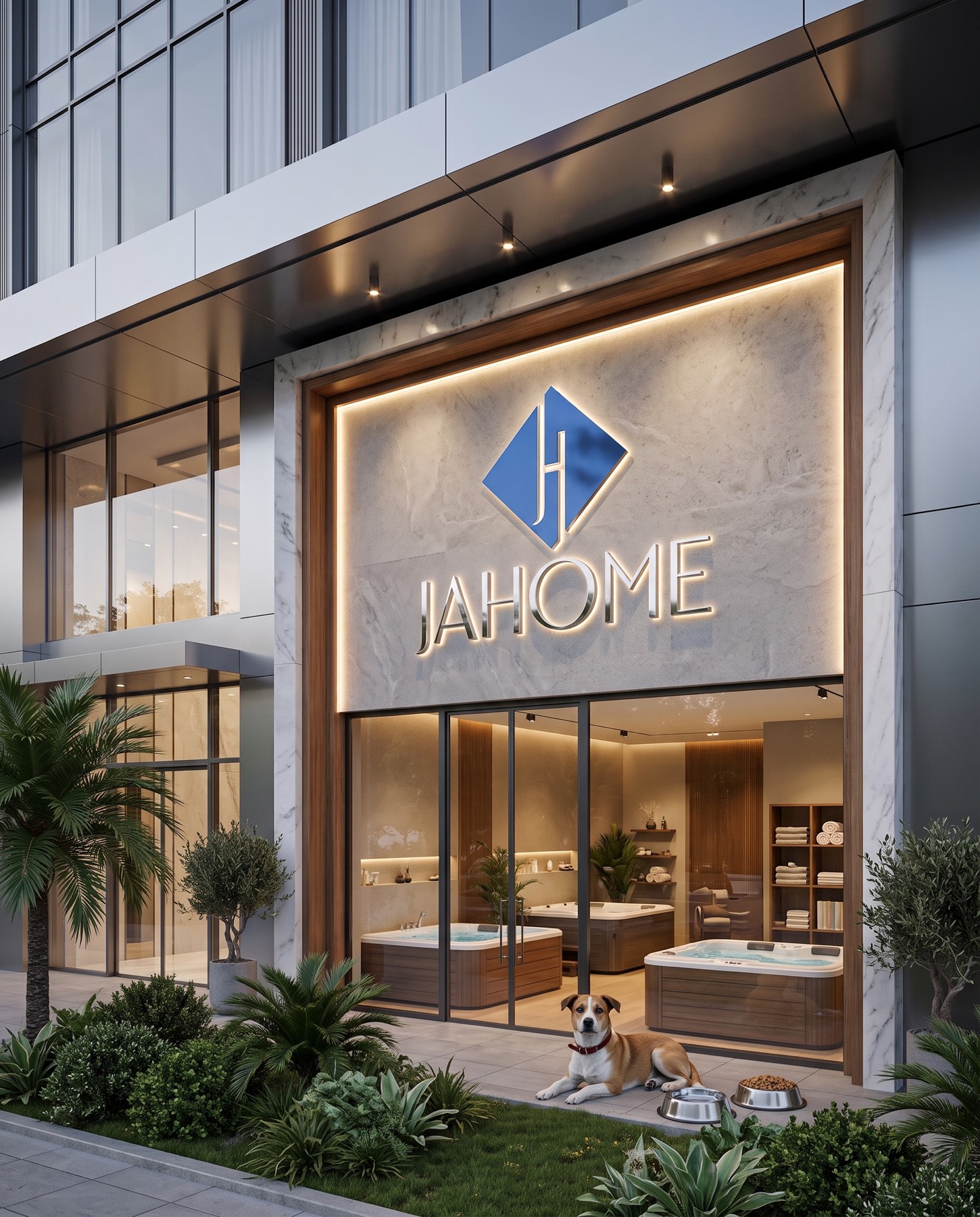
The blue diamond (rhombus) shape symbolises the luxury of fine jewellery, geometric balance, and unshakeable trust.
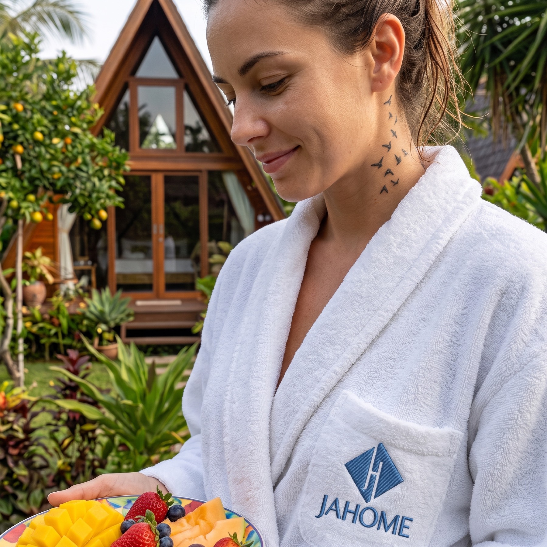
The abstract "JH" monogram within it combines the brand's initials while also evoking a doorway, the cross-section of an architectural structure, a pool ladder, or the abstract form of a lounger. This is a visionary synthesis that conveys "poolside" and "villa comfort" without symbolising them directly. The colour blue represents water, calm, peace, and professionalism. The "JAHOME" wordmark is set in a fine, modern, balanced, elite sans-serif typeface. The clean contours and fine weight of the letters convey elegance and attention to detail. The typography balances the emblem's powerful symbolism and reinforces the brand's professional stance.

Launch Similar Project