Kuan Mühendislik
Logo and corporate identity for Kuan Mühendislik, an İzmir firm that designs and builds steel structures.
Kuan Mühendislik is an engineering company founded in İzmir in 2022: it designs steel structures, runs their fabrication and erection, and develops real estate. In its founding year we designed the company's logo and corporate identity.
Challenge
A newly founded engineering company had to look the same from its first proposal folder to its site signage.
The company builds steel structures ranging from industrial plants to shopping centres. The logo had to carry the weight of that work and stay just as clear on a small business card as in channel letters on a building façade.
Goal
The aim was to build the company's initial like a steel structural element.
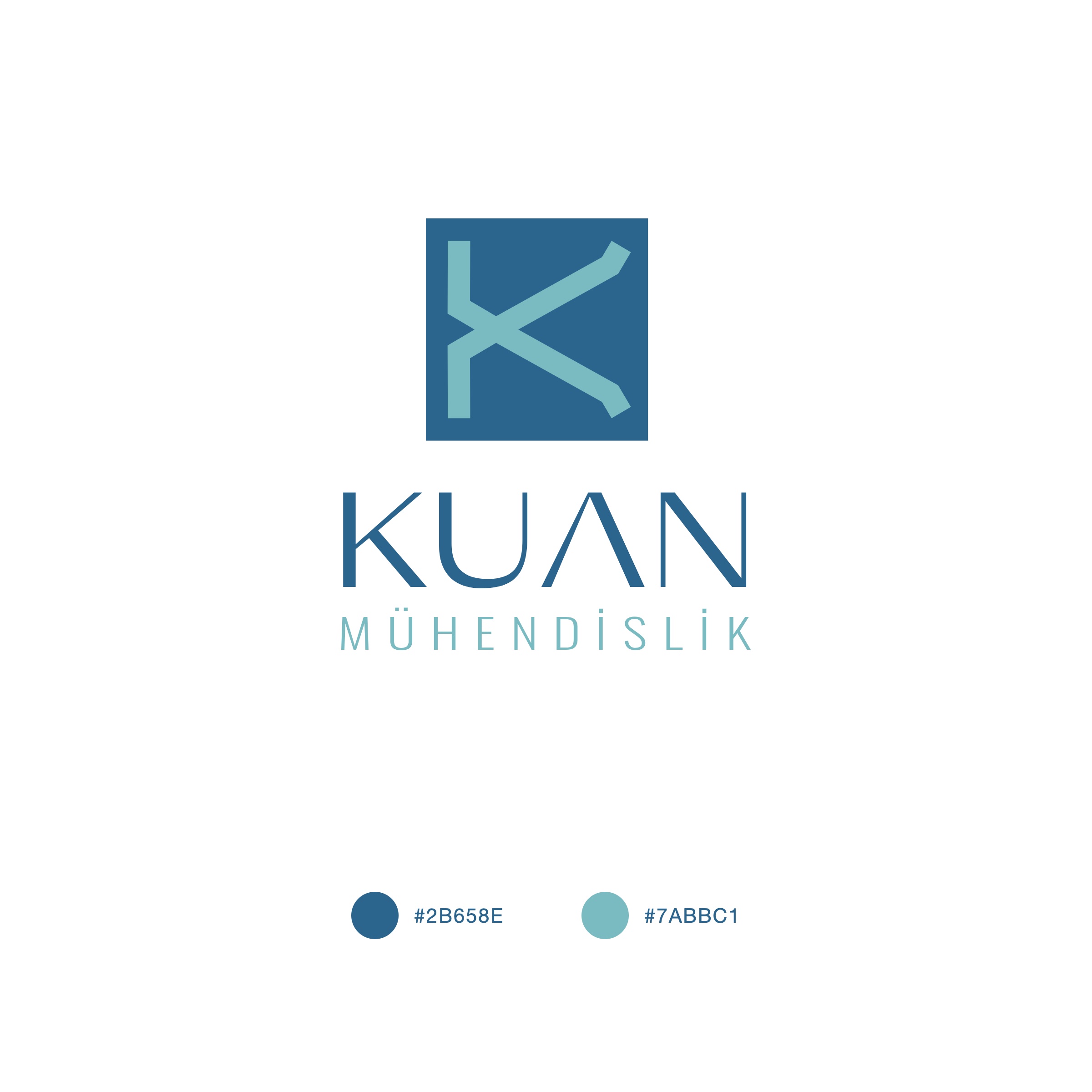
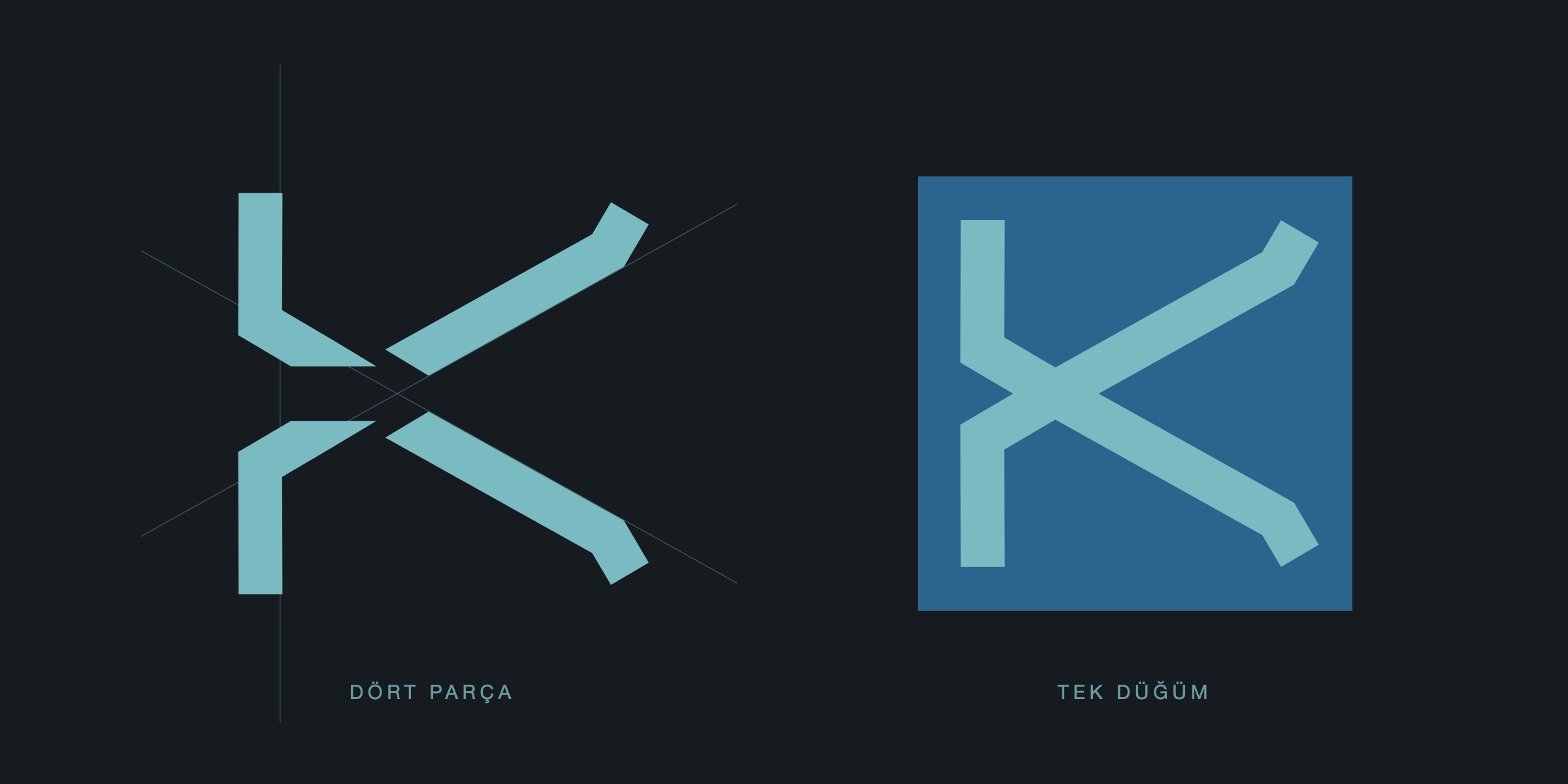
We prepared five directions for the presentation. In the chosen one the letter K is made of four parts: two posts that bend at an elbow and two diagonals with angled tips. The four parts meet at a single node, and the square ground carries it like a plate. The name KUAN is set in thin, wide capitals, with MÜHENDİSLİK letterspaced beneath it.
Result
The emblem also works on its own: the K inside the square became the company's signature.
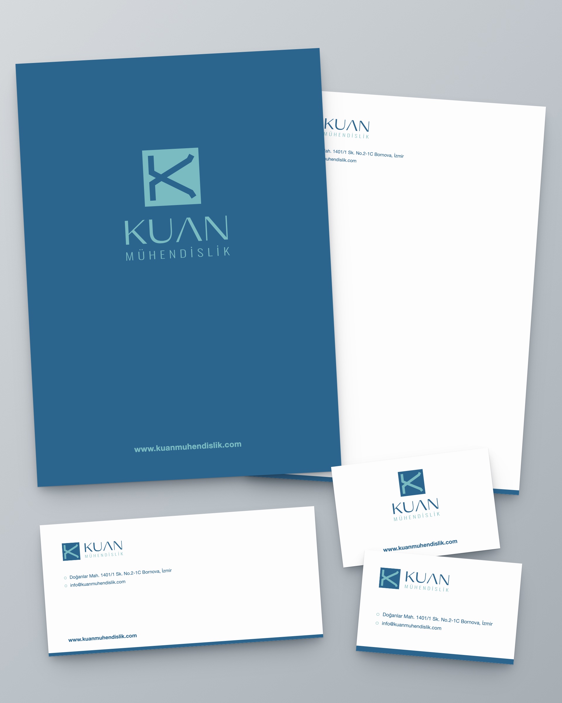
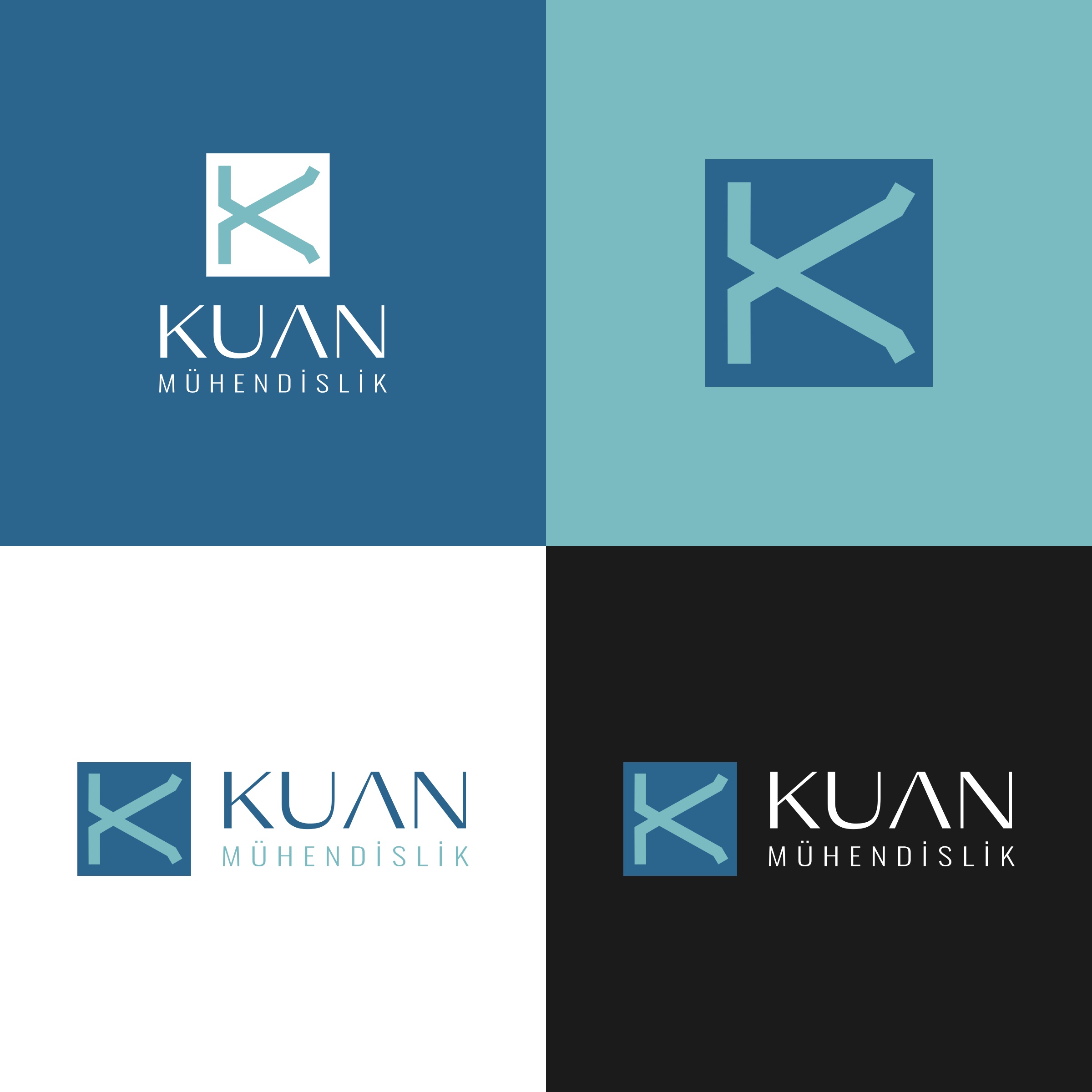
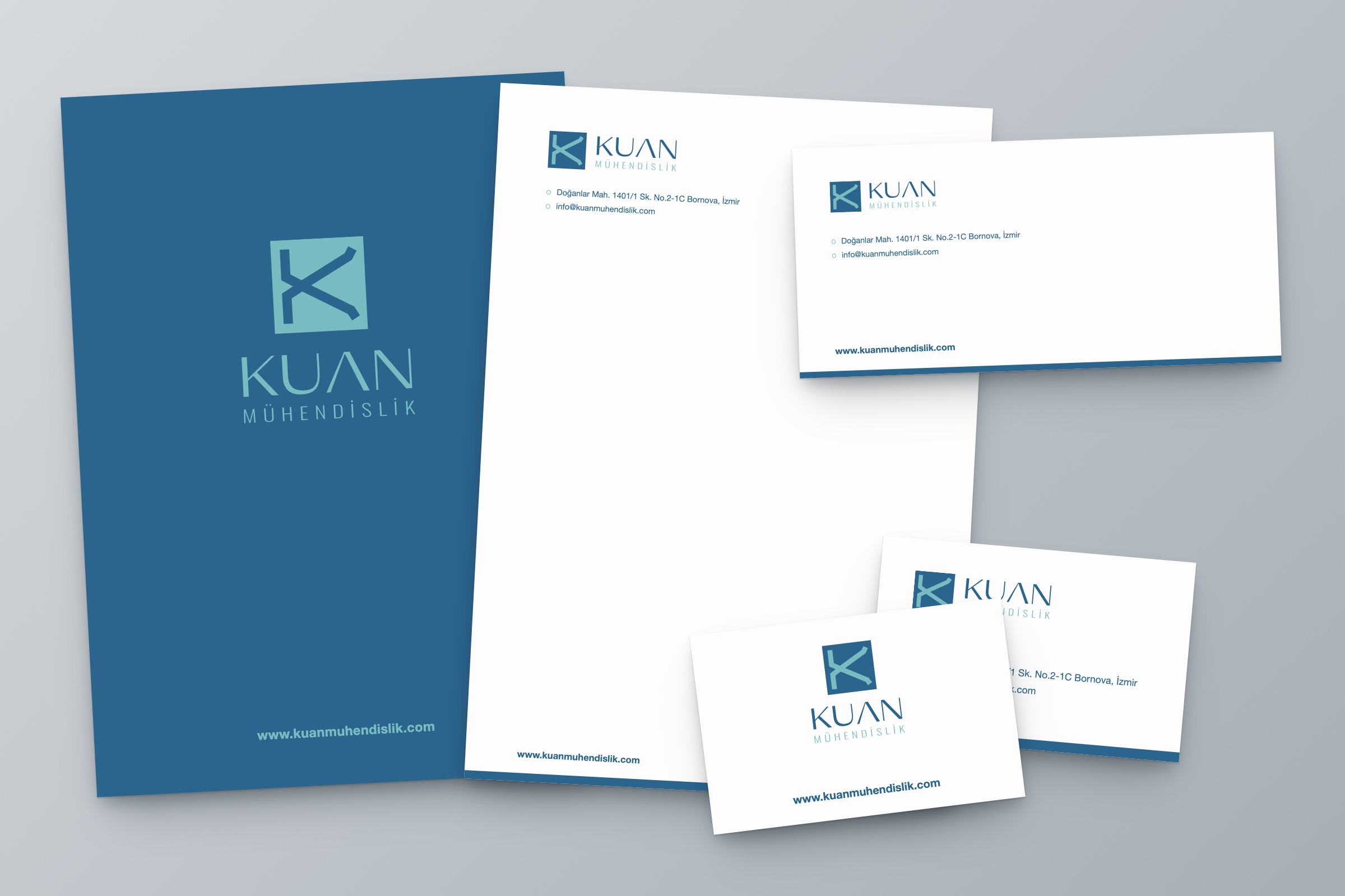
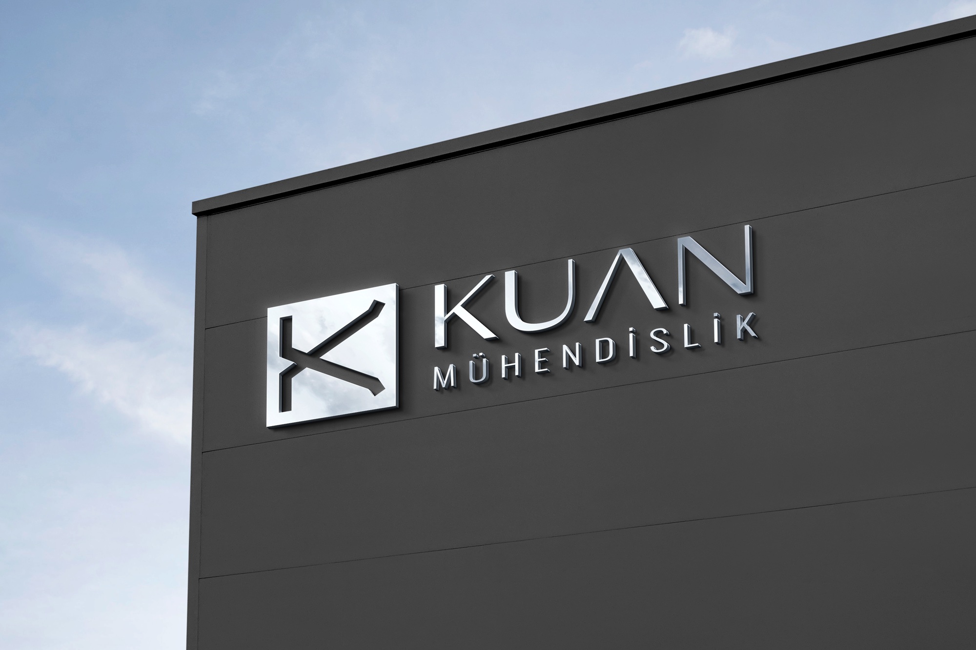
The identity is built on two colours: dark blue and light turquoise. Vertical and horizontal layouts were prepared, with versions for light, blue, turquoise and black backgrounds. The corporate identity consists of a pocket folder, letterhead, DL envelope and business card, all sharing the same blue strip along the bottom edge. The logo was also tried out as façade signage.
Launch Similar Project