Antrametal
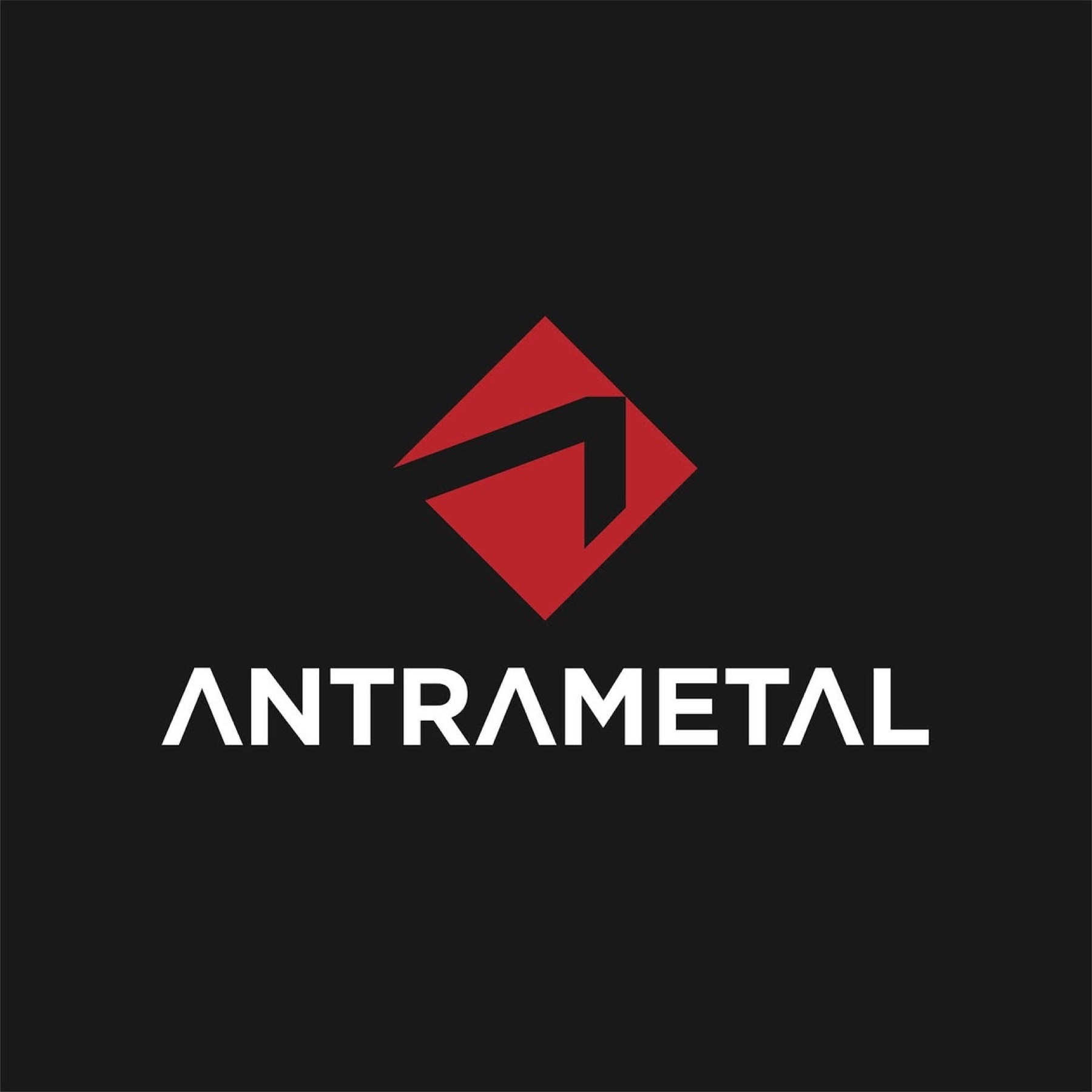
In creating the logo for Antrametal, we carefully examined the brand's values, mission, and vision. The resulting logo visually expresses the concepts of strength, reliability, and innovation that Antrametal is identified with.
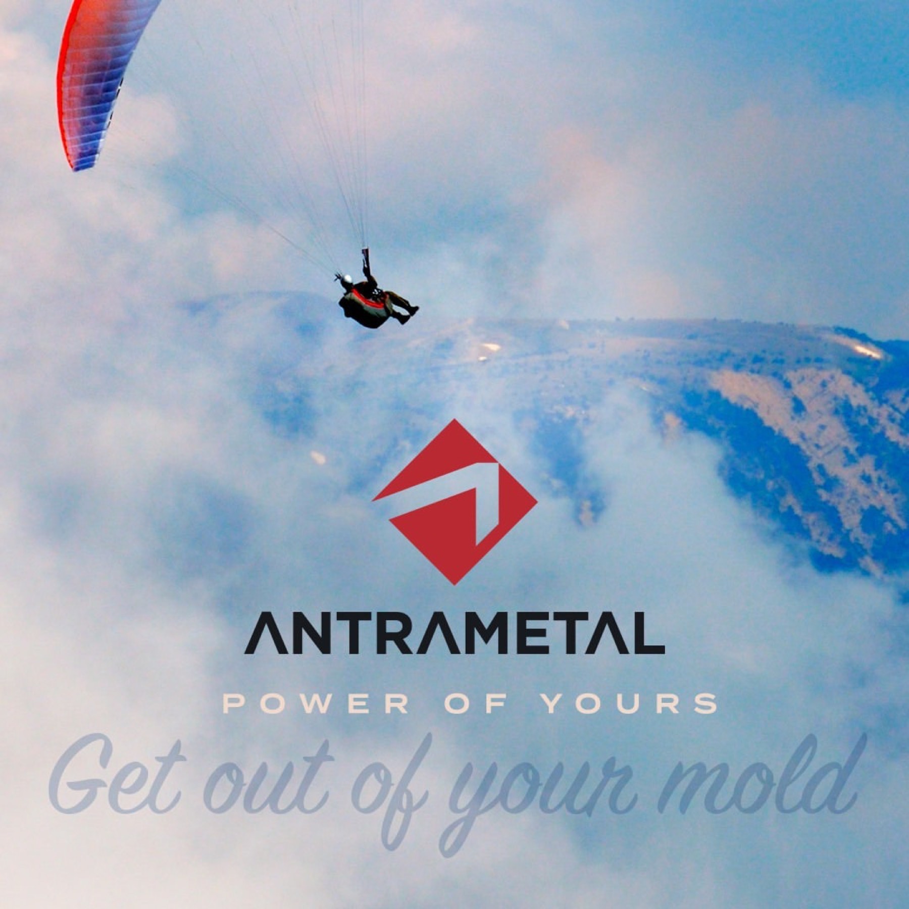
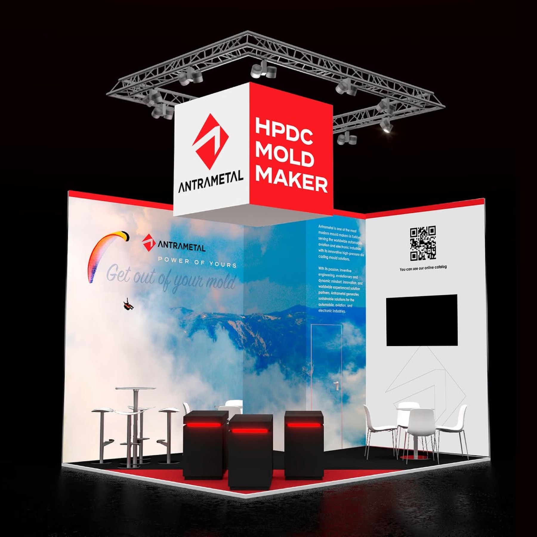
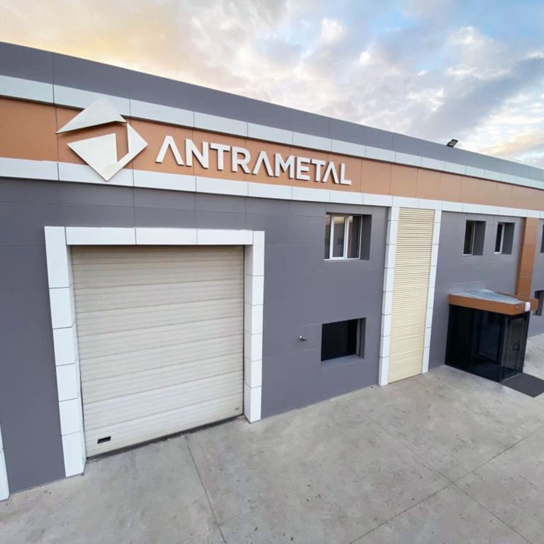
The logo design project we brought to life for Antra Metal is a journey translating structural strength in industrial manufacturing, sharp engineering vision, and dynamic sectoral progress into a modern, assertive, memorable visual language.
Challenge
Breaking the "heavy and cumbersome" perception inherent to the metal industry — adding a technological, agile, innovative vision without losing the brand's authority and structural weight in the sector — was the core challenge of the design process.
It was necessary to move entirely beyond conventional, clichéd industrial symbols (gears, cogs, classic metallic effects), creating a corporate identity sharp and simple enough to compete in the global market.
Goal
Our goal was to turn the letter "A", the brand's initial, into a dynamic symbol that could simultaneously reflect forward momentum (an arrow form) and millimetric precision in engineering.
Using skilful negative space within a red rhombus representing durability, we aimed to unite the workability of metal, cutting precision, and the brand's ambition to lead the sector, all in a single form.
Result
The result was a strong, resolute brand identity turning traditional industrial weight into modern sharpness.
The letters "A", stylised with their crossbars removed (Λ) in both the emblem and the logotype, provided flawless geometric unity while reinforcing the brand's steady upward growth ambition. The high contrast created by black, symbolising industrial authority, and red, reflecting energy and manufacturing strength, built a timeless, technical visual perception emphasising Antra Metal's professional stance in the sector.
Launch Similar Project