Tedarikçi Sepeti
For Tedarikçi Sepeti, positioned as the new centre of economical, fast, and reliable shopping in the industrial supply market, the corporate identity project we brought to life is a journey bringing together the brand's structural strength and its price-advantage promise in a cleverly constructed, minimalist geometric form.
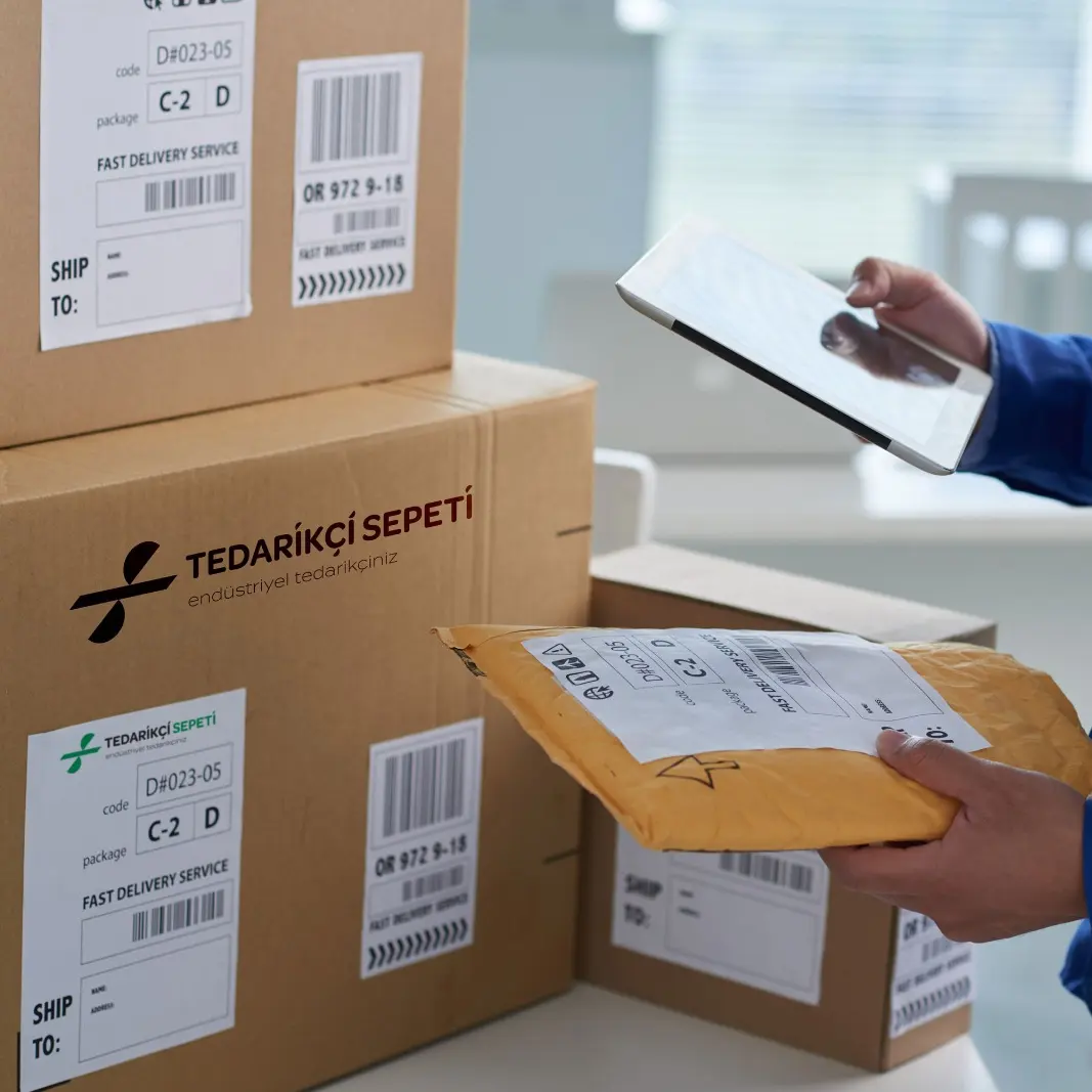
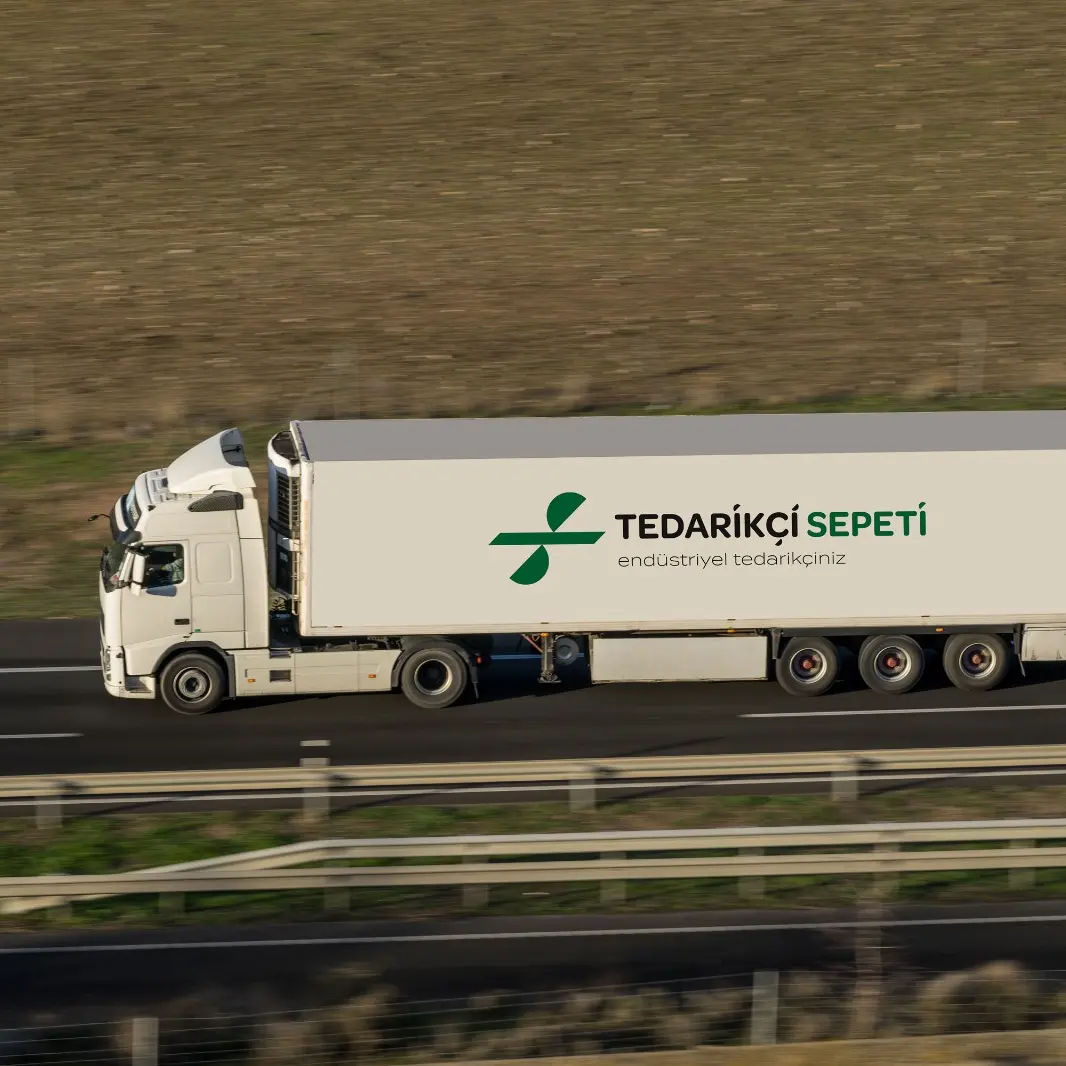
The logo design incorporates the letters "T" and "S" together with a "%" sign. This emblem sends customers the message that they can shop affordably and economically with the brand.
Challenge
The biggest risk brands seeking to create a perception of "affordable pricing" and "economical shopping" face in their visual communication is losing their corporate gravity and creating a "cheap" or "basic" perception.
In a sector like industrial supply, where trust, continuity, and quality are critical, our core challenge in the design process was to convey the message of discount and advantage to the target audience through an extremely professional, modern, trust-inspiring visual language — without shaking the brand's B2B (business-to-business) authority.
Goal
Our goal was to blend the forms of "T" and "S" — the initials of the brand's name — in flawless optical balance with the "%" (percent) sign, directly symbolising economical shopping and budget-friendly pricing.
By reducing complex messages to an uncluttered, simple line, we aimed to design an iconic emblem that would make the brand's identity felt at first glance while cleverly communicating, on a subliminal level, the promise: "you can shop here at an advantage and an affordable price."
Result
The design process brought to life a dynamic, multi-layered logo shaped by rational combinations of form.
While the sharp horizontal line emphasised the structural strength of the letter "T", the semicircular forms crossing this line diagonally formed both a flowing "S" and the universal "%" symbol, heralding shopping deals. Supported by a deep industrial green palette representing growth, commercial vitality, and corporate trust, this design successfully positioned Tedarikçi Sepeti as a rational, economical, and solid solution partner in its sector.


Launch Similar Project