Everest Lift Solutions
Logo and corporate identity design for Everest Lift Solutions, a lift consultancy and foreign trade company, built from a summit that rises floor by floor.
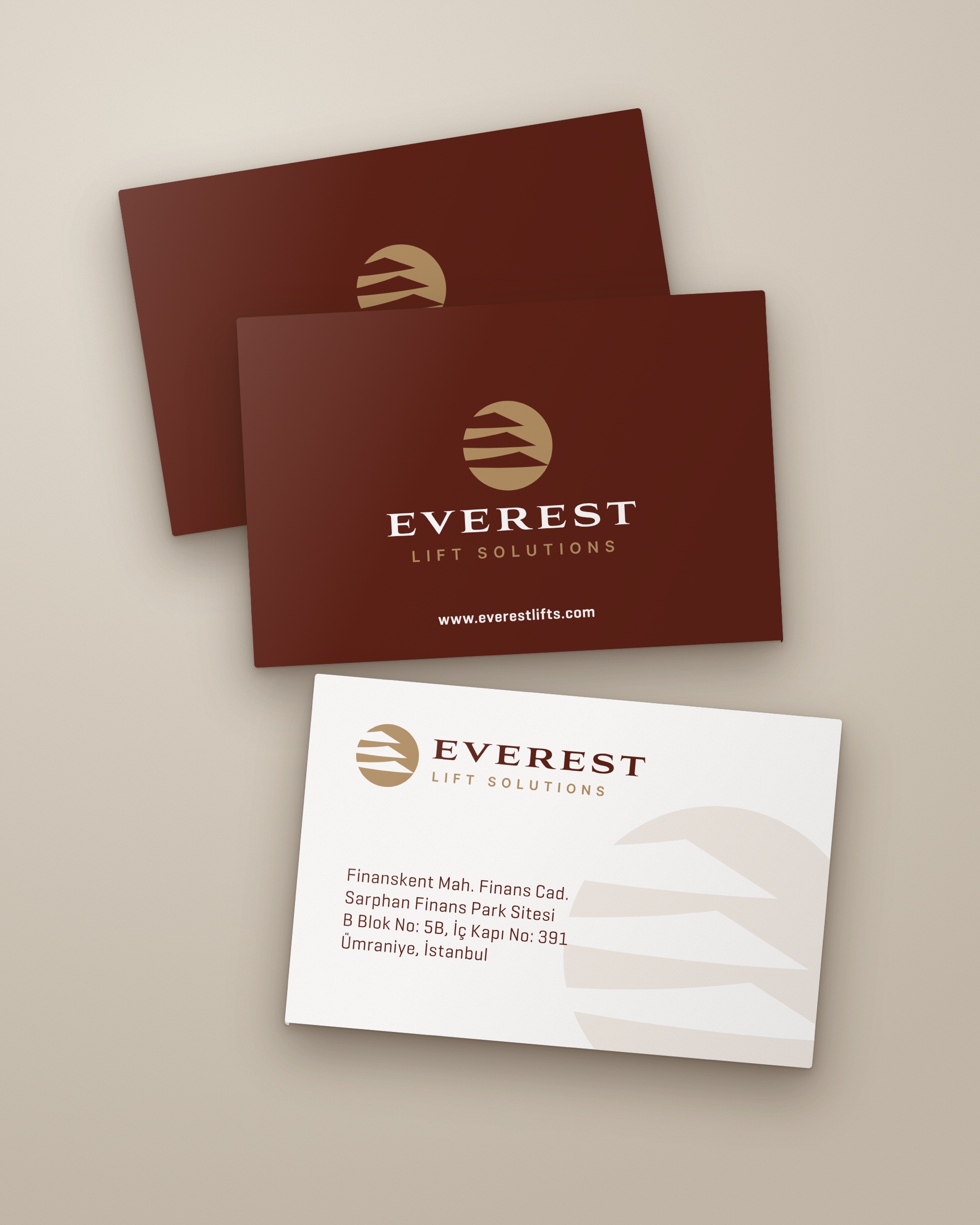
Everest Lift Solutions is an Istanbul-based company providing consultancy and foreign trade in the lift sector. We designed its logo and corporate identity in 2026: logo, business card, letterhead and email signature.
Challenge
The company takes its name from a mountain, while its business is lifts; the logo had to bring the two together in a single mark.
A mark that draws only a mountain does not say what the company does, and a mark that draws only a lift does not carry the name. Because the company works in foreign trade, the logo also had to read with the same clarity in correspondence, on a business card and at small sizes.
Goal
The goal was to build the summit of Everest out of the floors a lift travels through.
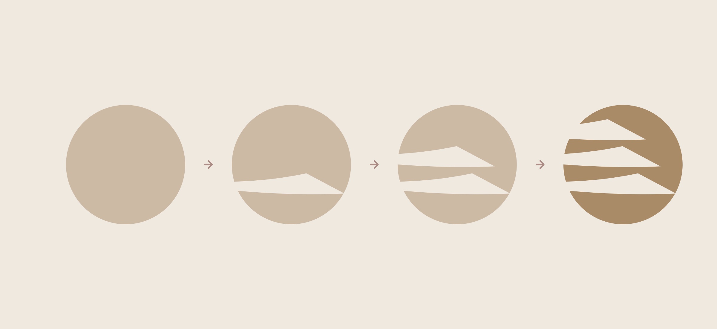
The starting idea is a summit rising floor by floor: the mountain would be made of layers stacked on top of one another, and each layer would read as a floor. That way the name and the business would meet in one mark. We also wanted the mark to be able to leave the name and work as a large trace on paper.
Result
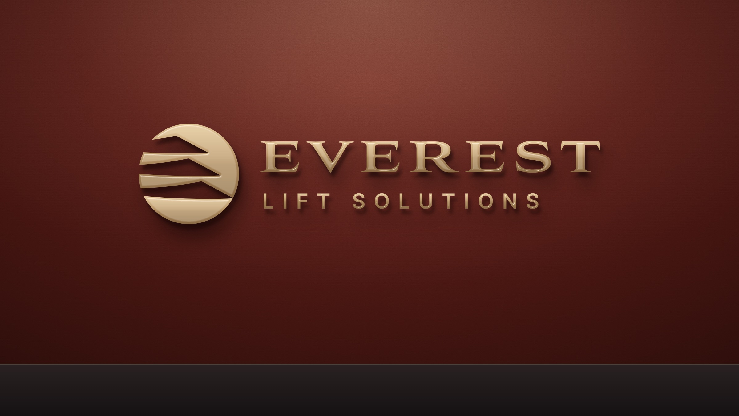
The logo is made of layers stacked inside a gold circle; the layers narrow towards the top and draw a summit.
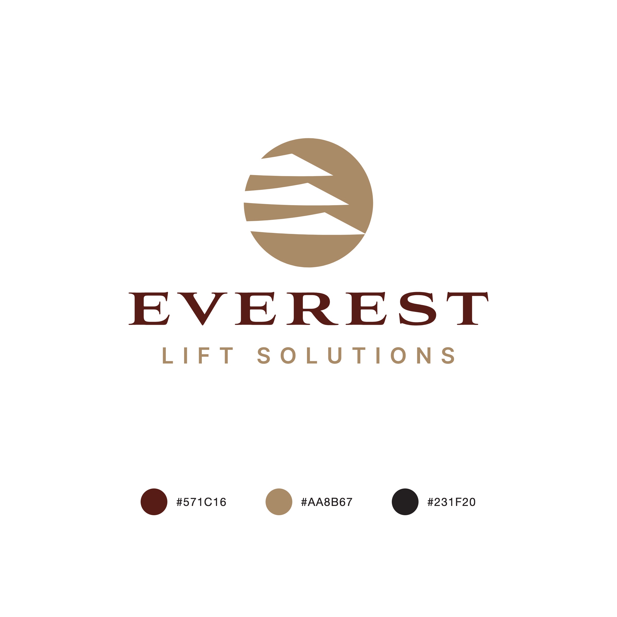
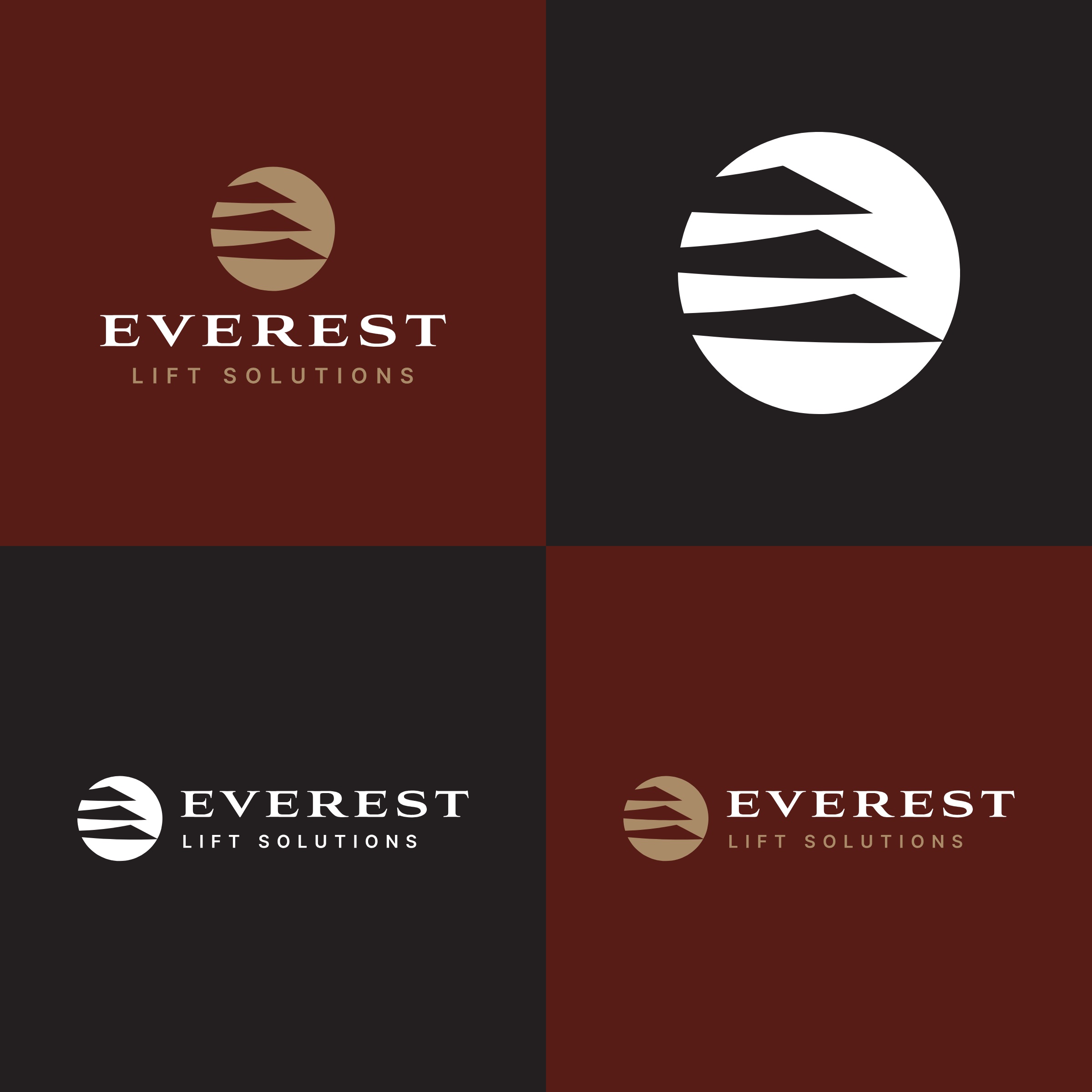
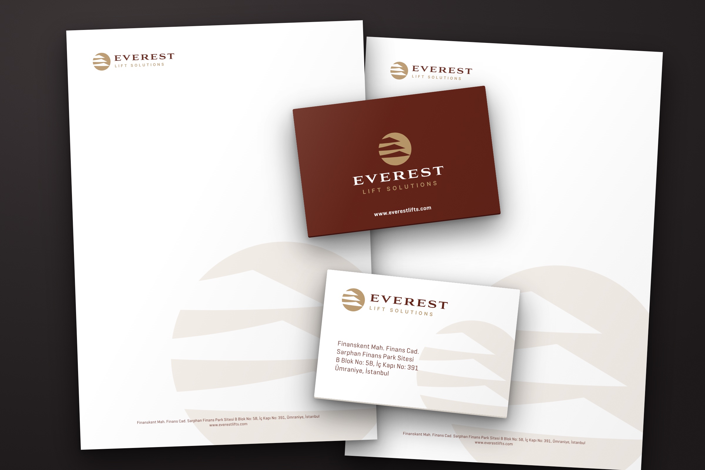
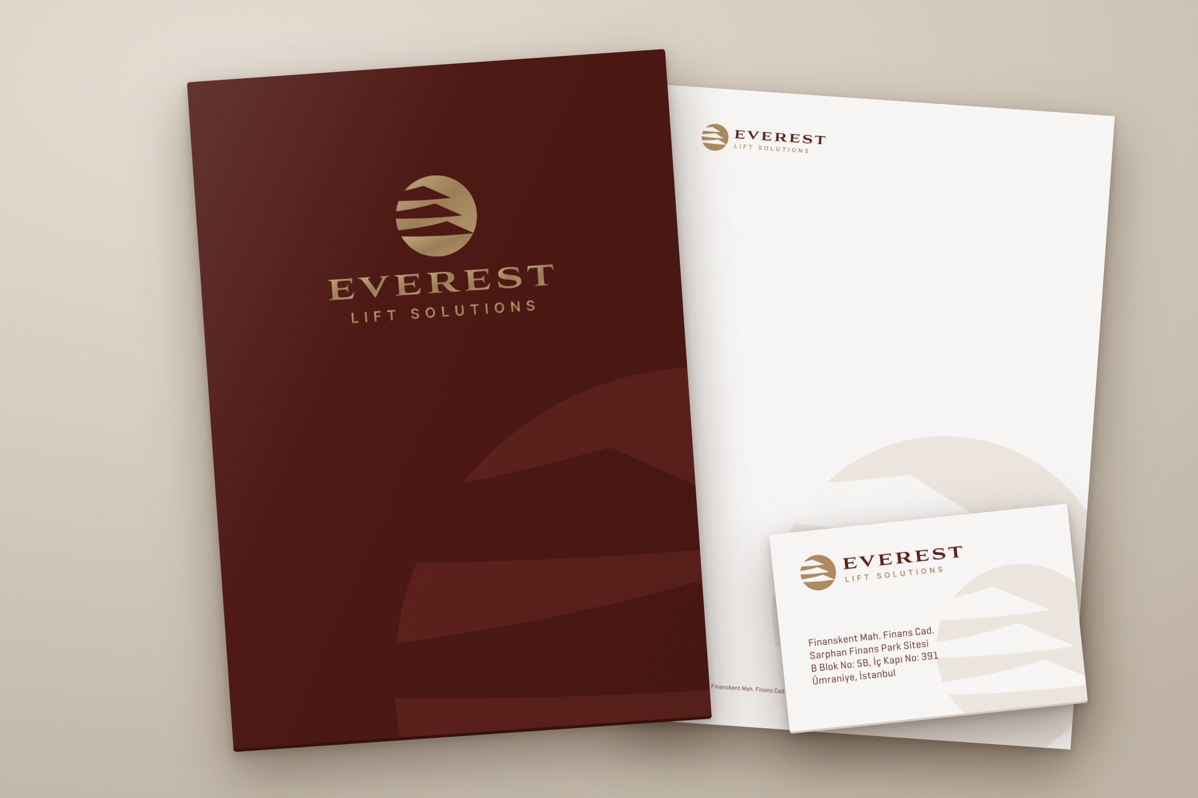
The right-hand ends of the layers finish in a point and line up along the same slope, which reads as the flank of the mountain. The name EVEREST is set in wide serif capitals, and the line LIFT SOLUTIONS in plain, widely spaced letters. The colours are burgundy, gold and black. Vertical and horizontal layouts were prepared, along with versions for white, burgundy and black backgrounds. The back of the business card is burgundy; on the front and on the letterhead the emblem is enlarged and placed in the corner of the page as a pale trace.
Launch Similar Project