Egip Eğitim ve Rehberlik
Meet the new face of digital guidance: EGİP. The brand identity we built entirely from scratch, with custom vector paths, for this fluid education-and-guidance platform is now live.
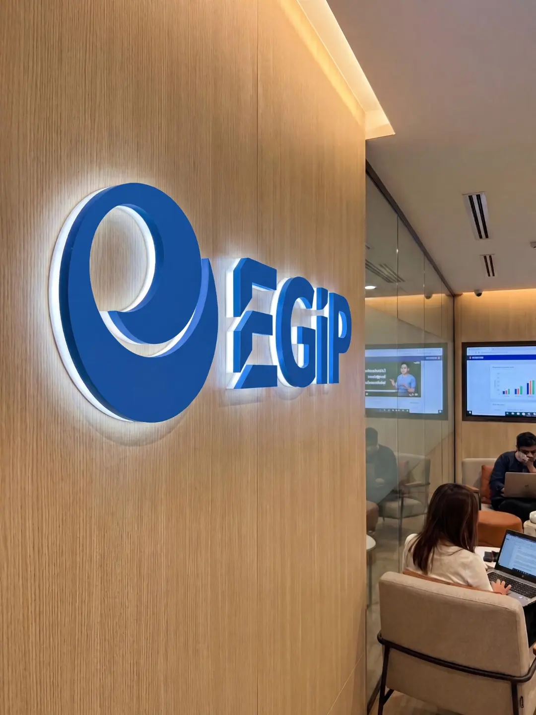
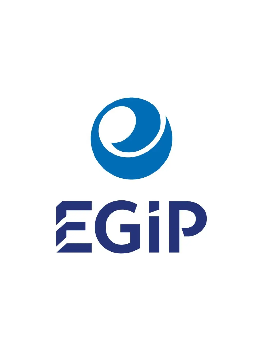
The fluid form in the emblem reflects the platform's dynamic, ever-evolving structure, while the structural details in the custom-designed typography emphasise a solid, reliable digital infrastructure. A minimalist, clean, powerful vision.
Challenge
Bringing together education and guidance — two fields that can sometimes be perceived as traditional and static — under a single digital, fluid platform was the core challenge. The visual identity needed to reflect both educational seriousness and guidance's empathetic, wayfinding nature, while also emphasising the platform's innovative, dynamic, accessible face.
The designed logo combines an iconic emblem — a fluid, cyclical blue spiral on top — with a modern, geometric sans-serif wordmark below. The emblem symbolises both the continuity and cyclicality of the learning process and the compass-like, wayfinding nature of guidance, while forming a visual unity with the brand name as a modern, dynamic interpretation of the letter "E." The clean lines and deep blue tones in the typeface emphasise professionalism and trust, while the dot on the "İ" and the modern cuts of the "E" reflect the platform's detail-focused, fluid structure. This design became a powerful, iconic brand signature that conveys EGİP's innovative, fluid platform experience in digital guidance at a single glance.
Goal
Our core aim was to design a logo positioning EGİP as the new, dynamic, reliable face of digital guidance, visualising a "fluid" platform experience.
We aimed to create a universal, symbolic emblem bringing together the concepts of education (the learning cycle, accumulated knowledge) and guidance (the compass, wayfinding, the journey), conveying a sense of both trust and technological innovation. It was critical to choose the typeface and colours in a way that reflects professionalism, clarity, and accessibility, ensuring the logo stays clear and legible across every digital medium.
Result
The designed logo combines an iconic emblem — a fluid, cyclical blue spiral on top — with a modern, geometric sans-serif wordmark below.
The emblem symbolises both the continuity and cyclicality of the learning process and the compass-like, wayfinding nature of guidance, while forming a visual unity with the brand name as a modern, dynamic interpretation of the letter "E." The clean lines and deep blue tones in the typeface emphasise professionalism and trust, while the dot on the "İ" and the modern cuts of the "E" reflect the platform's detail-focused, fluid structure. This design became a powerful, iconic brand signature that conveys EGİP's innovative, fluid platform experience in digital guidance at a single glance.


Launch Similar Project