Albay Group
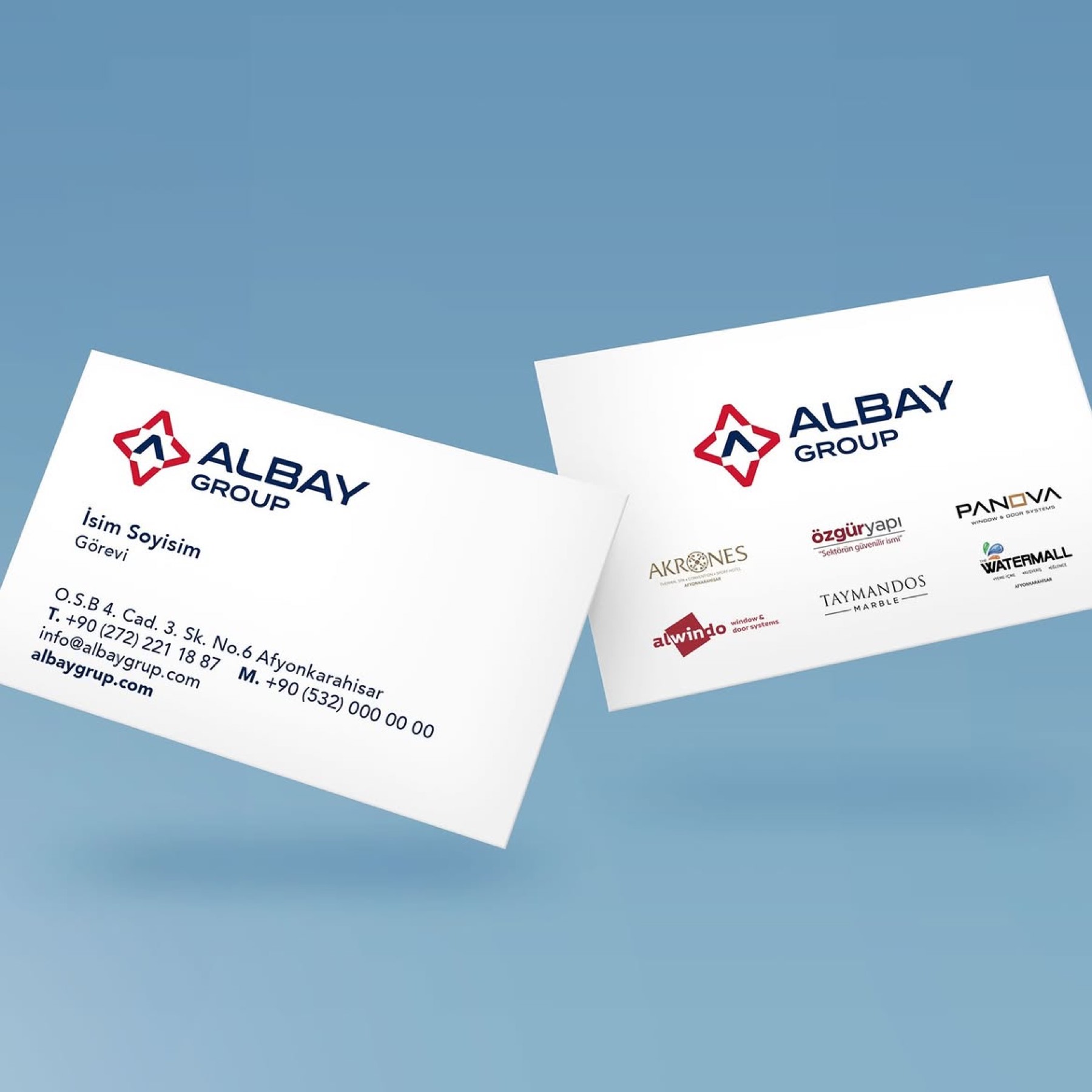
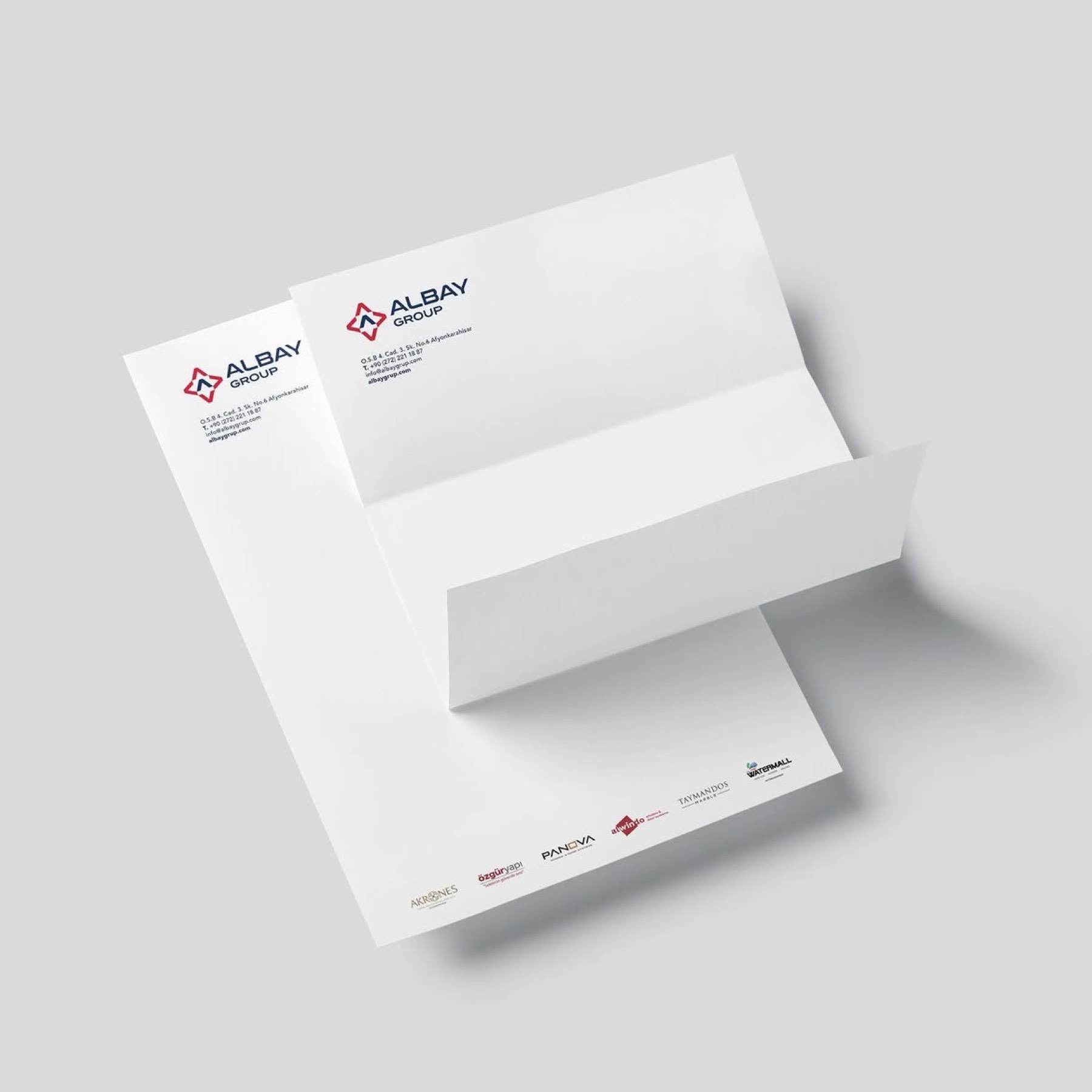
For Albay Group, based in Afyonkarahisar and shaping the region's economic dynamics across a wide range of activities — from vast production facilities to tourism investments — we designed a prestigious corporate identity reflecting the brand's unshakeable authority and visionary structure.
Challenge
The core design challenge on this project was representing, without clutter, under one umbrella brand, both an industry-focused brand manufacturing building systems in a vast 26,000-square-metre facility and a tourism-focused investment offering top-tier service, such as Akrones Hotel.
The resulting visual language had to carry the sense of "solidity, engineering, and durability" required by the construction sector, while also stretching, without losing shape, the feeling of "inclusiveness, trust, and prestige" a holding company must possess.
Goal
Our main goal was to build a versatile, unshakeable brand architecture bringing together every different sector Albay Group operates in.
We aimed to take the letter "A" carrying the brand's name out of being a standard typographic element, and transform it into an iconic emblem with three-dimensional depth symbolising the holding's manufacturing strength, structural foundations, and ever-accelerating growth ambitions.
Result
Our strategic design process resulted in a corporate identity reflecting the holding's deep-rooted strength and sectoral diversity in a modern form.
The upward-pointing "A" form at the centre of the design symbolises the brand's vision, while the three-dimensional geometric structure surrounding it like armour visualised the engineering precision of the company (Özgür Yapı) in production and the holding's unshakeable foundations. The four-pointed form making up the emblem's outer contour was built to represent Albay Group's diverse range of investments — from tourism to industry — its regional dominance, and its versatile strategy. An authoritative contrast was struck by bringing together an assertive red, reflecting leadership, energy, and manufacturing dynamism, with a navy blue representing corporate gravity, depth, and unshakeable trust. The modern, solid, clearly legible typography used at the bottom gave the logo industrial weight and corporate stature.
Launch Similar Project